Date pickers let users select a date, a date range, or both. They use a calendar dialog or text input to let users select dates.
Types
There are three types of date pickers:
- Docked: Appears inline within the layout. It's suitable for compact layouts where a dedicated dialog might feel intrusive.
- Modal: Appears as a dialog overlaying the app's content. This provides a clear focus on date selection.
- Modal input: Combines a text field with a modal date picker.
You can implement these date pickers in your app using the following composables:
DatePicker: General composable for a date picker. The container you use determines whether it is docked or model.DatePickerDialog: The container for both modal and modal input date pickers.DateRangePicker: For any date picker where the user can select a range with a start and end date.
State
The key parameter that the different date picker composables share in common is
state, which takes either a DatePickerState or
DateRangePickerState object. Their properties capture information about
the user's selection using the date picker, such as the current selected date.
For more information on how you can make use of the selected date, see the Use selected date section.
Docked date picker
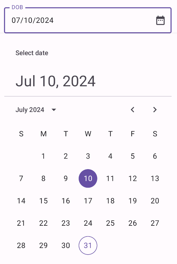
In the following example, there is a text field that prompts the user to input their date of birth. When they click the calendar icon in the field, it opens a docked date picker below the input field.
@Composable fun DatePickerDocked() { var showDatePicker by remember { mutableStateOf(false) } val datePickerState = rememberDatePickerState() val selectedDate = datePickerState.selectedDateMillis?.let { convertMillisToDate(it) } ?: "" Box( modifier = Modifier.fillMaxWidth() ) { OutlinedTextField( value = selectedDate, onValueChange = { }, label = { Text("DOB") }, readOnly = true, trailingIcon = { IconButton(onClick = { showDatePicker = !showDatePicker }) { Icon( imageVector = Icons.Default.DateRange, contentDescription = "Select date" ) } }, modifier = Modifier .fillMaxWidth() .height(64.dp) ) if (showDatePicker) { Popup( onDismissRequest = { showDatePicker = false }, alignment = Alignment.TopStart ) { Box( modifier = Modifier .fillMaxWidth() .offset(y = 64.dp) .shadow(elevation = 4.dp) .background(MaterialTheme.colorScheme.surface) .padding(16.dp) ) { DatePicker( state = datePickerState, showModeToggle = false ) } } } } } @Composable fun DatePickerFieldToModal(modifier: Modifier = Modifier) { var selectedDate by remember { mutableStateOf<Long?>(null) } var showModal by remember { mutableStateOf(false) } OutlinedTextField( value = selectedDate?.let { convertMillisToDate(it) } ?: "", onValueChange = { }, label = { Text("DOB") }, placeholder = { Text("MM/DD/YYYY") }, trailingIcon = { Icon(Icons.Default.DateRange, contentDescription = "Select date") }, modifier = modifier .fillMaxWidth() .pointerInput(selectedDate) { awaitEachGesture { // Modifier.clickable doesn't work for text fields, so we use Modifier.pointerInput // in the Initial pass to observe events before the text field consumes them // in the Main pass. awaitFirstDown(pass = PointerEventPass.Initial) val upEvent = waitForUpOrCancellation(pass = PointerEventPass.Initial) if (upEvent != null) { showModal = true } } } ) if (showModal) { DatePickerModal( onDateSelected = { selectedDate = it }, onDismiss = { showModal = false } ) } } fun convertMillisToDate(millis: Long): String { val formatter = SimpleDateFormat("MM/dd/yyyy", Locale.getDefault()) return formatter.format(Date(millis)) }
Key points about the code
- The date picker appears when the user clicks the
IconButton.- The icon button serves as the argument for the
OutlinedTextField'strailingIconparameter. - The
showDatePickerstate variable controls the visibility of the docked date picker.
- The icon button serves as the argument for the
- The date picker's container is a
Popupcomposable, which overlays the content without affecting the layout of other elements. selectedDatecaptures the value of the selected date from theDatePickerStateobject and formats it using theconvertMillisToDatefunction.- The selected date appears in the text field.
- The docked date picker is positioned below the text field using an
offsetmodifier. - A
Boxis used as the root container to allow proper layering of the text field and the date picker.
Results
After clicking the calendar icon, this implementation appears as follows:

Modal date picker
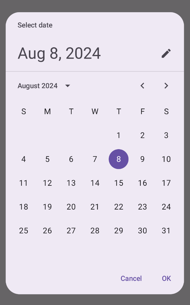
A modal date picker displays a dialog that floats over the screen. To implement
it, create a DatePickerDialog and pass it a DatePicker.
@Composable fun DatePickerModal( onDateSelected: (Long?) -> Unit, onDismiss: () -> Unit ) { val datePickerState = rememberDatePickerState() DatePickerDialog( onDismissRequest = onDismiss, confirmButton = { TextButton(onClick = { onDateSelected(datePickerState.selectedDateMillis) onDismiss() }) { Text("OK") } }, dismissButton = { TextButton(onClick = onDismiss) { Text("Cancel") } } ) { DatePicker(state = datePickerState) } }
Key points about the code
- The
DatePickerModalcomposable function displays a modal date picker. - The
onDateSelectedlambda expression executes when the user selects a date.- It exposes the selected date to the parent composable.
- The
onDismisslambda expression executes when the user dismisses the dialog.
Results
This implementation appears as follows:

Input modal date picker
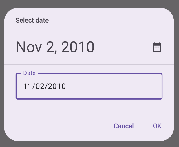
A modal date picker with input displays a dialog that floats over the screen and allows the user to input a date.
@Composable fun DatePickerModalInput( onDateSelected: (Long?) -> Unit, onDismiss: () -> Unit ) { val datePickerState = rememberDatePickerState(initialDisplayMode = DisplayMode.Input) DatePickerDialog( onDismissRequest = onDismiss, confirmButton = { TextButton(onClick = { onDateSelected(datePickerState.selectedDateMillis) onDismiss() }) { Text("OK") } }, dismissButton = { TextButton(onClick = onDismiss) { Text("Cancel") } } ) { DatePicker(state = datePickerState) } }
Key points about the code
This is very much the same as the modal date picker example. The primary difference is the following:
- The
initialDisplayModeparameter sets the initial display mode toDisplayMode.Input.

Date picker with range
You can create a date picker that lets the user select a range between a start
and end date. To do so, use DateRangePicker.
The use of DateRangePicker is essentially the same as DatePicker. You can
use it for a docked picker as a child of PopUp, or you can use it as a
modal picker and pass it to DatePickerDialog. The primary difference is
that you use DateRangePickerState instead of DatePickerState.
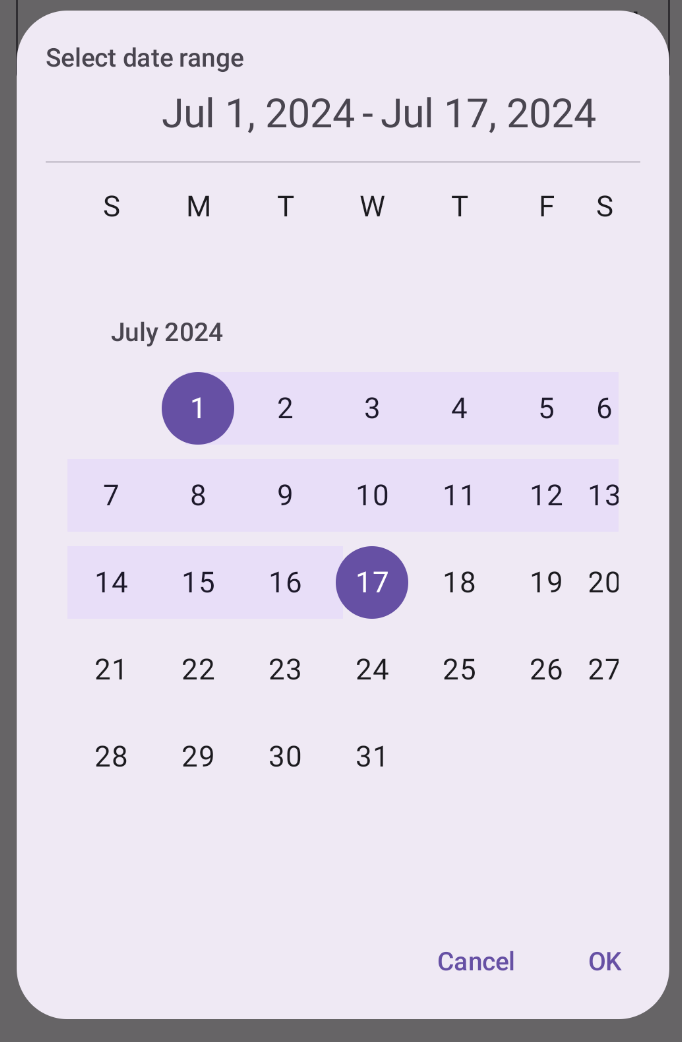
The following snippet demonstrates how to create a modal date picker with a range:
@Composable fun DateRangePickerModal( onDateRangeSelected: (Pair<Long?, Long?>) -> Unit, onDismiss: () -> Unit ) { val dateRangePickerState = rememberDateRangePickerState() DatePickerDialog( onDismissRequest = onDismiss, confirmButton = { TextButton( onClick = { onDateRangeSelected( Pair( dateRangePickerState.selectedStartDateMillis, dateRangePickerState.selectedEndDateMillis ) ) onDismiss() } ) { Text("OK") } }, dismissButton = { TextButton(onClick = onDismiss) { Text("Cancel") } } ) { DateRangePicker( state = dateRangePickerState, title = { Text( text = "Select date range" ) }, showModeToggle = false, modifier = Modifier .fillMaxWidth() .height(500.dp) .padding(16.dp) ) } }
Key points about the code
- The
onDateRangeSelectedparameter is a callback that receives aPair<Long?, Long?>that represents the selected start and end dates. This gives the parent composable access to the selected range. rememberDateRangePickerState()creates the state for the date range picker.- The
DatePickerDialogcreates a modal dialog container. - In the confirm button's
onClickhandler,onDateRangeSelectedpasses up the selected range to the parent composable. - The
DateRangePickercomposable serves as the dialog content.
Results
This implementation appears as follows:

Use selected date
To capture the selected date, track it in the parent composable as a Long and
pass the value to the DatePicker in onDateSelected. The following snippet
demonstrates this, though you can see the full implementation in the official
snippets app.
// ... var selectedDate by remember { mutableStateOf<Long?>(null) } // ... if (selectedDate != null) { val date = Date(selectedDate!!) val formattedDate = SimpleDateFormat("MMM dd, yyyy", Locale.getDefault()).format(date) Text("Selected date: $formattedDate") } else { Text("No date selected") } // ... DatePickerModal( onDateSelected = { selectedDate = it showModal = false }, onDismiss = { showModal = false } ) } // ...
Essentially the same applies for range date pickers, though you need to
use a Pair<Long?, Long?> or a data class to capture the start and end values.
