
Aside from the primary information that a composable carries, like a text string
of a Text composable, it can be helpful to have more supplemental
information about UI elements.
Information about the meaning and role of a component in Compose is called semantics, which are a way to provide additional context about composables to services like accessibility, autofill, and testing. For example, a camera icon might visually just be an image, but the semantic meaning could be "Take a photo".
By combining the appropriate semantics with the appropriate Compose APIs, you provide as much information about your component as possible to accessibility services, which then decide how to represent it to the user.
Material and Compose UI and Foundation APIs come with built-in semantics that follow their specific role and function, but you can also modify these semantics for existing APIs or set new ones for custom components, according to your specific requirements.
Semantic properties
Semantic properties convey the meaning of the corresponding composable. For
example, the Text composable contains a semantic property text, because
that's the meaning of that composable. An Icon contains a
contentDescription property (if set by the developer) that conveys in text
what the meaning of the icon is.
Consider how semantics properties convey the meaning of a composable. Consider a
Switch. This is how it looks to the user:
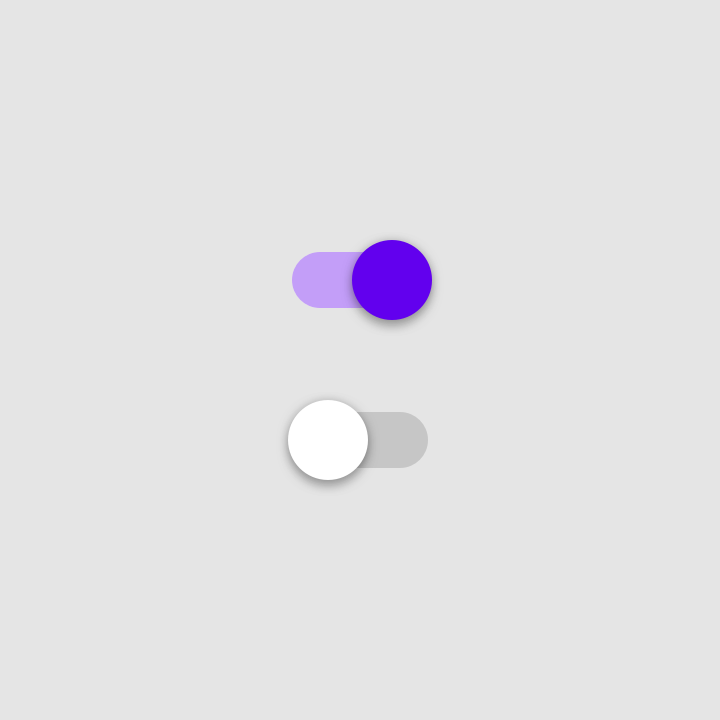
Switch in its "On" and "Off" state.To describe the meaning of this element, you could say the following: "This is a Switch, which is a toggleable element in its 'On' state. You can click it to interact with it."
This is exactly what the semantics properties are used for. The semantics node of this Switch element contains the following properties, as visualized with the Layout Inspector:
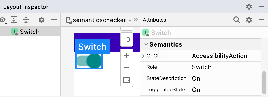
Switch composable.The Role indicates the type of element. The StateDescription describes how
the "On" state should be referenced. By default this is a localized version of
the word "On", but this can be made more specific (for example, "Enabled") based
on the context. The ToggleableState is the current state of the Switch. The
OnClick property references the method used to interact with this element.
Keeping track of the semantics properties of each composable in your app unlocks a lot of powerful possibilities:
- Accessibility services use the properties to represent UI shown on the screen and allow users to interact with it. For the Switch composable, Talkback might announce: "On; Switch; double tap to toggle". The user can double tap their screen to toggle the Switch off.
-
The Testing framework uses the properties to find nodes, interact with
them, and make assertions:
val mySwitch = SemanticsMatcher.expectValue( SemanticsProperties.Role, Role.Switch ) composeTestRule.onNode(mySwitch) .performClick() .assertIsOff()
Composables and modifiers that are built on top of the Compose foundation library already set the relevant properties for you by default. Optionally, you can change these properties manually, to improve the accessibility support for specific use cases, or change your composables' merging or clearing strategy.
To signal the specific content type of your component to accessibility services, you can apply a variety of different semantics. These additions will support the main semantic information in place and help accessibility services fine-tune how your component is represented, announced, or interacted with.
For a full list of semantics properties, see the
SemanticsProperties object. For a full list of possible Accessibility
Actions, see the SemanticsActions object.
Headings
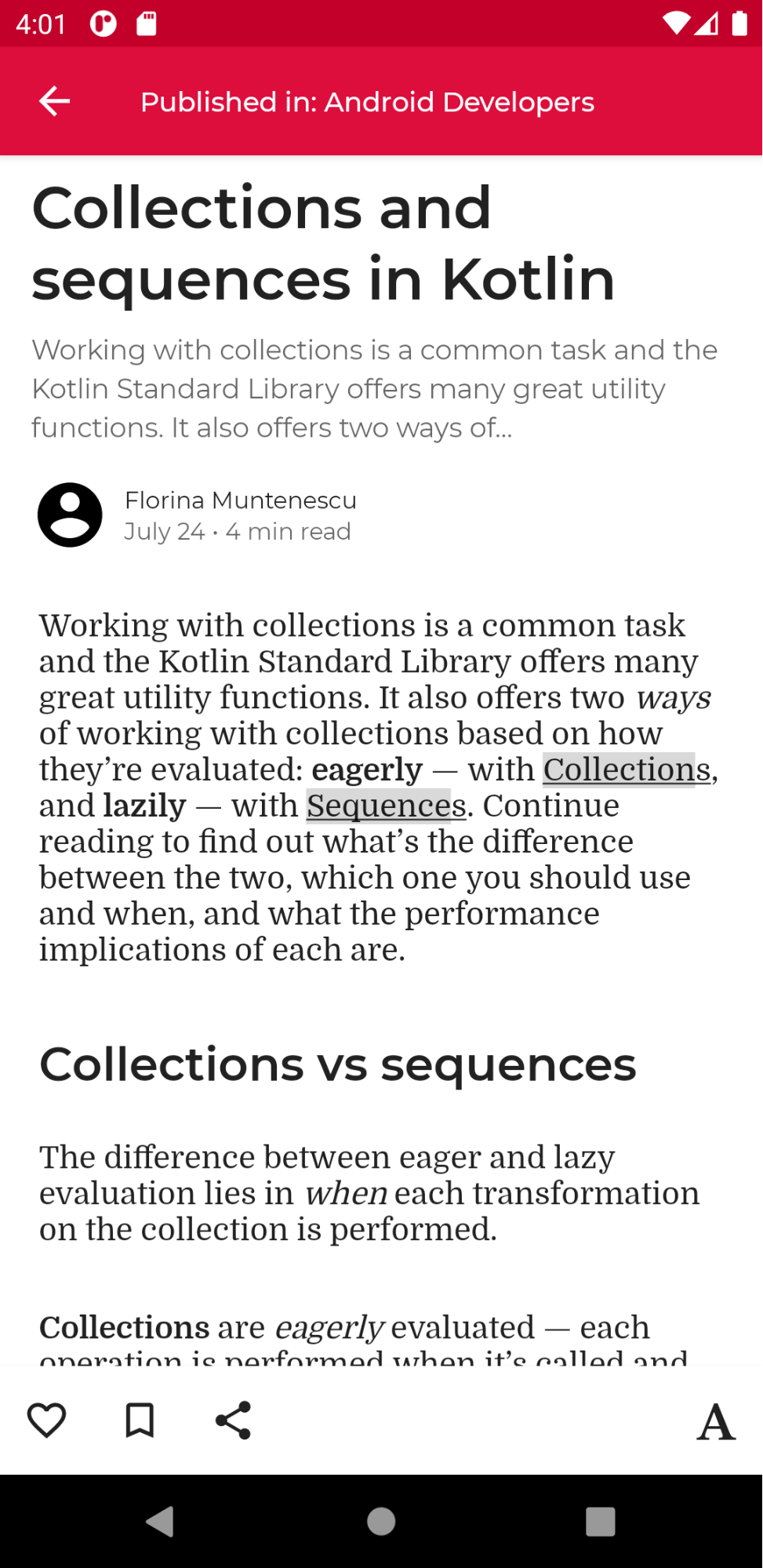
Apps often contain screens with text-rich content, like long articles or news pages, which are usually divided into different subsections with headings:
Users with accessibility needs can have difficulties navigating such a screen
easily. To improve the navigation experience, some accessibility services allow
for easier navigation directly between sections or headings. To enable this,
indicate that your component is a heading by defining its semantics
property:
@Composable private fun Subsection(text: String) { Text( text = text, style = MaterialTheme.typography.headlineSmall, modifier = Modifier.semantics { heading() } ) }
Alerts and pop ups
If your component is an alert or a pop up, like a Snackbar, you might want to
signal to accessibility services that a new structure or updates to content
can be conveyed to users.
Alert-like components can be marked with the liveRegion semantics
property. This allows accessibility services to automatically notify the user of
changes to this component, or its children:
PopupAlert( message = "You have a new message", modifier = Modifier.semantics { liveRegion = LiveRegionMode.Polite } )
You should use liveRegionMode.Polite in most cases where users' attention
should only briefly be drawn to alerts or important changing content on-screen.
You should use liveRegion.Assertive sparingly to avoid disruptive feedback.
It should be used for situations where it's crucial that users are made aware
of time-sensitive content:
PopupAlert( message = "Emergency alert incoming", modifier = Modifier.semantics { liveRegion = LiveRegionMode.Assertive } )
Live regions shouldn't be used on content that updates frequently, such as countdown timers, to avoid overwhelming users with constant feedback.
Window-like components
Window-like custom components, similar to ModalBottomSheet, need additional
signals to differentiate them from surrounding content. For this, you can use
paneTitle semantics, so that any relevant window or pane changes may be
represented appropriately by the accessibility services, along with its main
semantic information:
ShareSheet( message = "Choose how to share this photo", modifier = Modifier .fillMaxWidth() .align(Alignment.TopCenter) .semantics { paneTitle = "New bottom sheet" } )
For reference, see how Material 3 uses paneTitle for its components.
Error components
For other content types, such as error-like components, you might want to
expand on the main semantic information for users with accessibility needs.
When defining error states, you can inform the accessibility services of its
error semantics, and provide expanded error messaging.
In this example, TalkBack reads the main error text information, followed by additional, expanded messaging:
Error( errorText = "Fields cannot be empty", modifier = Modifier .semantics { error("Please add both email and password") } )
Progress tracking components
For custom components that track progress, you might want to notify users of
their progress changes, including the current progress value, its range, and
step size. You can do so with progressBarRangeInfo semantics―this
ensures that accessibility services are aware of progress changes, and can
update users accordingly. Different assistive technologies may also have unique
ways of hinting at increasing and decreasing progression.
ProgressInfoBar( modifier = Modifier .semantics { progressBarRangeInfo = ProgressBarRangeInfo( current = progress, range = 0F..1F ) } )
List and item information
In custom lists and grids with many items, it might be helpful for accessibility services to also receive more detailed information, like the total number of items and indices.
By using collectionInfo and collectionItemInfo semantics on the
list and items respectively, in this long list, accessibility services can
inform users of what item index they are at out of the total collection, in
addition to textual semantic information:
MilkyWayList( modifier = Modifier .semantics { collectionInfo = CollectionInfo( rowCount = milkyWay.count(), columnCount = 1 ) } ) { milkyWay.forEachIndexed { index, text -> Text( text = text, modifier = Modifier.semantics { collectionItemInfo = CollectionItemInfo(index, 0, 0, 0) } ) } }
State description
A composable can define a stateDescription for semantics which the
Android framework uses to read out the state that the composable is in. For
example, a toggleable composable can be in either a "checked" or an "unchecked"
state. In some cases, you might want to override the default state description
labels that Compose uses. You can do so by explicitly specifying the state
description labels before defining a composable as toggleable:
@Composable private fun TopicItem(itemTitle: String, selected: Boolean, onToggle: () -> Unit) { val stateSubscribed = stringResource(R.string.subscribed) val stateNotSubscribed = stringResource(R.string.not_subscribed) Row( modifier = Modifier .semantics { // Set any explicit semantic properties stateDescription = if (selected) stateSubscribed else stateNotSubscribed } .toggleable( value = selected, onValueChange = { onToggle() } ) ) { /* ... */ } }
Custom actions
Custom actions can be used for more complex touchscreen gestures, like swipe to dismiss or drag and drop, as these can be challenging for users with motor impairments or other disabilities to interact with.
To make the swipe to dismiss gesture more accessible, you can link it to a custom action, passing the dismissal action and label there:
SwipeToDismissBox( modifier = Modifier.semantics { // Represents the swipe to dismiss for accessibility customActions = listOf( CustomAccessibilityAction( label = "Remove article from list", action = { removeArticle() true } ) ) }, state = rememberSwipeToDismissBoxState(), backgroundContent = {} ) { ArticleListItem() }
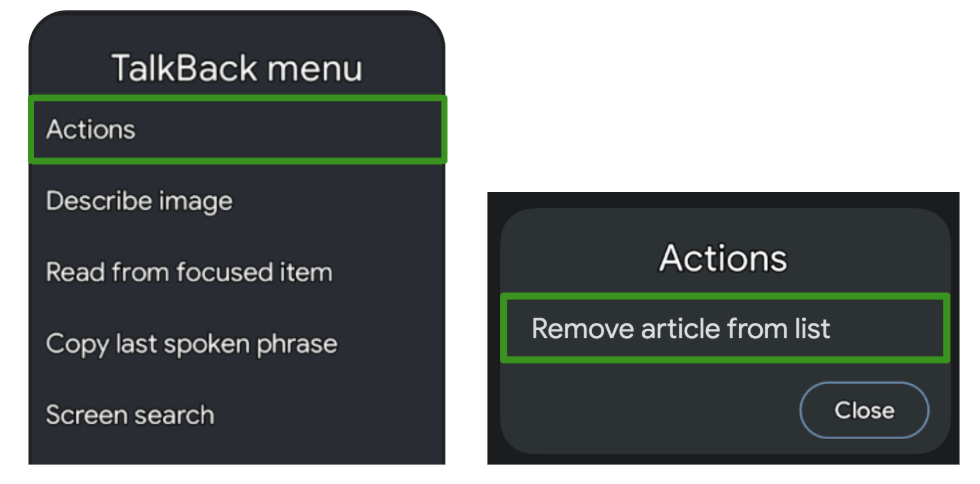
An accessibility service like TalkBack then highlights the component, and hints that there are more actions available in its menu, representing the swipe to dismiss action there:
Another use case for custom actions are long lists with items that have more available actions, as it might be tedious for users to iterate through each action for every single item individually:
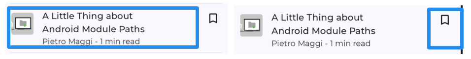
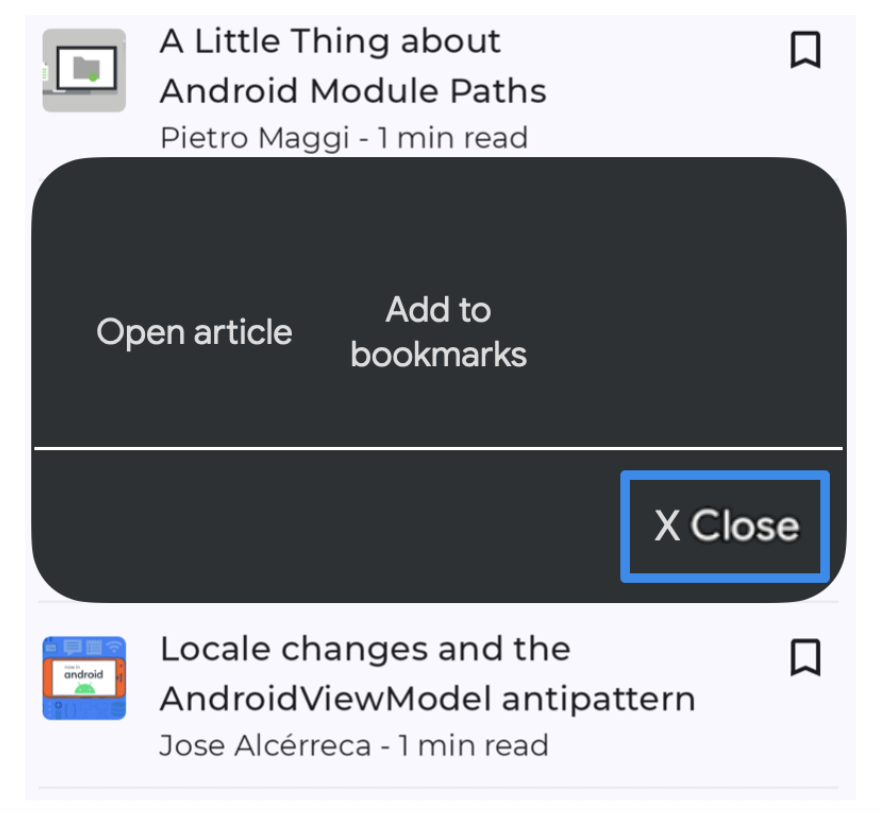
To improve the navigation experience, which is especially helpful for interaction-based assistive technologies like Switch Access or Voice Access, you can use custom actions on the container to move actions out of individual traversal, and into a separate action menu:
ArticleListItemRow( modifier = Modifier .semantics { customActions = listOf( CustomAccessibilityAction( label = "Open article", action = { openArticle() true } ), CustomAccessibilityAction( label = "Add to bookmarks", action = { addToBookmarks() true } ), ) } ) { Article( modifier = Modifier.clearAndSetSemantics { }, onClick = openArticle, ) BookmarkButton( modifier = Modifier.clearAndSetSemantics { }, onClick = addToBookmarks, ) }
In these cases, make sure to manually clear the original children's semantics
with the clearAndSetSemantics modifier, as you are moving them into
custom actions.
Using Switch Access as an example, its menu opens upon selection of the container and lists the available nested actions there:
Semantics tree
A composition describes the UI of your app and is produced by running composables. The composition is a tree-structure that consists of the composables that describe your UI.
Next to the Composition, there exists a parallel tree, called the semantics tree. This tree describes your UI in an alternative manner that is understandable for Accessibility services and for the Testing framework. Accessibility services use the tree to describe the app to users with a specific need. The testing framework uses the tree to interact with your app and make assertions about it. The Semantics tree does not contain the information on how to draw your composables, but it contains information about the semantic meaning of your composables.
If your app consists of composables and modifiers from the Compose foundation and material library, the Semantics tree is automatically filled and generated for you. However when you're adding custom low-level composables, you have to manually provide its semantics. There might also be situations where your tree does not correctly or fully represent the meaning of the elements on the screen, in which case you can adapt the tree.
Consider for example this custom calendar composable:
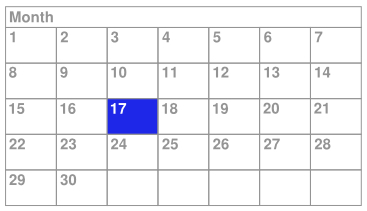
In this example, the entire calendar is implemented as a single low-level
composable, using the Layout composable and drawing directly to the Canvas.
If you don't do anything else, accessibility services won't receive enough
information about the content of the composable and the user's selection within
the calendar. For example, if a user clicks on the day containing 17, the
accessibility framework only receives the description information for the whole
calendar control. In this case, the TalkBack accessibility service would
announce "Calendar" or, only slightly better, "April Calendar" and the user
would be left to wonder what day was selected. To make this composable more
accessible, you'll need to add semantic information manually.
Merged and unmerged tree
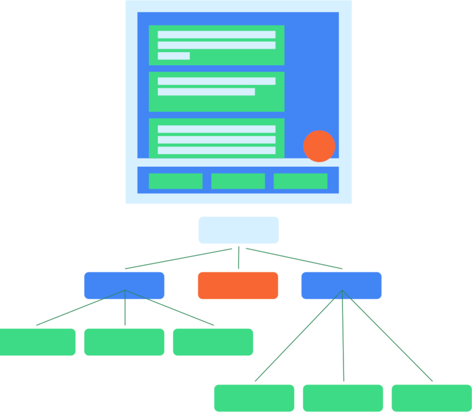
As mentioned before, each composable in the UI tree might have zero or more semantics properties set. When a composable has no semantics properties set, it isn't included as part of the Semantics tree. That way, the Semantics tree contains only the nodes that actually contain semantic meaning. However, sometimes to convey the correct meaning of what is shown on the screen, it is also useful to merge certain sub-trees of nodes and treat them as one. That way you can reason about a set of nodes as a whole, instead of dealing with each descendant node individually. As a rule of thumb, each node in this tree represents a focusable element when using Accessibility services.
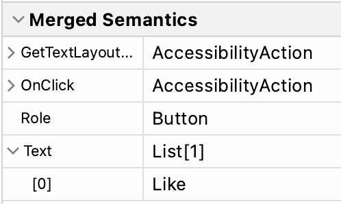
An example of such a composable is Button. You can reason about a button
as a single element, even though it may contain multiple child nodes:
Button(onClick = { /*TODO*/ }) { Icon( imageVector = Icons.Filled.Favorite, contentDescription = null ) Spacer(Modifier.size(ButtonDefaults.IconSpacing)) Text("Like") }
In the Semantics tree, the properties of the button's descendants are merged, and the button is presented as a single leaf node in the tree:
Composables and modifiers can indicate that they want to merge their
descendants' semantics properties by calling Modifier.semantics
(mergeDescendants = true) {}. Setting this property to true indicates that
the semantics properties should be merged. In the Button example, the Button
composable uses the clickable modifier internally that includes this
semantics modifier. Therefore, the descendant nodes of the button are merged.
Read the accessibility documentation to learn more about when you should change
merging behavior in your composable.
Several modifiers and composables in the Foundation and Material Compose
libraries have this property set. For example, the clickable and toggleable
modifiers will automatically merge their descendants. Also, the ListItem
composable will merge its descendants.
Inspect the tree
The semantics tree is in fact two different trees. There's a merged Semantics
tree, which merges descendant nodes when mergeDescendants is set to true.
There's also an unmerged Semantics tree, which does not apply the merging, but
keeps every node intact. Accessibility services use the unmerged tree and apply
their own merging algorithms, taking into consideration the mergeDescendants
property. The testing framework uses the merged tree by default.
You can inspect both trees with the printToLog() method. By default, and as in
the earlier examples, the merged tree is logged. To print the unmerged tree
instead, set the useUnmergedTree parameter of the onRoot() matcher to
true:
composeTestRule.onRoot(useUnmergedTree = true).printToLog("MY TAG")
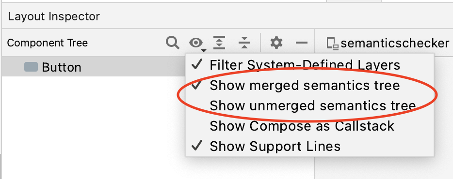
The Layout Inspector lets you display both the merged and the unmerged Semantics tree, by selecting the preferred one in the view filter:
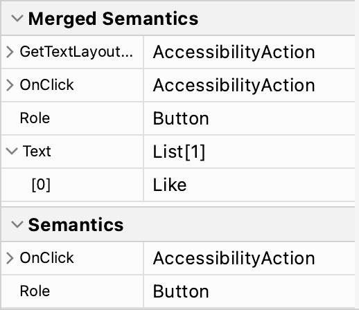
For each node in your tree, the Layout Inspector shows both the Merged Semantics and the Semantics set on that node in the properties panel:
By default, matchers in the Testing Framework use the merged Semantics tree.
That's why you can interact with a Button by matching the text shown inside
it:
composeTestRule.onNodeWithText("Like").performClick()
Override this behavior by setting the useUnmergedTree parameter of the
matchers to true, as with the onRoot matcher.
Adapt the tree
As mentioned before, you can override or clear certain semantics properties or change the merging behavior of the tree. This is particularly relevant when you're creating your own custom components. Without setting the correct properties and merge behavior, your app might not be accessible, and tests might behave differently than you expect. If you want to learn more about testing, see the testing guide.
Recommended for you
- Note: link text is displayed when JavaScript is off
- Accessibility in Compose
- Material Design 2 in Compose
- Testing your Compose layout