
The standard Red Up Green Down color scheme that many wealth management app users take for granted can be very problematic for colorblind users and those with color vision deficiency.The Futubull team is embracing users’ needs by making concrete improvements so that everyone can grasp the key to wealth.
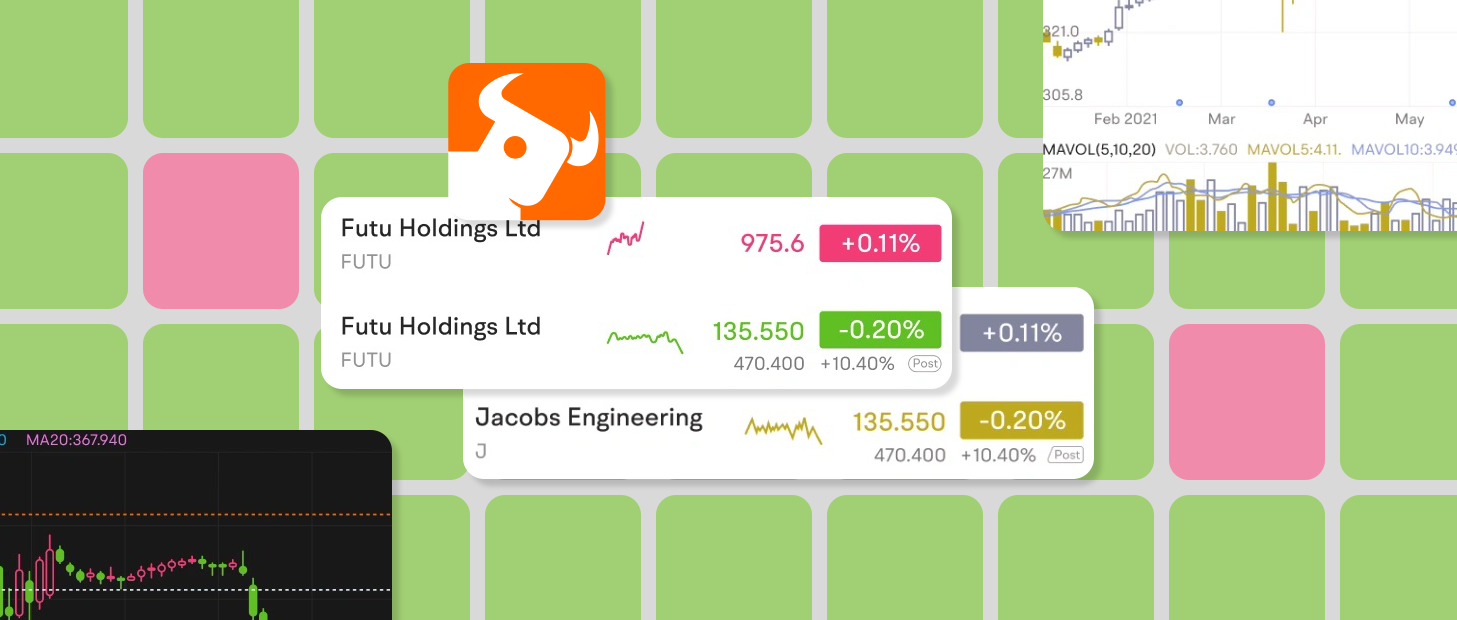
Futubull creates a better trading experience for more than 19 million users worldwide, by offering extensive investment information/analysis/decision-making services and free-for-life training content, in addition to a vibrant wealth management chat community.The Futubull app is currently compatible with Android, iOS, Windows, Macs, tablets (iPadOS and ChromeOS), Web browsers, and Tencent in-vehicle apps, as well as offering comprehensive API functionality.The Futubull team is committed to providing warm service to every customer, which naturally includes users with differing accessibility needs.
Red Up Green Down (or vice versa) is the most common color scheme used in investment apps, where every upward and downward price movement of an investment is a big deal for users.But the widespread use of this color scheme is leaving investors who suffer from red-green color blindness/color vision deficiency in the dark.Like any investors, these users work hard to accumulate funds and carefully research wealth management product combinations in an effort to grasp the key to wealth, but when they open the trading page, they find it impossible to identify upward and downward price movements, because they have difficulty distinguishing red from green.
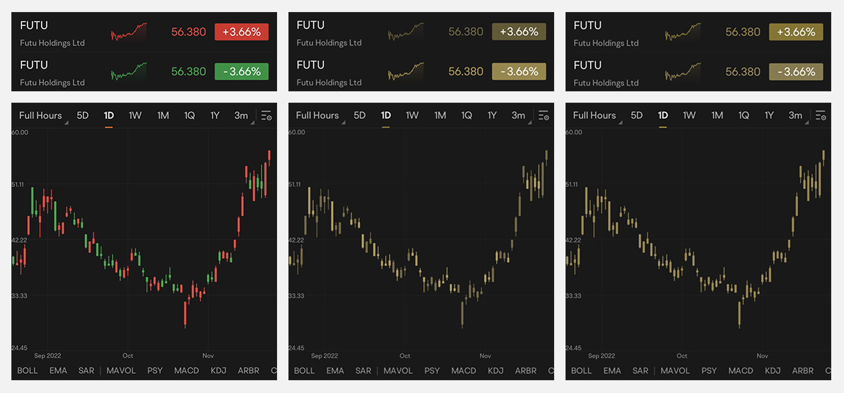
△ The Red Up Green Down color scheme, as seen by users with normal vision (left), users with protanopia (center), and users with deuteranopia (right)
Different Shades of Red and Green
The red and green color palette used in the Futubull app was originally designed for users with normal color vision, so those with a color vision impairment need to expend a lot of extra effort when using the app, such as by interpreting symbols or data to identify upward and downward price movements. Such a color scheme is very inconvenient for these users.
Due to survivorship bias, the proportion of the population with red-green color blindness may be higher than many people realize. According to statistics, around 5%–8% of men and 0.5% of women have a color vision deficiency (i.e., color blindness).This is not an insignificant proportion when you consider Futubull’s huge user base of 19 million people.
We have always valued the voices of our users and have learned through various channels that some of them are having troubles because of color vision impairment..Investors with red-green color blindness cannot perceive the difference between red and green, will definitely be slowed down during investment process.To this end, we have introduced a new color scheme, optimized for color vision impairments, that encompasses all visual elements of the app, enabling users to adjust the display according to their needs. —— Garit, Futubull App User Experience Director
In designing an accessible color scheme, the team evaluated existing apps using Google's Accessibility Scanner app, which can record pages, capturing each element of the interface and providing suggestions for improvement such as font size, touch target size, color contrast, and so on. This input was immensely helpful for the team.
- Accessibility Scanner
https://developer.android.google.cn/guide/topics/ui/accessibility/testing#accessibility-scanner
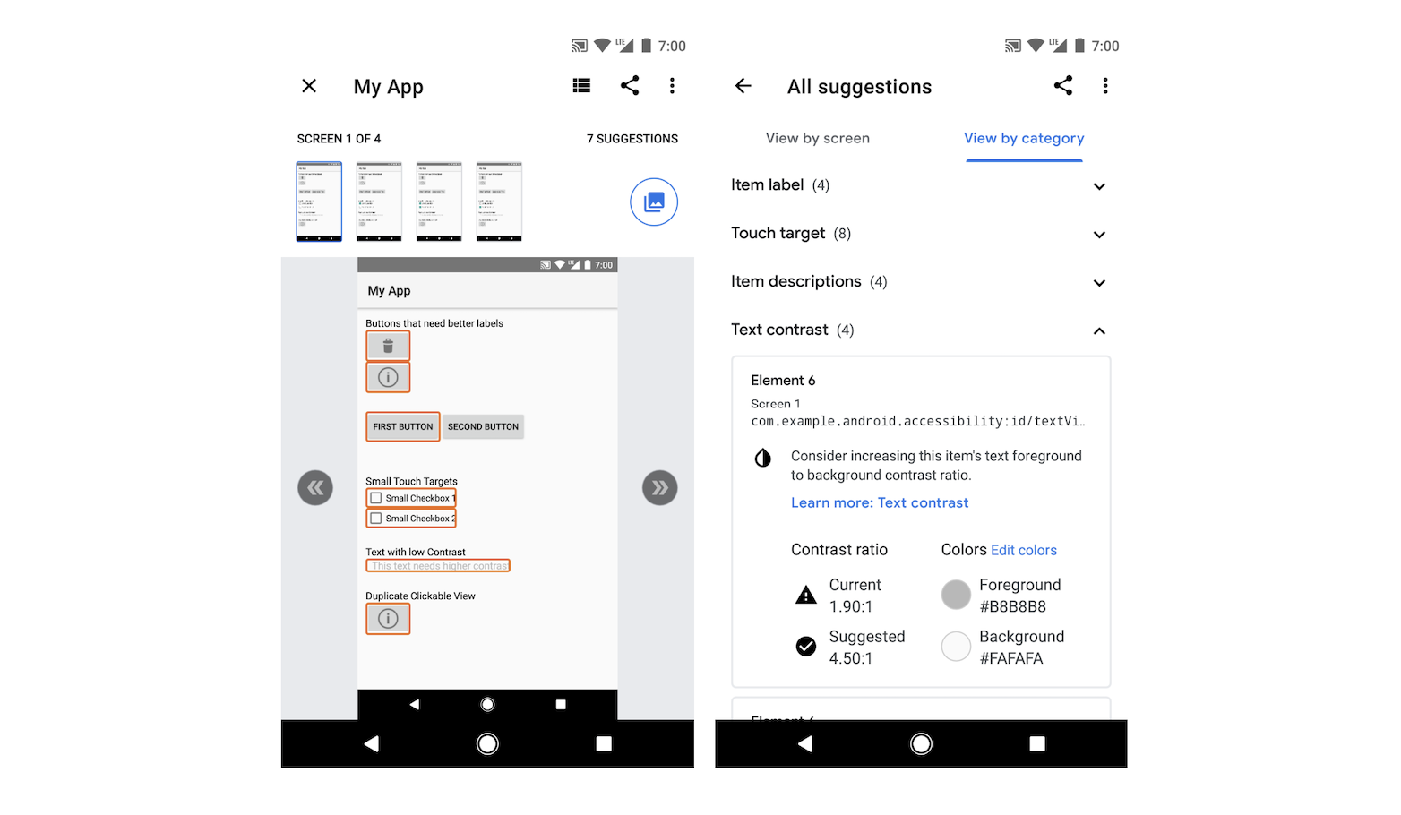
△ Accessibility Scanner gives accessibility optimization suggestions for each control/element, which is a good reference for developers
In the process of finalizing the accessible color palette, the team also surveyed users with color vision impairments, who were contacted through official channels and asked to test accessible color schemes, then provide detailed feedback on their experience, as well as suggestions for optimization. Based on this feedback, the team formulated an overall improvement plan.
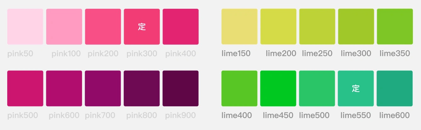
△ The new red and green.
The new pink-green scheme retains the same two-tone system while strictly adhering to the color contrast recommendations provided by Accessibility Scanner for normal vision, protanopia, and deuteranopia, thereby taking into consideration the visual experience of both users with normal vision and those with red-green color blindness.
- Material Design: Color and Contrast
https://m3.material.io/foundations/accessible-design/overview
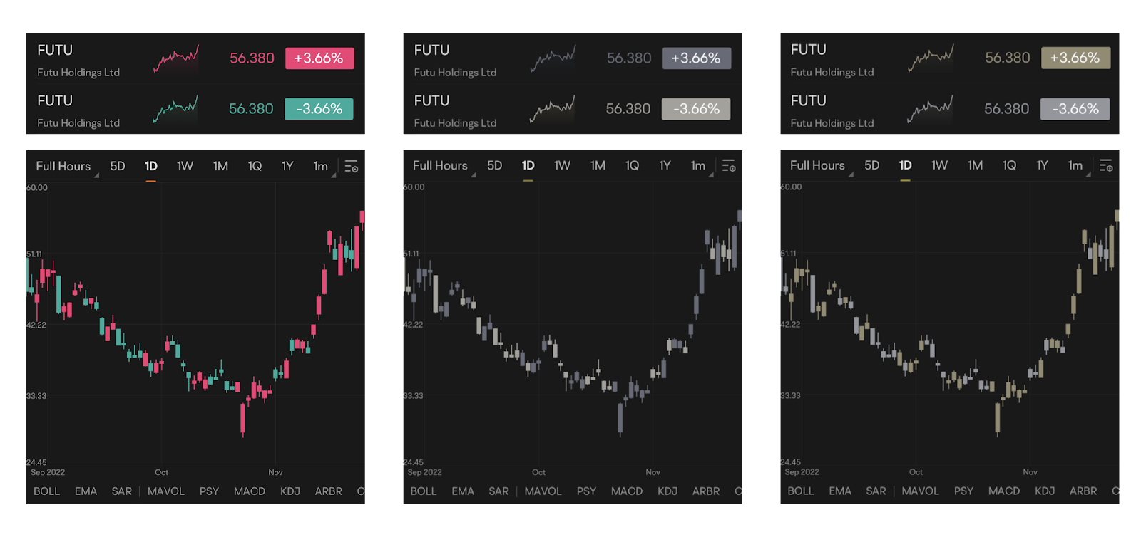
△ (Left) The pink-green color scheme, as seen by users with normal color vision (left), users with protanopia (center), and users with deuteranopia (right)
An Accessible Experience is a Team Effort
Our team currently numbers over 1,000 people, including colorblind members.Creating an accessible experience is not only serving our users, but also helping ourselves. —— Zed, Futubull Android R&D Engineer
After determining the new accessible color palette, the team subjected it to a series of internal tests in conjunction with the internal product and R&D teams, before the new features were launched.By collating the evaluation of team members, self-testing, and with the help of test engineers, the team ensured that the newly introduced color palette could meet the experience of a much wider range of users with color vision deficiency.It only took the team just 15 man-days to go live with the new color scheme.
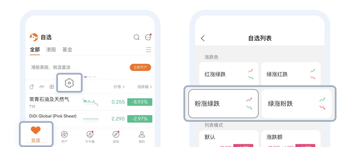
△ Switching color schemes is also very easy. Simply tap the Watchlist Settings icon on the app’s home page
But, this is only part of Futubull’s product accessibility improvement plan.
Another Step Beyond the Red-Green Spectrum
Futubull's product research and development philosophy is to make investing easier and not alone.That goal is applied to all of our users. —— Garit, Futubull App User Experience Director
The process of creating an accessible color palette also gave the team greater empathy with users who have different visual abilities.So, after devising the pink-green color scheme to meet the needs of users with red-green color vision deficiency/color blindness, the team then proceeded to develop a hollow candlestick design that uses hollow and solid candles to indicate upward and downward price movements respectively, thereby convincing a wider range of visually impaired groups.Even in the design of some of the app’s main activity pages, blue and orange colors that can be differentiated by colorblind users are used as much as possible.
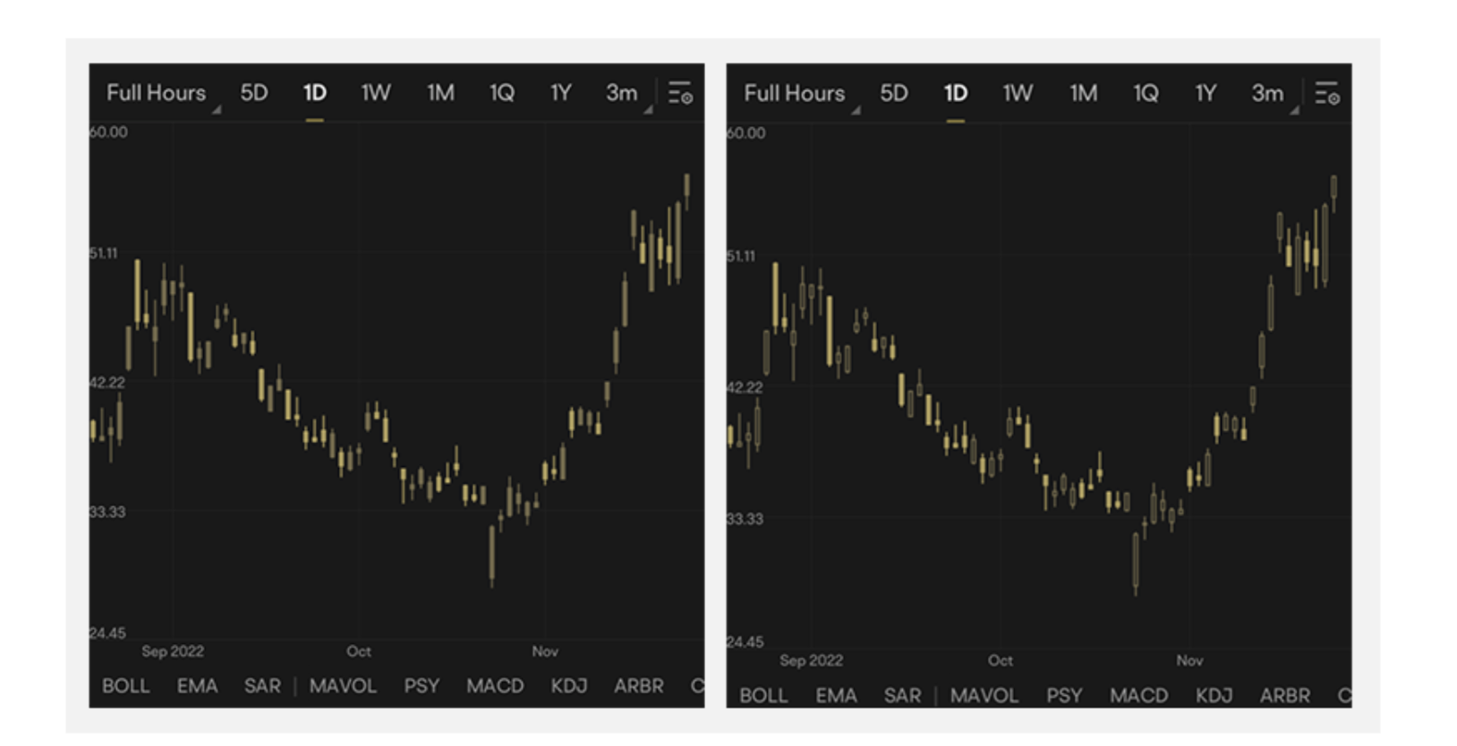
△ Solid candles (left) and hollow candles (right).Both screenshots demonstrate how the display appears to users with protanopia
For people who have difficulty reading text due to poor eyesight, the team also provided a font size setting function, which enables users to increase the size of text to facilitate reading.For users who require a certain font size for specific sections/functions of the app, the team also considerately provided the option of localized adjustment.
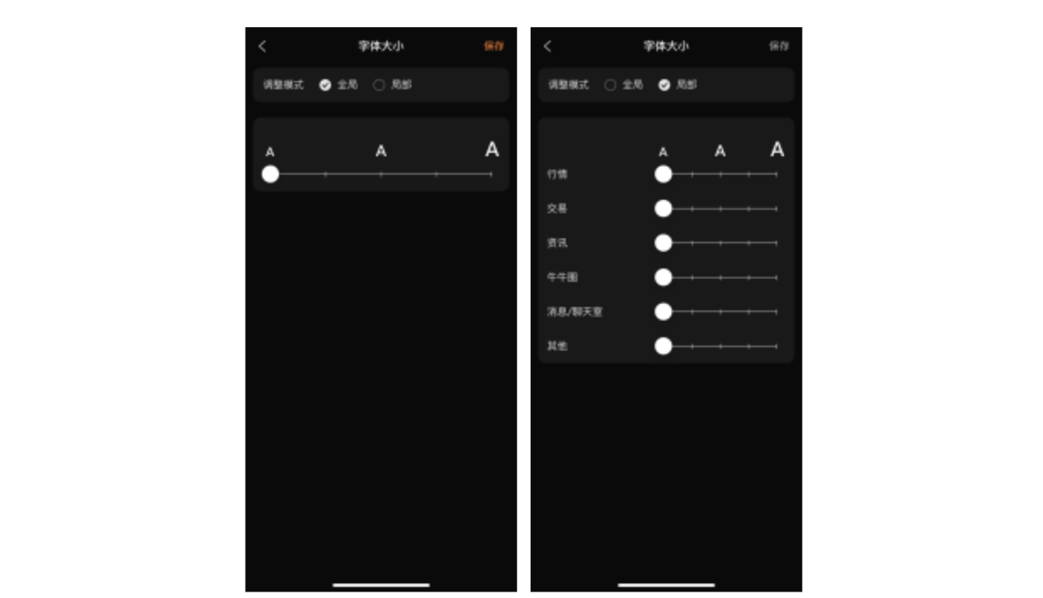
△ There are also localized and global options for font size adjustment, which users can select as needed
Our team is still progressively learning more about accessibility. We have a product manager dedicated to following up on accessibility experiences,who identifies app journeys that may constitute barriers to a good user experience, then coordinates their optimization.
—— Garit, Futubull App User Experience Director
Handing Everyone the Key to Wealth
On June 16 this year, Futubull's new accessible color palette was officially launched to rave reviews.

△ Although good reviews were expected, the amount of positive feedback was surprising
This undoubtedly strengthened the team's confidence to further improve the product’s accessibility. For example, the team is planning to expand the accessible color palette from Android and iOS devices to Web browsers and PC platforms. A text-to-speech function is also being developed for vision impaired users.With the implementation of these accessible features, more users will be able to use Futubull smoothly.
- Use of Lighthouse to check the web client accessibility experience
https://developer.chrome.com/docs/lighthouse/overview/
Making investing easier and not alone. The Futubull team supports each of its users with concrete actions, letting them know that their needs will be responded to in a timely manner so that they can grasp the key to wealth with their own hands.
We also look forward to more developers actively improving their products to create a more accessible experience, embrace more users, and thereby pave the way to greater success.