Create a catalog browser

A media app that runs on a TV needs to allow users to browse its content offerings, make a selection, and start playing content. The content browsing experience for apps of this type should be simple and intuitive, and visually pleasing and engaging.

This section describes how to use the functions provided by Compose for TV to implement a user interface for browsing music or videos from your app's media catalog.

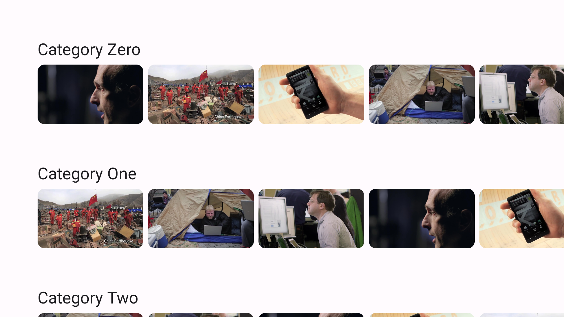
Typical catalog browser screen. It tiles cards representing media contents so that users browse content catalogs.

Figure 1. Typical catalog screen. Users are able to browse video catalog data.

A media catalog browser tends to consist of several sections, and each section has a list of media content. Examples of sections in a media catalog include: playlists, featured content, recommended categories

Create a composable function for catalog

Everything appearing on a display is implemented as a composable function in Compose for TV. You are going to start with defining a composable function for the media catalog browser as the following snippet:

import androidx.compose.runtime.Composable
import androidx.compose.ui.Modifier

import com.example.myapp.data.Movie
import com.example.myapp.data.Section

@Composable
fun CatalogBrowser(
   sectionList: List<Section>,
   modifier: Modifier = Modifier,
   onItemSelected: (Movie) -> Unit = {},
) {
// ToDo: add implementation
}

CatalogBrowser is the composable function implementing your media catalog browser. The function takes three arguments: list of sections, modifier allowing you to tweak the catalog browser when you call the function, and a callback function to notify that the user selects a media content from the media catalog. The callback triggers a screen transition to details screen.

Set UI elements

Compose for TV offers lazy lists, a component to display a large number of items (or a list of an unknown length). You are going to call TvLazyColumn to place sections vertically. TvLazyColumn provides a TvLazyListScope.() -> Unit block, which offers a DSL to define item contents. In the following example, each section is placed in a vertical list with a 16 dp gap between sections.

import androidx.compose.foundation.layout.Arrangement
import androidx.compose.foundation.layout.fillMaxSize
import androidx.compose.runtime.Composable
import androidx.compose.ui.Modifier
import androidx.compose.ui.unit.dp
import androidx.tv.foundation.lazy.list.TvLazyColumn
import androidx.tv.foundation.lazy.list.items

import com.example.myapp.data.Movie
import com.example.myapp.data.Section

@Composable
fun CatalogBrowser(
   sectionList: List<Section>,
   modifier: Modifier = Modifier,
   onItemSelected: (Movie) -> Unit = {},
) {
  TvLazyColumn(
    modifier = modifier.fillMaxSize(),
    verticalArrangement = Arrangement.spacedBy(16.dp)
  ) {
    items(sectionList) { section ->
      Section(section, onItemSelected = onItemSelected)
    }
  }
}

In the example, Section composable function defines how to display sections. In the following function, TvLazyRow demonstrates how this horizontal version of TvLazyColumn is similarly used to define a horizontal list with a TvLazyListScope.() -> Unit block by calling the provided DSL.

import androidx.compose.foundation.layout.Arrangement
import androidx.compose.runtime.Composable
import androidx.compose.ui.Modifier
import androidx.compose.ui.unit.dp
import androidx.tv.foundation.lazy.list.TvLazyRow
import androidx.tv.foundation.lazy.list.items
import androidx.tv.material3.MaterialTheme
import androidx.tv.material3.Text

import com.example.myapp.data.Movie
import com.example.myapp.data.Section

@Composable
fun Section(
  section: Section,
  modifier: Modifier = Modifier,
  onItemSelected: (Movie) -> Unit = {},
) {
  Text(
    text = section.title,
    style = MaterialTheme.typography.headlineSmall,
  )
  TvLazyRow(
     modifier = modifier,
     horizontalArrangement = Arrangement.spacedBy(8.dp)
  ) {
    items(section.movieList){ movie ->
    MovieCard(
         movie = movie,
         onClick = { onItemSelected(movie) }
       )
    }
  }
}

In the Section composable, the Text component is used. Text and other components defined in Material Design are offered in the tv-material library . You can change the texts' style as defined in Material Design by referring to the MaterialTheme object. This object is also provided by the tv-material library. MovieCard defines how each movie data is rendered in the catalog defined as the following snippet. Card is also a part of the tv-material library.

import androidx.compose.runtime.Composable
import androidx.compose.ui.Modifier
import androidx.tv.material3.Card
import coil.compose.AsyncImage

@Composable
fun MovieCard(
   movie: Movie,
   modifier: Modifier = Modifier,
   onClick: () -> Unit = {}
) {
   Card(modifier = modifier, onClick = onClick){
  AsyncImage(
       model = movie.thumbnailUrl,
       contentDescription = movie.title,
     )
   }
}

In the example described earlier, all movies are displayed equally. They have the same area, no visual difference between them. You can highlight some of them with the two components: Carousel and ImmersiveList.

The biggest difference between the two components is that ImmersiveList lets you to show a list of featured contents, while Carousel does not. The typical criteria to choose one from the two components is as follows: use ImmersiveList if you want to let users to choose the content to be highlighted from a list of content. Carousel is sufficient for your needs, otherwise.

Carousel displays the information in a set of items that can slide, fade, or move into view. You use the component to highlight featured content, such as newly available movies or new episodes of TV programs.

Carousel expects you to at least specify the number of items that Carousel has and how to draw each item. The first one can be specified via itemCount. The second one can be passed as a lambda. The index number of the displayed item is given to the lambda. You can determine the displayed item with the given index value.

CarouselItem composable helps you to define how to render each carousel item. In the following example, Carousel shows each featured movie's title on its image.

import androidx.compose.foundation.layout.fillMaxSize
import androidx.compose.ui.Modifier
import androidx.compose.ui.layout.ContentScale
import androidx.compose.ui.res.painterResource
import androidx.tv.material3.Carousel
import androidx.tv.material3.Text
import coil.compose.AsyncImage

Carousel(
    itemCount = featuredContentList.size
) { index ->
    val content = featuredContentList[index]
    CarouselItem(
        background = {
            AsyncImage(
                model = content.backgroundImageUrl,
                contentDescription = content.description,
                placeholder = painterResource(
                    id = R.drawable.placeholder
                ),
                contentScale = ContentScale.Crop,
                modifier = Modifier.fillMaxSize()
            )
        }
    ) {
        Text(text = content.title)
    }
}

This example shows how to use Carousel to display a set of images and text.

ImmersiveList

ImmersiveList is a component to feature content in a larger viewport. As the user navigates across a row of content, the background updates to reflect the newly focused element. ImmersiveList consists of two components, background and list. The background is updated according to the user's selection of an item in the list.

The following snippet shows how you can highlight contents with ImmersiveList composable. The background parameter is a lambda to define the background. The lambda after the argument list, which is associated with the list parameter, defines how the list is rendered. You can make the ImmersiveList to monitor user selection over the list item by calling Modifier.immersiveListItem for each list item, so that the list item can update the background according to the selected items.

import androidx.compose.animation.AnimatedContent
import androidx.compose.foundation.layout.Arrangement
import androidx.compose.foundation.layout.fillMaxWidth
import androidx.compose.foundation.layout.height
import androidx.compose.runtime.Composable
import androidx.compose.ui.Modifier
import androidx.compose.ui.unit.dp
import androidx.tv.foundation.lazy.list.TvLazyRow
import androidx.tv.foundation.lazy.list.items
import androidx.tv.material3.ImmversiveList
import androidx.tv.material3.MaterialTheme
import androidx.tv.material3.Text

ImmersiveList(
    modifier = Modifier.height(130.dp).fillMaxWidth(),
    background = { index, _ ->
        AnimatedContent(targetState = index) {
            MyImmersiveListBackground(it)
        }
    },
) {
    TvLazyRow {
        items(featuredContentList.size) { index ->
            MyCard(
                Modifier.immersiveListItem(index),
                featuredContentList[index],
                onClick = {}
            )
        }
    }
}

The components that trigger the ImmersiveList's background update should be focusable and clickable. The following code snippet shows an implementation of an item of the ImmersiveList. The Card component is already focusable and clickable, so there is no need to call the modifier functions explicitly.

import androidx.compose.animation.AnimatedContent
import androidx.compose.foundation.layout.Arrangement
import androidx.compose.foundation.layout.fillMaxWidth
import androidx.compose.foundation.layout.height
import androidx.compose.runtime.Composable
import androidx.compose.ui.Modifier
import androidx.compose.ui.unit.dp
import androidx.tv.foundation.lazy.list.TvLazyRow
import androidx.tv.foundation.lazy.list.items
import androidx.tv.material3.ImmversiveList
import androidx.tv.material3.MaterialTheme
import androidx.tv.material3.Text

ImmersiveList(
    modifier = Modifier.height(130.dp).fillMaxWidth(),
    background = { index, _ ->
        AnimatedContent(targetState = index) {
            MyImmersiveListBackground(it)
        }
    },
) {
    TvLazyRow {
        items(featuredContentList.size) { index ->
            MyCard(
                Modifier.immersiveListItem(index),
                featuredContentList[index],
                onClick = {}
            )
        }
    }
}