
Use a search bar to implement search functionality. A search bar is a persistent search field that lets users enter a keyword or phrase to display relevant results within your app, and is recommended when search is the primary focus of your app.

API surface
Use the SearchBar composable to implement search bars. Key parameters for
this composable include the following:
inputField: Defines the input field of the search bar. It typically utilizesSearchBarDefaults.InputField, which allows customization of:query: The query text to be shown in the input field.onQueryChange: Lambda to handle changes in the query string.
expanded: A boolean indicating whether the search bar is expanded to show suggestions or filtered results.onExpandedChange: Lambda to handle changes in the dropdown's expanded state.content: The content of this search bar to display search results below theinputField.
Search bar with suggestions
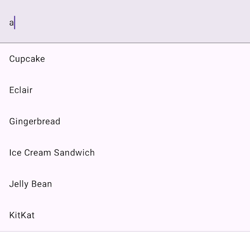
This snippet shows a basic implementation of SearchBar with suggestions:
@OptIn(ExperimentalMaterial3Api::class) @Composable fun SimpleSearchBar( textFieldState: TextFieldState, onSearch: (String) -> Unit, searchResults: List<String>, modifier: Modifier = Modifier ) { // Controls expansion state of the search bar var expanded by rememberSaveable { mutableStateOf(false) } Box( modifier .fillMaxSize() .semantics { isTraversalGroup = true } ) { SearchBar( modifier = Modifier .align(Alignment.TopCenter) .semantics { traversalIndex = 0f }, inputField = { SearchBarDefaults.InputField( query = textFieldState.text.toString(), onQueryChange = { textFieldState.edit { replace(0, length, it) } }, onSearch = { onSearch(textFieldState.text.toString()) expanded = false }, expanded = expanded, onExpandedChange = { expanded = it }, placeholder = { Text("Search") } ) }, expanded = expanded, onExpandedChange = { expanded = it }, ) { // Display search results in a scrollable column Column(Modifier.verticalScroll(rememberScrollState())) { searchResults.forEach { result -> ListItem( headlineContent = { Text(result) }, modifier = Modifier .clickable { textFieldState.edit { replace(0, length, result) } expanded = false } .fillMaxWidth() ) } } } } }
Key points about the code
rememberSaveableensures that whether the search bar is expanded or collapsed is preserved across configuration changes. It writes the remembered value into the hosting Activity'ssavedInstanceStatebundle before the Activity is destroyed during a configuration change.- The
semanticsmodifier controls the TalkBack traversal order.isTraversalGroupis set forBoxto group all its child composables.traversalIndexis set to specify the order in which TalkBack reads accessibility information from each group peer. TalkBack reads accessibility information on a peer with a negative value, such as-1, before a peer with a positive value, such as1. Because the value is a float, you can specify a custom order of many peers by setting values in between-1.0and1.0on each peer.
- The
SearchBarcontains aninputFieldfor user input and aColumnto display search suggestions.SearchBarDefaults.InputFieldcreates the input field and handles changes to the user query.onQueryChangehandles the text input and updates the state whenever the text in the input field changes.expandedstate controls the visibility of the suggestion list.
searchResults.forEach { result -> … }iterates through thesearchResultslist and creates aListItemfor each result.- When a
ListItemis clicked, it updates thetextFieldState, collapses the search bar, and fills thetextFieldwith the selected search result.
- When a
Result
Search bar with filtered list
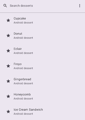
This example shows a SearchBar that filters a list based on the user's search
query:
@OptIn(ExperimentalMaterial3Api::class) @Composable fun CustomizableSearchBar( query: String, onQueryChange: (String) -> Unit, onSearch: (String) -> Unit, searchResults: List<String>, onResultClick: (String) -> Unit, modifier: Modifier = Modifier, // Customization options placeholder: @Composable () -> Unit = { Text("Search") }, leadingIcon: @Composable (() -> Unit)? = { Icon(Icons.Default.Search, contentDescription = "Search") }, trailingIcon: @Composable (() -> Unit)? = null, supportingContent: (@Composable (String) -> Unit)? = null, leadingContent: (@Composable () -> Unit)? = null, ) { // Track expanded state of search bar var expanded by rememberSaveable { mutableStateOf(false) } Box( modifier .fillMaxSize() .semantics { isTraversalGroup = true } ) { SearchBar( modifier = Modifier .align(Alignment.TopCenter) .semantics { traversalIndex = 0f }, inputField = { // Customizable input field implementation SearchBarDefaults.InputField( query = query, onQueryChange = onQueryChange, onSearch = { onSearch(query) expanded = false }, expanded = expanded, onExpandedChange = { expanded = it }, placeholder = placeholder, leadingIcon = leadingIcon, trailingIcon = trailingIcon ) }, expanded = expanded, onExpandedChange = { expanded = it }, ) { // Show search results in a lazy column for better performance LazyColumn { items(count = searchResults.size) { index -> val resultText = searchResults[index] ListItem( headlineContent = { Text(resultText) }, supportingContent = supportingContent?.let { { it(resultText) } }, leadingContent = leadingContent, colors = ListItemDefaults.colors(containerColor = Color.Transparent), modifier = Modifier .clickable { onResultClick(resultText) expanded = false } .fillMaxWidth() .padding(horizontal = 16.dp, vertical = 4.dp) ) } } } } }
Key points about the code
- The
onQueryChangelambda function is called whenever the user types or deletes text in the search bar. SearchBarDefaults.InputFieldcontains aleadingIcon, which adds a search icon to the beginning of the input field, and atrailingIcon, which adds a "more options" icon to the end of the input field. Here, you can provide sorting and filtering options to the user.onSearch = { … }calls theonSearchlambda and collapses the search bar when the search is submitted.- A
LazyColumnhandles a potentially large number of search results efficiently. It iterates through thesearchResultslist and displays each result as aListItem. - Each
ListItemcomposable shows the item text, text showing additional information, and a star icon as the item'sleadingContent. In this example, an option to favorite the item is presented. - For the filtering logic, see
CustomizableSearchBarExamplein the full source code on GitHub.
Result
Additional resources
- Material Design: Search bar