
Android Studio Compose Previews let you inspect and verify your Wear OS composables across different watch display sizes, round bezels, and font scales directly in the IDE—without deploying your app to a physical watch or emulator.
Because Wear OS devices feature circular displays where corners clip content
and system overlays like TimeText and ScrollIndicator curve along the
screen edge, configuring previews specifically for Wear OS is essential for
catching layout issues early.
Set up preview dependencies
To use Wear OS Compose preview annotations and device definitions, add the
following dependencies to your module's build.gradle.kts file:
dependencies {
    // Provides @WearPreview* multipreview annotations
    // (such as @WearPreviewDevices and @WearPreviewFontScales)
    implementation("androidx.wear.compose:compose-ui-tooling:1.7.0")

    // Provides WearDevices constants
    // (such as WearDevices.SMALL_ROUND and WearDevices.LARGE_ROUND)
    implementation("androidx.wear:wear-tooling-preview:1.0.0")

    // Standard Compose preview support and interactive/animation inspection
    implementation("androidx.compose.ui:ui-tooling-preview")
    debugImplementation("androidx.compose.ui:ui-tooling")
}
Choose what to preview: screens versus components
How you configure a preview depends on whether you are previewing a full screen or an isolated UI component.
Preview full screens (AppScaffold + ScreenScaffold)
When previewing an entire screen, always wrap your screen composable in both
AppScaffold and ScreenScaffold using a Wear device preview annotation. This
renders the circular watch display and ensures that:
TimeTextrenders at the top curved edge of the watch face.ScrollIndicatorappears along the right bezel.EdgeButtonis properly positioned and clipped at the bottom curve.- Content padding and circular screen clipping accurately reflect real watch hardware.
@WearPreviewDevices @Composable fun WorkoutScreenPreview() { MaterialTheme { // AppScaffold provides the top-level TimeText overlay AppScaffold { // WorkoutScreen contains its own ScreenScaffold and content WorkoutScreen( heartRate = 142, elapsedTime = "12:45" ) } } }
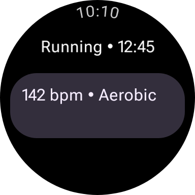
Small Round (192x192dp)
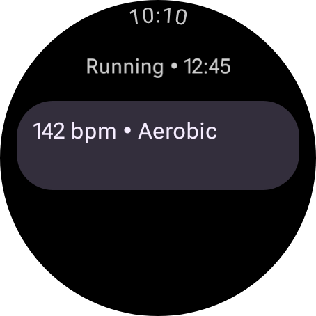
Large Round (227x227dp)
Preview isolated components
When previewing individual components—such as a custom Card, Button, or
status chip—omit the device parameter and use a standard @Preview with a
dark background. This ensures that Wear Material 3 colors and contrast appear
accurately without rendering a full circular watch display:
@Preview( showBackground = true, backgroundColor = 0xFF000000 ) @Composable fun HeartRateCardPreview() { MaterialTheme { HeartRateCard(bpm = 142, zone = "Aerobic") } }
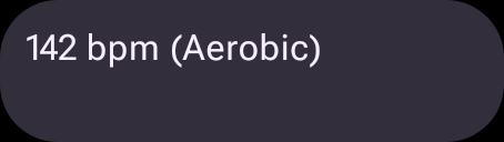
Isolated component preview (no device frame).
Built-in multipreview annotations
The androidx.wear.compose.ui.tooling.preview package provides built-in
annotations that automatically configure dark backgrounds
(backgroundColor = 0xFF000000, showBackground = true) and circular watch
device dimensions:
| Annotation | What it renders | When to use |
|---|---|---|
@WearPreviewSmallRound |
1 preview on WearDevices.SMALL_ROUND (192x192dp). |
Quick iteration on the most constrained circular display size. |
@WearPreviewLargeRound |
1 preview on WearDevices.LARGE_ROUND (227x227dp). |
Inspecting layout density and extra spacing on larger watches. |
@WearPreviewDevices |
2 previews: SMALL_ROUND and LARGE_ROUND. |
Standard multidevice check for every screen composable. |
@WearPreviewFontScales |
6 previews on SMALL_ROUND across all Wear font scales: Small (0.94f), Normal (1.0f), Medium (1.06f), Large (1.12f), Larger (1.18f), and Largest (1.24f). |
Checking for text wrapping, ellipsizing, and button height expansion. |
You can stack @WearPreviewDevices and @WearPreviewFontScales on the same
preview function to generate a comprehensive test matrix:
@WearPreviewDevices @WearPreviewFontScales @Composable fun MessageDetailScreenPreview() { MaterialTheme { AppScaffold { MessageDetailScreen( sender = "Alex", body = "Running 5 mins late!" ) } } }
Custom preview annotations and hardware specs
When you need finer control—such as testing specific hardware dimensions, long
localized strings, or worst-case combinations—you can configure @Preview
directly or define your own custom multipreview annotations.
Available WearDevices constants and custom hardware specs
The androidx.wear.tooling.preview.devices.WearDevices object provides
standard device IDs:
WearDevices.SMALL_ROUND("id:wearos_small_round", 192x192dp)WearDevices.LARGE_ROUND("id:wearos_large_round", 227x227dp)
To preview on extra-large round displays (such as 44mm–45mm watches or Ultra
models at 240x240dp), pass a custom spec: string to the device parameter:
@Preview( name = "XL Round Watch (240dp)", device = "spec:width=240dp,height=240dp,dpi=320,isRound=true", showBackground = true, backgroundColor = 0xFF000000 ) @Composable fun WorkoutScreenXlPreview() { MaterialTheme { AppScaffold { WorkoutScreen(heartRate = 142, elapsedTime = "12:45") } } }
Create a custom multi-preview annotation
To inspect an extreme scenario, create a custom multi-preview annotation that pairs the smallest round screen with the largest font scale and a verbose locale (such as German) alongside a standard large round screen:
@Preview( name = "1. Standard Large Round", group = "Layout extremes", device = WearDevices.LARGE_ROUND, backgroundColor = 0xFF000000, showBackground = true ) @Preview( name = "2. Extreme Small Round (Largest Font + German)", group = "Layout extremes", device = WearDevices.SMALL_ROUND, fontScale = 1.24f, locale = "de-rDE", backgroundColor = 0xFF000000, showBackground = true ) annotation class WearPreviewExtremes
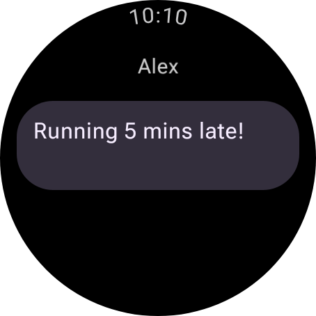
1. Standard Large Round
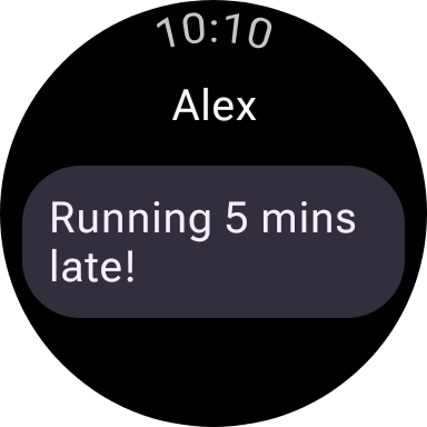
2. Extreme Small Round (Largest Font + German)
Preview scrolling columns (TransformingLazyColumn)
By default, a TransformingLazyColumn initializes with its first item
(index = 0) pinned to the top of the screen. However, on Wear OS, items
morph their height and rounded corners (SurfaceTransformation) as they
approach the top and bottom curved edges of the screen, and the EdgeButton
only appears when scrolled to the bottom.
To preview how your list looks when scrolled partway down or at the bottom of the list:
Step 1: Hoist TransformingLazyColumnState in your screen composable
Allow your screen composable to accept a TransformingLazyColumnState
parameter with rememberTransformingLazyColumnState() as the default value:
@Composable fun InboxScreen( messages: List<Message>, columnState: TransformingLazyColumnState = rememberTransformingLazyColumnState(), ) { val transformationSpec = rememberTransformationSpec() ScreenScaffold( scrollState = columnState, edgeButton = { EdgeButton(onClick = { /* Compose new */ }) { Text("New message") } } ) { contentPadding -> TransformingLazyColumn( state = columnState, contentPadding = contentPadding, ) { items(messages.size) { index -> Card( onClick = {}, modifier = Modifier .fillMaxWidth() .transformedHeight(this, transformationSpec) .minimumVerticalContentPadding( CardDefaults.minimumVerticalListContentPadding ), transformation = SurfaceTransformation(transformationSpec), ) { Text(messages[index].subject) } } } } }
Step 2: Pass initialAnchorItemIndex in your @Preview
rememberTransformingLazyColumnState accepts two optional initial scroll
parameters:
initialAnchorItemIndex: Int: When set to a non-negative index (for example,3), the list initializes with that item centered in the watch viewport.initialAnchorItemScrollOffset: Int: Optional pixel offset applied relative to the centered anchor item.
You can create side-by-side previews showing the Top, Middle
(scrolled), and Bottom (EdgeButton visible) states of the exact same
screen:
@WearPreviewLargeRound @Composable fun InboxScreenTopPreview() { MaterialTheme { AppScaffold { // Default (-1): Pinned to top of list (index 0) InboxScreen(messages = sampleMessages) } } } @WearPreviewLargeRound @Composable fun InboxScreenScrolledMiddlePreview() { MaterialTheme { AppScaffold { // Centers item index 3 in the viewport, showing top/bottom item morphing InboxScreen( messages = sampleMessages, columnState = rememberTransformingLazyColumnState( initialAnchorItemIndex = 3 ) ) } } } @WearPreviewLargeRound @Composable fun InboxScreenBottomEdgeButtonPreview() { MaterialTheme { AppScaffold { // Anchors on the last item so the EdgeButton is visible at the bottom InboxScreen( messages = sampleMessages, columnState = rememberTransformingLazyColumnState( initialAnchorItemIndex = sampleMessages.lastIndex ) ) } } }
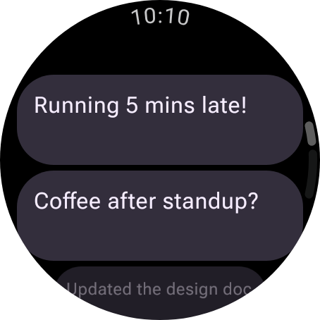
Top (Default -1)
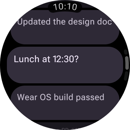
Middle (initialAnchorItemIndex = 3)
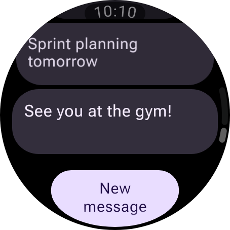
Bottom (EdgeButton expanded)
Tip: You can also click Start Interactive Mode on any
@Previewin Android Studio to scroll theTransformingLazyColumnlive with your mouse or trackpad and inspectSurfaceTransformationmorphing,EdgeButtonentrance animations, andScrollIndicatormovement in real time.
Guard ScrollIndicator during scroll capture (LocalScrollCaptureInProgress)
When system Scroll Capture (long screenshots) or multi-frame screenshot testing
tools capture a scrolling TransformingLazyColumn, Compose sets
LocalScrollCaptureInProgress.current to true while capturing and stitching
multiple viewport tiles vertically.
Because ScreenScaffold does not automatically hide its scrollIndicator
during scroll capture, the floating scrollbar overlay will appear repeated on
every stitched tile of a long screenshot unless you explicitly guard it with
!LocalScrollCaptureInProgress.current:
ScreenScaffold( scrollState = columnState, scrollIndicator = { if (!LocalScrollCaptureInProgress.current) { ScrollIndicator(state = columnState) } } ) { contentPadding -> // TransformingLazyColumn content... // ... }