
To start providing tiles from your app, include the following dependencies in
your app's build.gradle file.
Groovy
dependencies {
    // Use to implement support for wear tiles
    implementation "androidx.wear.tiles:tiles:1.6.0"

    // Use to utilize standard components and layouts in your tiles
    implementation "androidx.wear.protolayout:protolayout:1.4.0"

    // Use to utilize components and layouts with Material Design in your tiles
    implementation "androidx.wear.protolayout:protolayout-material:1.4.0"

    // Use to include dynamic expressions in your tiles
    implementation "androidx.wear.protolayout:protolayout-expression:1.4.0"

    // Use to preview wear tiles in your own app
    debugImplementation "androidx.wear.tiles:tiles-renderer:1.6.0"

    // Use to fetch tiles from a tile provider in your tests
    testImplementation "androidx.wear.tiles:tiles-testing:1.6.0"
}
Kotlin
dependencies {
    // Use to implement support for wear tiles
    implementation("androidx.wear.tiles:tiles:1.6.0")

    // Use to utilize standard components and layouts in your tiles
    implementation("androidx.wear.protolayout:protolayout:1.4.0")

    // Use to utilize components and layouts with Material Design in your tiles
    implementation("androidx.wear.protolayout:protolayout-material:1.4.0")

    // Use to include dynamic expressions in your tiles
    implementation("androidx.wear.protolayout:protolayout-expression:1.4.0")

    // Use to preview wear tiles in your own app
    debugImplementation("androidx.wear.tiles:tiles-renderer:1.6.0")

    // Use to fetch tiles from a tile provider in your tests
    testImplementation("androidx.wear.tiles:tiles-testing:1.6.0")
}
Key concepts
Tiles aren't built in the same way as Android apps, and make use of different concepts:
- Layout templates: Define the overall arrangement of visual elements on
the display. This is accomplished by the
primaryLayout()function. - Layout elements: Represent an individual graphical element, such a button or card, or several such elements grouped together using a column, buttonGroup or similar. These are embedded within a layout template.
- Resources:
ResourceBuilders.Resourcesobjects consist of a map of key-value pairs of the Android resources (images) that are required to render a layout, and a version. - Timeline: A
TimelineBuilders.Timelineobject is a list of one or more instances of a layout object. You can provide various mechanisms and expressions to indicate when the renderer should switch from one layout object to another, such as to stop showing a layout at a specific time. - State: A data structure of type
StateBuilders.Statethat is passed between tile and app, to enable the two components to communicate with each other. For example, if a button is tapped on the tile, the state holds the ID of the button. You can also exchange data types using a map. - Tile: A
TileBuilders.Tileobject representing a tile, consisting of a timeline, a resources version ID, freshness interval, and state. - Protolayout: This term appears in the name of various tiles-related classes and refers to the Wear OS Protolayout library, a graphics library that's used across various Wear OS surfaces.
Create a tile
To provide a tile from your app, implement a service of type TileService
and register it in your manifest. From this, the system requests the necessary
tiles during calls to onTileRequest() and resources during calls to
onTileResourcesRequest().
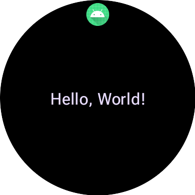
class MyTileService : TileService() { override fun onTileRequest(requestParams: RequestBuilders.TileRequest) = Futures.immediateFuture( Tile.Builder() .setResourcesVersion(RESOURCES_VERSION) .setTileTimeline( Timeline.fromLayoutElement( materialScope(this, requestParams.deviceConfiguration) { primaryLayout( mainSlot = { text("Hello, World!".layoutString, typography = BODY_LARGE) } ) } ) ) .build() ) override fun onTileResourcesRequest(requestParams: ResourcesRequest) = Futures.immediateFuture(Resources.Builder().setVersion(RESOURCES_VERSION).build()) }
Next, add a service inside the <application> tag of your AndroidManifest.xml
file.
<service android:name=".snippets.m3.tile.MyTileService" android:label="@string/tile_label" android:description="@string/tile_description" android:icon="@mipmap/ic_launcher" android:exported="true" android:permission="com.google.android.wearable.permission.BIND_TILE_PROVIDER"> <intent-filter> <action android:name="androidx.wear.tiles.action.BIND_TILE_PROVIDER" /> </intent-filter> <meta-data android:name="androidx.wear.tiles.PREVIEW" android:resource="@drawable/tile_preview" /> </service>
The permission and intent filter register this service as a tile provider.
The icon, label, description, and preview resource is shown to the user when they configure tiles on their phone or watch. Note that the preview resource supports all of Android's standard resource qualifiers, so it's possible to vary the preview according to factors like screen size and device language. See the preview checklist for additional recommendations.
Deploy your app, and add the Tile to the Tiles Carousel (there are a more developer-friendly way to preview a Tile too, but for now just do it manually).
For a complete example, see the code sample on GitHub or the codelab.
Create UI for tiles
Material 3 Expressive UI elements are created using a structured approach powered by Kotlin's type-safe builder pattern.
Layout
For guidance on the design principles behind creating effective and responsive tile layouts, see Common layouts for tiles.
To create your layout, do the following:
Initiate a Material Design scope: Call the
materialScope()function, providing the requiredcontextanddeviceConfiguration. You can include optional parameters, such asallowDynamicThemeanddefaultColorScheme. TheallowDynamicThemeistrueby default, and thedefaultColorSchemerepresents theColorSchemeused when dynamic colors are not available—such as when the user has turned the feature off—or when it's not supported by the device, orallowDynamicThemeisfalse).Build your UI within the scope: All UI components for a given Tile layout must be defined within the lambda of a single top-level materialScope() call. These component functions, such as
primaryLayout()andtextEdgeButton(), are extension functions onMaterialScopeand are only available when called on this receiver scope.materialScope( context = context, deviceConfiguration = requestParams.deviceConfiguration, // requestParams is passed to onTileRequest defaultColorScheme = myFallbackColorScheme ) { // inside the MaterialScope, you can call functions like primaryLayout() primaryLayout( titleSlot = { text(text = "Title".layoutString) }, mainSlot = { text(text = "Main Content".layoutString) }, bottomSlot = { textEdgeButton( labelContent = { text("Action".layoutString) }, onClick = clickable() ) } ) }
Slots
In M3, the tiles layout uses a Compose-inspired approach that makes use of three distinct slots. Running from top to bottom, they are:
- The
titleSlot, typically for a primary title or header. - The
mainSlot, for the core content. - The
bottomSlot, often used for actions or supplemental information. This is also where an edge button appears.
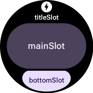
The contents of each slot are as follows:
titleSlot(optional): Typically a few words generated bytext().mainSlot(mandatory): Components organized into structures like rows, columns and button groups. These components can also be recursively embedded inside each other; for example, a column can contain rows.bottomSlot(optional): Typically filled with either an edge-hugging button or a text label.
Because tiles can't be scrolled, there are no components for paging, scrolling, or handling long lists of content. Take care that content remains visible when font size increases or text becomes longer due to translation.
UI components
The protolayout-material3 library provides a large number of components
designed according to the Material 3 Expressive specifications and user
interface recommendations.
Buttons
Buttons are primarily action-oriented. They serve to trigger specific actions. The content of each button, such as an icon or short text, identifies the action.
- textButton(): button with a single slot for (short) text content
- iconButton(): button with a single slot to represent an icon
- avatarButton(): pill-shaped avatar button that offers up to three slots to take content representing vertically stacked label and secondary label, and an image (avatar) next to it
- imageButton(): clickable image button that doesn't offer additional
slots, only image (for example
backgroundImageas a background) - compactButton(): compact button that offers up to two slots to take horizontally stacked content representing an icon and text next to it
- button(): pill shape button that offers up to three slots to take content representing vertically stacked label and secondary label, and an icon next to it
Edge Buttons
An edge button is a specialized, full-width button anchored to the bottom of a watch's round screen, representing the most important action to take from the current tile screen.
- iconEdgeButton(): edge button that offers a single slot to take an icon or similarly round, small content
- textEdgeButton(): edge button that offers a single slot to take a text or similarly long and wide content
Cards
Cards are primarily information-oriented. They display collections of related, structured data. While you can create interactive cards, they usually show a summary of information, which the user can then tap to see more details or perform a related action.
- titleCard(): title card that offers one to three slots, usually text based
- appCard(): app card that offers up to five slots, usually text based
- textDataCard(): data card that offers up to three vertically stacked slots, usually text or numeral based
- iconDataCard(): data card that offers up to three vertically stacked slots, usually text or numeral based, with an icon
- graphicDataCard(): graphic data card that offers a slot for graphic data, such as progress indicator, and up to two vertically stacked slots, usually for text descriptions
Progress Indicators
- circularProgressIndicator(): indicates progress toward a goal using a radial element
- segmentedCircularProgressIndicator(): indicates progress toward a goal using a radial element with distinct stages
Group layout elements
- buttonGroup(): component-layout that places its children in a horizontal sequence
- primaryLayout(): full screen layout that represents a suggested M3 layout style that is responsive and takes care of the elements' placement, together with the recommended margins and padding applied
Apply a theme
In Material 3 Expressive, the color system is defined by 29 standard color roles, organized into six groups: primary, secondary, tertiary, error, surface, and outline.
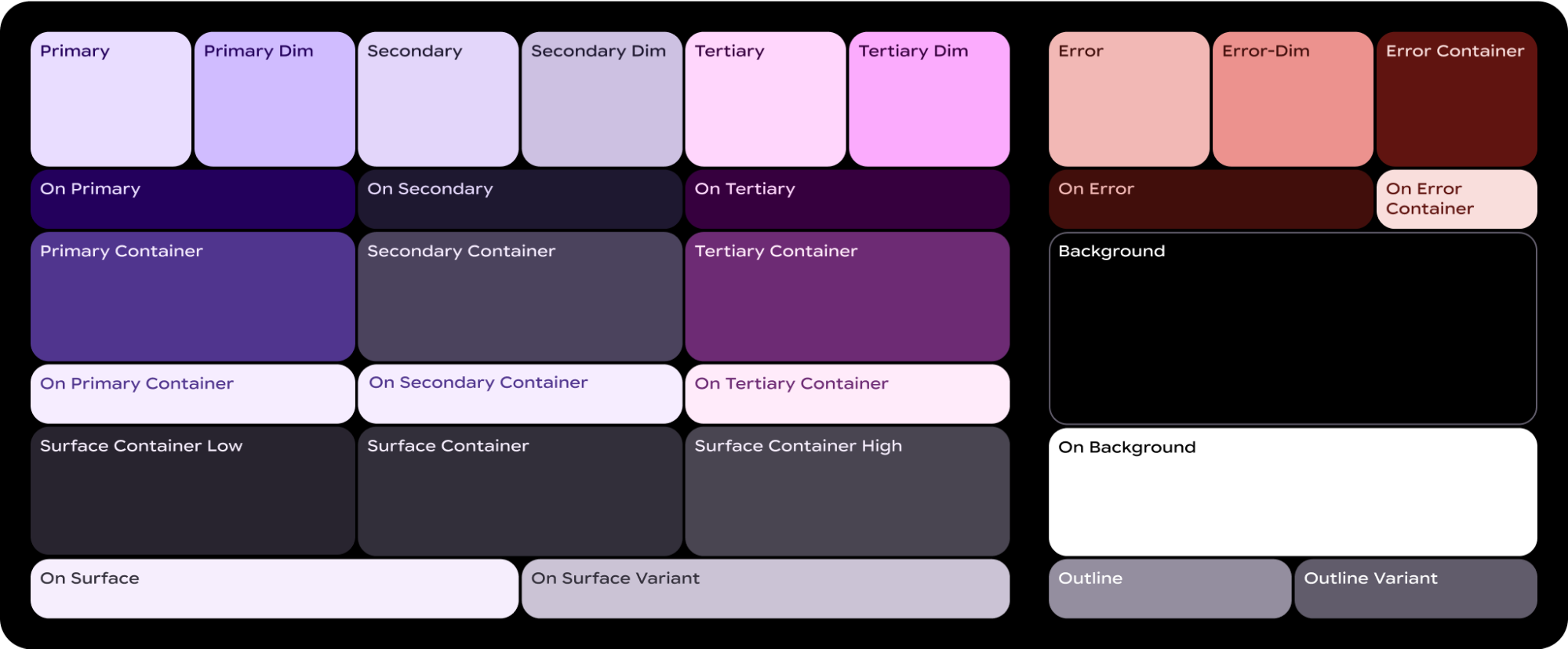
A ColorScheme maps each of these 29 roles to a corresponding color, and
since it's part of the MaterialScope and components must be created within it,
they automatically take colors from the scheme. This approach lets all UI
elements automatically adhere to the Material Design standards.
To let users choose between a color scheme you define—such as one that reflects
your brand colors—and one provided by the system—either derived from the user's
current watch face, or one chosen by the user—initialize the MaterialScope as
follows:
val myColorScheme = ColorScheme( primary = Color.rgb(0, 0, 255).argb, // Blue onPrimary = Color.rgb(255, 255, 255).argb, // White // 27 more ) materialScope( context = context, deviceConfiguration = requestParams.deviceConfiguration, defaultColorScheme = myColorScheme ) { // If the user selects "no theme" in settings, myColorScheme is used. // Otherwise, the system-provided theme is used. }
If you choose this option, provide a monochrome tile icon so that it can be correctly tinted for optimal visibility against any theme.
To force your tiles to appear in the color scheme you provide, disable support
for dynamic theming by setting allowDynamicTheme to false:
materialScope( context = context, deviceConfiguration = requestParams.deviceConfiguration, allowDynamicTheme = false, defaultColorScheme = myColorScheme ) { // myColorScheme is *always* used. }
Color
Each individual component uses a subset of the 29 color roles defined by a
ColorScheme. For example, buttons use up to four colors, which by default are
taken from the "primary" group of the active ColorScheme:
ButtonColors component token |
ColorScheme role |
|---|---|
| containerColor | primary |
| iconColor | onPrimary |
| labelColor | onPrimary |
| secondaryLabelColor | onPrimary (opacity 0.8) |
For detailed guidance on applying color to your Wear OS designs, see the color design guide.
You might need to deviate from the default color tokens for specific UI
elements. For example, you might want one textEdgeButton to use
colors from the "secondary" or "tertiary" group, instead of "primary", to
stand out and give better contrast.
You can customize component colors in several ways:
Use a helper function for predefined colors. Use helper functions like
filledTonalButtonColors()to apply the standard button styles for Material 3 Expressive. These functions create pre-configuredButtonColorsinstances that map common styles like filled, tonal, or outlined to the appropriate roles from the activeColorSchemewithin theMaterialScope. This lets you apply consistent styles without manually defining each color for common button types.textEdgeButton( colors = filledButtonColors(), // default /* OR colors = filledTonalButtonColors() */ /* OR colors = filledVariantButtonColors() */ // ... other parameters )
For cards, use the equivalent
filledCardColors()family of functions.You can also modify the
ButtonColorsobject returned by helper functions using theircopy()method if you only need to change one or two tokens:textEdgeButton( colors = filledButtonColors() .copy( containerColor = colorScheme.tertiary, labelColor = colorScheme.onTertiary ), // ... other parameters )
Explicitly provide replacement color roles. Create your own
ButtonColorsobject, and pass it to the component. For cards, use the equivalentCardColorsobject.textEdgeButton( colors = ButtonColors( // the materialScope makes colorScheme available containerColor = colorScheme.secondary, iconColor = colorScheme.secondaryDim, labelColor = colorScheme.onSecondary, secondaryLabelColor = colorScheme.onSecondary ), // ... other parameters )
Specify fixed colors (use with caution). While it's generally recommended to specify colors by their semantic role (e.g.,
colorScheme.primary), you can also provide direct color values. This approach should be used sparingly, as it can lead to inconsistencies with the overall theme, especially if the theme changes dynamically.textEdgeButton( colors = filledButtonColors().copy( containerColor = android.graphics.Color.RED.argb, // Using named colors labelColor = 0xFFFFFF00.toInt().argb // Using a hex code for yellow ), // ... other parameters )
Typography
For more information on using typography effectively in your designs, see the typography design guide.
To create visual consistency across the Wear OS platform and to optimize performance, all text on tiles is rendered using a system-provided font. That is, tiles don't support custom typefaces. On Wear OS 6 and higher, this is an OEM-specific font. In most cases it will be a variable font, offering a more expressive experience and more granular control.
To create a text style, you usually use the text() method
combined with typographic constants. This component lets you make use of
predefined typography roles in Material 3 Expressive, which helps your tile
adhere to established typographic best practices for readability and hierarchy.
The library offers a set of 18 semantic typography constants, such as
BODY_MEDIUM. These constants also affect font axes other than size.
text( text = "Hello, World!".layoutString, typography = BODY_MEDIUM, )
For more control, you can provide additional settings. On Wear OS 6 and
higher, a variable font is likely to be used, which you can modify along the
axes italic, weight, width, and roundness. You can control these axes
using the settings parameter:
text( text = "Hello, World".layoutString, italic = true, // Use elements defined in androidx.wear.protolayout.LayoutElementBuilders.FontSetting settings = listOf( weight(500), width(100F), roundness(100) ), )
Finally, if you need to control size or letter spacing (not recommended),
use basicText() instead of text(), and construct a value for the
fontStyle property using fontStyle()).
Shape and margins
You can change the corner radius of almost every component using itsshape
property. Values come from the MaterialScope property shapes:
textButton( height = expand(), width = expand(), shape = shapes.medium, // OR another value like shapes.full colors = filledVariantButtonColors(), labelContent = { text("Hello, World!".layoutString) }, )
After you alter the shape of a component, if you think that it leaves too much
or too little space around the edge of the display, adjust the margins using the
margin parameter of primaryLayout():
primaryLayout( mainSlot = { textButton( shape = shapes.small, /* ... */ ) }, // margin constants defined in androidx.wear.protolayout.material3.PrimaryLayoutMargins margins = MAX_PRIMARY_LAYOUT_MARGIN, )
Arcs
The following Arc container children are supported:
ArcLine: renders a curved line around the Arc.ArcText: renders curved text in the Arc.ArcAdapter: renders a basic layout element in the arc, drawn at a tangent to the arc.
For more information, see the reference documentation for each of the element types.
Modifiers
Every available layout element can optionally have modifiers applied to it. Use these modifiers for the following purposes:
- Change the visual appearance of the layout. For example, add a background, border, or padding to your layout element.
- Add metadata about the layout. For example, add a semantics modifier to your layout element for use with screen readers.
- Add functionality. For example, add a clickable modifier to your layout element to make your tile interactive. For more information, see Interact with tiles.
For example, we can customize the default look and metadata of an Image,
as shown in the following code sample:
private fun myImage(): LayoutElement = Image.Builder() .setWidth(dp(24f)) .setHeight(dp(24f)) .setResourceId("image_id") .setModifiers( Modifiers.Builder() .setBackground(Background.Builder().setColor(argb(0xFFFF0000.toInt())).build()) .setPadding(ModifiersBuilders.Padding.Builder().setStart(dp(12f)).build()) .setSemantics(Semantics.Builder().setContentDescription("Image description").build()) .build() ) .build()
Spannables
A Spannable is a special type of container that lays out elements similarly to
text. This is useful when you want to apply a different style to only one
substring in a larger block of text, something that isn't possible with the
Text element.
A Spannable container is filled with Span children. Other children, or
nested Spannable instances, aren't allowed.
There are two types of Span children:
For example, you could italicize "world" in a "Hello world" tile and insert an image between the words, as shown in the following code sample:
private fun mySpannable(): LayoutElement = LayoutElementBuilders.Spannable.Builder() .addSpan(SpanText.Builder().setText("Hello ").build()) .addSpan(SpanImage.Builder().setWidth(dp(24f)).setHeight(dp(24f)).setResourceId("image_id").build()) .addSpan( SpanText.Builder() .setText("world") .setFontStyle(FontStyle.Builder().setItalic(true).build()) .build() ) .build()
Work with resources
Tiles don't have access to any of your app's resources. This means that you
can't pass an Android image ID to an Image layout element and expect it to
resolve. Instead, override the onTileResourcesRequest() method and
provide any resources manually.
There are two ways to provide images within the onTileResourcesRequest()
method:
- Provide a drawable resource using
setAndroidResourceByResId(). - Provide a dynamic image as a
ByteArrayusingsetInlineResource().
override fun onTileResourcesRequest( requestParams: ResourcesRequest ) = Futures.immediateFuture( Resources.Builder() .setVersion("1") .addIdToImageMapping( "image_from_resource", ResourceBuilders.ImageResource.Builder() .setAndroidResourceByResId( ResourceBuilders.AndroidImageResourceByResId.Builder() .setResourceId(R.drawable.ic_walk) .build() ).build() ) .addIdToImageMapping( "image_inline", ResourceBuilders.ImageResource.Builder() .setInlineResource( ResourceBuilders.InlineImageResource.Builder() .setData(imageAsByteArray) .setWidthPx(48) .setHeightPx(48) .setFormat(ResourceBuilders.IMAGE_FORMAT_RGB_565) .build() ).build() ).build() )
Tile preview image checklist
The system displays the tile preview image, referenced in the Android app manifest, in the tile carousel editor for adding a new tile. This editor appears both on Wear OS devices and in the watch companion app on phones.
To help users make the most of this preview image, verify the following details about your tile:
- Reflects the latest design. The preview should accurately represent your tile's most current design.
- Uses recommended dimensions. To provide the best possible display quality and a good user experience, the preview image should have dimensions of 400px by 400px.
- Uses a static color theme. Use the tile's static color theme, not a dynamic one.
- Includes app icon. Confirm that your app's icon appears at the top of the preview image.
- Shows loaded/logged-in state. The preview should display a fully functional "loaded" or "logged-in" state, avoiding any empty or placeholder content.
- Leverage resource resolution rules for customization (optional). Consider using Android's resource resolution rules to provide previews that match the device's display size, language, or locale settings. This is particularly useful if your tile's appearance varies across devices.