
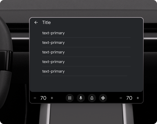
The List template presents a vertically scrolling collection of Rows or Conversation items. Lists are useful when users need to quickly browse items in a text format, such as recently-navigated places or songs in a queue.
With the List template, you can:
- Indicate a loading state.
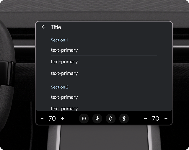
- Separate lists into sections using sublists.
- Use Rows as switches or radio buttons.
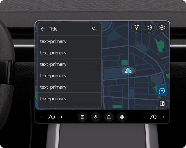
You can also provide tabbed navigation by embedding lists on the Tab template and show a list on a map using the Map + Content template.
Includes:
- Optional header: When this template is embedded in the Tab template, the header is replaced with tabs.
- List items (where the number of items and the amount of text in a row can
vary):
- Number of list items. The number of items allowed to be shown depends on the vehicle. To retrieve the list row limit for a given vehicle, use the ConstraintManager API.
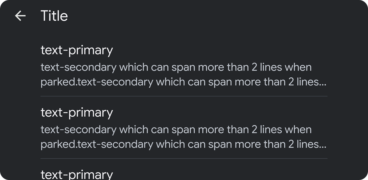
- Amount of text per item. Secondary text in list rows can be longer than 2 rows when parked. See More list text while parked.
- Optional floating action button
To learn more about what you can do with rows in the List template, see Row options for List template only and the examples in Sample flows.
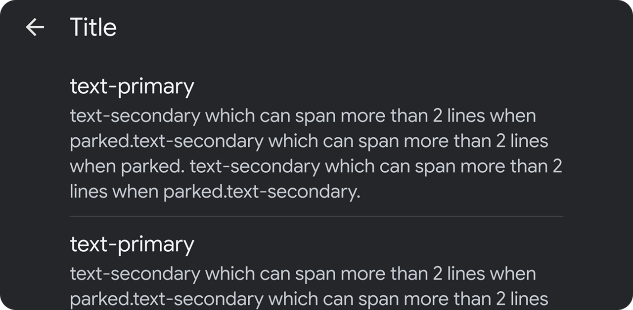
More list text when parked
The amount of secondary text allowed in each list row varies depending on whether the car is parked or driving. To minimize distraction, text is truncated to 2 lines while driving. Any text intended to be read while driving should be displayed at the beginning of the secondary text.
List template UX requirements
| MUST | Include a section header when sections are present. |
| MUST NOT | Mix selectable list rows (rows with radio buttons) with other types of rows or separate them with sections. |
| SHOULD | Present default selections on selectable lists. |
| SHOULD | Have an action associated with each list item (information-only rows are not recommended). |
| SHOULD | Place content in secondary text that is intended to be read while driving near the beginning, to avoid truncation. |
| SHOULD | Include a header with an optional title and primary and secondary actions. |
| MAY | Divide list content into sections. |
| MAY | Mix rows that have toggle switches with other rows as needed. |
| MAY | Update row text and image or icon asset when user changes toggle state. |
Resources
| Type | Link |
| API reference | ListTemplate, ListTemplate.Builder
|