
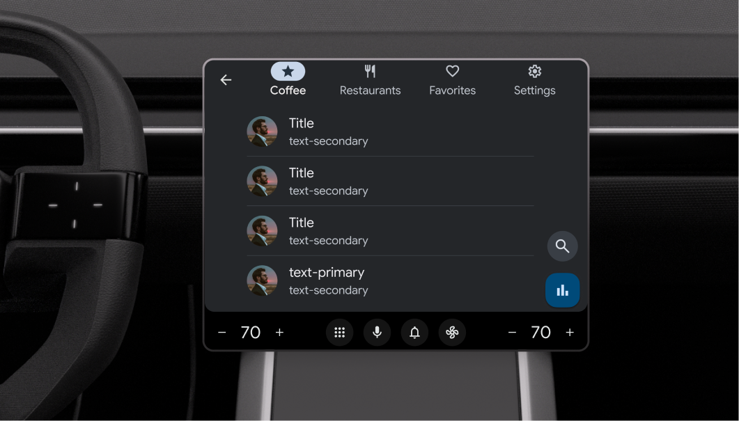
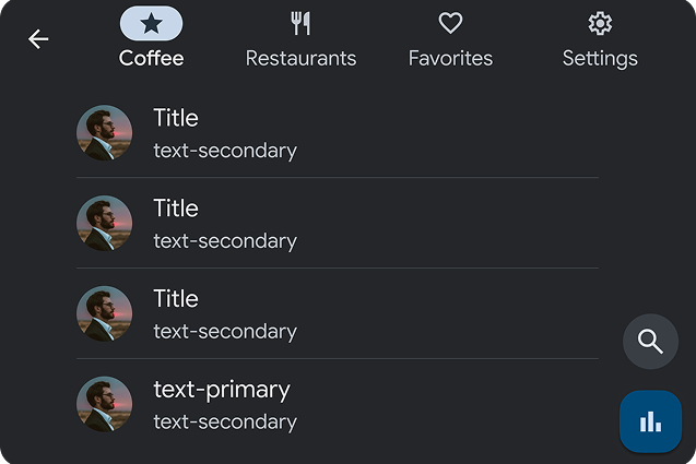
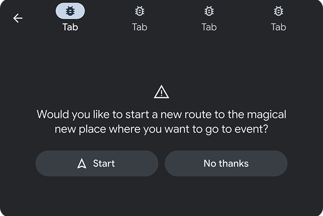
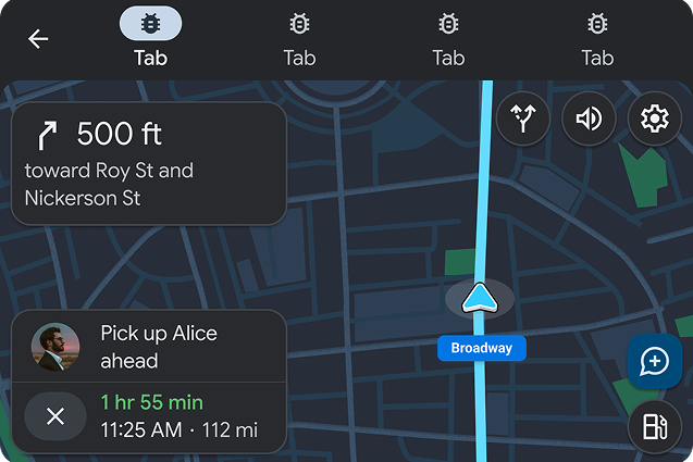
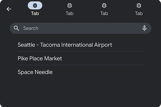
The Tab template acts as a container for other templates and allows switching among views.
This capability is particularly useful for organizing content or views that users will want to frequently switch between, such as available devices, settings, and more.
Tab template includes the following:
- Tab bar with app icon and up to 4 tabs. Each tab must provide both an icon and a title.
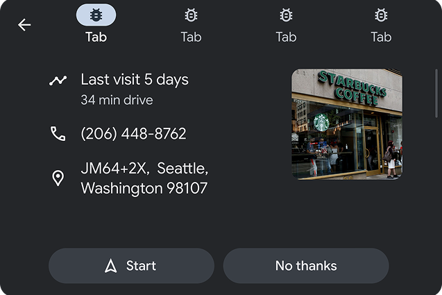
- Embedded template, which can be any of the following types:
Each tab corresponds to one embedded template. Only one tab can be active at any given time.
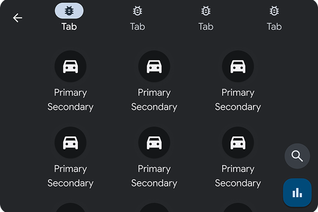
Anatomy of the tab template
Tab template UX requirements
| MUST | Provide icons for each tab. |
| MUST | Include at least 2 and no more than 4 tabs. |
| SHOULD | Use short tab labels to avoid truncation. |
| SHOULD NOT | Rely on a header or action strip in embedded templates. |
Resources
| Type | Link |
| API reference |
  TabTemplate,

    TabTemplate.Builder
|