
A tooltip is a small descriptive message that appears near a view when users long press the view or hover their mouse over it. This is useful when your app uses an icon to represent an action or piece of information to save space in the layout. This page shows you how to add these tooltips on Android 8.0 (API level 26) and higher.
Some scenarios, such as those in productivity apps, require a descriptive method of communicating ideas and actions. You can use tooltips to display a descriptive message, as shown in figure 1.
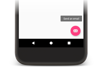
Figure 1. Tooltip displayed in an Android app.
Some standard widgets display tooltips based on the content of the title or
content description properties. Starting in Android 8.0, you can specify the
text displayed in the tooltip regardless of the value of other properties.
Setting the tooltip text
You can specify the tooltip text in a View by calling the
setTooltipText() method. You can set
the tooltipText property using the corresponding XML attribute or API.
To specify the tooltip text in your XML files, set the android:tooltipText attribute, as shown
in the following example:
<android.support.design.widget.FloatingActionButton
        android:id="@+id/fab"
        android:tooltipText="Send an email" />
To specify the tooltip text in your code, use the setTooltipText(CharSequence) method, as shown in the following example:
Kotlin
val fab: FloatingActionButton = findViewById(R.id.fab)
fab.tooltipText = "Send an email"
Java
FloatingActionButton fab = (FloatingActionButton) findViewById(R.id.fab);
fab.setTooltipText("Send an email");
The API also includes a getTooltipText() method that
you can use to retrieve the value of the tooltipText property.
Android displays the value of the tooltipText property when users hover their
mouse over the view or long press the view.