阴影可以从视觉上提升界面效果,向用户指示可交互性,并针对用户操作提供即时反馈。Compose 提供了多种方法,可将阴影融入到应用中:
Modifier.shadow():在符合 Material Design 准则的可组合项后面创建基于高度的阴影。Modifier.dropShadow():创建可自定义的阴影,该阴影会显示在可组合项后面,使其看起来像是悬浮的。Modifier.innerShadow():在可组合项的边框内创建阴影,使其看起来像是被压入其背后的表面。
Modifier.shadow() 适合创建基本阴影,而 dropShadow() 和 innerShadow() 修饰符则可对阴影渲染进行更精细、更精确的控制。
本页介绍了如何实现这些修饰符,包括如何在用户互动时为阴影添加动画效果,以及如何将 innerShadow() 和 dropShadow() 修饰符串联起来,以创建渐变阴影、拟物化阴影等。
创建基本阴影
Modifier.shadow() 会按照 Material Design 指南创建基本阴影,以模拟头顶光源。阴影深度基于 elevation 值,投射的阴影会根据可组合项的形状进行裁剪。
@Composable fun ElevationBasedShadow() { Box( modifier = Modifier.aspectRatio(1f).fillMaxSize(), contentAlignment = Alignment.Center ) { Box( Modifier .size(100.dp, 100.dp) .shadow(10.dp, RectangleShape) .background(Color.White) ) } }
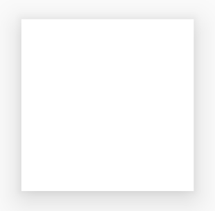
Modifier.shadow() 创建的基于高度的阴影。实现阴影
使用 dropShadow() 修饰符在内容后面绘制准确的阴影,使元素看起来像是悬浮的。
您可以通过其 Shadow 参数控制以下关键方面:
radius:定义模糊效果的柔和度和扩散度。color:定义色调的颜色。offset:沿 X 轴和 Y 轴定位阴影的几何图形。spread:控制阴影几何图形的扩张或收缩。
此外,shape 参数定义了阴影的整体形状。它可以使用 androidx.compose.foundation.shape 软件包中的任何几何图形,以及 Material Expressive 形状。
如需实现基本阴影,请将 dropShadow() 修饰符添加到可组合项链中,并提供半径、颜色和扩散。请注意,显示在阴影顶部的 purpleColor 背景是在 dropShadow() 修饰符之后绘制的:
@Composable fun SimpleDropShadowUsage() { Box(Modifier.fillMaxSize()) { Box( Modifier .width(300.dp) .height(300.dp) .dropShadow( shape = RoundedCornerShape(20.dp), shadow = Shadow( radius = 10.dp, spread = 6.dp, color = Color(0x40000000), offset = DpOffset(x = 4.dp, 4.dp) ) ) .align(Alignment.Center) .background( color = Color.White, shape = RoundedCornerShape(20.dp) ) ) { Text( "Drop Shadow", modifier = Modifier.align(Alignment.Center), fontSize = 32.sp ) } } }
代码要点
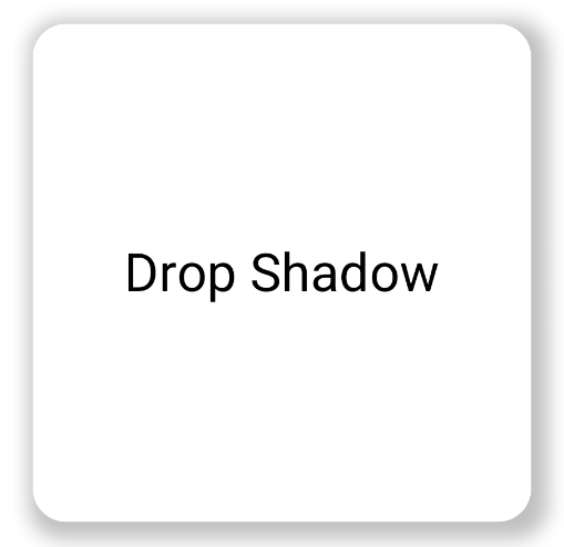
dropShadow()修饰符应用于内部Box。阴影具有以下特征:- 圆角矩形 (
RoundedCornerShape(20.dp)) - 模糊半径为
10.dp,使边缘柔和且呈漫射状 6.dp的扩散值,用于扩大阴影的大小,使其大于投射阴影的框- Alpha 值为
0.5f,使阴影半透明
- 圆角矩形 (
- 定义阴影后,已应用
background()修饰符。Box填充了白色。- 背景会被裁剪为与阴影相同的圆角矩形形状。
结果
实现内阴影
如需创建与 dropShadow() 相反的效果,请使用 Modifier.innerShadow(),这会营造出元素凹陷或压入底层表面的错觉。
创建内阴影时,顺序非常重要。innerShadow() 修饰符在内容顶部绘制。为确保阴影可见,您通常需要执行以下步骤:
- 绘制背景内容。
- 应用
innerShadow()修饰符以创建凹陷外观。
如果 innerShadow() 放置在背景之前,则背景会绘制在阴影上,从而将其完全隐藏。
以下示例展示了 innerShadow() 在 RoundedCornerShape 上的应用:
@Composable fun SimpleInnerShadowUsage() { Box(Modifier.fillMaxSize()) { Box( Modifier .width(300.dp) .height(200.dp) .align(Alignment.Center) // note that the background needs to be defined before defining the inner shadow .background( color = Color.White, shape = RoundedCornerShape(20.dp) ) .innerShadow( shape = RoundedCornerShape(20.dp), shadow = Shadow( radius = 10.dp, spread = 2.dp, color = Color(0x40000000), offset = DpOffset(x = 6.dp, 7.dp) ) ) ) { Text( "Inner Shadow", modifier = Modifier.align(Alignment.Center), fontSize = 32.sp ) } } }
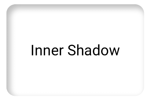
Modifier.innerShadow()。在用户互动时为阴影添加动画效果
如需让阴影响应用户互动,您可以将阴影属性与 Compose 的动画 API 集成。例如,当用户按下按钮时,阴影可以发生变化,以提供即时视觉反馈。
以下代码使用阴影创建“按下”效果(表面被向下推入屏幕的错觉):
@Composable fun AnimatedColoredShadows() { SnippetsTheme { Box(Modifier.fillMaxSize()) { val interactionSource = remember { MutableInteractionSource() } val isPressed by interactionSource.collectIsPressedAsState() // Create transition with pressed state val transition = updateTransition( targetState = isPressed, label = "button_press_transition" ) fun <T> buttonPressAnimation() = tween<T>( durationMillis = 400, easing = EaseInOut ) // Animate all properties using the transition val shadowAlpha by transition.animateFloat( label = "shadow_alpha", transitionSpec = { buttonPressAnimation() } ) { pressed -> if (pressed) 0f else 1f } // ... val blueDropShadow by transition.animateColor( label = "shadow_color", transitionSpec = { buttonPressAnimation() } ) { pressed -> if (pressed) Color.Transparent else blueDropShadowColor } // ... Box( Modifier .clickable( interactionSource, indication = null ) { // ** ...... **// } .width(300.dp) .height(200.dp) .align(Alignment.Center) .dropShadow( shape = RoundedCornerShape(70.dp), shadow = Shadow( radius = 10.dp, spread = 0.dp, color = blueDropShadow, offset = DpOffset(x = 0.dp, -(2).dp), alpha = shadowAlpha ) ) .dropShadow( shape = RoundedCornerShape(70.dp), shadow = Shadow( radius = 10.dp, spread = 0.dp, color = darkBlueDropShadow, offset = DpOffset(x = 2.dp, 6.dp), alpha = shadowAlpha ) ) // note that the background needs to be defined before defining the inner shadow .background( color = Color(0xFFFFFFFF), shape = RoundedCornerShape(70.dp) ) .innerShadow( shape = RoundedCornerShape(70.dp), shadow = Shadow( radius = 8.dp, spread = 4.dp, color = innerShadowColor2, offset = DpOffset(x = 4.dp, 0.dp) ) ) .innerShadow( shape = RoundedCornerShape(70.dp), shadow = Shadow( radius = 20.dp, spread = 4.dp, color = innerShadowColor1, offset = DpOffset(x = 4.dp, 0.dp), alpha = innerShadowAlpha ) ) ) { Text( "Animated Shadows", // ... ) } } } }
代码要点
- 使用
transition.animateColor和transition.animateFloat声明按下时要添加动画效果的参数的开始和结束状态。 - 使用
updateTransition并为其提供所选的targetState (targetState = isPressed),以验证所有动画是否同步。每当isPressed发生变化时,过渡对象都会自动管理所有子属性从当前值到新目标值的动画。 - 定义
buttonPressAnimation规范,用于控制过渡的时间和加/减速。它指定了一个持续时间为 400 毫秒的tween(in-between 的缩写)和一条EaseInOut曲线,这意味着动画开始时速度较慢,在中间阶段速度加快,在结束时速度减慢。 - 定义一个
Box,其中包含一系列修饰符函数,这些函数会应用所有动画属性来创建视觉元素,包括:- .
clickable():使Box具有互动性的修饰符。 .dropShadow():首先应用两个外阴影。它们的颜色和 Alpha 属性会关联到动画值(blueDropShadow等),并创建初始凸起外观。.innerShadow():在背景上绘制两个内阴影。 它们的属性会关联到另一组动画值(innerShadowColor1等),并创建缩进外观。
- .
结果
创建渐变阴影
阴影不限于纯色。阴影 API 接受 Brush,可让您创建渐变阴影。
Box( modifier = Modifier .width(240.dp) .height(200.dp) .dropShadow( shape = RoundedCornerShape(70.dp), shadow = Shadow( radius = 10.dp, spread = animatedSpread.dp, brush = Brush.sweepGradient( colors ), offset = DpOffset(x = 0.dp, y = 0.dp), alpha = animatedAlpha ) ) .clip(RoundedCornerShape(70.dp)) .background(Color(0xEDFFFFFF)), contentAlignment = Alignment.Center ) { Text( text = breathingText, color = Color.Black, style = MaterialTheme.typography.bodyLarge ) }
代码要点
dropShadow()会在方框后面添加阴影。brush = Brush.sweepGradient(colors)使用渐变色为阴影着色,该渐变色会循环显示一系列预定义的colors,从而营造出彩虹般的效果。
结果
您可以使用画笔作为阴影,创建具有“呼吸”动画的渐变 dropShadow():
合并阴影
您可以组合和叠加 dropShadow() 和 innerShadow() 修饰符,以创建各种效果。以下部分介绍了如何使用此技术生成拟物化、新粗野主义和逼真的阴影。
创建新拟物化阴影
新拟物化阴影的特点是外观柔和,从背景中自然浮现。如需创建拟物化阴影,请执行以下操作:
- 使用与背景颜色相同的元素。
- 应用两个微弱的、相反的投影:一个角落应用浅色阴影,对角应用深色阴影。
以下代码段将两个 dropShadow() 修饰符分层,以创建拟态效果:
@Composable fun NeumorphicRaisedButton( shape: RoundedCornerShape = RoundedCornerShape(30.dp) ) { val bgColor = Color(0xFFe0e0e0) val lightShadow = Color(0xFFFFFFFF) val darkShadow = Color(0xFFb1b1b1) val upperOffset = -10.dp val lowerOffset = 10.dp val radius = 15.dp val spread = 0.dp Box( modifier = Modifier .fillMaxSize() .background(bgColor) .wrapContentSize(Alignment.Center) .size(240.dp) .dropShadow( shape, shadow = Shadow( radius = radius, color = lightShadow, spread = spread, offset = DpOffset(upperOffset, upperOffset) ), ) .dropShadow( shape, shadow = Shadow( radius = radius, color = darkShadow, spread = spread, offset = DpOffset(lowerOffset, lowerOffset) ), ) .background(bgColor, shape) ) }

创建新野兽派阴影
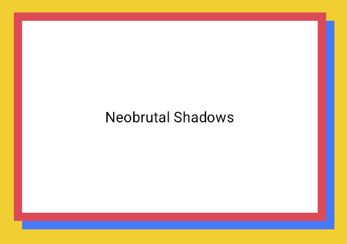
新野兽主义风格采用高对比度、块状布局、鲜艳色彩和粗边框。如需实现此效果,请使用模糊半径为零且偏移量明显的 dropShadow(),如以下代码段所示:
@Composable fun NeoBrutalShadows() { SnippetsTheme { val dropShadowColor = Color(0xFF007AFF) val borderColor = Color(0xFFFF2D55) Box(Modifier.fillMaxSize()) { Box( Modifier .width(300.dp) .height(200.dp) .align(Alignment.Center) .dropShadow( shape = RoundedCornerShape(0.dp), shadow = Shadow( radius = 0.dp, spread = 0.dp, color = dropShadowColor, offset = DpOffset(x = 8.dp, 8.dp) ) ) .border( 8.dp, borderColor ) .background( color = Color.White, shape = RoundedCornerShape(0.dp) ) ) { Text( "Neobrutal Shadows", modifier = Modifier.align(Alignment.Center), style = MaterialTheme.typography.bodyMedium ) } } } }
创建逼真的阴影
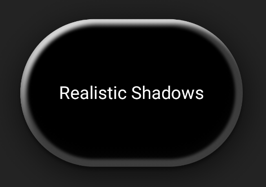
逼真的阴影会模仿物理世界中的阴影,它们看起来像是被主光源照亮,从而产生直接阴影和更漫射的阴影。您可以堆叠具有不同属性的多个 dropShadow() 和 innerShadow() 实例,以重现逼真的阴影效果,如以下代码段所示:
@Composable fun RealisticShadows() { Box(Modifier.fillMaxSize()) { val dropShadowColor1 = Color(0xB3000000) val dropShadowColor2 = Color(0x66000000) val innerShadowColor1 = Color(0xCC000000) val innerShadowColor2 = Color(0xFF050505) val innerShadowColor3 = Color(0x40FFFFFF) val innerShadowColor4 = Color(0x1A050505) Box( Modifier .width(300.dp) .height(200.dp) .align(Alignment.Center) .dropShadow( shape = RoundedCornerShape(100.dp), shadow = Shadow( radius = 40.dp, spread = 0.dp, color = dropShadowColor1, offset = DpOffset(x = 2.dp, 8.dp) ) ) .dropShadow( shape = RoundedCornerShape(100.dp), shadow = Shadow( radius = 4.dp, spread = 0.dp, color = dropShadowColor2, offset = DpOffset(x = 0.dp, 4.dp) ) ) // note that the background needs to be defined before defining the inner shadow .background( color = Color.Black, shape = RoundedCornerShape(100.dp) ) // // .innerShadow( shape = RoundedCornerShape(100.dp), shadow = Shadow( radius = 12.dp, spread = 3.dp, color = innerShadowColor1, offset = DpOffset(x = 6.dp, 6.dp) ) ) .innerShadow( shape = RoundedCornerShape(100.dp), shadow = Shadow( radius = 4.dp, spread = 1.dp, color = Color.White, offset = DpOffset(x = 5.dp, 5.dp) ) ) .innerShadow( shape = RoundedCornerShape(100.dp), shadow = Shadow( radius = 12.dp, spread = 5.dp, color = innerShadowColor2, offset = DpOffset(x = (-3).dp, (-12).dp) ) ) .innerShadow( shape = RoundedCornerShape(100.dp), shadow = Shadow( radius = 3.dp, spread = 10.dp, color = innerShadowColor3, offset = DpOffset(x = 0.dp, 0.dp) ) ) .innerShadow( shape = RoundedCornerShape(100.dp), shadow = Shadow( radius = 3.dp, spread = 9.dp, color = innerShadowColor4, offset = DpOffset(x = 1.dp, 1.dp) ) ) ) { Text( "Realistic Shadows", modifier = Modifier.align(Alignment.Center), fontSize = 24.sp, color = Color.White ) } } }
代码要点
- 应用了两个具有不同属性的链式
dropShadow()修饰符,后跟一个background()修饰符。 - 应用了链式
innerShadow()修饰符,以在组件边缘周围打造金属边框效果。
结果
上述代码段会生成以下内容: