
FlexBox is a container that lays out items in a single direction. It can
resize, wrap, align, and distribute space among items to optimally fill the
available space. It's a useful layout for different sized items and for resizing
items when the available space changes.
With FlexBox, you can:
- Control how items grow and shrink to fill the available space
- Wrap items onto new rows or columns when there isn't enough space for them
- Distribute extra space between items using convenient presets
When to use FlexBox
FlexBox is usually used to display a small number of items within an
overall screen layout. For an overall screen layout,
Grid is usually a better choice. FlexBox does not support lazy-loading of
items. To display large numbers of items, use lazy lists and grids. If you
need to wrap items, use FlexBox instead of FlowRow and FlowColumn.
Terminology and concepts
FlexBox lays out its items in either horizontal or vertical lines. This
direction of these lines establishes the main axis. 90 degrees to the main
axis is the cross axis. The length of the FlexBox along the main axis is
known as the main size. The corresponding cross axis length is known as the
cross size. These sizes and axes form the basis of FlexBox's behavior.
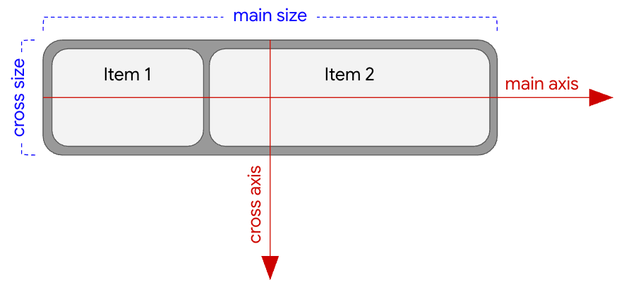
FlexBox direction is Row.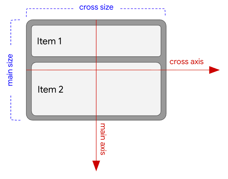
FlexBox direction is Column.Apply properties
You can apply FlexBox properties in two ways:
- To the
FlexBoxcontainer usingFlexBox(config) - To an item inside the
FlexBoxusingModifier.flex
Container properties ( |
Item properties ( |
|---|---|
See Set container behavior for more information about these properties. |
See Set item behavior for more information about these properties. |
Understand the FlexBox layout algorithm
One of FlexBox's most powerful features is its ability to resize its children
to best fit the space available to it. Understanding how FlexBox does this can
help you set FlexBox properties to optimize your UI for all possible sizes.
FlexBox's layout algorithm works in the following way:
Calculate child base size: Use the child's
basisvalue to calculate its initial size along the main axis before any extra space is distributed.Sort the children: Sort the children by their
ordervalues, if present.Build lines: For each child, check if its initial size plus
gapwill fit into the remaining space on the current line. If so, place this child into the line. If not, place it onto a new line if wrapping is enabled, or place the item into the current line where it will overflow (it will be partially obscured by the edge of the container).Align or resize items in the main axis: For each line, distribute extra space to or between items by resizing or aligning them.
Align or resize items in the cross axis: For each line, distribute extra space to or between items and lines by stretching or aligning them.
Now that you're familiar with FlexBox concepts, see Get started to
create a basic FlexBox.