Use Modifier.flex to control how an item changes size, order, and is aligned
inside a FlexBox.
Item size
Use the basis, grow, and shrink functions to control an item's size.
FlexBox { RedRoundedBox( modifier = Modifier.flex { basis(FlexBasis.Auto) grow(1.0f) shrink(0.5f) } ) }
Set initial size
Use basis to specify the item's initial size before any extra space is
distributed. You can think of this as the item's preferred size.
Value type |
Behavior |
Code snippet Note: The boxes have a maximum intrinsic size of |
Example using container width |
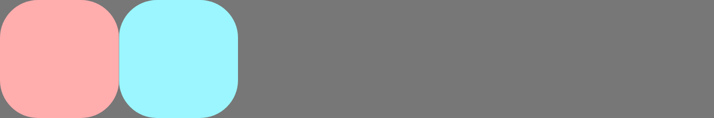
(default) |
Use the item's maximum intrinsic size. For example, a |
FlexBox { RedRoundedBox( Modifier.flex { basis(FlexBasis.Auto) } ) BlueRoundedBox( Modifier.flex { basis(FlexBasis.Auto) } ) } |
|
Fixed |
A fixed size in Dp. |
FlexBox { RedRoundedBox( Modifier.flex { basis(200.dp) } ) BlueRoundedBox( Modifier.flex { basis(100.dp) } ) } |

|
Percentage |
A percentage of the container size. |
FlexBox { RedRoundedBox( Modifier.flex { basis(0.7f) } ) BlueRoundedBox( Modifier.flex { basis(0.3f) } ) } |

|
If the basis value is less than the item's intrinsic minimum size, the intrinsic
minimum size is used instead. For example, if a Text item that contains a word
requires 50dp to display, but also has basis = 10.dp, a
value of 50dp is used.
Grow items when there's space
Use grow to specify how much an item grows when there is extra space. This is
space remaining in the FlexBox container after all the items' basis values
have been added up. The grow value indicates how much of the extra space a
given child will receive, relative to its siblings. By default, items won't
grow.
The following example shows a FlexBox with three child items. Each has a basis
value of 100dp. The first child has a positive grow value. Since there is
only one child with a grow value, the actual value is irrelevant - as long as
it's positive, the child receives all the extra space.
The images show the FlexBox behavior when its container size is 600dp.
FlexBox { RedRoundedBox( title = "400dp", modifier = Modifier.flex { grow(1f) } ) BlueRoundedBox(title = "100dp") GreenRoundedBox(title = "100dp") } |
Each child has a basis value of 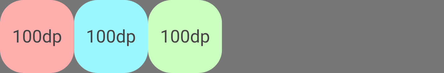
Child 1 grows by 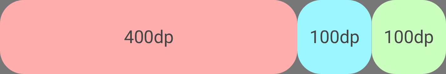
|
In the following example, the container size and basis size are the same. The
difference is that each child has a different grow value.
FlexBox { RedRoundedBox( title = "150dp", modifier = Modifier.flex { grow(1f) } ) BlueRoundedBox( title = "200dp", modifier = Modifier.flex { grow(2f) } ) GreenRoundedBox( title = "250dp", modifier = Modifier.flex { grow(3f) } ) } |
Each child has a basis value of 
The total grow value is 6. Child 1 grows by (1 / 6) * 300 = Child 2 grows by (2 / 6) * 300 = Child 3 grows by (3 / 6) * 300 = 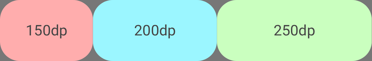
|
Shrink items when there's insufficient space
Use shrink to specify how much an item shrinks when the FlexBox container
has insufficient space for all the items. shrink works the same way as grow
except that, instead of distributing extra space to items, the space deficit
is distributed to items. The shrink value specifies how much of the space
deficit the item receives, or rather, how much the item will shrink by. By
default, items have a shrink value of 1f, meaning they shrink equally.
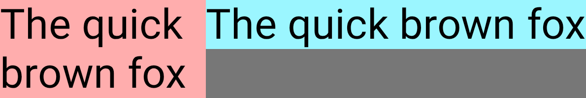
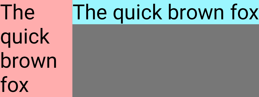
The following example shows two Text composables with the same text. The first
child has a shrink value of 1f, meaning it shrinks to absorb all the space
deficit.
FlexBox { Text( "The quick brown fox", fontSize = 36.sp, modifier = Modifier .background(PastelRed) .flex { shrink(1f) } ) Text( "The quick brown fox", fontSize = 36.sp, modifier = Modifier .background(PastelBlue) .flex { shrink(0f) } ) }
As the container size shrinks, Child 1 shrinks.
Container size |
FlexBox UI |
|

|
|
|
|
|
Item alignment
Use alignSelf to control how an item is aligned to the cross axis. This
overrides the alignItems property of the container for this item. It
has all the same possible values, with the addition of Auto which inherits the
behavior of the FlexBox container.
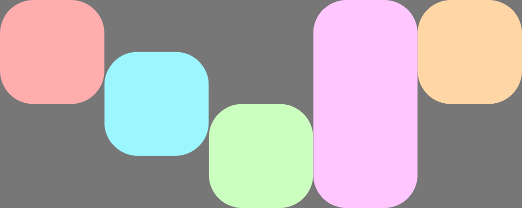
For example, this FlexBox has alignItems set to Start and five children
which override the cross axis alignment.
FlexBox( config = { alignItems(FlexAlignItems.Start) } ) { RedRoundedBox() BlueRoundedBox(modifier = Modifier.flex { alignSelf(FlexAlignSelf.Center) }) GreenRoundedBox(modifier = Modifier.flex { alignSelf(FlexAlignSelf.End) }) PinkRoundedBox(modifier = Modifier.flex { alignSelf(FlexAlignSelf.Stretch) }) OrangeRoundedBox(modifier = Modifier.flex { alignSelf(FlexAlignSelf.Baseline) }) }
Item order
By default, FlexBox lays out items in the order that they are declared in
code. Override this behavior using order.
The default value for order is zero, and FlexBox sorts items based on this
value in ascending order. Any items that have the same order value are
laid out in the same order they are declared in. Use negative and positive
order values to move items to the start or end of a layout without changing
where they are declared.
The following example shows two child items. The first has the default order
of zero, and the second has an order of -1. After sorting, Child 1 appears
after Child 2.
FlexBox { // Declared first, but will be placed after visually RedRoundedBox( title = "World" ) // Declared second, but will be placed first visually BlueRoundedBox( title = "Hello", modifier = Modifier.flex { order(-1) } ) }