
There are three ways you can adopt Styles throughout your app:
- Use directly on existing components that expose a
Styleparameter. - Apply a style with
Modifier.styleableon layout composables that don't accept aStyleparameter. - In your own custom design system, use
Modifier.styleable{}and expose a style parameter on your own components.
Available properties on Styles
Styles support many of the same properties that modifiers support; however, not everything that is a modifier can be replicated with a Style. You still need modifiers for certain behaviors, like interactions, custom drawing, or stacking of properties.
| Grouping | Properties | Inherited by children |
|---|---|---|
| Layout and sizing | ||
| Content Padding (inner) | - contentPadding(all: Dp)- contentPadding(horizontal: Dp, vertical: Dp)- contentPadding(start: Dp, top: Dp, end: Dp, bottom: Dp)- contentPaddingHorizontal(value: Dp) / contentPaddingVertical(value: Dp)- contentPaddingStart(value: Dp) / contentPaddingTop(value: Dp) / contentPaddingEnd(value: Dp) / contentPaddingBottom(value: Dp) |
No |
| External Padding (outer) | - externalPadding(all: Dp)- externalPadding(horizontal: Dp, vertical: Dp)- externalPadding(start: Dp, top: Dp, end: Dp, bottom: Dp)- externalPaddingHorizontal(value: Dp) / externalPaddingVertical(value: Dp)- externalPaddingStart(value: Dp) / externalPaddingTop(value: Dp) / externalPaddingEnd(value: Dp) / externalPaddingBottom(value: Dp) |
No |
| Dimensions | fillWidth()/fillHeight()/fillSize() and width, height, and size (supports Dp, DpSize, or Float fractions). |
No |
| Positioning | left/top/right/bottom offsets. |
No |
| Visual Appearance | ||
| Fills | background and foreground (supports Color or Brush). |
No |
| Borders | borderWidth, borderColor, and borderBrush. |
No |
| Shape | shape |
No - but used in conjunction with other properties. clip and border use this defined shape. |
| Shadows | dropShadow, innerShadow |
No |
| Transformations | ||
| Graphics layer spatial movement | translationX, translationY, scaleX/scaleY, rotationX/rotationY/rotationZ |
No |
| Control | alpha, zIndex (stacking order), and transformOrigin (pivot point) |
No |
| Typography | ||
| Styling | textStyle, fontSize, fontWeight, fontStyle, and fontFamily |
Yes |
| Coloration | contentColor and contentBrush. This is also used for Icons styling. |
Yes |
| Paragraph | lineHeight, letterSpacing, textAlign, textDirection, lineBreak, and hyphens. |
Yes |
| Decoration | textDecoration, textIndent, and baselineShift. |
Yes |
Use Styles directly on components with Style parameters
Components that expose a Style parameter allow you to set their styling:
BaseButton( onClick = { }, style = { } ) { BaseText("Click me") }
Within the style lambda, you can set various properties, such as externalPadding
or background:
BaseButton( onClick = { }, style = { background(Color.Blue) } ) { BaseText("Click me") }
For the full list of supported properties, see Available properties on Styles.
Apply Styles using modifiers for components with no existing parameter
For components that lack a built-in style parameter, you can still apply styles
with the styleable modifier. This approach is also useful when developing your
own custom components.
Row( modifier = Modifier.styleable { } ) { BaseText("Content") }
Similar to the style parameter, you can include properties like background,
contentPadding, or externalPadding inside the lambda.
Row( modifier = Modifier.styleable { background(Color.Blue) } ) { BaseText("Content") }
Multiple chained Modifier.styleable modifiers are additive with non-inherited
properties on the applied composable, behaving similarly to multiple modifiers
defining the same properties. For inherited properties, these are overridden,
and the last styleable modifier in the chain sets the values.
When using Modifier.styleable, you may also want to create and supply a
StyleState to be used with the modifier to apply state-based styling. For more
details, see State and animations with
Styles.
Define a standalone Style
You can define a standalone Style for reusability purposes:
val style = Style { background(Color.Blue) }
You can then pass that defined style into a composable's style parameter or with
Modifier.styleable. When using Modifier.styleable, you also need to create a
StyleState object. StyleState is covered in detail in the State and
animations with Styles documentation.
The following example shows how you can apply a Style either directly through a
component's built-in parameters, or through a Modifier.styleable:
val style = Style { background(Color.Blue) } // built in parameter BaseButton(onClick = { }, style = style) { BaseText("Button") } // modifier styleable val styleState = remember { MutableStyleState(null) } Column( Modifier.styleable(styleState, style) ) { BaseText("Column content") }
You can also pass that Style into multiple components:
val style = Style { background(Color.Blue) } // built in parameter BaseButton(onClick = { }, style = style) { BaseText("Button") } BaseText("Different text that uses the same style parameter", style = style) // modifier styleable val columnStyleState = remember { MutableStyleState(null) } Column( Modifier.styleable(columnStyleState, style) ) { BaseText("Column") } val rowStyleState = remember { MutableStyleState(null) } Row( Modifier.styleable(rowStyleState, style) ) { BaseText("Row") }
Add multiple Style properties
You can add multiple Style properties by setting different properties on each line:
BaseButton( onClick = { }, style = { background(Color.Blue) contentPaddingStart(16.dp) } ) { BaseText("Button") }
Properties in Styles are not additive, unlike modifier-based styling. Styles
take the last set value in the list of properties within one style block. In the
following example, with the background set twice, the TealColor is the applied
background. For padding, contentPaddingTop overrides the top
padding set by contentPadding and does not combine the values.
BaseButton( style = { background(Color.Red) // Background of Red is now overridden with TealColor instead background(TealColor) // All directions of padding are set to 64.dp (top, start, end, bottom) contentPadding(64.dp) // Top padding is now set to 16.dp, all other paddings remain at 64.dp contentPaddingTop(16.dp) }, onClick = { // } ) { BaseText("Click me!") }
contentPadding
overrides.Merge multiple style objects
You can create multiple Style objects and pass them into the style parameter of your composable.
val style1 = Style { background(TealColor) } val style2 = Style { contentPaddingTop(16.dp) } BaseButton( style = style1 then style2, onClick = { }, ) { BaseText("Click me!") }

contentPaddingTop set.When multiple Styles specify the same property, the last set
property is chosen. Because properties are not additive in Styles, the last
padding passed in overrides the contentPaddingHorizontal set by the initial
contentPadding. Additionally, the last background color overrides the
background color set by the initial style passed in.
val style1 = Style { background(Color.Red) contentPadding(32.dp) } val style2 = Style { contentPaddingHorizontal(8.dp) background(Color.LightGray) } BaseButton( style = style1 then style2, onClick = { }, ) { BaseText("Click me!") }
In this case, the styling applied has a light gray background and 32.dp padding,
except for the left and right padding, which has a value of 8.dp.

contentPadding that's overridden by different Styles.Style inheritance
Certain style properties, such as contentColor and text style-related
properties, propagate to the child composables. A style set on a child
composable overrides the inherited parent styling for that specific child.
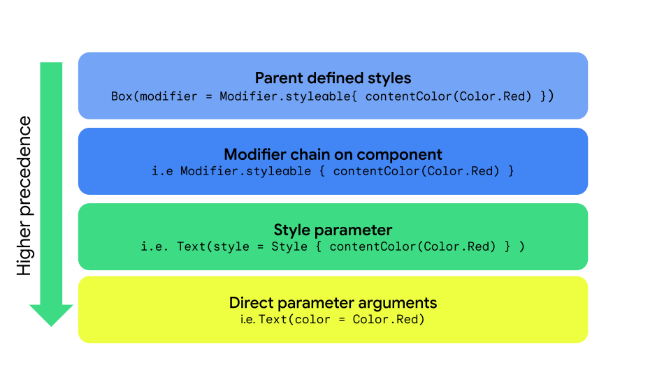
Style, styleable, and direct parameters.| Priority | Method | Effect |
|---|---|---|
| 1 (Highest) | Direct arguments on a composable | Overrides everything; for example, Text(color = Color.Red) |
| 2 | Style parameter | Local style overrides Text(style = Style { contentColor(Color.Red)} |
| 3 | Modifier chain | Modifier.styleable{ contentColor(Color.Red) on the component itself. |
| 4 (Lowest) | Parent styles | For properties that can be inherited (Typography/Color) passed down from the parent. |
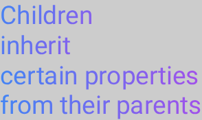
Parent styling
You can set text properties (such as contentColor) from the parent composable,
and they propagate to all child Text composables.
val styleState = remember { MutableStyleState(null) } Column( modifier = Modifier.styleable(styleState) { background(Color.LightGray) val blue = Color(0xFF4285F4) val purple = Color(0xFFA250EA) val colors = listOf(blue, purple) contentBrush(Brush.linearGradient(colors)) }, ) { BaseText("Children inherit", style = { width(60.dp) }) BaseText("certain properties") BaseText("from their parents") }
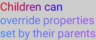
Child override of properties
You can also set styling on a specific Text composable. If the parent composable
has styling set, the styling set on the child composable overrides the
parent composable's styling.
val styleState = remember { MutableStyleState(null) } Column( modifier = Modifier.styleable(styleState) { background(Color.LightGray) val blue = Color(0xFF4285F4) val purple = Color(0xFFA250EA) val colors = listOf(blue, purple) contentBrush(Brush.linearGradient(colors)) }, ) { BaseText("Children can ", style = { contentBrush(Brush.linearGradient(listOf(Color.Red, Color.Blue))) }) BaseText("override properties") BaseText("set by their parents") }
Implement custom Style properties
You can create custom properties that map to existing Style definitions by using
extension functions on the StyleScope, as shown in the following example:
fun StyleScope.outlinedBackground(color: Color) { border(1.dp, color) background(color) }
Apply this new property within a Style definition:
val customExtensionStyle = Style { outlinedBackground(Color.Blue) }
Creating new styleable properties is unsupported. If your use case requires such support, submit a feature request.
Read CompositionLocal values
It's a common pattern to store design system tokens within a CompositionLocal,
to access the variables without needing to pass them as parameters. Styles
can access CompositionLocals to retrieve system-wide values within a style:
val buttonStyle = Style { contentPadding(12.dp) shape(RoundedCornerShape(50)) background(Brush.verticalGradient(LocalCustomColors.currentValue.background)) }