
This page describes how to implement basic FlexBox layouts.
Set up project
Add the
androidx.compose.foundation.layoutlibrary to your project'slib.versions.toml.[versions] compose = "1.12.0-beta01" [libraries] androidx-compose-foundation-layout = { group = "androidx.compose.foundation", name = "foundation-layout", version.ref = "compose" }Add the library dependency to your app's
build.gradle.kts.dependencies { implementation(libs.androidx.compose.foundation.layout) }
Create basic FlexBox layouts
Example 1: FlexBox lays out two Text elements that are centrally
aligned.
FlexBox( config = { direction(FlexDirection.Column) alignItems(FlexAlignItems.Center) } ) { Text(text = "Hello", fontSize = 48.sp) Text(text = "World!", fontSize = 48.sp) }

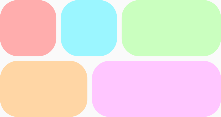
Example 2: FlexBox wraps five items onto two rows and grows them unequally
to fill the available space on each row. There is an 8.dp
gap, both vertically and horizontally, between the items.
FlexBox( config = { wrap(FlexWrap.Wrap) gap(8.dp) } ) { // All boxes have an intrinsic width of 100.dp // Some grow to fill any remaining space on the row. RedRoundedBox() BlueRoundedBox() GreenRoundedBox(modifier = Modifier.flex { grow(1.0f) }) OrangeRoundedBox(modifier = Modifier.flex { grow(1.0f) }) PinkRoundedBox(modifier = Modifier.flex { grow(1.0f) }) }
To learn more about FlexBox behavior, see Set container behavior and Set
item behavior.