

Compose כולל רכיבי Compose ומשנים מובנים לטיפול בתרחישי שימוש נפוצים באנימציה.
פונקציות מובנות של אנימציה
Compose מספקת כמה פונקציות Composable שמנפישות את ההופעה וההיעלמות של התוכן, וגם שינויים בפריסה.
הנפשה של הופעה והיעלמות
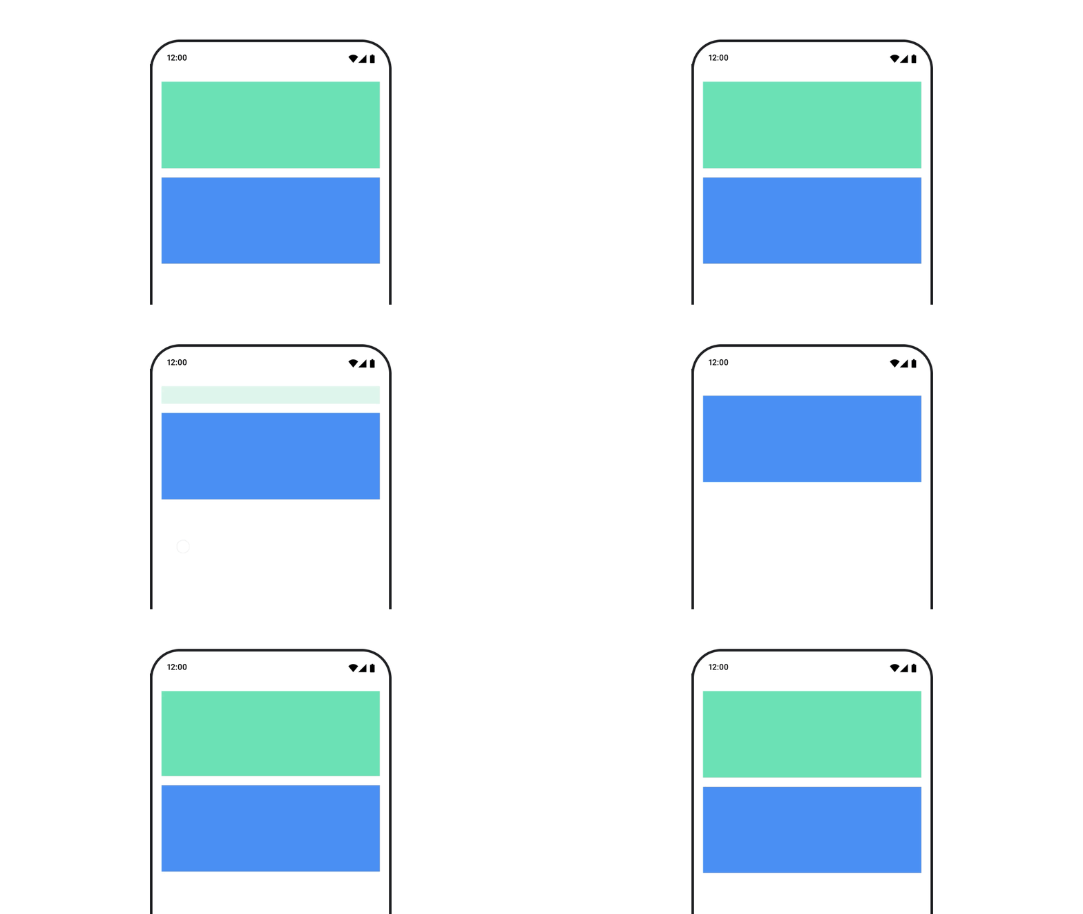
רכיב ה-Composable
AnimatedVisibility
מנפיש את ההופעה וההיעלמות של התוכן שלו.
var visible by remember { mutableStateOf(true) } // Animated visibility will eventually remove the item from the composition once the animation has finished. AnimatedVisibility(visible) { // your composable here // ... }
כברירת מחדל, התוכן מופיע בהדרגה ומתרחב, ונעלם בהדרגה ומתכווץ. כדי להתאים אישית את המעבר הזה, מציינים אובייקטים של EnterTransition ושל ExitTransition.
var visible by remember { mutableStateOf(true) } val density = LocalDensity.current AnimatedVisibility( visible = visible, enter = slideInVertically { // Slide in from 40 dp from the top. with(density) { -40.dp.roundToPx() } } + expandVertically( // Expand from the top. expandFrom = Alignment.Top ) + fadeIn( // Fade in with the initial alpha of 0.3f. initialAlpha = 0.3f ), exit = slideOutVertically() + shrinkVertically() + fadeOut() ) { Text( "Hello", Modifier .fillMaxWidth() .height(200.dp) ) }
כמו בדוגמה הקודמת, אפשר לשלב כמה אובייקטים של EnterTransition
או ExitTransition עם אופרטור +, וכל אחד מהם מקבל פרמטרים אופציונליים להתאמה אישית של ההתנהגות שלו. מידע נוסף זמין בדפי העזרה.
דוגמאות למעברים בין סצנות
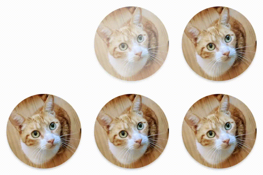

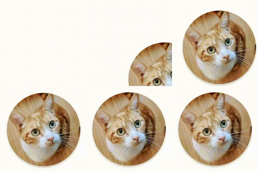

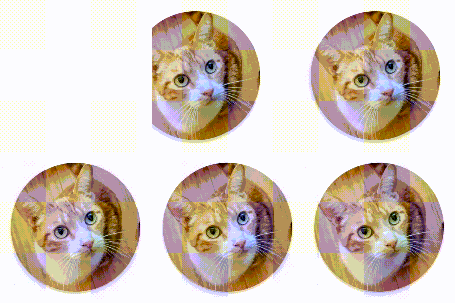





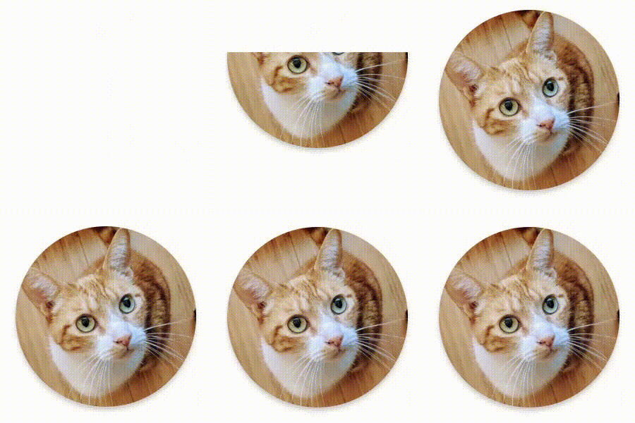

ב-AnimatedVisibility יש גם וריאציה שמקבלת ארגומנט MutableTransitionState. כך אפשר להפעיל אנימציה ברגע שהרכיב הקומפוזבילי AnimatedVisibility מתווסף לעץ הקומפוזיציה. הוא שימושי גם כדי לראות את מצב האנימציה.
// Create a MutableTransitionState<Boolean> for the AnimatedVisibility. val state = remember { MutableTransitionState(false).apply { // Start the animation immediately. targetState = true } } Column { AnimatedVisibility(visibleState = state) { Text(text = "Hello, world!") } // Use the MutableTransitionState to know the current animation state // of the AnimatedVisibility. Text( text = when { state.isIdle && state.currentState -> "Visible" !state.isIdle && state.currentState -> "Disappearing" state.isIdle && !state.currentState -> "Invisible" else -> "Appearing" } ) }
הוספת אנימציה לכניסה וליציאה לילדים
תוכן בתוך AnimatedVisibility (צאצאים ישירים או עקיפים) יכול להשתמש במאפיין שינוי animateEnterExit כדי לציין התנהגות שונה של אנימציה לכל אחד מהם. האפקט הוויזואלי של כל אחד מהצאצאים האלה הוא שילוב של האנימציות שצוינו ברכיב AnimatedVisibility composable ושל אנימציות הכניסה והיציאה של הצאצא עצמו.
var visible by remember { mutableStateOf(true) } AnimatedVisibility( visible = visible, enter = fadeIn(), exit = fadeOut() ) { // Fade in/out the background and the foreground. Box( Modifier .fillMaxSize() .background(Color.DarkGray) ) { Box( Modifier .align(Alignment.Center) .animateEnterExit( // Slide in/out the inner box. enter = slideInVertically(), exit = slideOutVertically() ) .sizeIn(minWidth = 256.dp, minHeight = 64.dp) .background(Color.Red) ) { // Content of the notification… } } }
במקרים מסוימים, יכול להיות שתרצו להגדיר את AnimatedVisibility כך שלא יחולו אנימציות בכלל, כדי שכל ילד יוכל להגדיר אנימציות ייחודיות משלו באמצעות animateEnterExit. כדי לעשות את זה, מציינים את EnterTransition.None ואת ExitTransition.None ב-AnimatedVisibility composable.
הוספת אנימציה בהתאמה אישית
אם רוצים להוסיף אפקטים מותאמים אישית של אנימציה מעבר לאנימציות המובנות של כניסה ויציאה, אפשר לגשת למופע הבסיסי Transition באמצעות המאפיין transition בתוך פונקציית ה-lambda של התוכן עבור AnimatedVisibility. כל מצבי האנימציה
שנוספו למופע Transition יפעלו בו-זמנית עם האנימציות enter
ו-exit של AnimatedVisibility. AnimatedVisibility ממתין עד שכל האנימציות ב-Transition מסתיימות לפני הסרת התוכן שלו.
אם יוצרים אנימציות יציאה בנפרד מ-Transition (למשל באמצעות animate*AsState), AnimatedVisibility לא יוכל להתחשב בהן, ולכן יכול להיות שהוא יסיר את רכיב התוכן לפני שהן יסתיימו.
var visible by remember { mutableStateOf(true) } AnimatedVisibility( visible = visible, enter = fadeIn(), exit = fadeOut() ) { // this: AnimatedVisibilityScope // Use AnimatedVisibilityScope#transition to add a custom animation // to the AnimatedVisibility. val background by transition.animateColor(label = "color") { state -> if (state == EnterExitState.Visible) Color.Blue else Color.Gray } Box( modifier = Modifier .size(128.dp) .background(background) ) }
מידע נוסף על שימוש ב-Transition לניהול אנימציות זמין במאמר הנפשת כמה מאפיינים בו-זמנית באמצעות מעבר.
הנפשה על סמך מצב היעד
ה-Composable AnimatedContent
מנפיש את התוכן שלו כשהוא משתנה בהתאם למצב היעד.
Row { var count by remember { mutableIntStateOf(0) } Button(onClick = { count++ }) { Text("Add") } AnimatedContent( targetState = count, label = "animated content" ) { targetCount -> // Make sure to use `targetCount`, not `count`. Text(text = "Count: $targetCount") } }
כברירת מחדל, התוכן הראשוני נחלש בהדרגה ואז התוכן של היעד מתחזק בהדרגה (ההתנהגות הזו נקראת fade through).
כדי להתאים אישית את אופן הפעולה של האנימציה, מציינים אובייקט ContentTransform לפרמטר transitionSpec. אפשר ליצור מופע של ContentTransform על ידי שילוב של אובייקט EnterTransition עם אובייקט ExitTransition באמצעות פונקציית ה-infix with. אפשר להחיל את SizeTransform על האובייקט ContentTransform על ידי צירוף שלו באמצעות פונקציית ה-infix using.
AnimatedContent( targetState = count, transitionSpec = { // Compare the incoming number with the previous number. if (targetState > initialState) { // If the target number is larger, it slides up and fades in // while the initial (smaller) number slides up and fades out. slideInVertically { height -> height } + fadeIn() togetherWith slideOutVertically { height -> -height } + fadeOut() } else { // If the target number is smaller, it slides down and fades in // while the initial number slides down and fades out. slideInVertically { height -> -height } + fadeIn() togetherWith slideOutVertically { height -> height } + fadeOut() }.using( // Disable clipping since the faded slide-in/out should // be displayed out of bounds. SizeTransform(clip = false) ) }, label = "animated content" ) { targetCount -> Text(text = "$targetCount") }
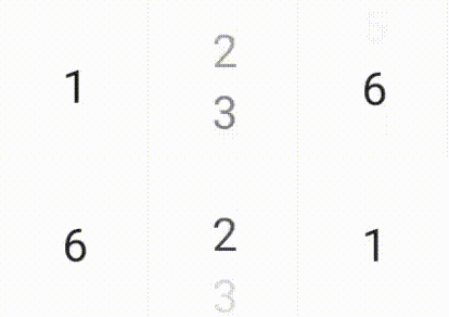
EnterTransition מגדיר איך תוכן היעד צריך להופיע, ו-ExitTransition מגדיר איך התוכן הראשוני צריך להיעלם. בנוסף לכל הפונקציות של EnterTransition ו-ExitTransition שזמינות ב-AnimatedVisibility, ב-AnimatedContent יש גם את slideIntoContainer ואת slideOutOfContainer.
אלה חלופות נוחות ל-slideInHorizontally/Vertically ול-slideOutHorizontally/Vertically שמחשבות את מרחק ההזזה על סמך הגדלים של התוכן המקורי והתוכן של AnimatedContent היעד.
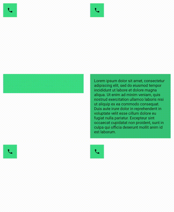
SizeTransform מגדיר את האופן שבו הגודל צריך להיות מונפש בין התוכן הראשוני לבין תוכן היעד. כשיוצרים את האנימציה, יש גישה גם לגודל ההתחלתי וגם לגודל היעד. SizeTransform קובע גם אם התוכן ייחתך לגודל הרכיב במהלך האנימציות.
var expanded by remember { mutableStateOf(false) } Surface( color = MaterialTheme.colorScheme.primary, onClick = { expanded = !expanded } ) { AnimatedContent( targetState = expanded, transitionSpec = { fadeIn(animationSpec = tween(150, 150)) togetherWith fadeOut(animationSpec = tween(150)) using SizeTransform { initialSize, targetSize -> if (targetState) { keyframes { // Expand horizontally first. IntSize(targetSize.width, initialSize.height) at 150 durationMillis = 300 } } else { keyframes { // Shrink vertically first. IntSize(initialSize.width, targetSize.height) at 150 durationMillis = 300 } } } }, label = "size transform" ) { targetExpanded -> if (targetExpanded) { Expanded() } else { ContentIcon() } } }
הוספת אנימציה למעברים של רכיבי צאצא בכניסה וביציאה
בדומה ל-AnimatedVisibility, מקש הצירוף animateEnterExit זמין בתוך פונקציית ה-lambda של התוכן AnimatedContent. אפשר להשתמש באפשרות הזו כדי להחיל את EnterAnimation ו-ExitAnimation על כל אחד מהצאצאים הישירים או העקיפים בנפרד.
הוספת אנימציה בהתאמה אישית
בדומה ל-AnimatedVisibility, השדה transition זמין בתוך פונקציית ה-lambda של התוכן AnimatedContent. אפשר להשתמש בזה כדי ליצור אפקט אנימציה מותאם אישית שפועל בו-זמנית עם המעבר AnimatedContent. פרטים נוספים זמינים במאמר בנושא updateTransition.
יצירת אנימציה למעבר בין שני פריסות
Crossfade יוצר אנימציה של מעבר בין שני פריסות עם אנימציית מעבר הדרגתי. כדי להחליף את התוכן באנימציית מעבר הדרגתי, צריך להחליף את הערך שמועבר לפרמטר current.
var currentPage by remember { mutableStateOf("A") } Crossfade(targetState = currentPage, label = "cross fade") { screen -> when (screen) { "A" -> Text("Page A") "B" -> Text("Page B") } }
אמצעי שינוי מובנים של אנימציות
Compose מספקת משנים להנפשת שינויים ספציפיים ישירות ברכיבים הניתנים להרכבה.
יצירת אנימציה לשינויים בגודל של רכיבים שאפשר להרכיב
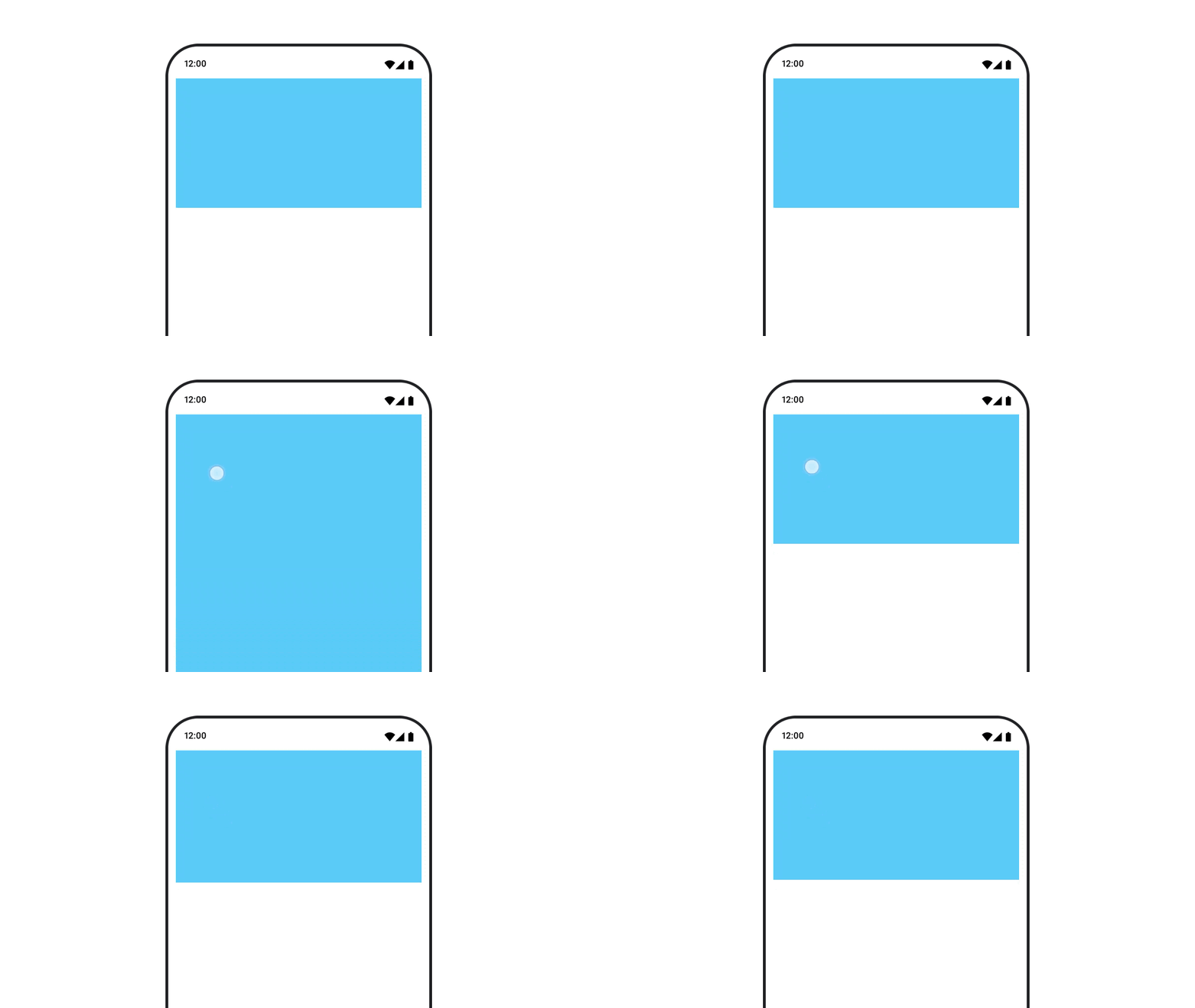
המשנה animateContentSize יוצר אנימציה של שינוי גודל.
var expanded by remember { mutableStateOf(false) } Box( modifier = Modifier .background(colorBlue) .animateContentSize() .height(if (expanded) 400.dp else 200.dp) .fillMaxWidth() .clickable( interactionSource = remember { MutableInteractionSource() }, indication = null ) { expanded = !expanded } ) { }
הנפשות של פריטים ברשימה
אם אתם רוצים להנפיש את הסידור מחדש של פריטים בתוך רשימה או רשת עצלה, כדאי לעיין במסמכי התיעוד בנושא אנימציה של פריטים בפריסה עצלה.
מומלץ בשבילך
- הערה: טקסט הקישור מוצג כש-JavaScript מושבת
- אנימציות מבוססות-ערך
- אנימציות ב-Compose
- תמיכה בכלי אנימציה {:#tooling}