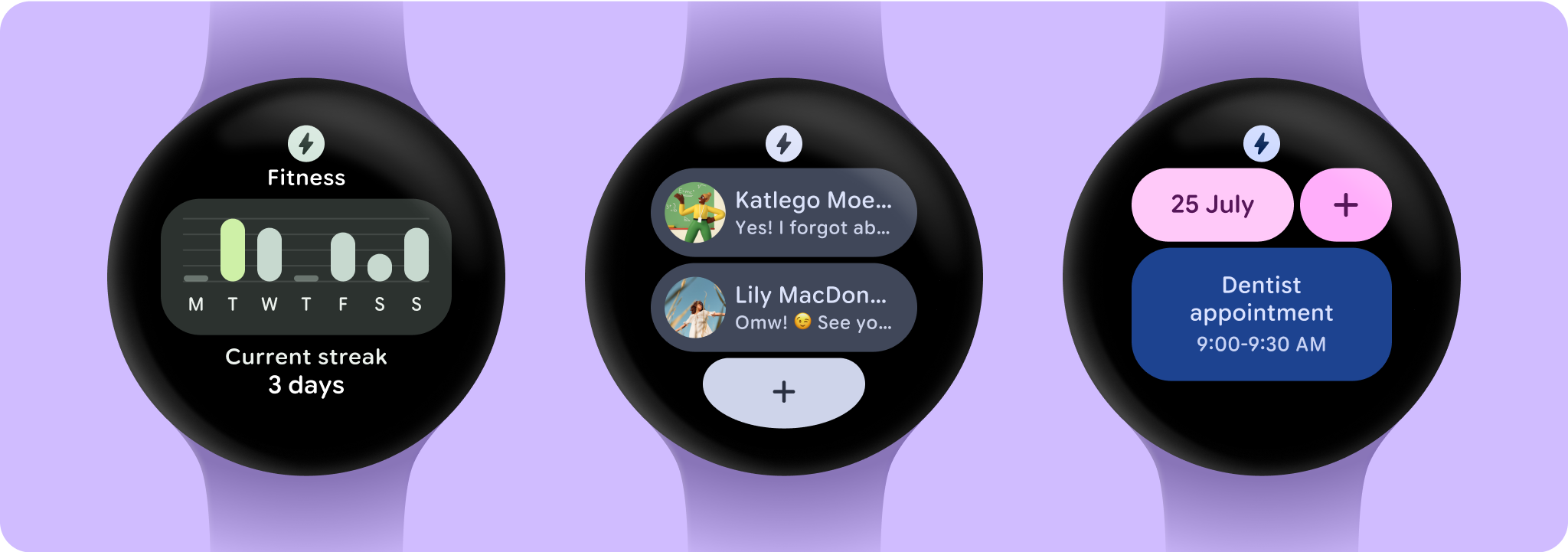
Tiles provide quick access to the information and actions users need to get things done. The tiles carousel is revealed by a swipe on the watch face, and additional swipes will switch between tiles. Tiles themselves cannot be scrolled.
Users can choose what tiles they want to see. There are tiles to check the weather, set a timer, track daily fitness progress, quick-start a workout, play a song, scan an upcoming meeting, and send a message to a favorite contact.

Instead of using Compose (or Views), Tiles are defined declaratively using Jetpack's protolayout and tiles libraries. Because Tiles are rendered in a separate, remote environment, they require different approaches to load, display, and update data within them. Their simplicity makes them straightforward to build, test, and deploy.
Core principles
Wear OS provides tiles as a way for you to show a small amount of key information, which users can read through after they glance at a tile for a few seconds. To provide this high-quality experience for users, follow these best practices:
- Don't overcrowd tiles with too much content. Instead, allow users to tap on tiles to learn more and take action on another surface in your app. See Include (at least) one container.
- Declaratively define your tile's layout and content. The system is responsible for the final rendering.
- Don't fetch content frequently or start long-running asynchronous work in your tile service. To perform work which may take some time to complete—such as network calls—use WorkManager to schedule background tasks, and cache or store the results in local storage.
Recommended for you
- Note: link text is displayed when JavaScript is off
- Show dynamic updates in tiles
- Migrate to ProtoLayout namespaces
