
Canonical layouts are proven, versatile layouts that provide an optimal user experience on a variety of form factors.

The canonical layouts support small screen phones as well as tablets, foldables, and ChromeOS devices. Derived from Material Design guidance, the layouts are aesthetic as well as functional.
The Android framework includes specialized components that make implementation of the layouts straightforward and reliable.
The canonical layouts create engaging, productivity‑enhancing UIs that form the foundation of great apps.
List-detail
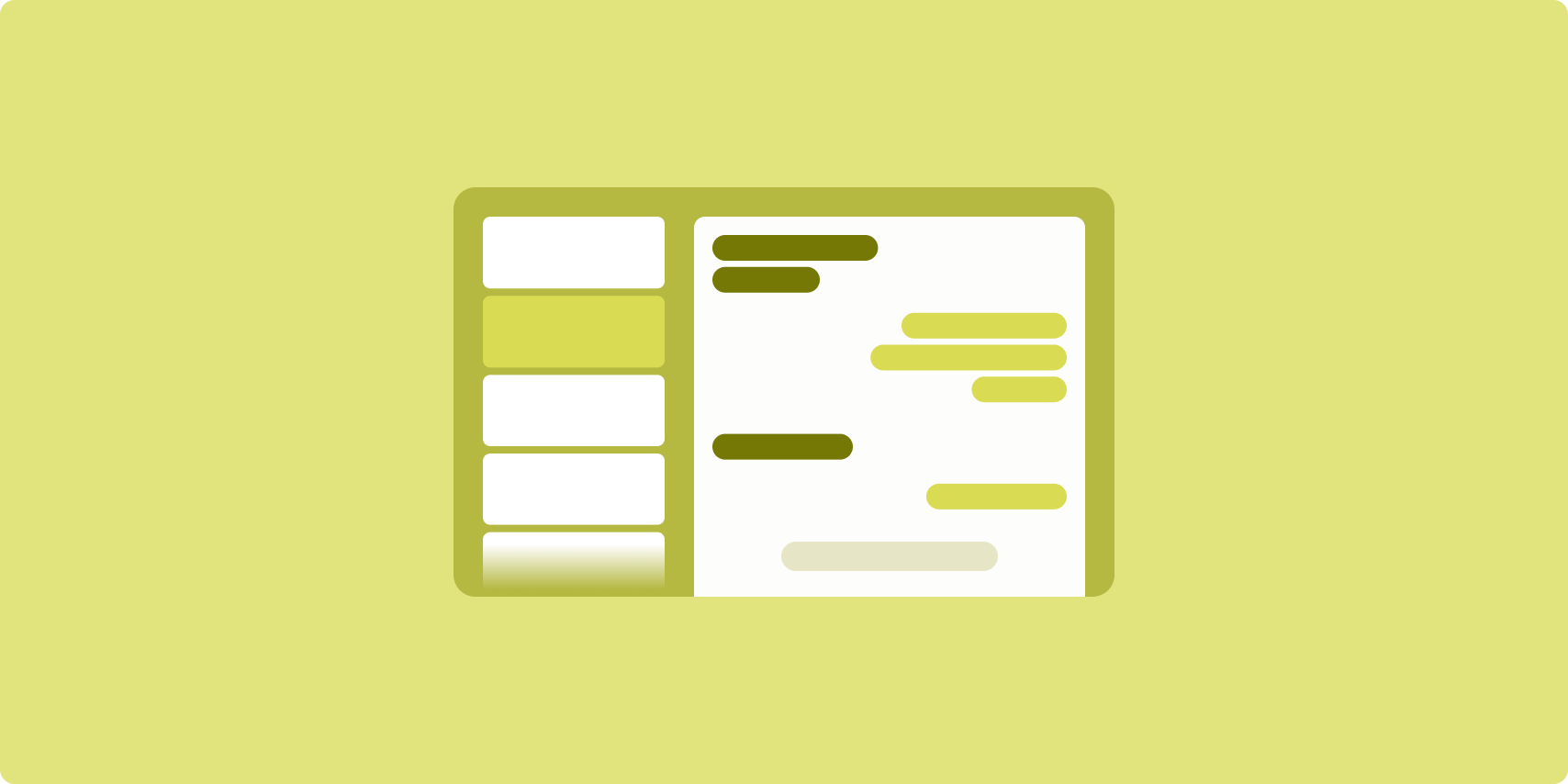
The list-detail layout enables users to explore lists of items that have descriptive, explanatory, or other supplementary information—the item detail.
The layout divides the app window into two side-by-side panes: one for the list, one for the detail. Users select items from the list to display the item detail. Deep links in the detail reveal additional content in the detail pane.
Expanded-width displays (see Use window size classes) accommodate both the list and detail at the same time. Selection of a list item updates the detail pane to show the related content for the selected item.
Medium- and compact-width displays show either the list or the detail, depending on user interaction with the app. When just the list is visible, selection of a list item displays the detail in place of the list. When just the detail is visible, pressing the back button redisplays the list.
Configuration changes such as device orientation changes or app window size changes can change the display's window size class. A list‑detail layout responds accordingly, preserving app state:
- If an expanded-width display showing both the list and detail panes narrows to medium or compact, the detail pane remains visible and the list pane is hidden
- If a medium- or compact-width display has just the detail pane visible and the window size class widens to expanded, the list and detail are shown together, and the list indicates that the item corresponding to the content in the detail pane is selected
- If a medium- or compact-width display has just the list pane visible and widens to expanded, the list and a placeholder detail pane are shown together
List-detail is ideal for messaging apps, contact managers, interactive media browsers or any app where the content can be organized as a list of items that reveal additional information.
Implementation
يتيح النموذج التصريحي في Compose منطق فئة حجم النافذة الذي يحدّد ما إذا كان سيتم عرض لوحتي القائمة والتفاصيل في الوقت نفسه (عندما تكون فئة حجم النافذة الموسّعة) أو لوحة القائمة أو التفاصيل فقط (عندما تكون فئة حجم النافذة متوسطة أو صغيرة).
لضمان تدفّق البيانات في اتجاه واحد، ارفع مستوى جميع الحالات، بما في ذلك فئة حجم النافذة الحالية وتفاصيل عنصر القائمة المحدّد (إن وُجد)، حتى تتمكّن جميع العناصر القابلة للإنشاء من الوصول إلى البيانات وعرضها بشكل صحيح.
عند عرض لوحة التفاصيل فقط على أحجام النوافذ الصغيرة، أضِف BackHandler
لإزالة لوحة التفاصيل وعرض لوحة القائمة فقط. لا يشكّل BackHandler جزءًا من التنقّل العام في التطبيق لأنّ المعالج يعتمد على فئة حجم النافذة وحالة التفاصيل المحدّدة.
ListDetailPaneScaffold هي دالة قابلة للإنشاء عالية المستوى تعمل على تبسيط عملية تنفيذ تصاميم عرض على شكل قائمة مع تفاصيل. تتعامل هذه السمة تلقائيًا مع منطق اللوحات استنادًا إلى فئات حجم النافذة، كما تتيح التنقّل بين اللوحات.
في ما يلي عملية تنفيذ بسيطة باستخدام ListDetailPaneScaffold:
@OptIn(ExperimentalMaterial3AdaptiveApi::class) @Composable fun MyListDetailPaneScaffold() { val navigator = rememberListDetailPaneScaffoldNavigator() ListDetailPaneScaffold( directive = navigator.scaffoldDirective, value = navigator.scaffoldValue, listPane = { // Listing Pane }, detailPane = { // Details Pane } ) }
في ما يلي المكوّنات الرئيسية في هذا المثال:
rememberListDetailPaneScaffoldNavigator: تنشئ أداة تنقّل لإدارة التنقّل بين لوحتي القائمة والتفاصيل.-
listPane: تعرض هذه السمة قائمة بالسلع. -
detailPane: تعرض هذه السمة محتوى عنصر محدّد.
للاطّلاع على أمثلة تفصيلية حول التنفيذ، يُرجى مراجعة:
- دليل المطوّر إنشاء عرض على شكل قائمة مع تفاصيل
- نموذج list-detail-compose
Feed
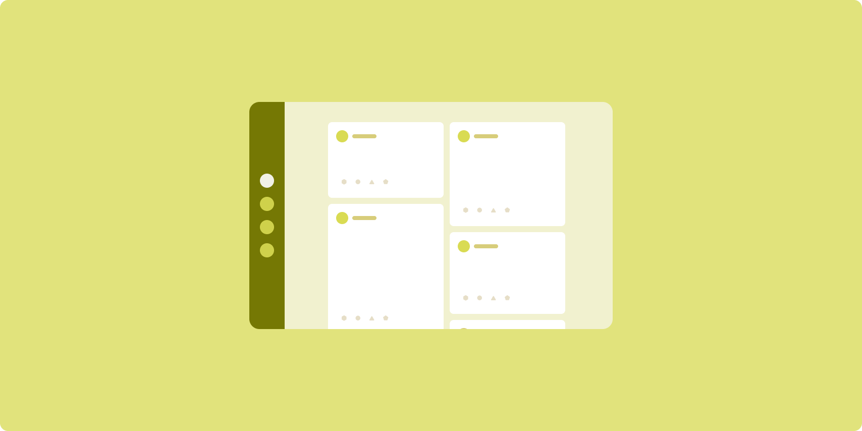
A feed layout arranges equivalent content elements in a configurable grid for quick, convenient viewing of a large amount of content.
Size and position establish relationships among the content elements.
Content groups are created by making elements the same size and positioning them together. Attention is drawn to elements by making them larger than nearby elements.
Cards and lists are common components of feed layouts.
A feed layout supports displays of almost any size because the grid can adapt from a single, scrolling column to a multi‑column scrolling feed of content.
Feeds are especially well suited for news and social media apps.
Implementation
تتألف الخلاصة من عدد كبير من عناصر المحتوى في حاوية قابلة للتمرير عموديًا مرتّبة في شبكة. تعرض القوائم الكسولة عددًا كبيرًا من العناصر في أعمدة أو صفوف بكفاءة. تعرض الشبكات الكسولة العناصر في شبكات، وتتيح إمكانية ضبط أحجام العناصر ومدى اتساعها.
اضبط أعمدة التخطيط الشبكي استنادًا إلى مساحة العرض المتاحة لضبط الحد الأدنى المسموح به لعرض عناصر الشبكة. عند تحديد عناصر الشبكة، اضبط عدد الأعمدة التي تشغلها بعض العناصر لتسليط الضوء عليها أكثر من غيرها.
بالنسبة إلى عناوين الأقسام أو الفواصل أو العناصر الأخرى المصمّمة لتشغل العرض الكامل للخلاصة، استخدِم maxLineSpan لتشغل العرض الكامل للتصميم.
على الشاشات ذات العرض المضغوط التي لا تتوفّر فيها مساحة كافية لعرض أكثر من عمود واحد، يتصرف LazyVerticalGrid تمامًا مثل LazyColumn.
في ما يلي عملية تنفيذ بسيطة باستخدام LazyVerticalGrid:
@Composable fun MyFeed(names: List<String>) { LazyVerticalGrid( // GridCells.Adaptive automatically adapts column count based on available width columns = GridCells.Adaptive(minSize = 180.dp), ) { items(names) { name -> Text(name) } } }
يكمن مفتاح الخلاصة التكيّفية في إعداد columns.
تنشئ GridCells.Adaptive(minSize = 180.dp) شبكة يكون فيها كل عمود بعرض 180.dp على الأقل. تعرض الشبكة بعد ذلك أكبر عدد ممكن من الأعمدة التي يمكن أن تتسع في المساحة المتاحة.
للحصول على مثال على التنفيذ، اطّلِع على نموذج الخلاصة باستخدام Compose.
Supporting pane

Supporting pane layout organizes app content into primary and secondary display areas.
The primary display area occupies the majority of the app window (typically about two thirds) and contains the main content. The secondary display area is a pane that takes up the remainder of the app window and presents content that supports the main content.
Supporting pane layouts work well on expanded-width displays (see Use window size classes) in landscape orientation. Medium- or compact‑width displays support showing both the primary and secondary display areas if the content is adaptable to narrower display spaces, or if the additional content can be initially hidden in a bottom or side sheet accessible by means of a control such as a menu or button.
A supporting pane layout differs from a list‑detail layout in the relationship of the primary and secondary content. Secondary pane content is meaningful only in relation to the primary content; for example, a supporting pane tool window is irrelevant by itself. The supplementary content in the detail pane of a list‑detail layout, however, is meaningful even without the primary content, for example, the description of a product from a product listing.
Use cases for supporting pane include:
- Productivity apps: A document or spreadsheet accompanied by reviewer comments in a supporting pane
- Media apps: A streaming video complemented by a list of related videos in a supporting pane, or the depiction of an album of music supplemented with a playlist
- Tools and settings: A media editing tool with palettes, effects, and other settings in a support pane
Implementation
يتوافق Compose مع منطق فئة حجم النافذة، ما يتيح لك تحديد ما إذا كنت تريد عرض المحتوى الرئيسي والمحتوى الداعم في الوقت نفسه أو وضع المحتوى الداعم في مكان بديل.
يجب عرض جميع الحالات، بما في ذلك فئة حجم النافذة الحالية والمعلومات ذات الصلة بالبيانات في المحتوى الرئيسي والمحتوى الداعم.
بالنسبة إلى الشاشات ذات العرض المضغوط، ضَع المحتوى الداعم أسفل المحتوى الرئيسي أو داخل ورقة في أسفل الشاشة. بالنسبة إلى العروض المتوسطة والموسّعة، ضَع المحتوى الثانوي بجانب المحتوى الرئيسي، مع تحديد حجمه بشكل مناسب استنادًا إلى المحتوى والمساحة المتاحة. بالنسبة إلى العرض المتوسط، قسِّم مساحة العرض بالتساوي بين المحتوى الرئيسي والمحتوى الداعم. بالنسبة إلى العرض الموسّع، خصِّص 70% من المساحة للمحتوى الرئيسي و30% للمحتوى الداعم.
SupportingPaneScaffold هو عنصر مركّب عالي المستوى يسهّل تنفيذ تنسيقات اللوحات الجانبية المتوافقة. يتعامل العنصر القابل للإنشاء تلقائيًا مع منطق اللوحة
استنادًا إلى فئات حجم النافذة، ويعرض اللوحات جنبًا إلى جنب على الشاشات الكبيرة
أو يخفي اللوحة الثانوية على الشاشات الصغيرة. يتيح لك SupportingPaneScaffold أيضًا التنقّل بين اللوحات.
في ما يلي عملية تنفيذ بسيطة:
@OptIn(ExperimentalMaterial3AdaptiveApi::class) @Composable fun MySupportingPaneScaffold() { // Creates and remembers a navigator to control pane visibility and navigation val navigator = rememberSupportingPaneScaffoldNavigator() SupportingPaneScaffold( // Directive and value help control pane visibility based on screen size and state directive = navigator.scaffoldDirective, value = navigator.scaffoldValue, mainPane = { // Main Pane for the primary content }, supportingPane = { //Supporting Pane for supplementary content } ) }
-
rememberSupportingPaneScaffoldNavigator: عنصر قابل للإنشاء ينشئ أداة تنقّل لإدارة إمكانية رؤية اللوحة (على سبيل المثال، إخفاء اللوحة الثانوية أو عرضها على الشاشات الصغيرة) -
mainPane: دالة مركّبة تعرض المحتوى الأساسي -
supportingPane: عنصر مركّب يعرض المحتوى التكميلي
للاطّلاع على أمثلة تفصيلية حول التنفيذ، يُرجى مراجعة:
Additional resources
- Material Design — Canonical layouts