
ConstraintLayout เป็นเลย์เอาต์ที่ช่วยให้คุณวางคอมโพสได้โดยสัมพันธ์กับคอมโพสอื่นๆ บนหน้าจอ ซึ่งเป็นทางเลือกแทนการใช้
Row, Column, Box, และ องค์ประกอบเลย์เอาต์ที่กำหนดเองอื่นๆ หลายรายการที่ซ้อนกัน
ในระบบ View นั้น ConstraintLayout เป็นวิธีที่แนะนำในการสร้างเลย์เอาต์ขนาดใหญ่และซับซ้อน เนื่องจากลำดับชั้นการแสดงผลแบบราบมีประสิทธิภาพดีกว่ามุมมองที่ซ้อนกัน อย่างไรก็ตาม ปัญหานี้จะไม่เกิดขึ้นใน Compose ซึ่งสามารถจัดการลำดับชั้นของเลย์เอาต์ที่ซับซ้อนได้อย่างมีประสิทธิภาพ ดังนั้น ConstraintLayout จึงไม่เป็นประโยชน์เท่าที่ควร
เริ่มต้นใช้งาน ConstraintLayout
หากต้องการใช้ ConstraintLayout ใน Compose คุณต้องเพิ่มทรัพยากร Dependency นี้ใน
build.gradle (นอกเหนือจากการตั้งค่า Compose):
implementation "androidx.constraintlayout:constraintlayout-compose:$constraintlayout_compose_version"
ConstraintLayout ใน Compose ทำงานในลักษณะต่อไปนี้โดยใช้
DSL:
- สร้างการอ้างอิงสำหรับคอมโพสแต่ละรายการใน
ConstraintLayoutโดยใช้createRefs()หรือcreateRefFor() - ระบบจะระบุข้อจำกัดโดยใช้ตัวแก้ไข
constrainAs()ซึ่งใช้การอ้างอิงเป็นพารามิเตอร์และช่วยให้คุณระบุข้อจำกัดในแลมบ์ดาของเนื้อหาได้ - ระบบจะระบุข้อจำกัดโดยใช้
linkTo()หรือเมธอดที่เป็นประโยชน์อื่นๆ parentเป็นการอ้างอิงที่มีอยู่ซึ่งใช้เพื่อระบุข้อจำกัดต่อคอมโพสConstraintLayoutเองได้
ตัวอย่างคอมโพสที่ใช้ ConstraintLayout มีดังนี้
@Composable fun ConstraintLayoutContent() { ConstraintLayout { // Create references for the composables to constrain val (button, text) = createRefs() Button( onClick = { /* Do something */ }, // Assign reference "button" to the Button composable // and constrain it to the top of the ConstraintLayout modifier = Modifier.constrainAs(button) { top.linkTo(parent.top, margin = 16.dp) } ) { Text("Button") } // Assign reference "text" to the Text composable // and constrain it to the bottom of the Button composable Text( "Text", Modifier.constrainAs(text) { top.linkTo(button.bottom, margin = 16.dp) } ) } }
โค้ดนี้จะจำกัดด้านบนของ Button ให้สัมพันธ์กับองค์ประกอบระดับบนสุดโดยมีระยะขอบ 16.dp และจำกัด Text ให้สัมพันธ์กับด้านล่างของ Button โดยมีระยะขอบ 16.dp เช่นกัน
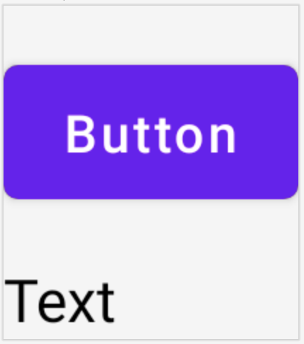
Button และคอมโพส Text ที่จำกัดให้สัมพันธ์กันใน
ConstraintLayout
API ที่แยกออกจากกัน
ในตัวอย่าง ConstraintLayout ระบบจะระบุข้อจำกัดแบบอินไลน์ด้วยตัวแก้ไขในคอมโพสที่ใช้ข้อจำกัด อย่างไรก็ตาม มีบางกรณีที่คุณควรแยกข้อจำกัดออกจากเลย์เอาต์ที่ใช้ข้อจำกัด
เช่น คุณอาจต้องการเปลี่ยนข้อจำกัดตามการกำหนดค่าหน้าจอ หรือสร้างภาพเคลื่อนไหวระหว่างชุดข้อจำกัด 2 ชุด
สำหรับกรณีเช่นนี้ คุณสามารถใช้ ConstraintLayout ในลักษณะอื่นได้ดังนี้
- ส่ง
ConstraintSetเป็นพารามิเตอร์ไปยังConstraintLayout - กำหนดการอ้างอิงที่สร้างขึ้นใน
ConstraintSetให้กับคอมโพสโดยใช้ตัวแก้ไขlayoutId
@Composable fun DecoupledConstraintLayout() { BoxWithConstraints { val constraints = if (minWidth < 600.dp) { decoupledConstraints(margin = 16.dp) // Portrait constraints } else { decoupledConstraints(margin = 32.dp) // Landscape constraints } ConstraintLayout(constraints) { Button( onClick = { /* Do something */ }, modifier = Modifier.layoutId("button") ) { Text("Button") } Text("Text", Modifier.layoutId("text")) } } } private fun decoupledConstraints(margin: Dp): ConstraintSet { return ConstraintSet { val button = createRefFor("button") val text = createRefFor("text") constrain(button) { top.linkTo(parent.top, margin = margin) } constrain(text) { top.linkTo(button.bottom, margin) } } }
จากนั้นเมื่อต้องการเปลี่ยนข้อจำกัด คุณก็เพียงแค่ส่ง ConstraintSet อื่น
แนวคิดของ ConstraintLayout
ConstraintLayout มีแนวคิดต่างๆ เช่น เส้นบอกแนว สิ่งกีดขวาง และเชน ซึ่งช่วยในการจัดตำแหน่งองค์ประกอบภายในคอมโพส
เส้นบอกแนว
เส้นบอกแนวเป็นตัวช่วยด้านภาพขนาดเล็กสำหรับการออกแบบเลย์เอาต์ คุณสามารถจำกัดคอมโพสให้สัมพันธ์กับเส้นบอกแนวได้ เส้นบอกแนวมีประโยชน์สำหรับการจัดตำแหน่งองค์ประกอบที่
กำหนดไว้ dp หรือ percentage ภายในคอมโพสระดับบนสุด
เส้นบอกแนวมี 2 ประเภท ได้แก่ แนวตั้งและแนวนอน เส้นบอกแนวแนวนอน 2 เส้นคือ top และ bottom ส่วนเส้นบอกแนวแนวตั้ง 2 เส้นคือ start และ end
ConstraintLayout { // Create guideline from the start of the parent at 10% the width of the Composable val startGuideline = createGuidelineFromStart(0.1f) // Create guideline from the end of the parent at 10% the width of the Composable val endGuideline = createGuidelineFromEnd(0.1f) // Create guideline from 16 dp from the top of the parent val topGuideline = createGuidelineFromTop(16.dp) // Create guideline from 16 dp from the bottom of the parent val bottomGuideline = createGuidelineFromBottom(16.dp) }
หากต้องการสร้างเส้นบอกแนว ให้ใช้ createGuidelineFrom* กับประเภทเส้นบอกแนวที่ต้องการ ซึ่งจะสร้างการอ้างอิงที่ใช้ในบล็อก Modifier.constrainAs() ได้
สิ่งกีดขวาง
สิ่งกีดขวางอ้างอิงคอมโพสหลายรายการเพื่อสร้างเส้นบอกแนวเสมือน ตามวิดเจ็ตที่อยู่ไกลที่สุดในด้านที่ระบุ
หากต้องการสร้างสิ่งกีดขวาง ให้ใช้ createTopBarrier() (หรือ createBottomBarrier(), createEndBarrier(), createStartBarrier()) แล้วระบุการอ้างอิงที่ควรประกอบกันเป็นสิ่งกีดขวาง
ConstraintLayout { val constraintSet = ConstraintSet { val button = createRefFor("button") val text = createRefFor("text") val topBarrier = createTopBarrier(button, text) } }
จากนั้นคุณจะใช้สิ่งกีดขวางในบล็อก Modifier.constrainAs() ได้
โซ่
โซ่มีลักษณะการทำงานคล้ายกลุ่มในแกนเดียว (แนวนอนหรือ แนวตั้ง) ส่วนแกนอื่นๆ สามารถจำกัดได้อย่างอิสระ
หากต้องการสร้างเชน ให้ใช้ createVerticalChain หรือ
createHorizontalChain:
ConstraintLayout { val constraintSet = ConstraintSet { val button = createRefFor("button") val text = createRefFor("text") val verticalChain = createVerticalChain(button, text, chainStyle = ChainStyle.Spread) val horizontalChain = createHorizontalChain(button, text) } }
จากนั้นคุณจะใช้โซ่ในบล็อก Modifier.constrainAs() ได้
คุณสามารถกำหนดค่าเชนด้วย ChainStyles ที่แตกต่างกัน ซึ่งจะกำหนดวิธีจัดการกับพื้นที่รอบๆ คอมโพส เช่น
ChainStyle.Spread: ระบบจะกระจายพื้นที่อย่างเท่าเทียมกันในคอมโพสทั้งหมด รวมถึงพื้นที่ว่างก่อนคอมโพสแรกและหลังคอมโพสสุดท้ายChainStyle.SpreadInside: ระบบจะกระจายพื้นที่อย่างเท่าเทียมกันในคอมโพสทั้งหมด โดยไม่มีพื้นที่ว่างก่อนคอมโพสแรกหรือหลังคอมโพสสุดท้ายChainStyle.Packed: ระบบจะกระจายพื้นที่ก่อนคอมโพสแรกและหลังคอมโพสสุดท้าย โดยคอมโพสจะอยู่ติดกันโดยไม่มีพื้นที่คั่นระหว่างกัน