UI Package
UI Packages are a new flexible way to exchange UI information. Designers use the Relay for Figma plugin to create UI Packages from components in Figma. Doing this declares the design ready for use by developers. Designers then provide developers with the URL to their Figma design file.
Developers use the Android Studio plugin to import UI Packages from the Figma design file. In an Android Studio project, a UI Package contains declarative descriptions of the imported Figma components along with associated assets, including font files, images, and SVGs.
UI Packages are persistent artifacts and can be committed to source control.
When a developer imports a Figma package in an Android Studio project, files are
added to the project within the ui-packages folder. Here is a sample imported
UI Package:
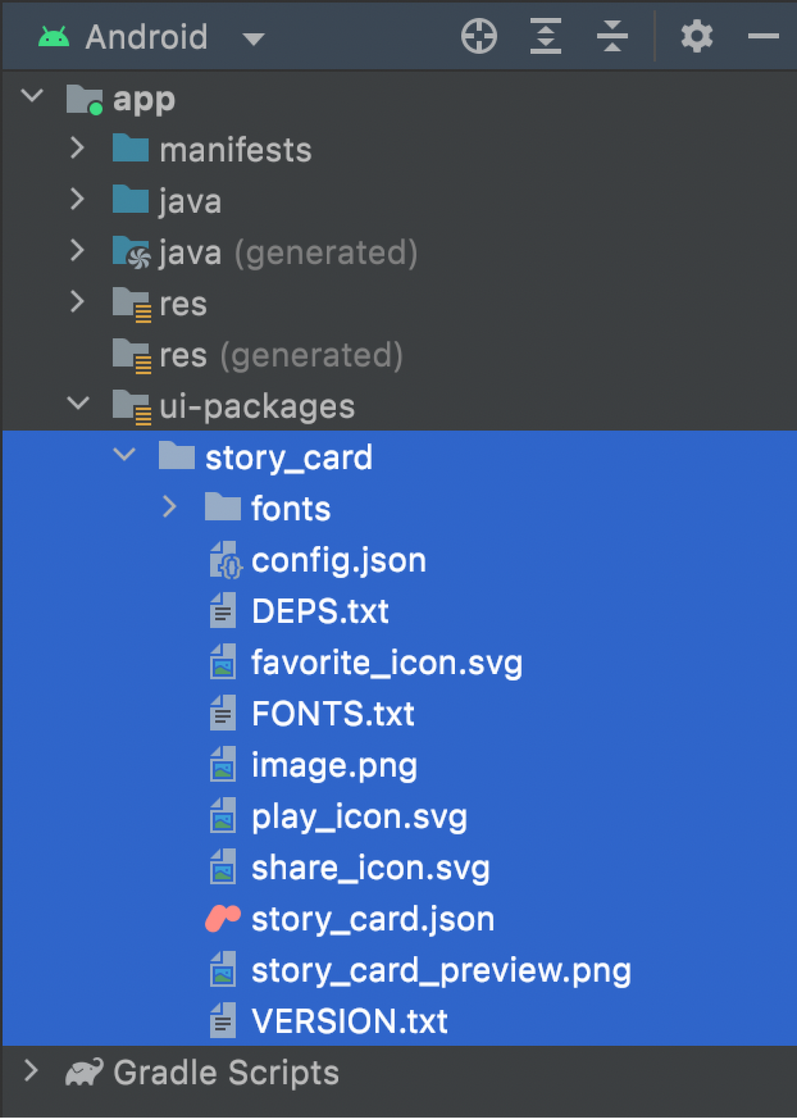
A project with an imported UI Package contains the following files:
[component_name].json— A JSON file describing the component (for example,story_card.json).config.json— Stores metadata for the specific UI Package.fonts/— Folder where the font assets used by the component are stored, if any.*.png— Image assets used in the component (for example,menu.png), if any.[component_name]_preview.png— Preview image of the component (for example,story_card_preview.png).*.svg— Vector graphic assets used in the component (for example, a triangle), if any.FONTS.txt— A list of fonts used, if any.DEPS.txt— Names of any child components.VERSION.txt— The version of Relay used to create and import the UI Package.
These are stored under src/main/ui-packages/[package_name].
Removing UI Packages
To remove a UI Package from the project, you can delete the folder under
ui-packages/. Re-building the project after removing the folder removes its
generated code as well.
Generated code folder structure
When the project builds, these UI Packages are turned into generated code
containing @Composable functions that the developer can invoke. These are
stored under build/generated/. In the Android view, these show up as java
(generated) and res under your module directory (in this case, the app
directory).
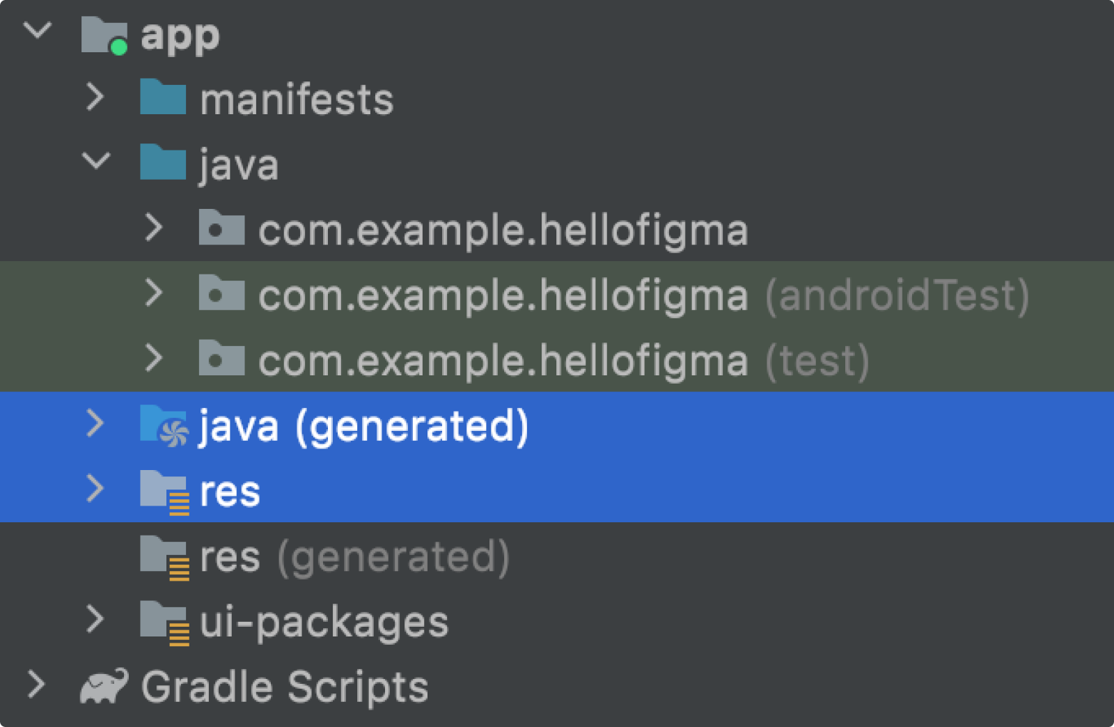
The following screenshots walk through the files in this directory:
Resources, such as fonts and images, are copied to
build/generated/res/relay/.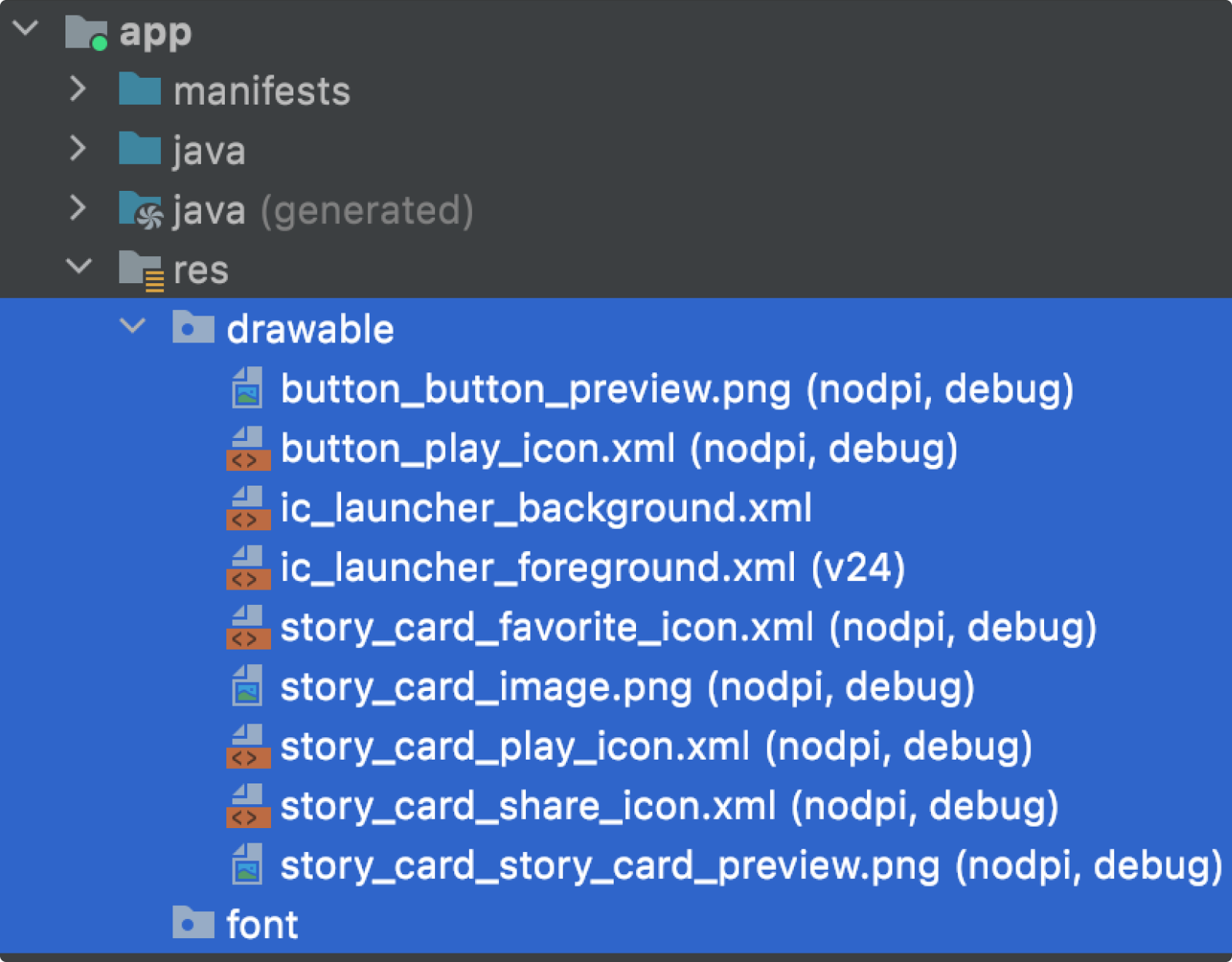
Each UI Package has its generated code placed under
build/generated/source/relay/. Each UI Package’s generated code folder has a single file corresponding to the component that was imported. It also contains a single file ending inFonts.kt, which contains references to the font assets used by the component.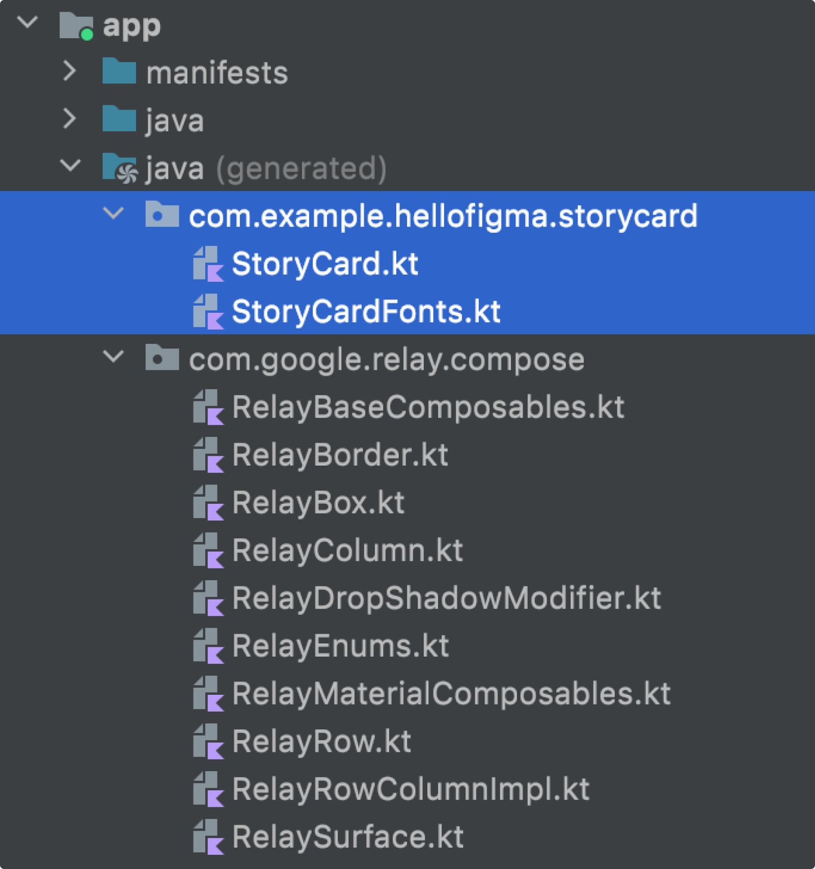
There is also a runtime library,
com.google.relay.compose, which provides functionality used by the generated code.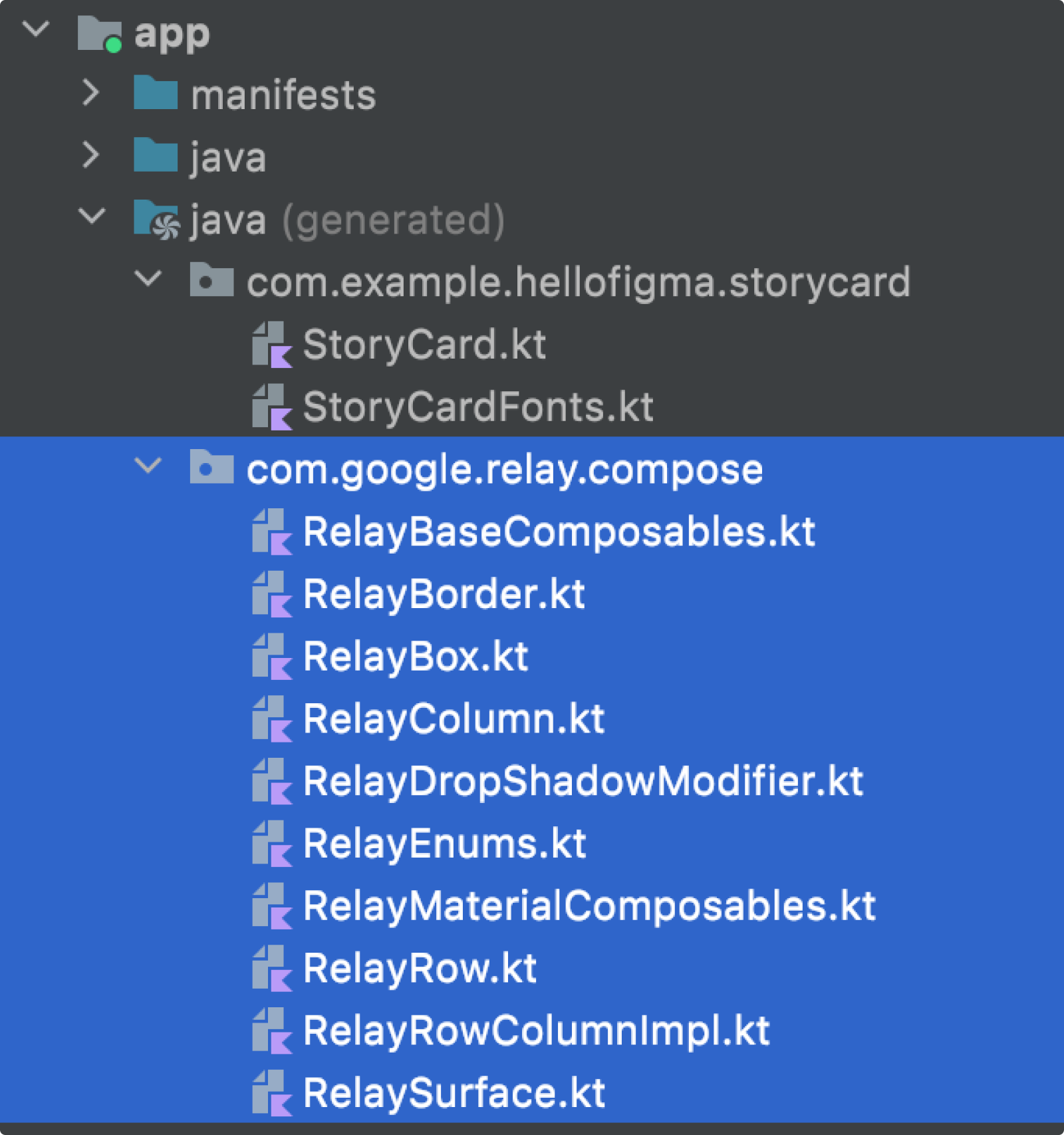
Generated code structure
Composables
Components in Figma are made up of layers. For example, this design contains a frame layer Hello Card, which contains two child layers, Image (an image layer) and Title (a text layer):

When this design is translated into code, we create separate composable functions for each layer, where the name of the Figma layer is the name of the composable function (modified to conform to Kotlin syntax). The layers are translated as follows:
Hello Card layer:
@Composable
fun HelloCard(
  modifier: Modifier = Modifier,
  title: String
) {
  TopLevel(modifier = modifier) {
      Image()
      Title(title = title)
  }
]
Image layer:
@Composable
fun Image(modifier: Modifier = Modifier) {
  Image(...)
}
Title layer:
@Composable
fun Title(
  title: String,
  modifier: Modifier = Modifier
) {
  Text(...)
}
Translated Figma variants and parameters
If a Figma component has multiple variants, then the generated code includes an enum for each variant property. The values in each variant enum correspond to that variant property’s value. The composable includes a parameter for each variant enum.
// Design to select for NewsCard
enum class View {
    HeroItem,
    ArticleItem,
    AudioItem
}

/**
 *   This composable was generated from the UI Package 'news_card'.
 *   Generated code; do not edit directly
 */
@Composable
fun NewsCard(
    modifier: Modifier = Modifier,
    view: View = View.HeroItem,
    onNewsCardTapped: () -> Unit = {},
    thumbnail: Painter,
    headline: String,
    author: String,
    date: String,
    onMenuTapped: () -> Unit = {}
) {
       when (view) {
           View.HeroItem -> TopLevelViewHeroItem(...) {
               ContentViewHeroItem { ... }
           }
           View.ArticleItem -> TopLevelViewArticleItem(...) {
               ContentViewArticleItem { ... }
           }
           View.AudioItem -> TopLevelViewAudioItem(...) {
               ContentViewAudioItem { ... }
           }
       }
   }
}
Each content parameter and interaction handler of a Figma component is
translated into a parameter of the composable. The NewsCard composable below
has four content parameters (one image and three strings) and two interaction
handlers (the last two parameters).
/**
 *   This composable was generated from the UI Package 'news_card'.
 *   Generated code; do not edit directly
 */
@Composable
fun NewsCard(
    modifier: Modifier = Modifier,
    view: View = View.HeroItem,
    thumbnail: Painter,
    headline: String,
    author: String,
    date: String,
    onNewsCardTapped: () -> Unit = {},
    onMenuTapped: () -> Unit = {}
) {...}
Recommended for you
- Note: link text is displayed when JavaScript is off
- Limitations and troubleshooting
- Android Studio workflow
- Preview your UI with Composable previews
