
While Material is our recommended design system and Jetpack Compose ships an implementation of Material, you are not forced to use it. Material is built entirely on public APIs, so it's possible to create your own design system in the same manner.
There are several approaches you might take:
- Extend
MaterialThemewith additional theming values. - Replace one or more Material systems —
Colors,Typography, orShapes— with custom implementations while keeping the others. - Implement a fully custom design system to replace
MaterialTheme.
You may also want to continue using Material components with a custom design system. It's possible to do this but there are things to keep in mind to suit the approach you've taken.
To learn more about the lower-level constructs and APIs used by MaterialTheme
and custom design systems, check out the Anatomy of a theme in Compose guide.
Extend Material Theming
Compose Material closely models Material Theming to make it straightforward and type-safe to follow the Material guidelines. However, it's possible to extend the color, typography, and shape sets with additional values. The simplest approach is to add extension properties:
// Use with MaterialTheme.colorScheme.snackbarAction val ColorScheme.snackbarAction: Color @Composable get() = if (isSystemInDarkTheme()) Red300 else Red700 // Use with MaterialTheme.typography.textFieldInput val Typography.textFieldInput: TextStyle get() = TextStyle(/* ... */) // Use with MaterialTheme.shapes.card val Shapes.card: Shape get() = RoundedCornerShape(size = 20.dp)
This provides consistency with MaterialTheme usage APIs. An example of this
defined by Compose itself is
surfaceColorAtElevation,
which determines the surface color that should be used depending on the
elevation.
Another approach is to define an extended theme that "wraps" MaterialTheme and
its values.
Suppose you want to add two additional colors — caution and onCaution, a
yellow color used for actions that are semi-dangerous — whilst keeping the
existing Material colors:
@Immutable data class ExtendedColors( val caution: Color, val onCaution: Color ) val LocalExtendedColors = staticCompositionLocalOf { ExtendedColors( caution = Color.Unspecified, onCaution = Color.Unspecified ) } @Composable fun ExtendedTheme( /* ... */ content: @Composable () -> Unit ) { val extendedColors = ExtendedColors( caution = Color(0xFFFFCC02), onCaution = Color(0xFF2C2D30) ) CompositionLocalProvider(LocalExtendedColors provides extendedColors) { MaterialTheme( /* colors = ..., typography = ..., shapes = ... */ content = content ) } } // Use with eg. ExtendedTheme.colors.caution object ExtendedTheme { val colors: ExtendedColors @Composable get() = LocalExtendedColors.current }
This is similar to MaterialTheme usage APIs. It also supports multiple themes
as you can nest ExtendedThemes in the same way as MaterialTheme.
Use Material components
When extending Material Theming, existing MaterialTheme values are maintained
and Material components still have reasonable defaults.
If you want to use extended values in components, wrap them in your own composable functions, directly setting the values you want to alter, and exposing others as parameters to the containing composable:
@Composable fun ExtendedButton( onClick: () -> Unit, modifier: Modifier = Modifier, content: @Composable RowScope.() -> Unit ) { Button( colors = ButtonDefaults.buttonColors( containerColor = ExtendedTheme.colors.caution, contentColor = ExtendedTheme.colors.onCaution /* Other colors use values from MaterialTheme */ ), onClick = onClick, modifier = modifier, content = content ) }
You would then replace usages of Button with ExtendedButton where
appropriate.
@Composable fun ExtendedApp() { ExtendedTheme { /*...*/ ExtendedButton(onClick = { /* ... */ }) { /* ... */ } } }
Replace Material subsystems
Instead of extending Material Theming, you may want to replace one or more
systems — Colors, Typography, or Shapes — with a custom implementation,
while maintaining the others.
Suppose you want to replace the type and shape systems while keeping the color system:
@Immutable data class ReplacementTypography( val body: TextStyle, val title: TextStyle ) @Immutable data class ReplacementShapes( val component: Shape, val surface: Shape ) val LocalReplacementTypography = staticCompositionLocalOf { ReplacementTypography( body = TextStyle.Default, title = TextStyle.Default ) } val LocalReplacementShapes = staticCompositionLocalOf { ReplacementShapes( component = RoundedCornerShape(ZeroCornerSize), surface = RoundedCornerShape(ZeroCornerSize) ) } @Composable fun ReplacementTheme( /* ... */ content: @Composable () -> Unit ) { val replacementTypography = ReplacementTypography( body = TextStyle(fontSize = 16.sp), title = TextStyle(fontSize = 32.sp) ) val replacementShapes = ReplacementShapes( component = RoundedCornerShape(percent = 50), surface = RoundedCornerShape(size = 40.dp) ) CompositionLocalProvider( LocalReplacementTypography provides replacementTypography, LocalReplacementShapes provides replacementShapes ) { MaterialTheme( /* colors = ... */ content = content ) } } // Use with eg. ReplacementTheme.typography.body object ReplacementTheme { val typography: ReplacementTypography @Composable get() = LocalReplacementTypography.current val shapes: ReplacementShapes @Composable get() = LocalReplacementShapes.current }
Use Material components
When one or more systems of MaterialTheme have been replaced, using Material
components as-is may result in unwanted Material color, type, or shape values.
If you want to use replacement values in components, wrap them in your own composable functions, directly setting the values for the relevant system, and exposing others as parameters to the containing composable.
@Composable fun ReplacementButton( onClick: () -> Unit, modifier: Modifier = Modifier, content: @Composable RowScope.() -> Unit ) { Button( shape = ReplacementTheme.shapes.component, onClick = onClick, modifier = modifier, content = { ProvideTextStyle( value = ReplacementTheme.typography.body ) { content() } } ) }
You would then replace usages of Button with ReplacementButton where
appropriate.
@Composable fun ReplacementApp() { ReplacementTheme { /*...*/ ReplacementButton(onClick = { /* ... */ }) { /* ... */ } } }
Implement a fully custom design system
You may want to replace Material Theming with a fully custom design system.
Consider that MaterialTheme provides the following systems:
Colors,Typography, andShapes: Material Theming systemsTextSelectionColors: Colors used for text selection byTextandTextFieldRippleandRippleTheme: Material implementation ofIndication
If you want to continue using Material components, you must replace some of these systems in your custom themes or handle the systems in your components to avoid unwanted behavior.
However, design systems are not limited to the concepts Material relies on. You can modify existing systems and introduce entirely new ones — with new classes and types — to make other concepts compatible with themes.
In the following code, we model a custom color system that includes gradients
(List<Color>), include a type system, introduce a new elevation system,
and exclude other systems provided by MaterialTheme:
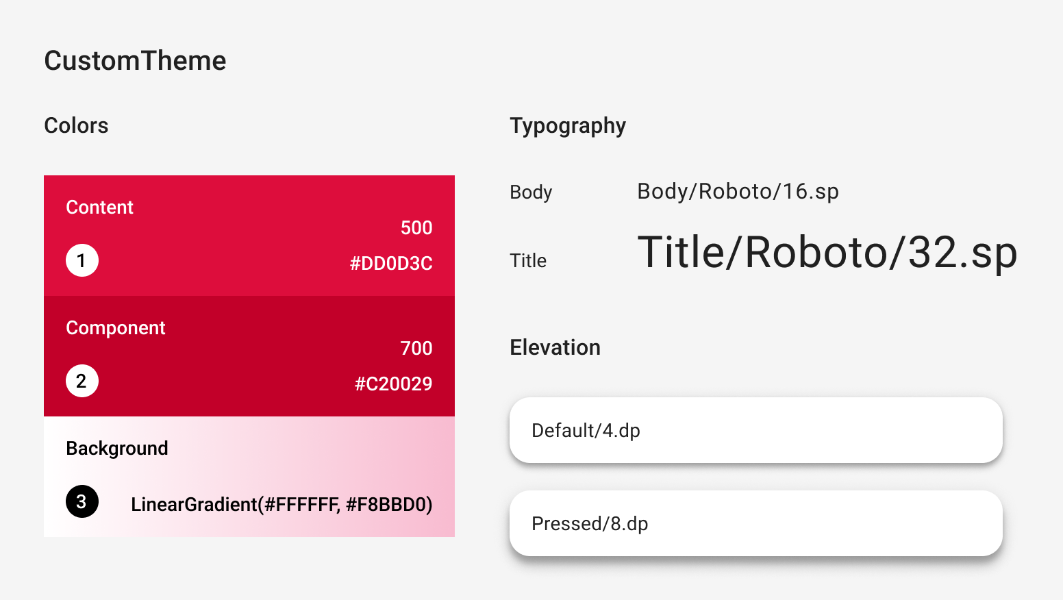
@Immutable data class CustomColors( val content: Color, val component: Color, val background: List<Color> ) @Immutable data class CustomTypography( val body: TextStyle, val title: TextStyle ) @Immutable data class CustomElevation( val default: Dp, val pressed: Dp ) val LocalCustomColors = staticCompositionLocalOf { CustomColors( content = Color.Unspecified, component = Color.Unspecified, background = emptyList() ) } val LocalCustomTypography = staticCompositionLocalOf { CustomTypography( body = TextStyle.Default, title = TextStyle.Default ) } val LocalCustomElevation = staticCompositionLocalOf { CustomElevation( default = Dp.Unspecified, pressed = Dp.Unspecified ) } @Composable fun CustomTheme( /* ... */ content: @Composable () -> Unit ) { val customColors = CustomColors( content = Color(0xFFDD0D3C), component = Color(0xFFC20029), background = listOf(Color.White, Color(0xFFF8BBD0)) ) val customTypography = CustomTypography( body = TextStyle(fontSize = 16.sp), title = TextStyle(fontSize = 32.sp) ) val customElevation = CustomElevation( default = 4.dp, pressed = 8.dp ) CompositionLocalProvider( LocalCustomColors provides customColors, LocalCustomTypography provides customTypography, LocalCustomElevation provides customElevation, content = content ) } // Use with eg. CustomTheme.elevation.small object CustomTheme { val colors: CustomColors @Composable get() = LocalCustomColors.current val typography: CustomTypography @Composable get() = LocalCustomTypography.current val elevation: CustomElevation @Composable get() = LocalCustomElevation.current }
Use Material components
When no MaterialTheme is present, using Material components as-is will result
in unwanted Material color, type, and shape values and indication behavior.
If you want to use custom values in components, wrap them in your own composable functions, directly setting the values for the relevant system, and exposing others as parameters to the containing composable.
We recommend that you access values you set from your custom theme.
Alternatively, if your theme doesn't provide Color, TextStyle, Shape, or
other systems, you can hardcode them.
@Composable fun CustomButton( onClick: () -> Unit, modifier: Modifier = Modifier, content: @Composable RowScope.() -> Unit ) { Button( colors = ButtonDefaults.buttonColors( containerColor = CustomTheme.colors.component, contentColor = CustomTheme.colors.content, disabledContainerColor = CustomTheme.colors.content .copy(alpha = 0.12f) .compositeOver(CustomTheme.colors.component), disabledContentColor = CustomTheme.colors.content .copy(alpha = 0.38f) ), shape = ButtonShape, elevation = ButtonDefaults.elevatedButtonElevation( defaultElevation = CustomTheme.elevation.default, pressedElevation = CustomTheme.elevation.pressed /* disabledElevation = 0.dp */ ), onClick = onClick, modifier = modifier, content = { ProvideTextStyle( value = CustomTheme.typography.body ) { content() } } ) } val ButtonShape = RoundedCornerShape(percent = 50)
If you've introduced new class types — such as List<Color> to represent
gradients — then it may be better to implement components from scratch instead
of wrapping them. For an example, take a look at
JetsnackButton
from the Jetsnack sample.
Recommended for you
- Note: link text is displayed when JavaScript is off
- Material Design 3 in Compose
- Migrate from Material 2 to Material 3 in Compose
- Anatomy of a theme in Compose