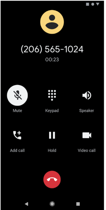
Dark theme is available in Android 10 (API level 29) and higher. It has the following benefits:
- Reduces power usage by a significant amount, depending on the device’s screen technology.
- Improves visibility for users with low vision and those who are sensitive to bright light.
- Makes it easier to use a device in a low-light environment.
Dark theme applies to the Android system UI and apps running on the device.
There are three ways to enable dark theme in Android 10 and higher:
- Use the system setting by navigating to Settings > Display > Theme to enable dark theme.
- Use the Quick Settings tile to switch themes from the notification tray, when enabled.
- On Pixel devices, enable Battery Saver mode to enable dark theme at the same time. Other devices might not support this behavior.
For instructions on applying a dark theme to web-based content using a WebView component, see Darken web content in WebView.
Support dark theme in your app
To support dark theme, set your app's theme—usually found in
res/values/styles.xml—to inherit from a DayNight theme:
<style name="AppTheme" parent="Theme.AppCompat.DayNight">
You can also use the Material Components dark theme:
<style name="AppTheme" parent="Theme.MaterialComponents.DayNight">
This ties the app's main theme to the system-controlled night mode flags and gives the app a default dark theme when it is enabled.
Themes and styles
Avoid using hardcoded colors or icons intended for use under a light theme. Use theme attributes or night-qualified resources instead.
Two theme attributes are most important for dark theme:
?android:attr/textColorPrimary: a general-purpose text color. It is near-black in light theme and near-white in dark themes. It contains a disabled state.?attr/colorControlNormal: a general-purpose icon color. It contains a disabled state.
We recommend using Material Design
Components, since its color theming
system, such as the theme
attributes ?attr/colorSurface and ?attr/colorOnSurface, provides easy access
to suitable colors. You can customize these attributes in your theme.
Change themes in-app
You can let users change the app's theme while the app is running. The following are recommended options:
- Light
- Dark
- System default (the recommended default option)
These options map directly to AppCompat.DayNight modes:
Light:
MODE_NIGHT_NO.Dark:
MODE_NIGHT_YES.System default:
MODE_NIGHT_FOLLOW_SYSTEM.
To switch the theme, do the following:
On API level 31 and above, use
UiModeManager#setApplicationNightModeto let the system know what theme your app runs. This lets the system match the theme during the splash screen.On API level 30 and below, use
AppCompatDelegate.setDefaultNightMode()to switch the theme.
Force Dark
Android 10 provides Force Dark, a feature for developers to
quickly implement a dark theme without explicitly setting a DayNight theme.
Force Dark analyzes each view of your light-themed app and applies a dark theme automatically before it is drawn to the screen. You can use a mix of Force Dark and native implementation to cut down on the time needed to implement dark theme.
Apps must opt in to Force Dark by setting android:forceDarkAllowed="true" in
the activity's theme. This attribute is set on all of the system- and
AndroidX-provided light themes, such as Theme.Material.Light. When you use
Force Dark, test your app thoroughly and exclude views as needed.
If your app uses a dark theme, such as Theme.Material), Force Dark isn't
applied. Similarly, if your app's theme inherits from a DayNight theme, Force
Dark isn't applied due to the automatic theme switching.
Disable Force Dark on a view
Force Dark can be controlled on specific views with the
android:forceDarkAllowed layout attribute or with
setForceDarkAllowed().
Web content
For information on using dark themes in web-based content, see Darken web content in WebView. For an example of dark theme applied to a WebView, see the WebView demo on GitHub .
Best practices
The following sections provide best practices for implementing dark themes.
Notifications and widgets
For UI surfaces that you display on the device but don't directly control, make sure that any views you use reflect the host app’s theme. Two examples are notifications and launcher widgets.
Notifications
Use the system-provided notification templates, such as MessagingStyle. This
means the system is responsible for applying the correct view styling.
Widgets and custom notification views
For launcher widgets, or if your app uses custom notification content views, test the content on both the light and dark themes.
Common pitfalls to look out for include the following:
- Assuming the background color is always light.
- Hardcoding text colors.
- Setting a hardcoded background color while using the default text color.
- Using a drawable icon that is a static color.
In all these cases, use appropriate theme attributes instead of hardcoded colors.
Launch screens
If your app has a custom launch screen, you might need to modify it so that it reflects the selected theme.
Remove any hardcoded colors such as background colors set programmatically to
white. Use the ?android:attr/colorBackground theme attribute instead.
Configuration changes
When the app’s theme changes, either through the system setting or AppCompat, it
triggers a uiMode
configuration change. This means activities are automatically recreated.
In some cases, you might want an app to handle the configuration change. For example, you might want to delay a configuration change because a video is playing.
An app can handle the implementation of dark theme by declaring that each
Activity can handle the uiMode configuration change:
<activity
    android:name=".MyActivity"
    android:configChanges="uiMode" />
When an Activity declares that it handles configuration changes, its
onConfigurationChanged()
method is called when there is a theme change.
To check what the current theme is, apps can run code like this:
Kotlin
val currentNightMode = configuration.uiMode and Configuration.UI_MODE_NIGHT_MASK
when (currentNightMode) {
    Configuration.UI_MODE_NIGHT_NO -> {} // Night mode is not active, we're using the light theme.
    Configuration.UI_MODE_NIGHT_YES -> {} // Night mode is active, we're using dark theme.
}
Java
int currentNightMode = configuration.uiMode & Configuration.UI_MODE_NIGHT_MASK;
switch (currentNightMode) {
    case Configuration.UI_MODE_NIGHT_NO:
        // Night mode is not active, we're using the light theme
        break;
    case Configuration.UI_MODE_NIGHT_YES:
        // Night mode is active, we're using dark theme
        break;
}

