
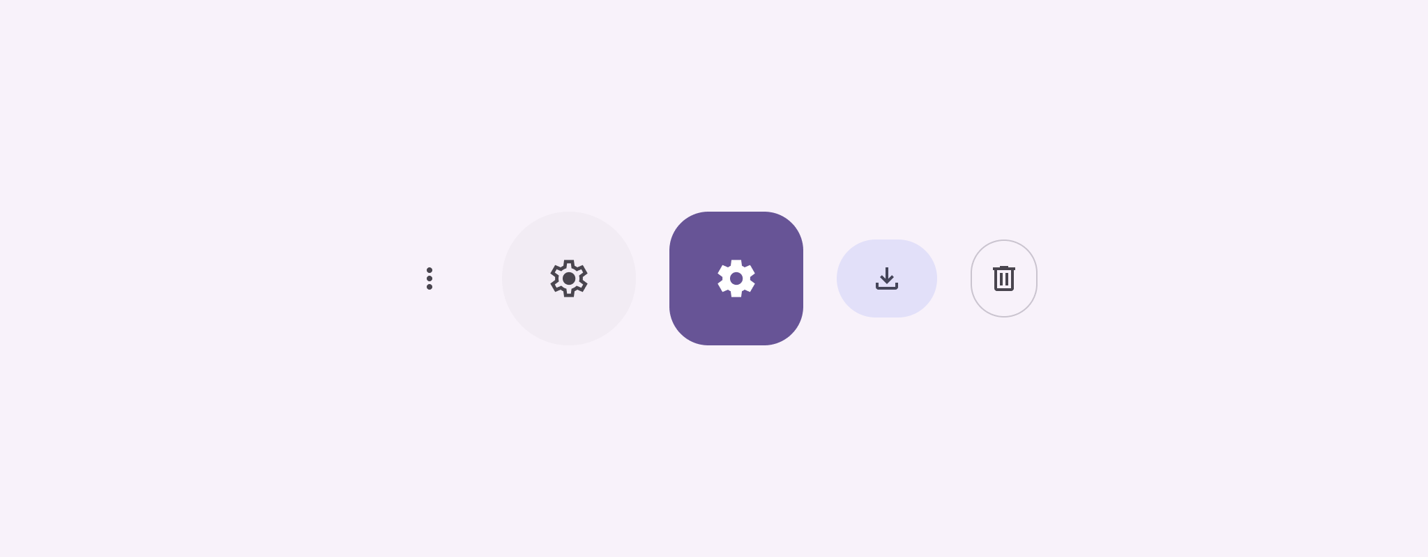
Icon buttons display actions that users can take. Icon buttons must use an icon with a clear meaning, and typically represent common or frequently used actions.
There are two types of icon buttons:
- Default: These buttons can open other elements, such as a menu or search.
- Toggle: These buttons can represent binary actions that can be toggled on or off, such as "favorite" or "bookmark".
API surface
Use the IconButton composable to implement standard icon buttons. To
create different visual styles like filled, filled tonal, or outlined, use
FilledIconButton, FilledTonalIconButton, and
OutlinedIconButton, respectively.
The key parameters for IconButton include:
onClick: A lambda function that executes when the user taps the icon button.enabled: A boolean that controls the enabled state of the button. Whenfalse, the button does not respond to user input.content: The composable content inside the button, typically anIcon.
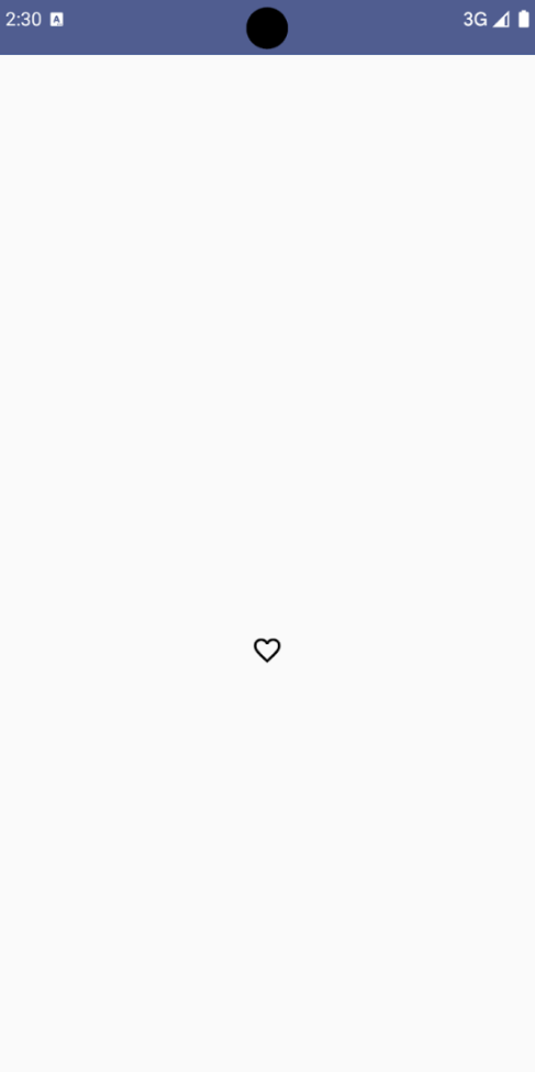
Basic example: Toggle icon button
This example shows you how to implement a toggle icon button. A toggle icon button changes its appearance based on whether it's selected or unselected.
@Preview @Composable fun ToggleIconButtonExample() { // isToggled initial value should be read from a view model or persistent storage. var isToggled by rememberSaveable { mutableStateOf(false) } IconButton( onClick = { isToggled = !isToggled } ) { Icon( painter = if (isToggled) painterResource(R.drawable.favorite_filled) else painterResource(R.drawable.favorite), contentDescription = if (isToggled) "Selected icon button" else "Unselected icon button." ) } }
Key points about the code
- The
ToggleIconButtonExamplecomposable defines a toggleableIconButton.mutableStateOf(false)creates aMutableStateobject that holds a boolean value, initiallyfalse. This makesisToggleda state holder, meaning Compose recomposes the UI whenever its value changes.rememberSaveableensures theisToggledstate persists across configuration changes, like screen rotation.
- The
onClicklambda of theIconButtondefines the button's behavior when clicked, toggling the state betweentrueandfalse. - The
Iconcomposable'spainterparameter conditionally loads a differentpainterResourcebased on theisToggledstate. This changes the visual appearance of the icon.- If
isToggledistrue, it loads the filled heart drawable. - If
isToggledisfalse, it loads the outlined heart drawable.
- If
- The
contentDescriptionof theIconalso updates based on theisToggledstate to provide appropriate accessibility information.
Result
The following image shows the toggle icon button from the preceding snippet in its unselected state:
Advanced example: Repeated actions on press
This section demonstrates how to create icon buttons that continuously trigger an action while the user presses and holds them, rather than just triggering once per click.
@Composable fun MomentaryIconButton( unselectedImage: Int, selectedImage: Int, contentDescription: String, modifier: Modifier = Modifier, stepDelay: Long = 100L, // Minimum value is 1L milliseconds. onClick: () -> Unit ) { val interactionSource = remember { MutableInteractionSource() } val isPressed by interactionSource.collectIsPressedAsState() val pressedListener by rememberUpdatedState(onClick) LaunchedEffect(isPressed) { while (isPressed) { delay(stepDelay.coerceIn(1L, Long.MAX_VALUE)) pressedListener() } } IconButton( modifier = modifier, onClick = onClick, interactionSource = interactionSource ) { Icon( painter = if (isPressed) painterResource(id = selectedImage) else painterResource(id = unselectedImage), contentDescription = contentDescription, ) } }
Key points about the code
MomentaryIconButtontakes anunselectedImage: Int, the drawable resource ID for the icon when the button is not pressed, andselectedImage: Int, the drawable resource ID for the icon when the button is pressed.- It uses an
interactionSourceto specifically track "press" interactions from the user. isPressedis true when the button is actively being pressed and false otherwise. WhenisPressedistrue, theLaunchedEffectenters a loop.- Inside this loop, it uses a
delay(withstepDelay) to create pauses between triggering actions.coerceInensures the delay is at least 1ms to prevent infinite loops. - The
pressedListeneris invoked after each delay within the loop. This makes the action repeat.
- Inside this loop, it uses a
- The
pressedListenerusesrememberUpdatedStateto ensure that theonClicklambda (the action to perform) is always the most up-to-date from the latest composition. - The
Iconchanges its displayed image based on whether the button is currently pressed or not.- If
isPressedis true, theselectedImageis shown. - Otherwise, the
unselectedImageis shown.
- If
Next, use this MomentaryIconButton in an example. The following snippet
demonstrates two icon buttons controlling a counter:
@Preview() @Composable fun MomentaryIconButtonExample() { var pressedCount by remember { mutableIntStateOf(0) } Row( modifier = Modifier.fillMaxWidth(), verticalAlignment = Alignment.CenterVertically ) { MomentaryIconButton( unselectedImage = R.drawable.fast_rewind, selectedImage = R.drawable.fast_rewind_filled, stepDelay = 100L, onClick = { pressedCount -= 1 }, contentDescription = "Decrease count button" ) Spacer(modifier = Modifier) Text("advanced by $pressedCount frames") Spacer(modifier = Modifier) MomentaryIconButton( unselectedImage = R.drawable.fast_forward, selectedImage = R.drawable.fast_forward_filled, contentDescription = "Increase count button", stepDelay = 100L, onClick = { pressedCount += 1 } ) } }
Key points about the code
- The
MomentaryIconButtonExamplecomposable displays aRowcontaining twoMomentaryIconButtoninstances and aTextcomposable to build a UI for incrementing and decrementing a counter. - It maintains a
pressedCountmutable state variable usingrememberandmutableIntStateOf, initialized to 0. WhenpressedCountchanges, any composables observing it (like theTextcomposable) recompose to reflect the new value. - The first
MomentaryIconButtondecreasespressedCountwhen clicked or held. - The second
MomentaryIconButtonincreasespressedCountwhen clicked or held. - Both buttons use a
stepDelayof 100 milliseconds, meaning theonClickaction repeats every 100ms while a button is held.
Result
The following video shows the UI with the icon buttons and the counter: