
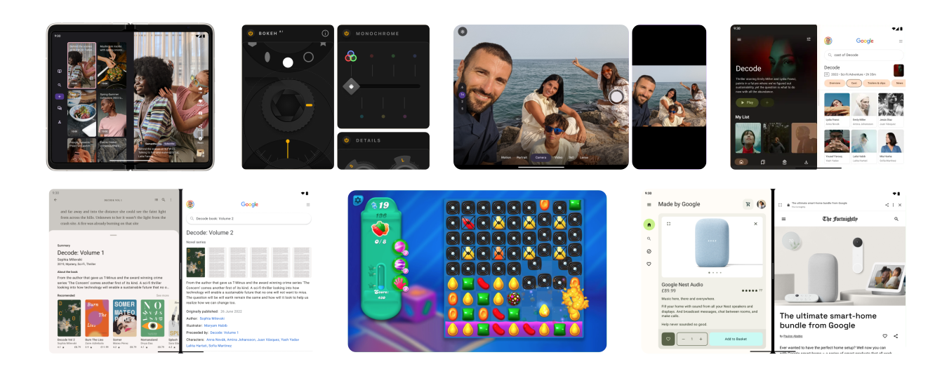
Foldable devices provide an opportunity for innovative app development. Large and small screens on the same device offer complementary but distinct interactive experiences. Folding features such as tabletop posture and book posture enable imaginative layouts and unconventional user interfaces.
Adaptive design
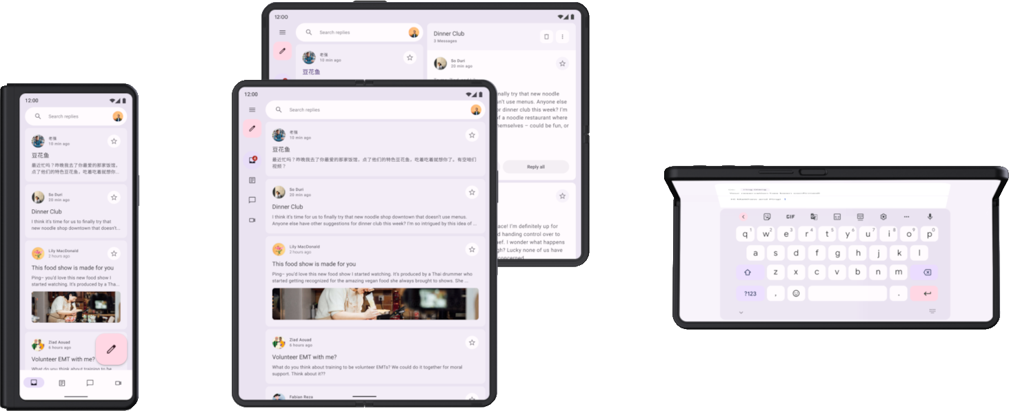
To optimally support the folded and unfolded screens of a foldable device, the layout needs to adapt. The differences in screen size and aspect ratio of folded and unfolded screens can be substantial, requiring alternative layouts optimized for different screen sizes and configurations. Adaptive layouts provide an optimized user experience when a foldable device is folded or unfolded, in portrait or landscape orientation, or in tabletop or book posture.
For example, a large screen foldable device unfolded in landscape orientation is like a tablet; a two‑pane layout with a navigation rail makes excellent use of the wide screen. Folded, the device is similar to a standard phone; a single column layout with a bottom navigation bar is straightforward but effective. Because the layouts are separate, you can optimize each for its specific use case.
To learn more about adaptive design and development for foldables, see the following:
- Design: Look at the UI gallery for layout inspiration and patterns across form factors.
- Development: Follow the developer guidance in Support different display sizes to build adaptive layouts.
Foldable states and postures
The fold of a foldable device divides the screen into two portions. The fold can be a flexible area of the screen or, on dual‑screen devices, a hinge that separates the two displays.
The fold has dimension and an occlusionType property, which defines
whether the fold obscures part of the display. On dual‑screen devices, the
occlusionType is FULL, no content is viewable in the fold (hinge) area even
though an app might span both screens.
Foldable devices can be in various folded states, such as FLAT (fully
open) or HALF_OPENED (somewhere between fully open and completely closed).
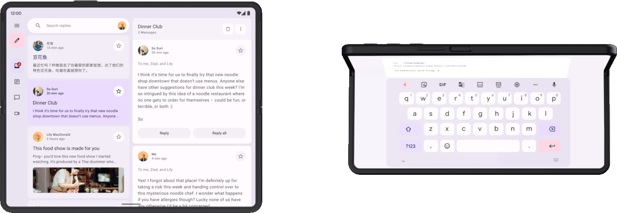
When a device is in the HALF_OPENED state, two postures are possible,
depending on the orientation of the fold: tabletop posture (horizontal fold) and
book posture (vertical fold).
Tabletop and book postures offer new layout possibilities, but the HALF_OPENED
device state also imposes some limitations. For example, UI controls near the
fold can be difficult for users to access, and text overlaying the fold can be
hard to read (or unreadable if occlusionType is FULL).
Design your layouts so that UI elements are accessible in all device states. Position dialog boxes and pop‑up menus so they don't overlay the fold. Make sure important content is viewable when the device is partially folded. Split content into two areas when the device is half opened—top and bottom in tabletop posture, left and right in book posture.
In addition to postures, foldables support unique display modes:
- Rear display mode: Enables your app to use the outer screen while the device is unfolded, allowing features such as rear-camera selfie preview.
- Dual-screen mode: Displays content simultaneously on both the inner and outer screens, enabling experiences like two-way translation.
For more information about folds and foldable postures, see Make your app fold aware. To learn how to support unique display modes, see Support foldable display modes.
App continuity
An app stops and restarts as it transitions from one screen to another when a device folds or unfolds. To maintain continuity for the user, the app must preserve and restore its state seamlessly, as outlined in the Adaptive app quality guidelines.
The different screen layouts of a foldable device should also complement one another. For example, if the folded screen shows an image and description for a product from an online store, the unfolded screen should maintain continuity by showing the same image and description, but also include complementary content, such as product specifications or reviews.
To learn more about managing app state and continuity, see Save UI states and Handle configuration changes.
Multitasking
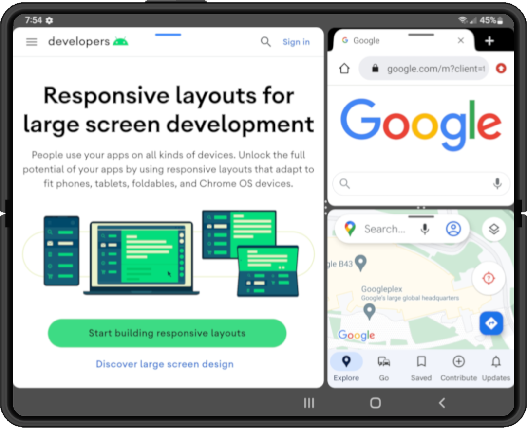
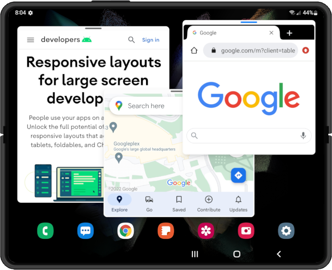
Large screen foldables have a tablet‑sized screen that's ideal for multitasking in multi‑window mode. Foldables support split‑screen mode; some even support desktop windowing, where apps are contained in movable, resizable windows, similar to a desktop windowing system.
|
|
|
|
|
Android 12 (API level 31) and later versions default to multi‑window mode—on large screens, all apps run in multi‑window mode regardless of app configuration. On previous versions down to Android 7.0 (API level 24), you must configure your app to be resizable to support multi‑window mode.
For information about multitasking in multi‑window mode, see Support multi-window mode.
Drag and drop
Large screen foldable devices provide ample screen space for drag and drop interactions. Multi‑window mode on foldables enables drag and drop between apps.
Drag and drop interactions create a productive and engaging user experience. Add drag and drop capabilities to your app using the Android drag and drop framework. For more information, see Enable drag and drop.