
Enabling users to physically drag components across a screen is fundamental to modern Android apps. Whether you're building a custom slider, a swipe-to-dismiss component, or an interactive canvas, Jetpack Compose provides a comprehensive set of APIs to easily handle drag events.
The Compose dragging APIs abstract away the complexity of raw touch events.
Instead of manually calculating touch coordinates and managing gesture
lifecycles with pointerInput, you can use built-in modifiers that tie
directly into Compose's state management and animation systems.
This page describes how and when to use each dragging API.
Choose the correct dragging API
There are several APIs you can use for implementing draggable content.
- Choose standard Material components (like
SwipeToDismissBoxor navigation drawers) when: You need default Material 3 swipe or drag behavior (for example, deleting an email, archiving a task, or opening a side menu / bottom sheets). They provide built-in behaviors without requiring custom state or layout management. - Choose
Modifier.draggablewhen: You only need raw drag deltas (for example, dragging a custom slider). For more information, see Drag along a single axis with draggable.- Choose
Modifier.draggable2Dwhen: You need a component to move continuously across both the X and Y axes simultaneously (for example, panning across a map or creating a floating action button that the user can drag anywhere on the screen). For more information, see Drag in two dimensions withModifier.draggable2D.
- Choose
- Choose
Modifier.anchoredDraggablewhen: You're building custom interactive components that need to snap between two or more discrete positions (for example, a bottom sheet, a navigation drawer, or a swipe-to-reveal action). For more information, see Drag components between anchor points withanchoredDraggable.
Drag along a single axis with draggable
The draggable modifier is the high-level entry point to drag gestures in
a single orientation, and reports the drag distance in pixels.
It's important to note that this modifier is similar to scrollable, in that it
only detects the gesture. You need to hold the state and represent it on screen
by, for example, moving the element via the offset modifier:
@Composable private fun DraggableText() { var offsetX by remember { mutableFloatStateOf(0f) } Text( modifier = Modifier .offset { IntOffset(offsetX.roundToInt(), 0) } .draggable( orientation = Orientation.Horizontal, state = rememberDraggableState { delta -> offsetX += delta } ), text = "Drag me!" ) }
If you need to control the whole dragging gesture, consider using the drag
gesture detector instead, via the pointerInput modifier.
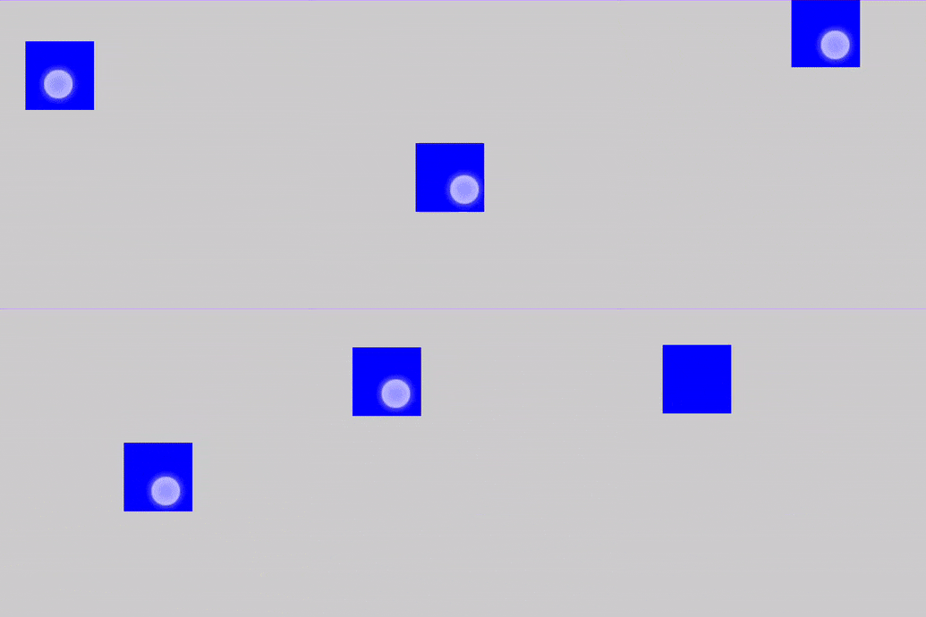
@Composable private fun DraggableTextLowLevel() { Box(modifier = Modifier.fillMaxSize()) { var offsetX by remember { mutableFloatStateOf(0f) } var offsetY by remember { mutableFloatStateOf(0f) } Box( Modifier .offset { IntOffset(offsetX.roundToInt(), offsetY.roundToInt()) } .background(Color.Blue) .size(50.dp) .pointerInput(Unit) { detectDragGestures { change, dragAmount -> change.consume() offsetX += dragAmount.x offsetY += dragAmount.y } } ) } }
Drag components between anchor points with anchoredDraggable
The anchoredDraggable modifier lets you drag a component between a set of
predefined positions called anchor points. When the user releases the drag
gesture, the component settles at the closest anchor. anchoredDraggable is
useful for creating components like custom bottom sheets, complex sliders, or
drawer panels.
API surface
The AnchoredDraggable API consists of the following main parts:
- Anchors (
DraggableAnchors): A builder that defines the mapping between your custom states (e.g., an enum class forStart, Center, End) and their corresponding pixel offset values. - State (
AnchoredDraggableState<T>): A state holder that manages the component's current position (offset), the anchor it's settled at, and its drag progress. It should be created usingrememberSaveableandAnchoredDraggableState.Saver<T>to preserve its state across configuration changes. - Gesture modifier (
Modifier.anchoredDraggable): A modifier that detects drag gestures along anOrientation, updates the state with the drag delta, and handles the fling gesture to animate the component to the nearest anchor upon release.
Example: Build a custom SwipeToDismiss component
This example demonstrates how to build a custom SwipeToDismiss component (a
white banner) that the user can swipe left to dismiss, or drag to the right to
see an overscroll stretch effect.
Define anchor values. Define an enum representing the discrete positions the draggable content can settle into:
private enum class AnchoredDraggableSwipeDismissValue { DismissedStart, Resting }
Instantiate and save
AnchoredDraggableState. UserememberSaveablewithAnchoredDraggableState.Saver()to persist the component's current position across activity recreation and configuration changes (e.g., screen rotation or theme changes):val state = rememberSaveable(saver = AnchoredDraggableState.Saver()) { AnchoredDraggableState(initialValue = AnchoredDraggableSwipeDismissValue.Resting) }
Apply the
layout,offset, anddraggablemodifiers. To make the component draggable and ensure its anchor points adapt to its size, apply the following modifiers to the content that should visually move:Modifier.layout: Anchor positions often depend on a component's size, which isn't known during initial composition. Use thelayoutmodifier to measure the component, calculate theDraggableAnchorsmap dynamically based on its width, and update the state usingstate.updateAnchors().
Modifier.anchoredDraggable: Connects to the state, dispatches drag deltas in the specified orientation, and handles the fling gesture to animate the component to the nearest anchor when released. Add this modifier to the component that should respond to drag gestures and pass it thestateand dragorientation(and, optionally,overscrollEffect).Modifier.offset: Reads the offset fromstate.requireOffset()inside the offset lambda. Reading the offset within this lambda ensures the value is only read during the placement phase, avoiding unnecessary recompositions during the drag. Apply this modifier to the content that should visually move.
Box( modifier = Modifier .fillMaxWidth() // Read state.requireOffset() inside the offset lambda to defer reading to the placement phase .offset { IntOffset(state.requireOffset().roundToInt(), 0) } .layout { measurable, constraints -> val placeable = measurable.measure(constraints) val anchors = DraggableAnchors { AnchoredDraggableSwipeDismissValue.DismissedStart at -placeable.width.toFloat() AnchoredDraggableSwipeDismissValue.Resting at 0f } state.updateAnchors(anchors) layout(placeable.width, placeable.height) { placeable.placeRelative(0, 0) } } // Pass overscrollEffect to anchoredDraggable so deltas beyond the bounds (min and max anchor) are dispatched to overscrollEffect, and render the visual effect with Modifier.overscroll. .overscroll(overscrollEffect) .anchoredDraggable( state, Orientation.Horizontal, overscrollEffect = overscrollEffect ) ) { dismissContent() }
[Optional] Integrate overscroll. The
overscrollEffectAPI implements a visual effect that displays when the edges of a scrolling container have been reached with a scroll or fling. You can provide visual feedback when a user drags past the defined anchor bounds with an overscroll effect (typically a stretch or glow).- Dispatch: Pass an
overscrollEffectinstance to theanchoredDraggablemodifier. This dispatches drag deltas to either theAnchoredDraggablestate or the overscroll effect, depending on whether the gesture is inside or outside the anchor bounds. - Render: Apply the
Modifier.overscrollwith the sameOverscrollEffectinstance to the component that should visually render the effect.
- Dispatch: Pass an
The following snippet shows how to add a standard stretch effect:
val overscrollEffect = rememberOverscrollEffect() Box( modifier.fillMaxWidth() ) { Box(Modifier.fillMaxWidth()) { background() } Box( modifier = Modifier .fillMaxWidth() // Read state.requireOffset() inside the offset lambda to defer reading to the placement phase .offset { IntOffset(state.requireOffset().roundToInt(), 0) } .layout { measurable, constraints -> val placeable = measurable.measure(constraints) val anchors = DraggableAnchors { AnchoredDraggableSwipeDismissValue.DismissedStart at -placeable.width.toFloat() AnchoredDraggableSwipeDismissValue.Resting at 0f } state.updateAnchors(anchors) layout(placeable.width, placeable.height) { placeable.placeRelative(0, 0) } } // Pass overscrollEffect to anchoredDraggable so deltas beyond the bounds (min and max anchor) are dispatched to overscrollEffect, and render the visual effect with Modifier.overscroll. .overscroll(overscrollEffect) .anchoredDraggable( state, Orientation.Horizontal, overscrollEffect = overscrollEffect ) ) { dismissContent() } }
Result
The preceding code snippet results in a white banner, with the text "Drag me to dismiss!", that the user can swipe left to dismiss (or drag right to see the overscroll stretch effect):
Example: Create custom, gesture-driven navigation drawer
This example demonstrates how to build a custom, gesture-driven navigation
drawer. As the user drags horizontally, the foreground screen (ScreenContents)
slides to the right, scales down from 1.0f to 0.8f, and rounds its corners
to reveal the underlying navigation drawer.
Define anchor states and positions. In this example, the anchors are the opened and closed states of the drawer. Define an enum for the
OpenandClosedstates, and map them to pixel offsets usingDraggableAnchors:enum class DrawerState { Open, Closed } val anchors = DraggableAnchors { DrawerState.Open at drawerWidth DrawerState.Closed at 0f } val state = remember { AnchoredDraggableState( initialValue = DrawerState.Closed, anchors = anchors, ) }
Animate
anchoredDraggableStateon the click of an item. PlaceHomeScreenDrawerat the bottom of theBoxandScreenContentson top. The drawer remains stationary, while the top layer translates and scales over it.When a user selects a drawer item, update the active screen state and automatically dismiss the drawer using
state.animateTo(DrawerState.Closed):@Composable private fun AnchoredDraggableDrawerOnClickSample( modifier: Modifier = Modifier, state: AnchoredDraggableState<DrawerState>, coroutineScope: CoroutineScope ) { var screenState by remember { mutableStateOf(ScreenState.Home) } Box(modifier = modifier.fillMaxSize()) { HomeScreenDrawer( selectedScreen = screenState, onScreenSelected = { screen -> screenState = screen // Dismiss drawer when a destination is selected coroutineScope.launch { state.animateTo(DrawerState.Closed) } } ) // ScreenContents(...) } }
Use
state.requireOffset()to change multiple visual properties. Instead of only offsetting the content, you can change multiple properties withModifier.graphicsLayerto simultaneously animate translation, scale, and corner radius based on the drag progress:- Use
state.requireOffset()to get the current drag offset. - Use
lerp()(linear interpolation) to calculate proportional scale (1fto0.8f) and corner radius (0.dpto32.dp) relative to the offset and drawer width. Modifier.graphicsLayerexecutes changes in the draw phase, ensuring high-performance animations without triggering recompositions during the drag.
@Composable private fun AnchoredDraggableDrawerGraphicsLayerSample( state: AnchoredDraggableState<DrawerState>, drawerWidth: Float, selectedScreen: ScreenState, onDrawerClicked: () -> Unit ) { ScreenContents( selectedScreen = selectedScreen, onDrawerClicked = onDrawerClicked, modifier = Modifier .graphicsLayer { this.translationX = state.requireOffset() val scale = lerp(1f, 0.8f, state.requireOffset() / drawerWidth) this.scaleX = scale this.scaleY = scale val cornerRadius = lerp(0f, 32f, state.requireOffset() / drawerWidth) this.shape = RoundedCornerShape(cornerRadius.dp) this.clip = true } .anchoredDraggable(state, Orientation.Horizontal) ) }
- Use
Trigger programmatic animations with
animateTo. Control the drawer programmatically (such as when tapping the menu icon or selecting a drawer item) by launchingstate.animateTo()within a coroutine scope:fun toggleDrawerState( state: AnchoredDraggableState<DrawerState>, coroutineScope: CoroutineScope ) { coroutineScope.launch { if (state.currentValue == DrawerState.Open) { state.animateTo(DrawerState.Closed) } else { state.animateTo(DrawerState.Open) } } }
Result
Drag in two dimensions with Modifier.draggable2D
Use the draggable2D modifier for moving individual UI elements across both
the X and Y axes simultaneously.
Drag a composable element
This example shows the most common use case for draggable2D — allowing a user
to pick up a UI element and reposition it anywhere within a parent container.
@Composable private fun DraggableComposableElement() { // 1. Track the position of the floating window var offset by remember { mutableStateOf(Offset.Zero) } Box(modifier = Modifier.fillMaxSize().background(Color(0xFFF5F5F5))) { Box( modifier = Modifier // 2. Apply the offset to the box's position .offset { IntOffset(offset.x.roundToInt(), offset.y.roundToInt()) } // ... // 3. Attach the 2D drag logic .draggable2D( state = rememberDraggable2DState { delta -> // 4. Update the position based on the movement delta offset += delta } ), contentAlignment = Alignment.Center ) { Text("Video Preview", color = Color.White, fontSize = 12.sp) } } }
The preceding code snippet includes the following:
- Tracks the box's position using an
offsetstate. - Uses
offsetmodifier to shift the component's position based on the drag deltas. - Since there is no fling support, the box stops moving the instant the user lifts their finger.
Drag a child composable based on parent's drag area
This example demonstrates how to use draggable2D to create a 2D input area
where a selector knob is constrained within a specific surface. Unlike the
draggable element example, which moves the component itself, this implementation
uses the 2D deltas to move a child composable "selector" across a color picker:
@Composable private fun ExampleColorSelector( // ... ) { // 1. Maintain the 2D position of the selector in state. var selectorOffset by remember { mutableStateOf(Offset.Zero) } // 2. Track the size of the background container. var containerSize by remember { mutableStateOf(IntSize.Zero) } Box( modifier = Modifier .size(300.dp, 200.dp) // Capture the actual pixel dimensions of the container when it's laid out. .onSizeChanged { containerSize = it } .clip(RoundedCornerShape(12.dp)) .background( brush = remember(hue) { // Create a simple gradient representing Saturation and Value for the given Hue. Brush.linearGradient(listOf(Color.White, Color.hsv(hue, 1f, 1f))) } ) ) { Box( modifier = Modifier .size(24.dp) .graphicsLayer { // Center the selector on the finger by subtracting half its size. translationX = selectorOffset.x - (24.dp.toPx() / 2) translationY = selectorOffset.y - (24.dp.toPx() / 2) } // ... // 3. Configure 2D touch dragging. .draggable2D( state = rememberDraggable2DState { delta -> // 4. Calculate the new position and clamp it to the container bounds val newX = (selectorOffset.x + delta.x) .coerceIn(0f, containerSize.width.toFloat()) val newY = (selectorOffset.y + delta.y) .coerceIn(0f, containerSize.height.toFloat()) selectorOffset = Offset(newX, newY) } ) ) } }
The preceding snippet includes the following:
- It uses the
onSizeChangedmodifier to capture the actual dimensions of the gradient container. The selector knows exactly where the edges are. - Inside the
graphicsLayer, it adjusts thetranslationXandtranslationYto make sure the selector stays centered while dragging.
Recommended for you
- Note: link text is displayed when JavaScript is off
- Understand gestures
- Advanced animation example: Gestures {:#gesture-and-animation}
- Value-based animations