This guide explains how to create a dynamic top app bar in Compose that changes its options when items are selected from the list. You can modify the top app bar's title and actions based on the selection state.
Implement dynamic top app bar behavior
This code defines a composable function for the top app bar that changes based on item selection:
@Composable fun AppBarSelectionActions( selectedItems: Set<Int>, modifier: Modifier = Modifier, ) { val hasSelection = selectedItems.isNotEmpty() val topBarText = if (hasSelection) { "Selected ${selectedItems.size} items" } else { "List of items" } TopAppBar( title = { Text(topBarText) }, colors = TopAppBarDefaults.topAppBarColors( containerColor = MaterialTheme.colorScheme.primaryContainer, titleContentColor = MaterialTheme.colorScheme.primary, ), actions = { if (hasSelection) { IconButton(onClick = { /* click action */ }) { Icon( imageVector = Icons.Filled.Share, contentDescription = "Share items" ) } } }, modifier = modifier ) }
Key points about the code
AppBarSelectionActionsaccepts aSetof selected item indexes.- The
topBarTextchanges depending on whether you select any items.- When you select items, text describing the number of items selected
appears in the
TopAppBar. - If you don't select any items, the
topBarTextis "List of items".
- When you select items, text describing the number of items selected
appears in the
- The
actionsblock defines the actions you display in the top app bar. IfhasSelectionis true, a share icon appears after the text. - The
onClicklambda of theIconButtonhandles the share action when you click the icon.
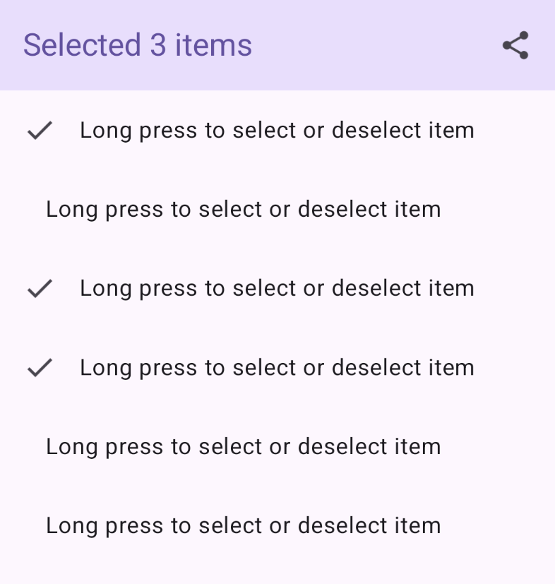
Result

Integrate selectable list into dynamic top app bar
This example demonstrates how to add a selectable list to a dynamic top app bar:
@Composable private fun AppBarMultiSelectionExample( modifier: Modifier = Modifier, ) { val listItems by remember { mutableStateOf(listOf(1, 2, 3, 4, 5, 6)) } var selectedItems by rememberSaveable { mutableStateOf(setOf<Int>()) } Scaffold( modifier = modifier, topBar = { AppBarSelectionActions(selectedItems) } ) { innerPadding -> LazyColumn(contentPadding = innerPadding) { itemsIndexed(listItems) { _, index -> val isItemSelected = selectedItems.contains(index) ListItemSelectable( selected = isItemSelected, Modifier .combinedClickable( interactionSource = remember { MutableInteractionSource() }, indication = null, onClick = { /* click action */ }, onLongClick = { if (isItemSelected) selectedItems -= index else selectedItems += index } ) ) } } } }
Key points about the code
- The top bar updates based on how many list items you select.
selectedItemsholds the set of selected item indexes.AppBarMultiSelectionExampleuses aScaffoldto structure the screen.topBar = { AppBarSelectionActions(selectedItems) }sets theAppBarSelectionActionscomposable as the top app bar.AppBarSelectionActionsreceives theselectedItemsstate.
LazyColumndisplays the items in a vertical list, rendering only the items visible on the screen.ListItemSelectablerepresents a selectable list item.combinedClickableallows both click and long-click handling for item selection. A click performs an action, while long-clicking an item toggles its selection state.
Result