While the Grid config defines the overall structure,
you use the gridItem modifier to control the position, spanning,
and alignment of items within that structure.
Set the item position
Place an item into a specific track or cell
with the row and column parameters.
The row and column parameters specify the row and column track indexes
that the item is placed in.
Track indexes are 1-based—they start at one.
Specifying only row or column (not both) places the item
in the next available space in that track.
Specifying both places the item into that cell.
Use a positive integer to specify the track index from the start.
For example, to place an item in the first row and column,
use gridItem(row = 1, column = 1).
Use a negative integer to specify the track relative to the end.
For example, to place an item in the second-to-last row and column, use
gridItem(row = -2, column = -2).
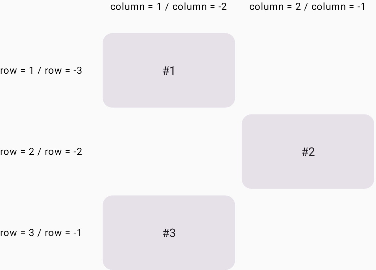
In the following example, Card #2 is placed in the second row and the second column. Card #3 is assigned to the last row (indexed by -1), where it automatically occupies the first available column in that track (Figure 1).
Grid( config = { repeat(2) { column(160.dp) } repeat(3) { row(90.dp) } gap(8.dp) } ) { Card1() Card2(modifier = Modifier.gridItem(row = 2, column = 2)) Card3(modifier = Modifier.gridItem(row = -1, column = -2)) }
Span rows and columns
Use the rowSpan and columnSpan parameters
to span an item over multiple cells.
You can place a UI element into a grid area,
which is the area consisting of several grid cells.
The gridItem modifier lets you specify the grid area
with the rowSpan and columnSpan parameters.
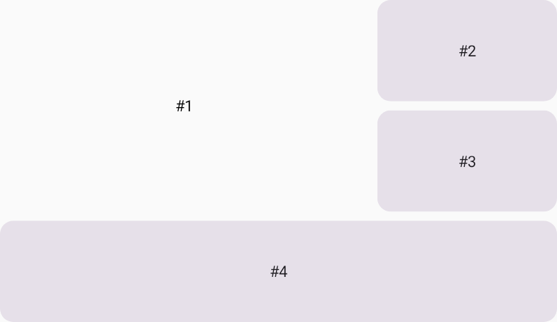
In the following example,
Card #1 is placed in the area consisting of two rows and two columns
(Figure 2).
Grid( config = { repeat(3) { column(160.dp) } repeat(3) { row(90.dp) } rowGap(8.dp) columnGap(8.dp) } ) { Card1(modifier = Modifier.gridItem(rowSpan = 2, columnSpan = 2)) Card2() Card3() Card4(modifier = Modifier.gridItem(columnSpan = 3)) }

Set the alignment in a grid area
You can set the alignment of the UI element in a grid area
by specifying it in the alignment parameter of the gridItem modifier.
In the following example, #1 is placed in the center of the grid area
consisting of two columns and two rows.
Grid( config = { repeat(3) { column(160.dp) } repeat(3) { row(90.dp) } rowGap(8.dp) columnGap(8.dp) }, ) { Text( text = "#1", modifier = Modifier .gridItem( rowSpan = 2, columnSpan = 2, alignment = Alignment.Center ), ) Card2() Card3() Card4(modifier = Modifier.gridItem(columnSpan = 3)) }
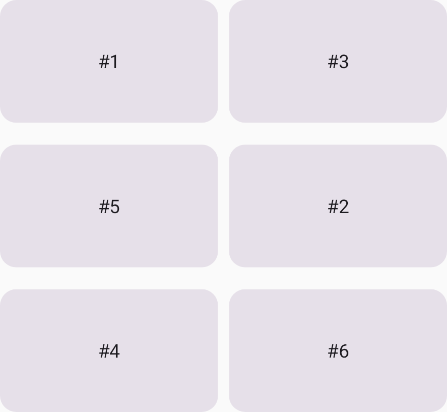
Auto-placement mixed with placed items
A UI element in Grid
that has no position specification undergoes auto-placement.
This example shows how you can mix auto-placed elements
and the UI elements with specified grid cells.
Card #2 and Card #4 are placed in specified grid cells,
and the other items are auto-placed.
Grid( config = { repeat(2) { column(160.dp) } repeat(3) { row(90.dp) } rowGap(16.dp) columnGap(8.dp) } ) { Card1() Card2(modifier = Modifier.gridItem(row = 2, column = 2)) Card3() Card4(modifier = Modifier.gridItem(row = 3, column = 1)) Card5() Card6() }