
More than 300 million Android large screen devices, including tablets, foldables, ChromeOS devices, car displays, and TVs, are in use today, with more coming continually. To provide an optimal user experience on the growing number and diversity of large screen devices—as well as on standard phones—build adaptive apps.
What are adaptive apps?
Adaptive apps change layouts based on changes in the app display, primarily the size of the app window. But adaptive apps also accommodate changes in the posture of foldable devices, such as tabletop or book posture, and changes in screen density and font size.
Instead of just stretching or shrinking UI elements in response to different window sizes, adaptive apps replace layout components and show or hide content. For example, on standard phones, an adaptive app might display a bottom navigation bar, but on large screens, a navigation rail. On large screens, adaptive apps display more content, such as a two-pane, list-detail layout; on small screens, less content, either the list or the detail.
In the past, apps typically ran full screen. Today, apps run in multi-window mode in arbitrarily sized windows independent of the device screen size. Users can change the window size at any time. So even on a single device type, apps must be adaptive.
Adaptive apps look great and work well on any device in any configuration.
Why build adaptive UIs?
Users expect your app to function flawlessly on all their devices and provide enhanced capabilities on large screens. Users multitask in multi-window mode for an enhanced app experience and increased productivity.
Apps limited to single-tasking on standard phones miss out on an expanding user base of diverse possibilities.
Google Play
Google Play provides tablet- and foldable-specific app collections and recommendations, which enable users to discover high-quality apps.
Play ranks apps and games optimized for large screens higher than unoptimized apps. Play bases the ranking on the large screen app quality guidelines. Higher ranking increases discoverability by enabling multi‑device users to see large screen–specific ratings and reviews on their phones.
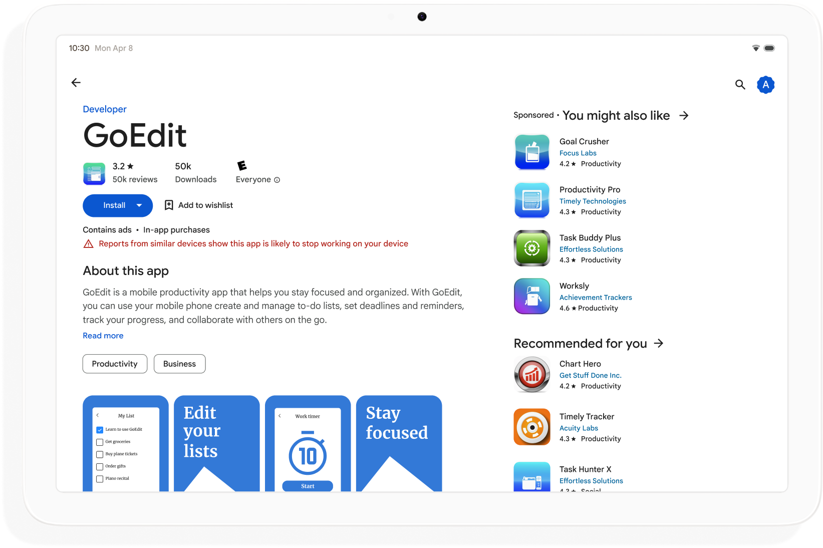
Apps that don't meet the Play Store's large screen quality standards display a warning on the app details page. The warning advises users that the app might not perform well on their large screen devices.
Build adaptive apps to broaden discoverability on Google Play and maximize the number of devices that can download your app.
How to get started
Think about adaptive design in all phases of app development from planning to deployment. Inform graphic designers about adaptive design. Design your app to be adaptive, and you'll build an app that's manageable, extensible, and ready for future form factors and windowing modes.
To create an adaptive app that supports all display sizes and configurations, do the following:
- Use window size classes to make layout decisions
- Build with the Compose Material 3 Adaptive library
- Support input beyond touch
- Test on all device types
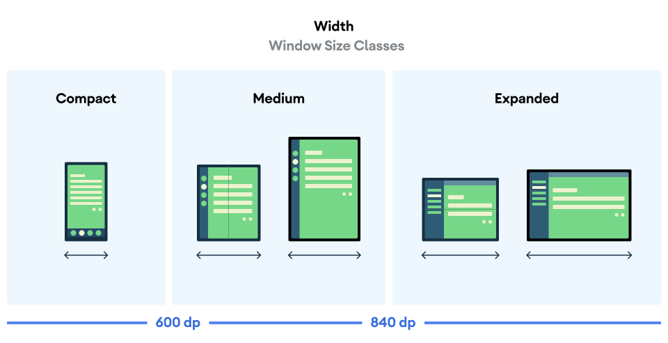
Window size classes
App window dimensions can be different on different devices—or on the same device in the case of foldables—even when the app is full screen. Different device orientations produce different aspect ratios. In multi‑window mode, app window size, aspect ratio, and orientation can differ from that of the device screen.
Adaptive apps simplify and generalize the problem of determining and managing window size, aspect ratio, and orientation by considering only the app window when rendering layouts, which also works when the app window is the full screen.
Window size classes categorize app windows as compact, medium, or expanded based on window width or height.
Compute your app's WindowSizeClass using the
currentWindowAdaptiveInfo() top‑level function of the Compose
Material 3 Adaptive library. The function returns an instance of
WindowAdaptiveInfo, which contains windowSizeClass. Your app
receives updates whenever the window size class changes:
val windowSizeClass = currentWindowAdaptiveInfo().windowSizeClass
Content panes
An activity's layout is sometimes referred to as a screen. For example, your app might have a home screen, a list screen, and an item detail screen. The terminology implies that each activity fills the device screen.
However, on device screens that are large enough to support the expanded width window size class, multiple activity screens can be onscreen at the same time. Pane is a more precise term for content displays of individual activities.
Window size classes enable you to determine how many content panes to show in multi‑pane layouts, as specified in Material Design.

Panes are navigable. On compact and medium window size classes, apps display a single pane; and so, navigation to any destination displays one pane.
On the expanded window size class, apps can display related content in multiple panes, such as a list‑detail layout. Navigation to either pane displays the two‑pane layout. If the window size changes to compact or medium, adaptive apps show only one pane, the navigation destination, either the list or the detail.
|
|
|
Compose Material 3 Adaptive
Jetpack Compose is the modern, declarative approach to building adaptive apps without the duplication and maintenance burden of multiple layout files.
The Compose Material 3 Adaptive library contains composables that manage window size classes, navigation components, multi‑pane layouts, and foldable postures and hinge location, for example:
NavigationSuiteScaffold: Automatically switches between navigation bar and navigation rail depending on app window size class and device posture.ListDetailPaneScaffold: Implements the list-detail canonical layout.Adapts the layout to the app window size. Presents a list and the detail of a list item in side‑by‑side panes on the expanded window size class, but just the list or the detail on compact and medium window size classes.
SupportingPaneScaffold: Implements the supporting pane canonical layout.Presents the main content pane and a supporting pane on the expanded window size class, but just the main content pane on compact and medium window size classes.
The Compose Material 3 Adaptive library is a key dependency for developing adaptive apps.
Configuration and continuity
Adaptive apps retain continuity during configuration changes.
A configuration change occurs when the app window is resized, the posture of a foldable changes, or the screen density or font changes.
By default, configuration changes recreate the app activity, and all activity
state is lost. To maintain continuity, adaptive apps save state in the
activity's onSaveInstanceState() method or in a ViewModel.
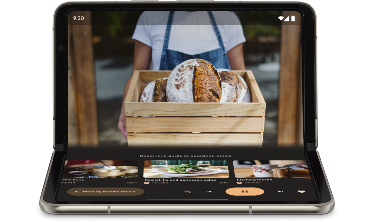
Posture
Adaptive apps respond to changes in the posture of foldable devices. Postures include tabletop and book posture.
The WindowInfoTracker interface in Jetpack WindowManager lets you to
obtain a list of DisplayFeature objects for the device. Among the display
features is FoldingFeature.State, which indicates whether the device is
fully or half open.
The Compose Material 3 Adaptive library provides the
currentWindowAdaptiveInfo() top‑level function, which returns an
instance of WindowAdaptiveInfo containing windowPosture.
Input beyond touch
Users often connect external keyboards, trackpads, mice, and styluses to large screen devices. The peripherals enhance user productivity, input precision, personal expression, and accessibility. Most ChromeOS devices come with keyboards and trackpads built in.
Adaptive apps support external input devices, but the Android framework does much of the work for you:
Jetpack Compose 1.7 and higher: Keyboard tab navigation and mouse or trackpad click, select, and scroll are supported by default.
Jetpack
androidx.compose.material3library: Enables users to write into anyTextFieldcomponent using a stylus.Keyboard Shortcuts Helper: Makes Android platform and app keyboard shortcuts discoverable by users. Publish your app's keyboard shortcuts in Keyboard Shortcuts Helper by overriding the
onProvideKeyboardShortcuts()window callback.
To fully support form factors of all sizes, adaptive apps support input of all types.
How to test adaptive apps
Test different screen and window sizes and different device configurations. Use host‑side screenshots and Compose previews to check your app layouts. Run your app on Android Studio emulators and remote Android devices hosted in Google data centers.
Large screen app quality guidelines
The large screen app quality guidelines help you verify that your adaptive app works well on tablets, foldables, and ChromeOS devices. The guidelines include tests that enable you to verify app functionality for critical user journeys. Although the guidelines focus on large screens, they're compatible with all screen sizes.
Multiple configurations
The DeviceConfigurationOverride interface in Compose 1.7 and higher
lets you to override various aspects of device configuration. The API
simulates different device configurations in a localized way for whatever
composable content you want to test. For example, you can test multiple,
arbitrary UI sizes in a single run of your test suite on a single device or
emulator.
With the DeviceConfigurationOverride.then() extension function, you can
test multiple configuration parameters, such as font size, locale, theme, and
layout size, all at the same time.
Host-side screenshots
Host-side screenshot tests are a fast and scalable way of verifying the visual appearance of your app layouts. Use host-side screenshots to test your UI for a variety of display sizes.
For more information, see Compose Preview Screenshot Testing.
Compose previews
Compose previews let you check your app's UI in the design view of Android
Studio. Previews use annotations, such as @PreviewScreenSizes,
@PreviewFontScale, and @PreviewLightDark to let you see composable
content in various configurations. You can even interact with the previews.
Android Studio also highlights common usability issues in previews, such as buttons or text fields that are too wide.
For more information, see Preview your UI with composable previews.
Emulators
Android Studio offers a variety of emulators for testing different layout sizes:
- Resizable emulator: Emulates a phone, tablet, or foldable device and lets you switch between them on the fly
- Pixel Fold emulator: Emulates the Pixel Fold large screen foldable phone
- Pixel Tablet emulator: Emulates the Pixel Tablet large screen device
- Desktop emulator: Lets you test free-form windowing, mouse hover, and keyboard shortcuts
Remote device streaming
Securely connect to remote Android devices hosted in Google data centers and run your app on the latest Pixel and Samsung devices. Install and debug apps, run ADB commands, and rotate and fold devices to verify that your app works well on a variety of real devices.
Remote device streaming is integrated into Android Studio. For more information, see Android Device Streaming, powered by Firebase.
Additional resources
- I/O presentation: Building adaptive Android apps