
פריסות קנוניות הן פריסות מגוונות ומוכחות שמספקות חוויית משתמש אופטימלית במגוון גורמים צורניים.

הפריסות הקנוניות תומכות בטלפונים עם מסכים קטנים, בטאבלטים, במכשירים מתקפלים ובמכשירי ChromeOS. הפריסות מבוססות על ההנחיות של Material Design, והן אסתטיות ופונקציונליות.
מסגרת Android כוללת רכיבים ייעודיים שהופכים את ההטמעה של הפריסות לפשוטה ומהימנה.
הפריסות הקנוניות יוצרות ממשקי משתמש מושכים שמשפרים את הפרודוקטיביות, ומהווים את הבסיס לאפליקציות מצוינות.
רשימה ופירוט
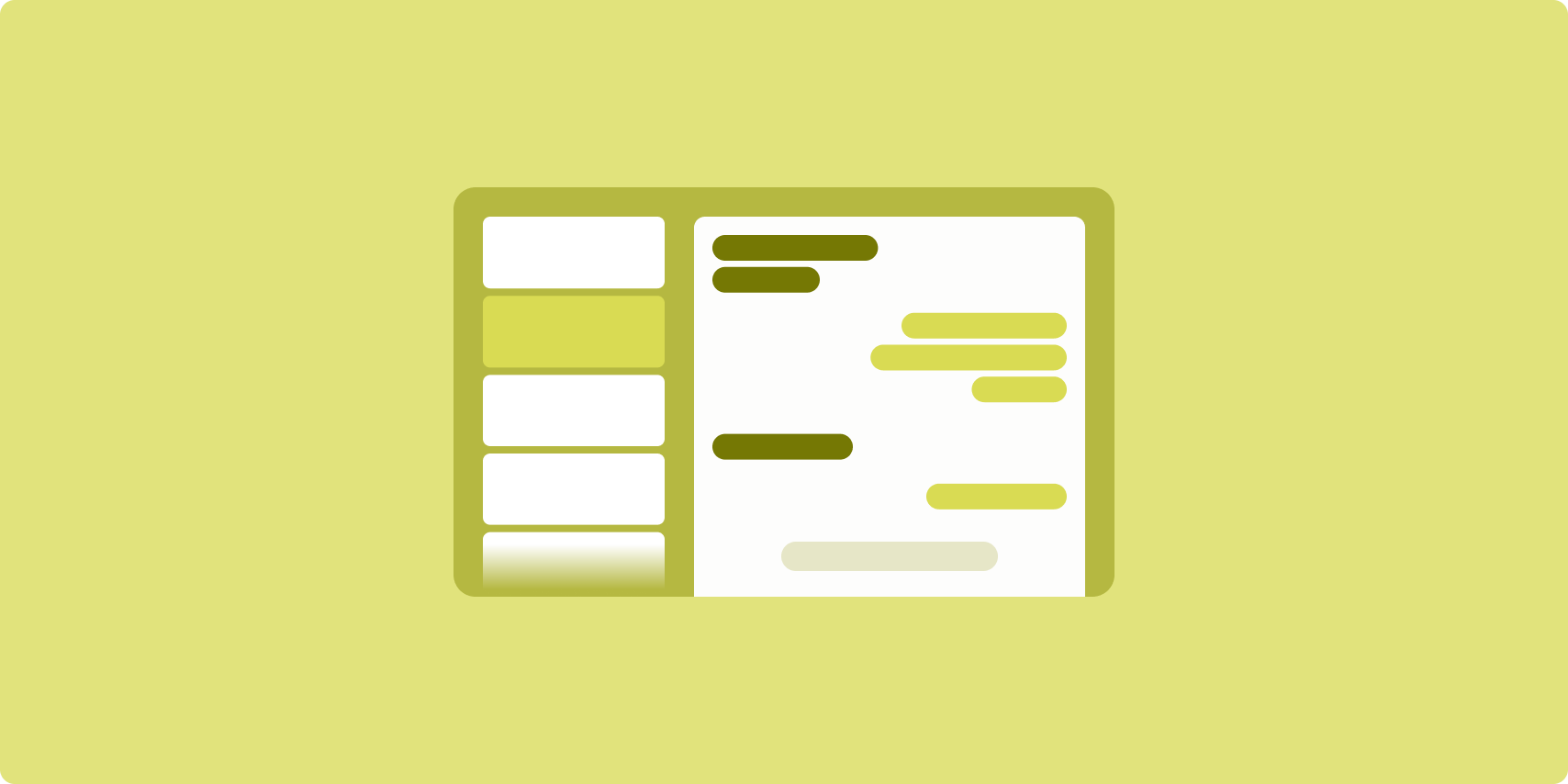
פריסת רשימה עם פרטים מאפשרת למשתמשים לעיין ברשימות של פריטים שיש להם מידע תיאורי, הסברי או מידע נוסף אחר – פרטי הפריט.
הפריסה מחלקת את חלון האפליקציה לשני חלונות צדדיים זה לצד זה: אחד לרשימה ואחד לפרטים. משתמשים בוחרים פריטים מהרשימה כדי להציג את פרטי הפריט. קישורי עומק בחלונית הפרטים חושפים תוכן נוסף בחלונית הפרטים.
במסכים רחבים (ראו שימוש במחלקות של גודל חלון) אפשר להציג את הרשימה ואת הפרטים בו-זמנית. כשבוחרים פריט ברשימה, חלונית הפרטים מתעדכנת ומציגה את התוכן שקשור לפריט שנבחר.
בתצוגות ברוחב בינוני וקומפקטי מוצגת הרשימה או הפרטים, בהתאם לאינטראקציה של המשתמש עם האפליקציה. כשהרשימה בלבד גלויה, בחירה של פריט ברשימה מציגה את הפרטים במקום הרשימה. כשרואים רק את הפרטים, לחיצה על הכפתור "הקודם" מציגה מחדש את הרשימה.
שינויים בהגדרות, כמו שינויים בכיוון המכשיר או בגודל חלון האפליקציה, יכולים לשנות את סיווג גודל החלון של התצוגה. פריסת רשימה עם פרטים מגיבה בהתאם, ושומרת על מצב האפליקציה:
- אם מסך רחב שמציג גם את הרשימה וגם את חלונית הפרטים מצטמצם לגודל בינוני או קומפקטי, חלונית הפרטים נשארת גלויה וחלונית הרשימה מוסתרת
- אם בתצוגה ברוחב בינוני או קומפקטי מוצג רק חלונית הפרטים, וגודל החלון משתנה ל'מורחב', הרשימה והפרטים מוצגים יחד, וברשימה מצוין שהפריט שמתאים לתוכן בחלונית הפרטים נבחר
- אם תצוגה ברוחב בינוני או קומפקטי מציגה רק את חלונית הרשימה, והרוחב שלה מתרחב, הרשימה וחלונית פרטים של placeholder מוצגות יחד
הפריסה 'רשימה עם פרטים' מתאימה במיוחד לאפליקציות להעברת הודעות, למנהלי אנשי קשר, לדפדפני מדיה אינטראקטיביים או לכל אפליקציה שבה התוכן יכול להיות מאורגן כרשימה של פריטים שחושפים מידע נוסף.
הטמעה
הפרדיגמה הדקלרטיבית של Compose תומכת בלוגיקה של מחלקת גודל החלון שקובעת אם להציג את חלוניות הרשימה והפרטים בו-זמנית (כשהרוחב של מחלקת גודל החלון מורחב) או רק את חלונית הרשימה או הפרטים (כשהרוחב של מחלקת גודל החלון הוא בינוני או קומפקטי).
כדי להבטיח זרימת נתונים חד-כיוונית, מעבירים את כל המצב, כולל פרטים על גודל החלון הנוכחי ופרטים על הפריט שנבחר ברשימה (אם יש כזה), כך שלכל הפונקציות הניתנות להרכבה תהיה גישה לנתונים והן יוכלו לבצע רינדור בצורה תקינה.
כשמציגים רק את חלונית הפרטים בגדלים קטנים של חלונות, מוסיפים BackHandler כדי להסיר את חלונית הפרטים ולהציג רק את חלונית הרשימה. ה-BackHandler לא מהווה חלק מהניווט הכולל באפליקציה, כי ה-handler תלוי במחלקה של גודל החלון ובמצב הפרטים שנבחרו.
ListDetailPaneScaffold הוא רכיב הניתן להרכבה ברמה גבוהה, שמפשט את ההטמעה של פריסות עם רשימה ופרטים. הוא מטפל אוטומטית בלוגיקה של החלונית על סמך סיווגים של גודל החלון, ותומך בניווט בין חלוניות.
הנה הטמעה מינימלית באמצעות ListDetailPaneScaffold:
@OptIn(ExperimentalMaterial3AdaptiveApi::class) @Composable fun MyListDetailPaneScaffold() { val navigator = rememberListDetailPaneScaffoldNavigator() ListDetailPaneScaffold( directive = navigator.scaffoldDirective, value = navigator.scaffoldValue, listPane = { // Listing Pane }, detailPane = { // Details Pane } ) }
הרכיבים העיקריים בדוגמה הזו הם:
-
rememberListDetailPaneScaffoldNavigator: יוצר רכיב ניווט לניהול הניווט בין חלוניות הרשימה והפרטים. -
listPane: הצגת רשימת הפריטים. -
detailPane: הצגת התוכן של פריט נבחר.
דוגמאות מפורטות להטמעה זמינות במאמרים הבאים:
פיד
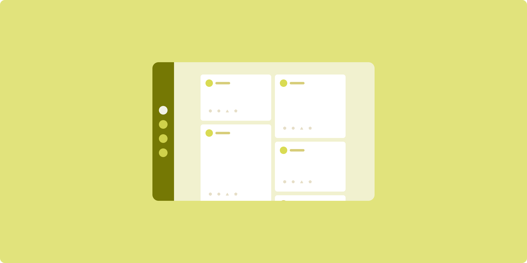
פריסת פיד מארגנת רכיבי תוכן שווי ערך ברשת שניתנת להגדרה, כדי לאפשר צפייה מהירה ונוחה בכמות גדולה של תוכן.
הגודל והמיקום יוצרים קשרים בין רכיבי התוכן.
קבוצות תוכן נוצרות על ידי יצירת רכיבים באותו גודל ומיקומם יחד. כדי למשוך תשומת לב לרכיבים, צריך להגדיל אותם ביחס לרכיבים הסמוכים.
כרטיסים ורשימות הם רכיבים נפוצים בפריסות של פידים.
פריסת פיד תומכת בתצוגות כמעט בכל גודל, כי הרשת יכולה להשתנות מעמודה אחת עם גלילה לפיד עם גלילה של תוכן בכמה עמודות.
פידים מתאימים במיוחד לאפליקציות של חדשות ומדיה חברתית.
הטמעה
פיד מורכב ממספר גדול של רכיבי תוכן במיכל עם גלילה אנכית, שמוצגים בפריסה של רשת. רשימות עצלניות מאפשרות לעבד ביעילות מספר גדול של פריטים בעמודות או בשורות. Lazy grids מעבדים פריטים בטבלאות, ותומכים בהגדרת הגדלים והטווחים של הפריטים.
הגדרת העמודות של פריסת הרשת על סמך אזור התצוגה הזמין כדי להגדיר את הרוחב המינימלי המותר לפריטים ברשת. כשמגדירים פריטים ברשת, אפשר לשנות את מספר העמודות שהפריטים תופסים כדי להבליט פריטים מסוימים יותר מאחרים.
כדי שפריטים כמו כותרות של קטעים, קווים להפרדה או פריטים אחרים שנועדו לתפוס את כל הרוחב של הפיד יתפסו את כל הרוחב של הפריסה, צריך להשתמש ב-maxLineSpan.
במסכים צרים שאין בהם מספיק מקום להצגת יותר מעמודה אחת, התג LazyVerticalGrid מתנהג בדיוק כמו התג LazyColumn.
הנה הטמעה מינימלית באמצעות LazyVerticalGrid:
@Composable fun MyFeed(names: List<String>) { LazyVerticalGrid( // GridCells.Adaptive automatically adapts column count based on available width columns = GridCells.Adaptive(minSize = 180.dp), ) { items(names) { name -> Text(name) } } }
הסוד לפיד שמותאם לצרכים שלכם הוא ההגדרה columns.
GridCells.Adaptive(minSize = 180.dp) יוצר רשת שבה כל עמודה היא ברוחב של לפחות 180.dp. לאחר מכן, הרשת תציג כמה עמודות שאפשר להציג במקום הפנוי.
דוגמה להטמעה מופיעה בדוגמה של פיד עם Compose.
חלונית תומכת

פריסת חלוניות תומכת בארגון התוכן של האפליקציה באזורים של מסכים ראשיים ומשניים.
אזור התצוגה הראשי תופס את רוב חלון האפליקציה (בדרך כלל כשני שלישים) ומכיל את התוכן העיקרי. אזור התצוגה המשני הוא חלונית שתופסת את שאר חלון האפליקציה ומציגה תוכן שתומך בתוכן הראשי.
פריסות חלוניות תומכות פועלות היטב במסכים רחבים (ראו שימוש במחלקות של גודל חלון) בכיוון לרוחב. במסכים ברוחב בינוני או קומפקטי אפשר להציג גם את האזורים הראשיים וגם את האזורים המשניים, אם התוכן ניתן להתאמה למסכים צרים יותר, או אם אפשר להסתיר את התוכן הנוסף בתחילה בגיליון תחתון או צדדי שאפשר לגשת אליו באמצעות אמצעי בקרה כמו תפריט או לחצן.
ההבדל בין פריסת חלונית תומכת לבין פריסת רשימה עם פרטים הוא ביחס בין התוכן הראשי לתוכן המשני. התוכן בחלונית המשנית משמעותי רק ביחס לתוכן הראשי. לדוגמה, חלון של הכלי תומך בחלונית לא רלוונטי בפני עצמו. לעומת זאת, התוכן המשני בחלונית הפרטים של פריסת רשימה-פרטים הוא בעל משמעות גם ללא התוכן הראשי. לדוגמה, תיאור של מוצר מרשימת מוצרים.
תרחישי שימוש בחלונית התמיכה כוללים:
- אפליקציות פרודוקטיביות: מסמך או גיליון אלקטרוני עם הערות של בודק בחלונית תומכת
- אפליקציות מדיה: סרטון בסטרימינג ורשימה של סרטונים קשורים בחלונית תומכת, או תיאור של אלבום מוזיקה בתוספת פלייליסט
- כלים והגדרות: כלי לעריכת מדיה עם פלטות, אפקטים והגדרות אחרות בחלונית תמיכה
הטמעה
התכונה 'יצירת מוזיקה' תומכת בלוגיקה של סיווג גודל החלון, שמאפשרת לכם לקבוע אם להציג את התוכן העיקרי ואת התוכן התומך בו בו-זמנית, או למקם את התוכן התומך במיקום חלופי.
העברת כל המצב, כולל גודל חלון ההקשר הנוכחי ומידע שקשור לנתונים בתוכן הראשי ובתוכן התומך.
במסכים צרים, מומלץ להציב את התוכן התומך מתחת לתוכן הראשי או בגיליון תחתון. במקרים של רוחב בינוני ורוחב מורחב, צריך למקם את התוכן התומך לצד התוכן הראשי, בגודל המתאים על סמך התוכן והשטח הזמין. ברוחב בינוני, מחלקים את שטח התצוגה באופן שווה בין התוכן הראשי לתוכן המשני. בפריסה ברוחב מורחב, 70% מהשטח מוקצים לתוכן הראשי ו-30% לתוכן המשני.
SupportingPaneScaffold הוא קומפוננטה ברמה גבוהה שמפשטת את ההטמעה של פריסות חלוניות נתמכות. הקומפוזבל מטפל אוטומטית בלוגיקה של החלונית על סמך מחלקות גודל החלון, ומציג חלוניות זו לצד זו במסכים גדולים או מסתיר את חלונית התמיכה במסכים קטנים. SupportingPaneScaffold
תומך גם בניווט בין חלוניות.
הנה הטמעה מינימלית:
@OptIn(ExperimentalMaterial3AdaptiveApi::class) @Composable fun MySupportingPaneScaffold() { // Creates and remembers a navigator to control pane visibility and navigation val navigator = rememberSupportingPaneScaffoldNavigator() SupportingPaneScaffold( // Directive and value help control pane visibility based on screen size and state directive = navigator.scaffoldDirective, value = navigator.scaffoldValue, mainPane = { // Main Pane for the primary content }, supportingPane = { //Supporting Pane for supplementary content } ) }
-
rememberSupportingPaneScaffoldNavigator: קומפוזבל שיוצר רכיב ניווט לניהול החשיפה של חלונית (לדוגמה, הסתרה או הצגה של חלונית התמיכה במסכים קומפקטיים) -
mainPane: רכיב Composable שמציג את התוכן הראשי -
supportingPane: רכיב שאפשר להוסיף לו תוכן שמוצג בנוסף לתוכן העיקרי
דוגמאות מפורטות להטמעה זמינות במאמרים הבאים:
מקורות מידע נוספים
- Material Design – פריסות קנוניות