
Testing is an integral part of the app development process. You usually run apps on an emulator or device to manually verify that your code works as expected. However, manual testing is time consuming, susceptible to errors, and often unmanageable for apps that run on screens and devices of various sizes. The problems of manual testing are most often the result of using a single device for development. As a result, errors can go unnoticed on other devices with different form factors.
To identify regressions on different window and screen sizes, implement automated tests to verify that the behavior and look of your app is consistent across different form factors. Automated tests identify issues early on, mitigating the risk of problems impacting the user experience.
What to test
When developing UIs made for different screen and window sizes, pay special attention to two aspects:
- How the visual attributes of the components and layouts are different on windows of different sizes
- How state is preserved across configuration changes
Visual attributes
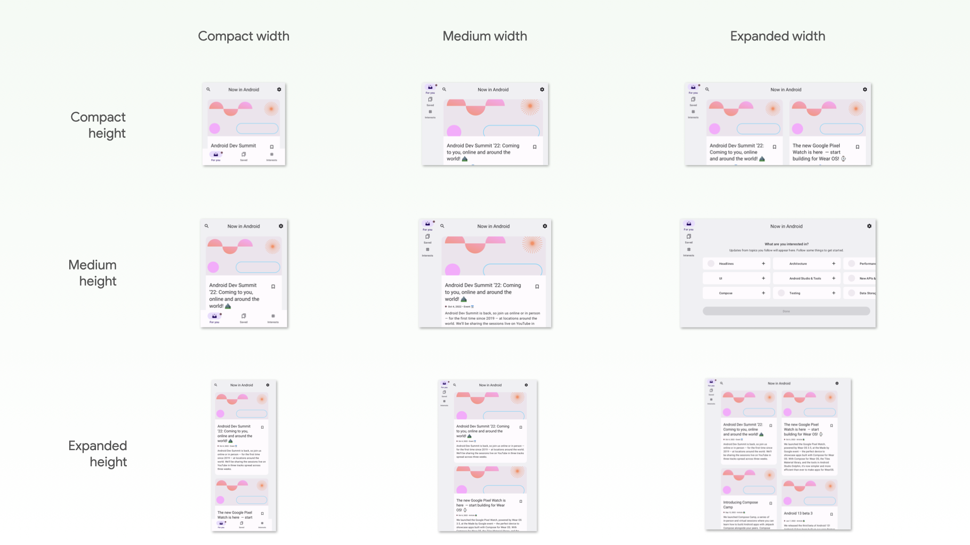
Whether you customize UIs for different window sizes or not, you should verify that the UIs are displayed correctly. Take into account widths and heights that are compact, medium, and extended. See Window size classes for the recommended breakpoints.
Also, your app might not render some components in your design system as expected when their size constraints are stretched.
If your app has adaptive layouts for different window sizes, you should have automated tests to prevent regressions. For example, fixing a margin on a phone can lead to layout inconsistencies on a tablet. Create UI tests to verify the behavior of your layouts and components, or construct screenshot tests to verify the layouts visually.
State restoration
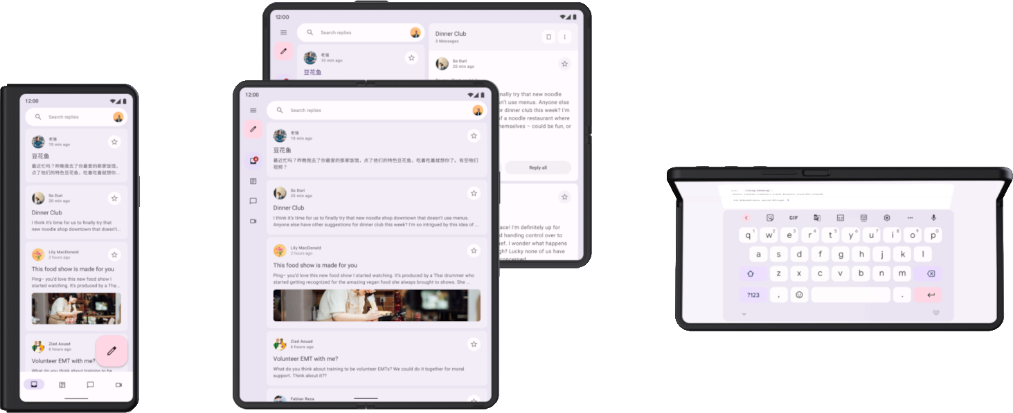
Apps running on devices such as tablets are rotated and resized much more frequently than apps on phones. Also, foldables introduce new display capabilities, such as folding and unfolding, that can trigger configuration changes. Your app needs to be able to restore state when these configuration changes occur. You also then need to write tests that confirm your app restores state correctly.
First, test that your app doesn't crash when configuration changes occur. Make sure that every UI in your app can handle any combination of rotating, resizing, or folding. Because configuration changes recreate the activity by default, some crashes happen due to assumptions of activity persistence.
There are multiple ways to test configuration changes, but for most cases, there are two ways to test:
- In Compose, use
StateRestorationTesterto simulate a configuration change in an efficient way without restarting the activity. See the following sections for more information. - In any UI test such as Espresso or Compose, simulate a configuration change
by calling
Activity.recreate().
You generally don't have to use different devices to test state restoration in response to configuration changes. This is because all configuration changes that recreate the activity have similar repercussions. However, some configuration changes might trigger different state restoration mechanisms on specific devices.
For example, when a user is viewing a list-detail UI on an open foldable and they fold the device to switch to the front display, the UI typically switches to the detail page. An automated test should cover this restoration of the UI state, including the navigation state.
To test configuration changes that happen on devices going from one display to another or entering multi-window mode, you have multiple options:
- Using any device, resize the screen during a test. In most cases, this triggers all the state restoration mechanisms that you need to verify. However, this test won't work for logic that detects specific postures in foldables, as posture changes don't trigger a configuration change.
- Using a device or emulator that supports the features you want to test, trigger the related configuration changes. For example, a foldable or a tablet can be controlled using Espresso Device to move from folded to open flat in landscape. See the Espresso Device section of Libraries and tools to test different screen sizes for examples.
Types of tests for different screen and window sizes
Use the appropriate type of test for each use case to verify the test is working correctly across different form factors:
UI behavior tests launch some portion of the app UI, such as the display of an activity. The tests verify that certain elements exist or have specific attributes . The tests might optionally perform simulated user actions. For views, use Espresso. Jetpack Compose has its own testing APIs. UI behavior tests can be instrumented or local. Instrumented tests run on devices or emulators, while local UI tests run on Robolectric on the JVM.
Use UI behavior tests to verify that an app's implementation of navigation is correct. The tests perform actions such as clicks and swipes. UI behavior tests also check the existence of certain elements or properties. For more information, see Automate UI tests.
Screenshot tests take a screenshot of a UI or component and compare the image to a previously approved screenshot. This is a very effective way to protect against regressions, as a single screenshot can cover a large number of elements and its visual properties. You can run screenshot tests on the JVM or on devices. There are multiple screenshot test frameworks available. For more information, see screenshot tests.
Finally, you might need unit tests to test the functionality of units of logic that behave differently depending on the type of device or window size, but unit tests are less common in this area.
Next steps
For more information about how to implement the checks contained in this document, see Libraries and tools.