
VerticalSlider
Functions summary
Unit |
@ExperimentalMaterial3ExpressiveApi |
Cmn
|
Functions
VerticalSlider
@ExperimentalMaterial3ExpressiveApi
@Composable
fun VerticalSlider(
    state: SliderState,
    modifier: Modifier = Modifier,
    enabled: Boolean = true,
    reverseDirection: Boolean = false,
    colors: SliderColors = SliderDefaults.colors(),
    interactionSource: MutableInteractionSource = remember { MutableInteractionSource() },
    thumb: @Composable (SliderState) -> Unit = { sliderState ->
        SliderDefaults.Thumb(
            interactionSource = interactionSource,
            sliderState = sliderState,
            colors = colors,
            enabled = enabled,
            thumbSize = VerticalThumbSize,
        )
    },
    track: @Composable (SliderState) -> Unit = { sliderState ->
        SliderDefaults.Track(
            colors = colors,
            enabled = enabled,
            sliderState = sliderState,
            trackCornerSize = Dp.Unspecified,
        )
    }
): Unit
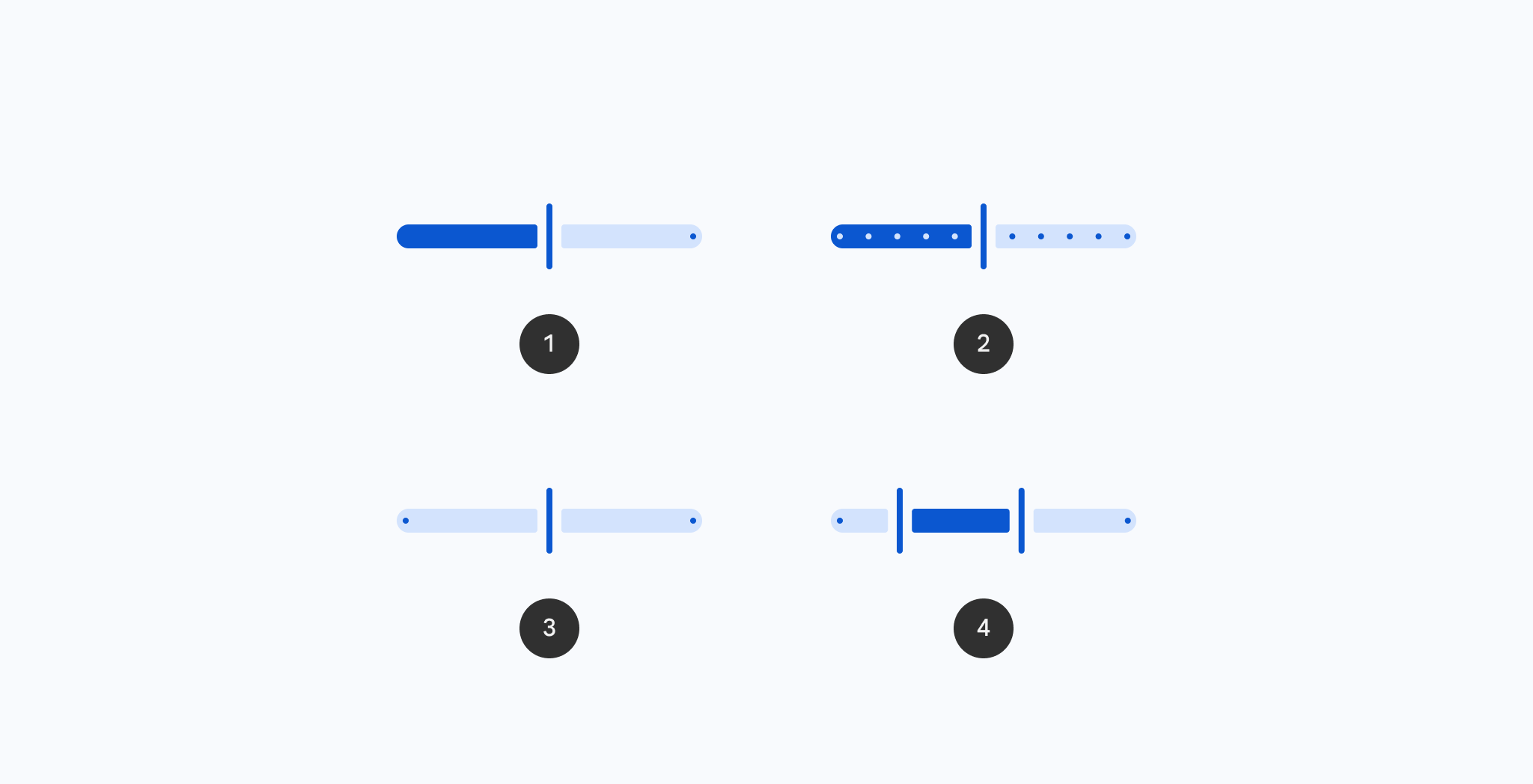
Vertical Sliders allow users to make selections from a range of values.
Vertical Sliders reflect a range of values along a vertical bar, from which users may select a single value. They are ideal for adjusting settings such as volume, brightness, or applying image filters.
Vertical Slider:
import androidx.compose.animation.core.animate
import androidx.compose.foundation.interaction.MutableInteractionSource
import androidx.compose.foundation.layout.Column
import androidx.compose.foundation.layout.Spacer
import androidx.compose.foundation.layout.height
import androidx.compose.foundation.layout.padding
import androidx.compose.foundation.layout.width
import androidx.compose.foundation.progressSemantics
import androidx.compose.material3.MaterialTheme
import androidx.compose.material3.Slider
import androidx.compose.material3.SliderDefaults
import androidx.compose.material3.Text
import androidx.compose.material3.VerticalSlider
import androidx.compose.material3.rememberSliderState
import androidx.compose.runtime.getValue
import androidx.compose.runtime.mutableFloatStateOf
import androidx.compose.runtime.mutableStateOf
import androidx.compose.runtime.remember
import androidx.compose.runtime.rememberCoroutineScope
import androidx.compose.runtime.saveable.rememberSaveable
import androidx.compose.ui.Alignment
import androidx.compose.ui.Modifier
import androidx.compose.ui.unit.dp

val coroutineScope = rememberCoroutineScope()
val sliderState =
    rememberSliderState(
        // Only allow multiples of 10. Excluding the endpoints of `valueRange`,
        // there are 9 steps (10, 20, ..., 90).
        steps = 9,
        valueRange = 0f..100f,
    )
val snapAnimationSpec = MaterialTheme.motionScheme.fastEffectsSpec<Float>()
var currentValue by rememberSaveable { mutableFloatStateOf(sliderState.value) }
var animateJob: Job? by remember { mutableStateOf(null) }
sliderState.shouldAutoSnap = false
sliderState.onValueChange = { newValue ->
    currentValue = newValue
    // only update the sliderState instantly if dragging
    if (sliderState.isDragging) {
        animateJob?.cancel()
        sliderState.value = newValue
    }
}
sliderState.onValueChangeFinished = {
    animateJob =
        coroutineScope.launch {
            animate(
                initialValue = sliderState.value,
                targetValue = currentValue,
                animationSpec = snapAnimationSpec,
            ) { value, _ ->
                sliderState.value = value
            }
        }
}
val interactionSource = remember { MutableInteractionSource() }
Column(modifier = Modifier.padding(horizontal = 16.dp)) {
    Text(
        modifier = Modifier.align(Alignment.CenterHorizontally),
        text = "%.2f".format(sliderState.value),
    )
    Spacer(Modifier.height(16.dp))
    VerticalSlider(
        state = sliderState,
        modifier =
            Modifier.height(300.dp)
                .align(Alignment.CenterHorizontally)
                .progressSemantics(
                    currentValue,
                    sliderState.valueRange.start..sliderState.valueRange.endInclusive,
                    sliderState.steps,
                ),
        interactionSource = interactionSource,
        track = {
            SliderDefaults.Track(
                sliderState = sliderState,
                modifier = Modifier.width(36.dp),
                trackCornerSize = 12.dp,
            )
        },
        reverseDirection = true,
    )
}
Vertical Slider with a centered track:
import androidx.compose.animation.core.animate
import androidx.compose.foundation.interaction.MutableInteractionSource
import androidx.compose.foundation.layout.Column
import androidx.compose.foundation.layout.Spacer
import androidx.compose.foundation.layout.height
import androidx.compose.foundation.layout.padding
import androidx.compose.foundation.progressSemantics
import androidx.compose.material3.MaterialTheme
import androidx.compose.material3.Slider
import androidx.compose.material3.SliderDefaults
import androidx.compose.material3.Text
import androidx.compose.material3.VerticalSlider
import androidx.compose.material3.rememberSliderState
import androidx.compose.runtime.getValue
import androidx.compose.runtime.mutableFloatStateOf
import androidx.compose.runtime.mutableStateOf
import androidx.compose.runtime.remember
import androidx.compose.runtime.rememberCoroutineScope
import androidx.compose.runtime.saveable.rememberSaveable
import androidx.compose.ui.Alignment
import androidx.compose.ui.Modifier
import androidx.compose.ui.unit.dp

val coroutineScope = rememberCoroutineScope()
val sliderState =
    rememberSliderState(
        // Only allow multiples of 10. Excluding the endpoints of `valueRange`,
        // there are 9 steps (10, 20, ..., 90).
        steps = 9,
        valueRange = -50f..50f,
    )
val snapAnimationSpec = MaterialTheme.motionScheme.fastEffectsSpec<Float>()
var currentValue by rememberSaveable { mutableFloatStateOf(sliderState.value) }
var animateJob: Job? by remember { mutableStateOf(null) }
sliderState.shouldAutoSnap = false
sliderState.onValueChange = { newValue ->
    currentValue = newValue
    // only update the sliderState instantly if dragging
    if (sliderState.isDragging) {
        animateJob?.cancel()
        sliderState.value = newValue
    }
}
sliderState.onValueChangeFinished = {
    animateJob =
        coroutineScope.launch {
            animate(
                initialValue = sliderState.value,
                targetValue = currentValue,
                animationSpec = snapAnimationSpec,
            ) { value, _ ->
                sliderState.value = value
            }
        }
}
val interactionSource = remember { MutableInteractionSource() }
Column(modifier = Modifier.padding(horizontal = 16.dp)) {
    Text(
        modifier = Modifier.align(Alignment.CenterHorizontally),
        text = "%.2f".format(sliderState.value),
    )
    Spacer(Modifier.height(16.dp))
    VerticalSlider(
        state = sliderState,
        modifier =
            Modifier.height(300.dp)
                .align(Alignment.CenterHorizontally)
                .progressSemantics(
                    currentValue,
                    sliderState.valueRange.start..sliderState.valueRange.endInclusive,
                    sliderState.steps,
                ),
        interactionSource = interactionSource,
        track = { SliderDefaults.CenteredTrack(sliderState = sliderState) },
        reverseDirection = true,
    )
}
| Parameters | |
|---|---|
state: SliderState |
|
modifier: Modifier = Modifier |
the |
enabled: Boolean = true |
controls the enabled state of this slider. When |
reverseDirection: Boolean = false |
controls the direction of this slider. Default is top to bottom. |
colors: SliderColors = SliderDefaults.colors() |
|
interactionSource: MutableInteractionSource = remember { MutableInteractionSource() } |
the |
thumb: @Composable (SliderState) -> Unit = { sliderState ->
        SliderDefaults.Thumb(
            interactionSource = interactionSource,
            sliderState = sliderState,
            colors = colors,
            enabled = enabled,
            thumbSize = VerticalThumbSize,
        )
} |
the thumb to be displayed on the slider, it is placed on top of the track. The lambda receives a |
track: @Composable (SliderState) -> Unit = { sliderState ->
        SliderDefaults.Track(
            colors = colors,
            enabled = enabled,
            sliderState = sliderState,
            trackCornerSize = Dp.Unspecified,
        )
} |
the track to be displayed on the slider, it is placed underneath the thumb. The lambda receives a |