
Stepper
Functions summary
Unit |
@Composable
|
Unit |
@Composable
|
Functions
Stepper
@Composable
fun Stepper(
    value: Int,
    onValueChange: (Int) -> Unit,
    valueProgression: IntProgression,
    decreaseIcon: @Composable () -> Unit,
    increaseIcon: @Composable () -> Unit,
    modifier: Modifier = Modifier,
    enabled: Boolean = true,
    colors: StepperColors = StepperDefaults.colors(),
    content: @Composable BoxScope.() -> Unit
): Unit
Stepper allows users to make a selection from a range of values. It's a full-screen control with increase button on the top, decrease button on the bottom and a slot (expected to have either Text or Button) in the middle. Value can be increased and decreased by clicking on the increase and decrease buttons. Buttons can have custom icons - decreaseIcon and increaseIcon. Stepper itself doesn't show the current value but can be displayed via the content slot or StepperLevelIndicator if required. To add range semantics on Stepper, use Modifier.rangeSemantics.
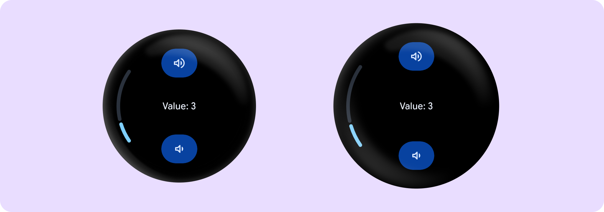
Example of a Stepper with integer values:
import androidx.compose.foundation.layout.Box
import androidx.compose.foundation.layout.fillMaxSize
import androidx.compose.runtime.mutableIntStateOf
import androidx.compose.runtime.remember
import androidx.compose.ui.Alignment
import androidx.compose.ui.Modifier
import androidx.wear.compose.material3.Stepper
import androidx.wear.compose.material3.StepperDefaults
import androidx.wear.compose.material3.StepperLevelIndicator
import androidx.wear.compose.material3.Text
import androidx.wear.compose.material3.samples.icons.VolumeDownIcon
import androidx.wear.compose.material3.samples.icons.VolumeUpIcon

var value by remember { mutableIntStateOf(3) }
val valueProgression = remember { 0..10 }
Box(modifier = Modifier.fillMaxSize()) {
    Stepper(
        value = value,
        onValueChange = { value = it },
        valueProgression = valueProgression,
        decreaseIcon = { VolumeDownIcon(StepperDefaults.IconSize) },
        increaseIcon = { VolumeUpIcon(StepperDefaults.IconSize) },
    ) {
        Text(String.format("Value: %d".format(value)))
    }
    StepperLevelIndicator(
        value = { value },
        valueProgression = valueProgression,
        modifier = Modifier.align(Alignment.CenterStart),
    )
}
A number of steps is calculated as the difference between max and min values of valueProgression divided by valueProgression.step - 1. For example, with a range of 100..120 and a step 5, number of steps will be (120-100)/ 5 - 1 = 3. Steps are 100(first), 105, 110, 115, 120(last)
If valueProgression range is not equally divisible by valueProgression.step, then valueProgression.last will be adjusted to the closest divisible value in the range. For example, 1..13 range and a step = 5, steps will be 1(first), 6, 11(last)
If value is not equal to any step value, then it will be coerced to the closest step value. However, the value itself will not be changed and onValueChange in this case will not be triggered.
| Parameters | |
|---|---|
value: Int |
Current value of the Stepper. If outside of |
onValueChange: (Int) -> Unit |
Lambda in which value should be updated. |
valueProgression: IntProgression |
Progression of values that Stepper value can take. Consists of rangeStart, rangeEnd and step. Range will be equally divided by step size. |
decreaseIcon: @Composable () -> Unit |
A slot for an icon which is placed on the decrease (bottom) button. |
increaseIcon: @Composable () -> Unit |
A slot for an icon which is placed on the increase (top) button. |
modifier: Modifier = Modifier |
Modifiers for the Stepper layout. |
enabled: Boolean = true |
Whether the |
colors: StepperColors = StepperDefaults.colors() |
|
content: @Composable BoxScope.() -> Unit |
Content body for the Stepper. |
Stepper
@Composable
fun Stepper(
    value: Float,
    onValueChange: (Float) -> Unit,
    steps: Int,
    decreaseIcon: @Composable () -> Unit,
    increaseIcon: @Composable () -> Unit,
    modifier: Modifier = Modifier,
    enabled: Boolean = true,
    valueRange: ClosedFloatingPointRange<Float> = 0f..(steps + 1).toFloat(),
    colors: StepperColors = StepperDefaults.colors(),
    content: @Composable BoxScope.() -> Unit
): Unit
Stepper allows users to make a selection from a range of values. It's a full-screen control with increase button on the top, decrease button on the bottom and a slot (expected to have either Text or Button) in the middle. Value can be increased and decreased by clicking on the increase and decrease buttons. Buttons can have custom icons - decreaseIcon and increaseIcon. Step value is calculated as the difference between min and max values divided by steps+1. Stepper itself doesn't show the current value but can be displayed via the content slot or StepperLevelIndicator if required. If value is not equal to any step value, then it will be coerced to the closest step value. However, the value itself will not be changed and onValueChange in this case will not be triggered. To add range semantics on Stepper, use Modifier.rangeSemantics.
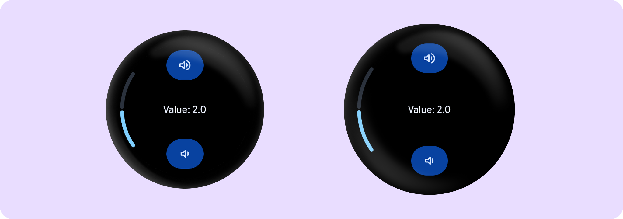
Example of a simple Stepper with StepperLevelIndicator:
import androidx.compose.foundation.layout.Box
import androidx.compose.foundation.layout.fillMaxSize
import androidx.compose.runtime.mutableFloatStateOf
import androidx.compose.runtime.remember
import androidx.compose.ui.Alignment
import androidx.compose.ui.Modifier
import androidx.wear.compose.material3.Stepper
import androidx.wear.compose.material3.StepperDefaults
import androidx.wear.compose.material3.StepperLevelIndicator
import androidx.wear.compose.material3.Text
import androidx.wear.compose.material3.samples.icons.VolumeDownIcon
import androidx.wear.compose.material3.samples.icons.VolumeUpIcon

var value by remember { mutableFloatStateOf(2f) }
val valueRange = remember { 0f..4f }
Box(modifier = Modifier.fillMaxSize()) {
    Stepper(
        value = value,
        onValueChange = { value = it },
        valueRange = valueRange,
        steps = 7,
        decreaseIcon = { VolumeDownIcon(StepperDefaults.IconSize) },
        increaseIcon = { VolumeUpIcon(StepperDefaults.IconSize) },
    ) {
        Text(String.format("Value: %.1f".format(value)))
    }
    StepperLevelIndicator(
        value = { value },
        valueRange = valueRange,
        modifier = Modifier.align(Alignment.CenterStart),
    )
}
Example of a Stepper with range semantics:
import androidx.compose.foundation.layout.Box
import androidx.compose.foundation.layout.fillMaxSize
import androidx.compose.runtime.mutableFloatStateOf
import androidx.compose.runtime.remember
import androidx.compose.ui.Alignment
import androidx.compose.ui.Modifier
import androidx.wear.compose.material3.Stepper
import androidx.wear.compose.material3.StepperDefaults
import androidx.wear.compose.material3.StepperLevelIndicator
import androidx.wear.compose.material3.Text
import androidx.wear.compose.material3.rangeSemantics
import androidx.wear.compose.material3.samples.icons.VolumeDownIcon
import androidx.wear.compose.material3.samples.icons.VolumeUpIcon

var value by remember { mutableFloatStateOf(2f) }
val valueRange = remember { 0f..4f }
val onValueChange = { i: Float -> value = i }
val steps = 7
Box(modifier = Modifier.fillMaxSize()) {
    Stepper(
        value = value,
        onValueChange = onValueChange,
        valueRange = valueRange,
        modifier = Modifier.rangeSemantics(value, true, onValueChange, valueRange, steps),
        steps = steps,
        decreaseIcon = { VolumeDownIcon(StepperDefaults.IconSize) },
        increaseIcon = { VolumeUpIcon(StepperDefaults.IconSize) },
    ) {
        Text("Value: $value")
    }
    StepperLevelIndicator(
        value = { value },
        valueRange = valueRange,
        modifier = Modifier.align(Alignment.CenterStart),
    )
}
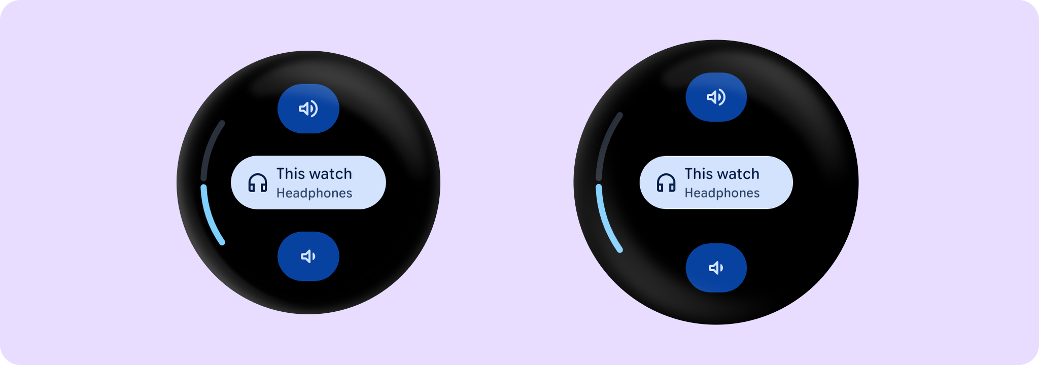
Example of a Stepper with Custom icons and Button content:
import androidx.compose.foundation.layout.Box
import androidx.compose.foundation.layout.fillMaxSize
import androidx.compose.foundation.layout.fillMaxWidth
import androidx.compose.foundation.layout.width
import androidx.compose.runtime.mutableFloatStateOf
import androidx.compose.runtime.remember
import androidx.compose.ui.Alignment
import androidx.compose.ui.Modifier
import androidx.compose.ui.unit.dp
import androidx.wear.compose.material3.Button
import androidx.wear.compose.material3.Stepper
import androidx.wear.compose.material3.StepperDefaults
import androidx.wear.compose.material3.StepperLevelIndicator
import androidx.wear.compose.material3.Text
import androidx.wear.compose.material3.samples.icons.HeadphoneIcon
import androidx.wear.compose.material3.samples.icons.VolumeDownIcon
import androidx.wear.compose.material3.samples.icons.VolumeUpIcon

var value by remember { mutableFloatStateOf(2f) }
val valueRange = remember { 0f..4f }
Box(modifier = Modifier.fillMaxSize()) {
    Stepper(
        value = value,
        onValueChange = { value = it },
        valueRange = valueRange,
        increaseIcon = { VolumeUpIcon(StepperDefaults.IconSize) },
        decreaseIcon = { VolumeDownIcon(StepperDefaults.IconSize) },
        steps = 7,
    ) {
        Text(String.format("Value: %.1f".format(value)))
        Button(
            onClick = {},
            modifier = Modifier.width(150.dp),
            label = { Text(text = "This watch", modifier = Modifier.fillMaxWidth()) },
            secondaryLabel = { Text(text = "Headphones", modifier = Modifier.fillMaxWidth()) },
            icon = { HeadphoneIcon(24.dp) },
        )
    }
    StepperLevelIndicator(
        value = { value },
        valueRange = valueRange,
        modifier = Modifier.align(Alignment.CenterStart),
    )
}
| Parameters | |
|---|---|
value: Float |
Current value of the Stepper. If outside of |
onValueChange: (Float) -> Unit |
Lambda in which value should be updated. |
steps: Int |
Specifies the number of discrete values, excluding min and max values, evenly distributed across the whole value range. Must not be negative. If 0, stepper will have only min and max values and no steps in between. |
decreaseIcon: @Composable () -> Unit |
A slot for an icon which is placed on the decrease (bottom) button. |
increaseIcon: @Composable () -> Unit |
A slot for an icon which is placed on the increase (top) button. |
modifier: Modifier = Modifier |
Modifiers for the Stepper layout. |
enabled: Boolean = true |
Whether the |
valueRange: ClosedFloatingPointRange<Float> = 0f..(steps + 1).toFloat() |
Range of values that Stepper value can take. Passed |
colors: StepperColors = StepperDefaults.colors() |
|
content: @Composable BoxScope.() -> Unit |
Content body for the Stepper. |