
OpenOnPhoneDialog
Functions summary
Unit |
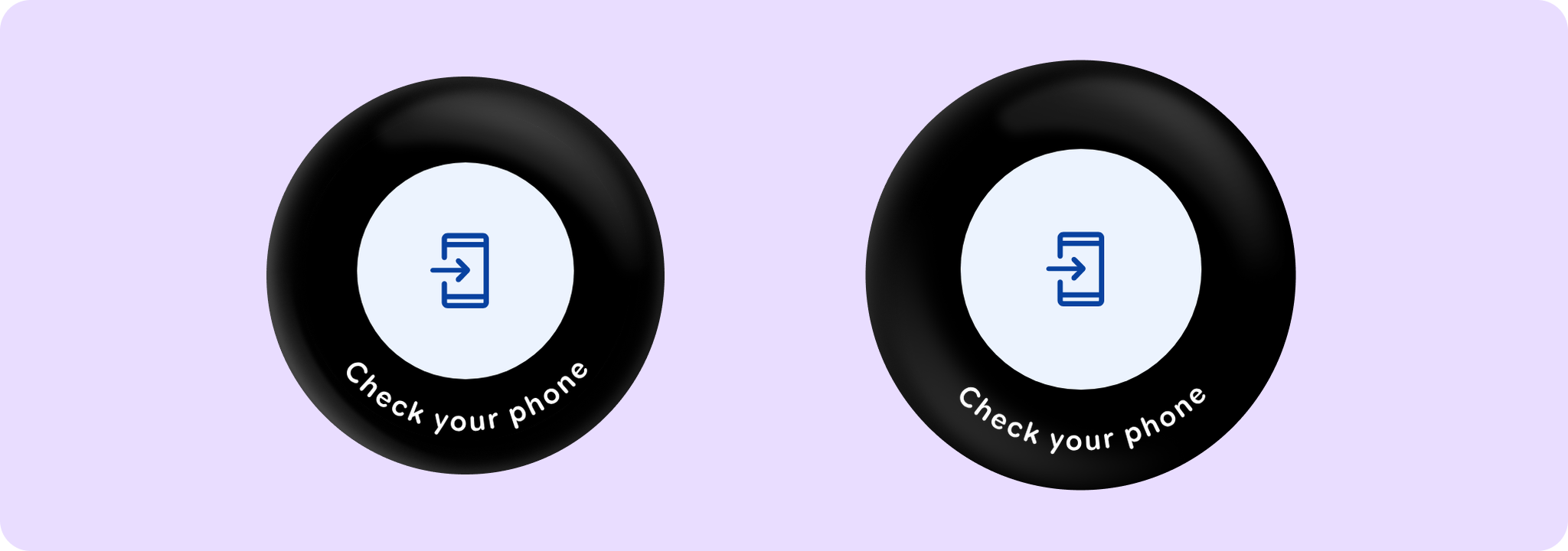
@ComposableA full-screen dialog that displays an animated icon with a curved text at the bottom. |
Functions
OpenOnPhoneDialog
@Composable
fun OpenOnPhoneDialog(
    visible: Boolean,
    onDismissRequest: () -> Unit,
    curvedText: (CurvedScope.() -> Unit)?,
    modifier: Modifier = Modifier,
    colors: OpenOnPhoneDialogColors = OpenOnPhoneDialogDefaults.colors(),
    properties: DialogProperties = DialogProperties(),
    durationMillis: Long = OpenOnPhoneDialogDefaults.DurationMillis,
    content: @Composable () -> Unit = { OpenOnPhoneDialogDefaults.Icon() }
): Unit
A full-screen dialog that displays an animated icon with a curved text at the bottom.
The dialog will be showing a message to the user for durationMillis. After a specified timeout, the onDismissRequest callback will be invoked, where it's up to the caller to handle the dismissal. To hide the dialog, visible parameter should be set to false.
This dialog is typically used to indicate that an action has been initiated and will continue on the user's phone. Once this dialog is displayed, it's developer responsibility to establish the connection between the watch and the phone.
Example of an OpenOnPhoneDialog usage:
import androidx.compose.foundation.layout.Box
import androidx.compose.foundation.layout.fillMaxSize
import androidx.compose.runtime.mutableStateOf
import androidx.compose.runtime.remember
import androidx.compose.ui.Alignment
import androidx.compose.ui.Modifier
import androidx.wear.compose.material3.FilledTonalButton
import androidx.wear.compose.material3.OpenOnPhoneDialog
import androidx.wear.compose.material3.OpenOnPhoneDialogDefaults
import androidx.wear.compose.material3.Text
import androidx.wear.compose.material3.openOnPhoneDialogCurvedText

var showConfirmation by remember { mutableStateOf(false) }

Box(Modifier.fillMaxSize()) {
    FilledTonalButton(
        modifier = Modifier.align(Alignment.Center),
        onClick = { showConfirmation = true },
        label = { Text("Open on phone") },
    )
}

val text = OpenOnPhoneDialogDefaults.text
val style = OpenOnPhoneDialogDefaults.curvedTextStyle
OpenOnPhoneDialog(
    visible = showConfirmation,
    onDismissRequest = { showConfirmation = false },
    curvedText = { openOnPhoneDialogCurvedText(text = text, style = style) },
)
| Parameters | |
|---|---|
visible: Boolean |
A boolean indicating whether the dialog should be displayed. |
onDismissRequest: () -> Unit |
A lambda function to be called when the dialog is dismissed - either by swiping right or when the |
curvedText: (CurvedScope.() -> Unit)? |
A slot for displaying curved text content which will be shown along the bottom edge of the dialog. We recommend using |
modifier: Modifier = Modifier |
Modifier to be applied to the dialog content. |
colors: OpenOnPhoneDialogColors = OpenOnPhoneDialogDefaults.colors() |
|
properties: DialogProperties = DialogProperties() |
An optional |
durationMillis: Long = OpenOnPhoneDialogDefaults.DurationMillis |
The duration in milliseconds for which the dialog is displayed. This value will be adjusted by the accessibility manager according to the content displayed. |
content: @Composable () -> Unit = { OpenOnPhoneDialogDefaults.Icon() } |
A slot for displaying an icon inside the open on phone dialog, which can be animated. Defaults to |