
SuccessConfirmationDialogContent
Functions summary
Unit |
@Composable
|
Functions
SuccessConfirmationDialogContent
@Composable
fun SuccessConfirmationDialogContent(
    curvedText: (CurvedScope.() -> Unit)?,
    modifier: Modifier = Modifier,
    colors: ConfirmationDialogColors = ConfirmationDialogDefaults.successColors(),
    content: @Composable () -> Unit = { ConfirmationDialogDefaults.SuccessIcon() }
): Unit
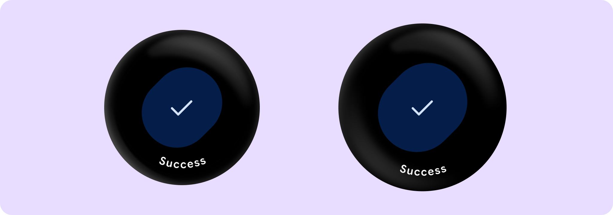
SuccessConfirmationDialogContent provides the content for a success confirmation dialog with a success icon and optional short curved text. This variation of confirmation dialog indicates a successful operation or action.
Prefer using SuccessConfirmationDialog directly, which provides built-in animations when showing/hiding the dialog. This composable may be used to provide the content for a confirmation dialog if custom show/hide animations are required.
Where user input is required, such as choosing to ok or cancel an action, use AlertDialog instead of SuccessConfirmationDialog.
Example of a SuccessConfirmationDialog usage:
import androidx.compose.foundation.layout.Box
import androidx.compose.foundation.layout.fillMaxSize
import androidx.compose.runtime.mutableStateOf
import androidx.compose.runtime.remember
import androidx.compose.ui.Alignment
import androidx.compose.ui.Modifier
import androidx.wear.compose.material3.ConfirmationDialog
import androidx.wear.compose.material3.ConfirmationDialogDefaults
import androidx.wear.compose.material3.FilledTonalButton
import androidx.wear.compose.material3.SuccessConfirmationDialog
import androidx.wear.compose.material3.Text
import androidx.wear.compose.material3.confirmationDialogCurvedText

var showConfirmation by remember { mutableStateOf(false) }

Box(Modifier.fillMaxSize()) {
    FilledTonalButton(
        modifier = Modifier.align(Alignment.Center),
        onClick = { showConfirmation = true },
        label = { Text("Show Confirmation") },
    )
}

val text = "Success"
val style = ConfirmationDialogDefaults.curvedTextStyle
SuccessConfirmationDialog(
    visible = showConfirmation,
    onDismissRequest = { showConfirmation = false },
    curvedText = { confirmationDialogCurvedText(text, style) },
)
| Parameters | |
|---|---|
curvedText: (CurvedScope.() -> Unit)? |
A slot for displaying curved text content which will be shown along the bottom edge of the dialog. We recommend using |
modifier: Modifier = Modifier |
Modifier to be applied to the confirmation content. |
colors: ConfirmationDialogColors = ConfirmationDialogDefaults.successColors() |
A |
content: @Composable () -> Unit = { ConfirmationDialogDefaults.SuccessIcon() } |
A slot for displaying an icon inside the confirmation dialog, which can be animated. Defaults to an animated |