
ConfirmationDialogContent
Functions summary
Unit |
@ComposableThis overload of |
Unit |
@ComposableThis overload of |
Functions
ConfirmationDialogContent
@Composable
fun ConfirmationDialogContent(
    curvedText: (CurvedScope.() -> Unit)?,
    modifier: Modifier = Modifier,
    colors: ConfirmationDialogColors = ConfirmationDialogDefaults.colors(),
    content: @Composable () -> Unit
): Unit
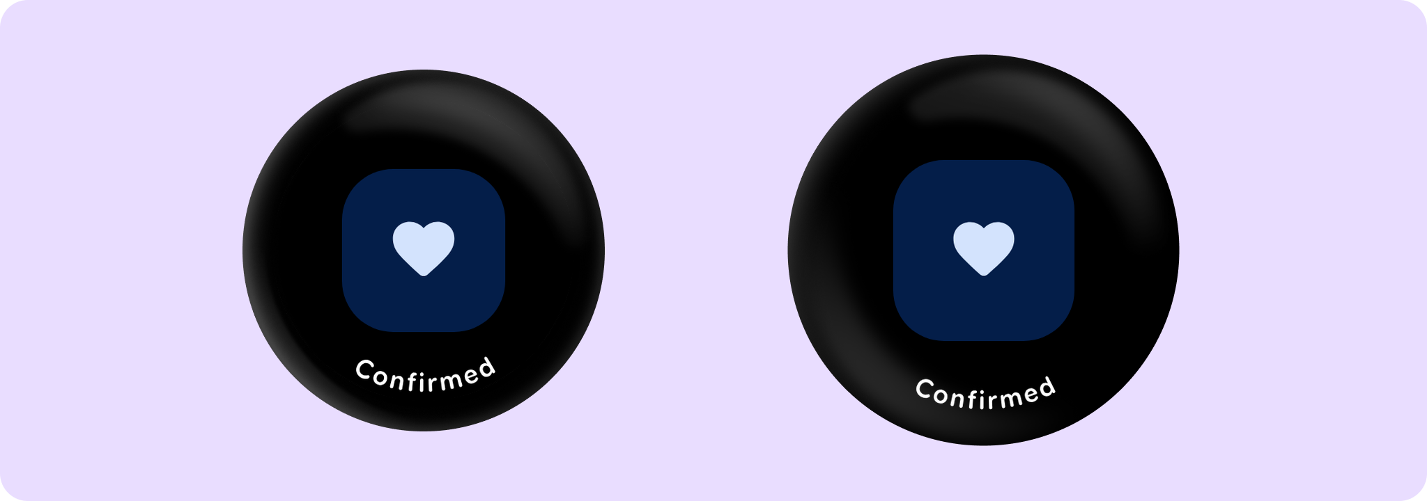
This overload of ConfirmationDialogContent provides the content for a ConfirmationDialog with an icon and optional very short curvedText. The length of the curved text should be very short and should not exceed 1-2 words. If a longer text is required, then the alternative ConfirmationDialog overload with slot for linear text should be used instead.
Prefer using ConfirmationDialog directly, which provides built-in animations when showing/hiding the dialog. This composable may be used to provide the content for a confirmation dialog if custom show/hide animations are required.
Example of a ConfirmationDialog with an icon and a curved text content:
import androidx.compose.foundation.layout.Box
import androidx.compose.foundation.layout.fillMaxSize
import androidx.compose.runtime.mutableStateOf
import androidx.compose.runtime.remember
import androidx.compose.ui.Alignment
import androidx.compose.ui.Modifier
import androidx.wear.compose.material3.ConfirmationDialog
import androidx.wear.compose.material3.ConfirmationDialogDefaults
import androidx.wear.compose.material3.FilledTonalButton
import androidx.wear.compose.material3.Icon
import androidx.wear.compose.material3.Text
import androidx.wear.compose.material3.confirmationDialogCurvedText
import androidx.wear.compose.material3.samples.icons.FavoriteIcon

var showConfirmation by remember { mutableStateOf(false) }

Box(Modifier.fillMaxSize()) {
    FilledTonalButton(
        modifier = Modifier.align(Alignment.Center),
        onClick = { showConfirmation = true },
        label = { Text("Show Confirmation") },
    )
}

// Has an icon and a short curved text content, which will be displayed along the bottom edge of
// the screen.
val curvedTextStyle = ConfirmationDialogDefaults.curvedTextStyle
ConfirmationDialog(
    visible = showConfirmation,
    onDismissRequest = { showConfirmation = false },
    curvedText = { confirmationDialogCurvedText("Confirmed", curvedTextStyle) },
) {
    FavoriteIcon(ConfirmationDialogDefaults.IconSize)
}
| Parameters | |
|---|---|
curvedText: (CurvedScope.() -> Unit)? |
A slot for displaying curved text content which will be shown along the bottom edge of the dialog. We recommend using |
modifier: Modifier = Modifier |
Modifier to be applied to the confirmation content. |
colors: ConfirmationDialogColors = ConfirmationDialogDefaults.colors() |
A |
content: @Composable () -> Unit |
A slot for displaying an icon inside the confirmation dialog. It's recommended to set its size to |
ConfirmationDialogContent
@Composable
fun ConfirmationDialogContent(
    text: (@Composable ColumnScope.() -> Unit)?,
    modifier: Modifier = Modifier,
    colors: ConfirmationDialogColors = ConfirmationDialogDefaults.colors(),
    content: @Composable () -> Unit
): Unit
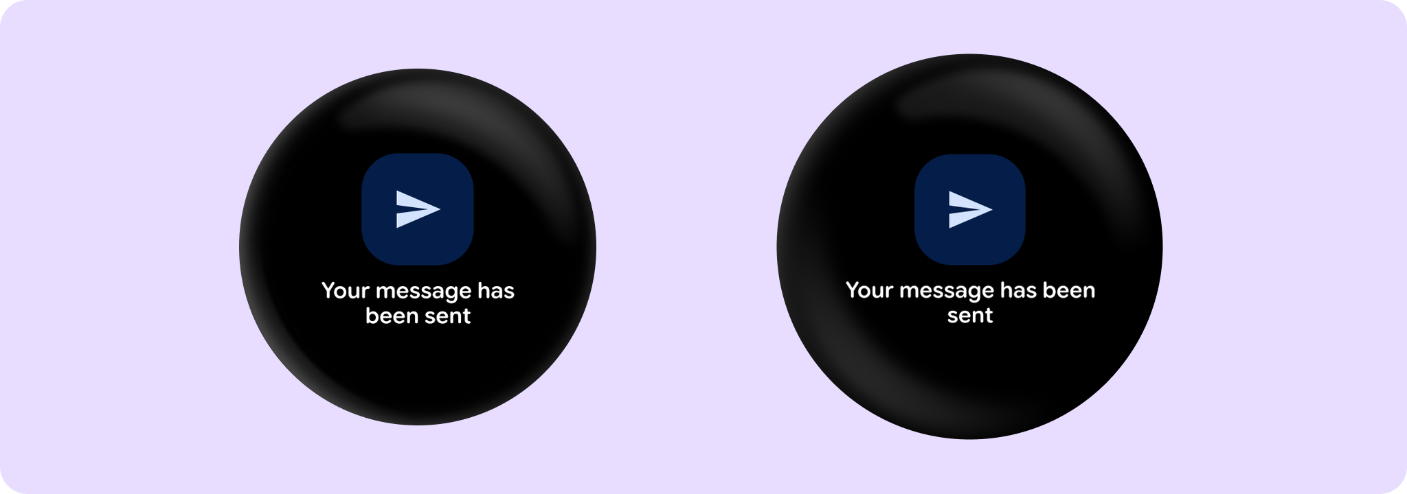
This overload of ConfirmationDialogContent provides the content for a ConfirmationDialog with with an icon and optional short text. The length of the text should not exceed 3 lines. If the text is very short and fits into 1-2 words, consider using the alternative ConfirmationDialog overload with the curvedText parameter instead.
Prefer using ConfirmationDialog directly, which provides built-in animations when showing/hiding the dialog. This composable may be used to provide the content for a confirmation dialog if custom show/hide animations are required.
Example of a ConfirmationDialog with an icon and a text which fits into 3 lines:
import androidx.compose.foundation.layout.Box
import androidx.compose.foundation.layout.fillMaxSize
import androidx.compose.foundation.layout.size
import androidx.compose.material.icons.Icons
import androidx.compose.material.icons.automirrored.filled.Send
import androidx.compose.runtime.mutableStateOf
import androidx.compose.runtime.remember
import androidx.compose.ui.Alignment
import androidx.compose.ui.Modifier
import androidx.wear.compose.material3.ConfirmationDialog
import androidx.wear.compose.material3.ConfirmationDialogDefaults
import androidx.wear.compose.material3.FilledTonalButton
import androidx.wear.compose.material3.Icon
import androidx.wear.compose.material3.Text

var showConfirmation by remember { mutableStateOf(false) }

Box(Modifier.fillMaxSize()) {
    FilledTonalButton(
        modifier = Modifier.align(Alignment.Center),
        onClick = { showConfirmation = true },
        label = { Text("Show Confirmation") },
    )
}

// Has an icon and a text content. Text will be displayed in the center of the screen below the
// icon.
ConfirmationDialog(
    visible = showConfirmation,
    onDismissRequest = { showConfirmation = false },
    text = { Text(text = "Your message has been sent") },
) {
    Icon(
        imageVector = Icons.AutoMirrored.Filled.Send,
        contentDescription = null,
        modifier = Modifier.size(ConfirmationDialogDefaults.SmallIconSize),
    )
}
| Parameters | |
|---|---|
text: (@Composable ColumnScope.() -> Unit)? |
A slot for displaying text below the icon. It should not exceed 3 lines. |
modifier: Modifier = Modifier |
Modifier to be applied to the confirmation content. |
colors: ConfirmationDialogColors = ConfirmationDialogDefaults.colors() |
A |
content: @Composable () -> Unit |
A slot for displaying an icon inside the confirmation dialog. It's recommended to set its size to |