
StandardCardContainer
Functions summary
Unit |
@Composable
|
Functions
StandardCardContainer
@Composable
fun StandardCardContainer(
    imageCard: @Composable (interactionSource: MutableInteractionSource) -> Unit,
    title: @Composable () -> Unit,
    modifier: Modifier = Modifier,
    subtitle: @Composable () -> Unit = {},
    description: @Composable () -> Unit = {},
    contentColor: CardContainerColors = CardContainerDefaults.contentColor(),
    interactionSource: MutableInteractionSource = remember { MutableInteractionSource() }
): Unit
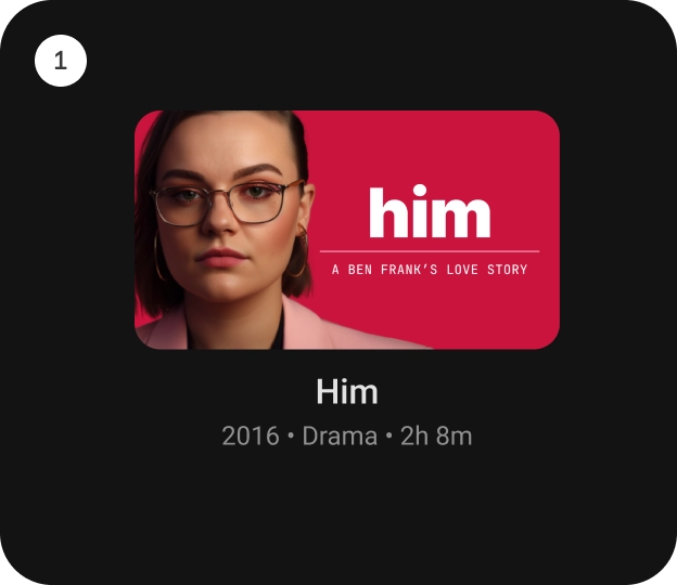
StandardCardContainer is an opinionated TV Material Card layout with an image and text content to show information about a subject.
It provides a vertical layout with an image card slot at the top. And below that, there are slots for the title, subtitle and description.
Checkout TV design guidelines to learn more about Material Standard Card.
import androidx.compose.foundation.background
import androidx.compose.foundation.layout.Box
import androidx.compose.foundation.layout.fillMaxWidth
import androidx.compose.foundation.layout.height
import androidx.compose.foundation.layout.size
import androidx.compose.ui.Modifier
import androidx.compose.ui.graphics.Color
import androidx.compose.ui.unit.dp
import androidx.tv.material3.Card
import androidx.tv.material3.StandardCardContainer
import androidx.tv.material3.Text

StandardCardContainer(
    modifier = Modifier.size(150.dp, 120.dp),
    imageCard = { interactionSource ->
        Card(onClick = {}, interactionSource = interactionSource) {
            Box(modifier = Modifier.fillMaxWidth().height(80.dp).background(Color.Blue))
        }
    },
    title = { Text("Standard Card") },
)
| Parameters | |
|---|---|
imageCard: @Composable (interactionSource: MutableInteractionSource) -> Unit |
defines the |
title: @Composable () -> Unit |
defines the |
modifier: Modifier = Modifier |
the |
subtitle: @Composable () -> Unit = {} |
defines the |
description: @Composable () -> Unit = {} |
defines the |
contentColor: CardContainerColors = CardContainerDefaults.contentColor() |
|
interactionSource: MutableInteractionSource |
a hoisted |