
Card
Functions summary
Unit |
@ComposableBase level Wear Material 3 |
Unit |
@ComposableWear Material 3 |
Unit |
@ComposableBase level Wear Material 3 |
Unit |
@ComposableWear Material 3 |
Functions
Card
@Composable
fun Card(
    modifier: Modifier = Modifier,
    shape: Shape = CardDefaults.shape,
    colors: CardColors = CardDefaults.cardColors(),
    border: BorderStroke? = null,
    contentPadding: PaddingValues = CardDefaults.ContentPadding,
    transformation: SurfaceTransformation? = null,
    content: @Composable ColumnScope.() -> Unit
): Unit
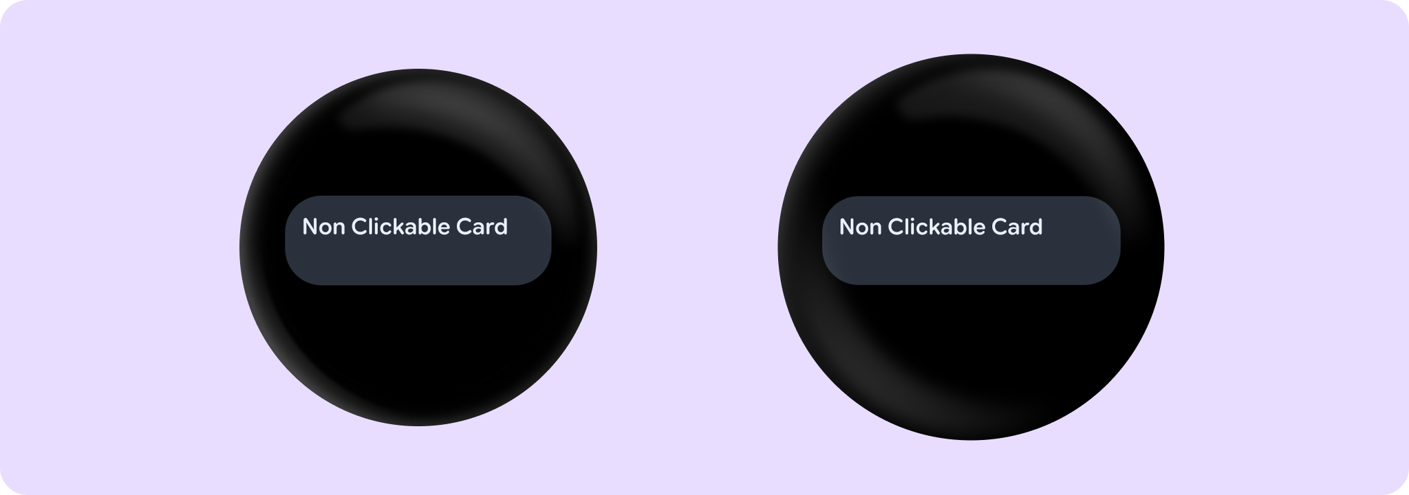
Base level Wear Material 3 Card that offers a single slot to take any content.
This Card does not handle input events - see the other Card overloads if you want a clickable Card.
Is used as the container for more opinionated Card components that take specific content such as icons, images, titles, subtitles and labels.
The Card is Rectangle-shaped with rounded corners by default.
Example of a non-clickable Card:
import androidx.wear.compose.material3.Card
import androidx.wear.compose.material3.Text

Card { Text("Non Clickable Card") }
For more information, see the Cards Wear OS Material design guide.
| Parameters | |
|---|---|
modifier: Modifier = Modifier |
Modifier to be applied to the card |
shape: Shape = CardDefaults.shape |
Defines the card's shape. It is strongly recommended to use the default as this shape is a key characteristic of the Wear Material Theme |
colors: CardColors = CardDefaults.cardColors() |
|
border: BorderStroke? = null |
A BorderStroke object which is used for drawing outlines. |
contentPadding: PaddingValues = CardDefaults.ContentPadding |
The spacing values to apply internally between the container and the content |
transformation: SurfaceTransformation? = null |
Transformation to be used when card appears inside a container that needs to dynamically change its content separately from the background. |
content: @Composable ColumnScope.() -> Unit |
The main slot for a content of this card |
Card
@Composable
fun Card(
    containerPainter: Painter,
    modifier: Modifier = Modifier,
    shape: Shape = CardDefaults.shape,
    colors: CardColors = CardDefaults.cardWithContainerPainterColors(),
    border: BorderStroke? = null,
    contentPadding: PaddingValues = CardDefaults.CardWithContainerPainterContentPadding,
    transformation: SurfaceTransformation? = null,
    content: @Composable ColumnScope.() -> Unit
): Unit
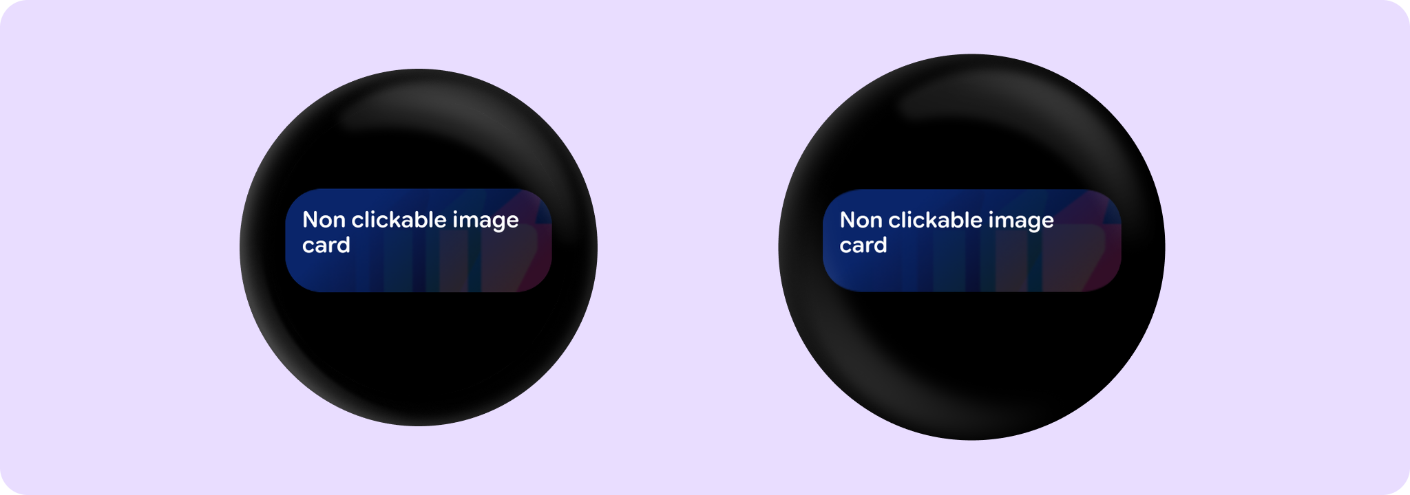
Wear Material 3 Card that takes a container painter for drawing a background image, and offers a single slot to take any content.
This Card does not handle input events - see the other Card overloads if you want a clickable Card.
An image background is a means to reinforce the meaning of information in a Card. Cards should have a content color that contrasts with the background image and scrim. This Card takes containerPainter for the container image background to be drawn (the CardColors containerColor property is ignored). It is recommended to use CardDefaults.containerPainter to create the painter so that a scrim is drawn on top of the container image, ensuring that any content above the background is legible.
The Card is Rectangle-shaped with rounded corners by default.
Example of a non-clickable Card with an image background:
import androidx.compose.foundation.background
import androidx.compose.ui.res.painterResource
import androidx.wear.compose.material3.Card
import androidx.wear.compose.material3.CardDefaults
import androidx.wear.compose.material3.Text

Card(
    containerPainter =
        CardDefaults.containerPainter(image = painterResource(id = R.drawable.backgroundimage))
) {
    Text("Non clickable image card")
}
| Parameters | |
|---|---|
containerPainter: Painter |
The |
modifier: Modifier = Modifier |
Modifier to be applied to the card |
shape: Shape = CardDefaults.shape |
Defines the card's shape. It is strongly recommended to use the default as this shape is a key characteristic of the Wear Material Theme |
colors: CardColors = CardDefaults.cardWithContainerPainterColors() |
|
border: BorderStroke? = null |
A BorderStroke object which is used for drawing outlines. |
contentPadding: PaddingValues = CardDefaults.CardWithContainerPainterContentPadding |
The spacing values to apply internally between the container and the content |
transformation: SurfaceTransformation? = null |
Transformation to be used when card appears inside a container that needs to dynamically change its content separately from the background. |
content: @Composable ColumnScope.() -> Unit |
The main slot for a content of this card |
Card
@Composable
fun Card(
    onClick: () -> Unit,
    modifier: Modifier = Modifier,
    onLongClick: (() -> Unit)? = null,
    onLongClickLabel: String? = null,
    enabled: Boolean = true,
    shape: Shape = CardDefaults.shape,
    colors: CardColors = CardDefaults.cardColors(),
    border: BorderStroke? = null,
    contentPadding: PaddingValues = CardDefaults.ContentPadding,
    interactionSource: MutableInteractionSource? = null,
    transformation: SurfaceTransformation? = null,
    content: @Composable ColumnScope.() -> Unit
): Unit
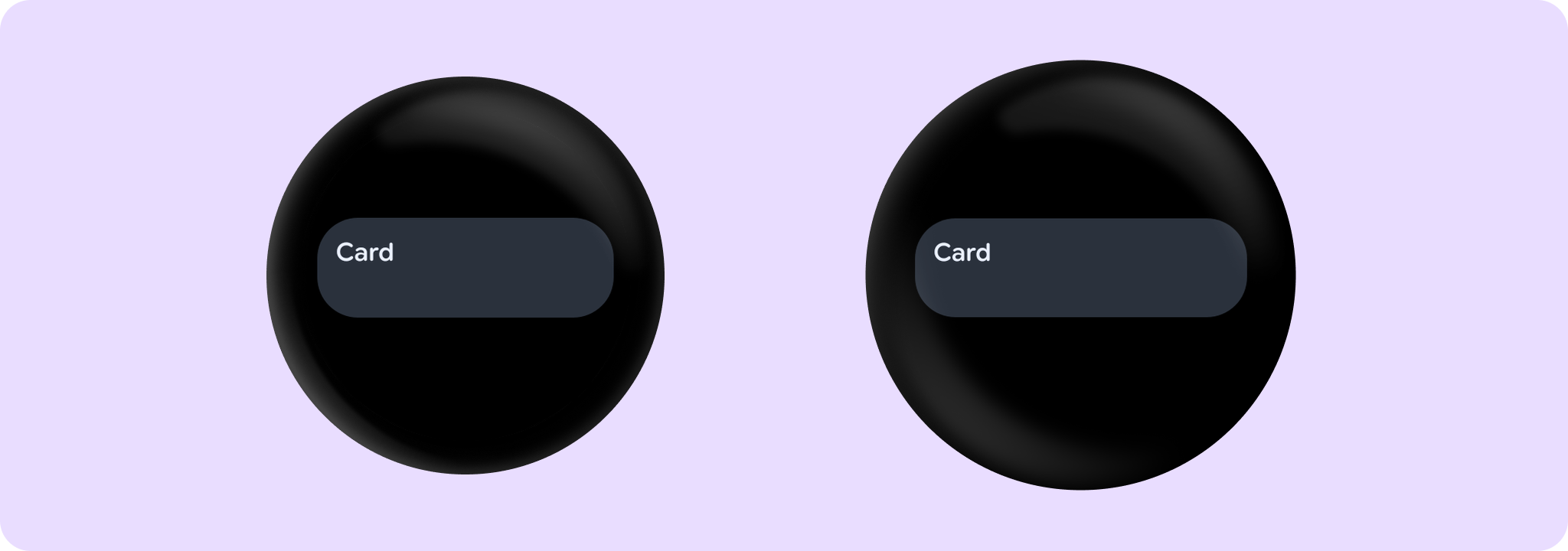
Base level Wear Material 3 Card that offers a single slot to take any content.
Is used as the container for more opinionated Card components that take specific content such as icons, images, titles, subtitles and labels.
The Card is Rectangle-shaped with rounded corners by default.
Cards can be enabled or disabled. A disabled card will not respond to click events.
Example of a Card with onClick:
import androidx.wear.compose.material3.Card
import androidx.wear.compose.material3.Text

Card(onClick = { /* Do something */ }) { Text("Card") }
Example of Card with onLongClick:
import androidx.wear.compose.material3.Card
import androidx.wear.compose.material3.Text

Card(
    onClick = { /* Do something */ },
    onLongClick = onLongClickHandler,
    onLongClickLabel = "Long click",
) {
    Text("Card with long click")
}
Card does not constrain the height of its contents by default. Where necessary to do that, use Modifier.height(IntrinsicSize.Min) as shown in this example:
import androidx.compose.foundation.background
import androidx.compose.foundation.layout.IntrinsicSize
import androidx.compose.foundation.layout.fillMaxHeight
import androidx.compose.foundation.layout.height
import androidx.compose.ui.Modifier
import androidx.compose.ui.graphics.Color
import androidx.wear.compose.material3.Card
import androidx.wear.compose.material3.Text

Card(
    onClick = { /* Do something */ },
    // Constrains the card to fill background up to the intrinsic height.
    modifier = Modifier.height(IntrinsicSize.Min),
) {
    Text("Card", modifier = Modifier.fillMaxHeight().background(Color.Red))
}
For more information, see the Cards Wear OS Material design guide.
| Parameters | |
|---|---|
onClick: () -> Unit |
Will be called when the user clicks the card |
modifier: Modifier = Modifier |
Modifier to be applied to the card |
onLongClick: (() -> Unit)? = null |
Called when this card is long clicked (long-pressed). When this callback is set, |
onLongClickLabel: String? = null |
Semantic / accessibility label for the |
enabled: Boolean = true |
Controls the enabled state of the card. When false, this card will not be clickable and there will be no ripple effect on click. Wear cards do not have any specific elevation or alpha differences when not enabled - they are simply not clickable. |
shape: Shape = CardDefaults.shape |
Defines the card's shape. It is strongly recommended to use the default as this shape is a key characteristic of the Wear Material Theme |
colors: CardColors = CardDefaults.cardColors() |
|
border: BorderStroke? = null |
A BorderStroke object which is used for drawing outlines. |
contentPadding: PaddingValues = CardDefaults.ContentPadding |
The spacing values to apply internally between the container and the content |
interactionSource: MutableInteractionSource? = null |
an optional hoisted |
transformation: SurfaceTransformation? = null |
Transformation to be used when card appears inside a container that needs to dynamically change its content separately from the background. |
content: @Composable ColumnScope.() -> Unit |
The main slot for a content of this card |
Card
@Composable
fun Card(
    onClick: () -> Unit,
    containerPainter: Painter,
    modifier: Modifier = Modifier,
    onLongClick: (() -> Unit)? = null,
    onLongClickLabel: String? = null,
    enabled: Boolean = true,
    shape: Shape = CardDefaults.shape,
    colors: CardColors = CardDefaults.cardWithContainerPainterColors(),
    border: BorderStroke? = null,
    contentPadding: PaddingValues = CardDefaults.CardWithContainerPainterContentPadding,
    interactionSource: MutableInteractionSource? = null,
    transformation: SurfaceTransformation? = null,
    content: @Composable ColumnScope.() -> Unit
): Unit
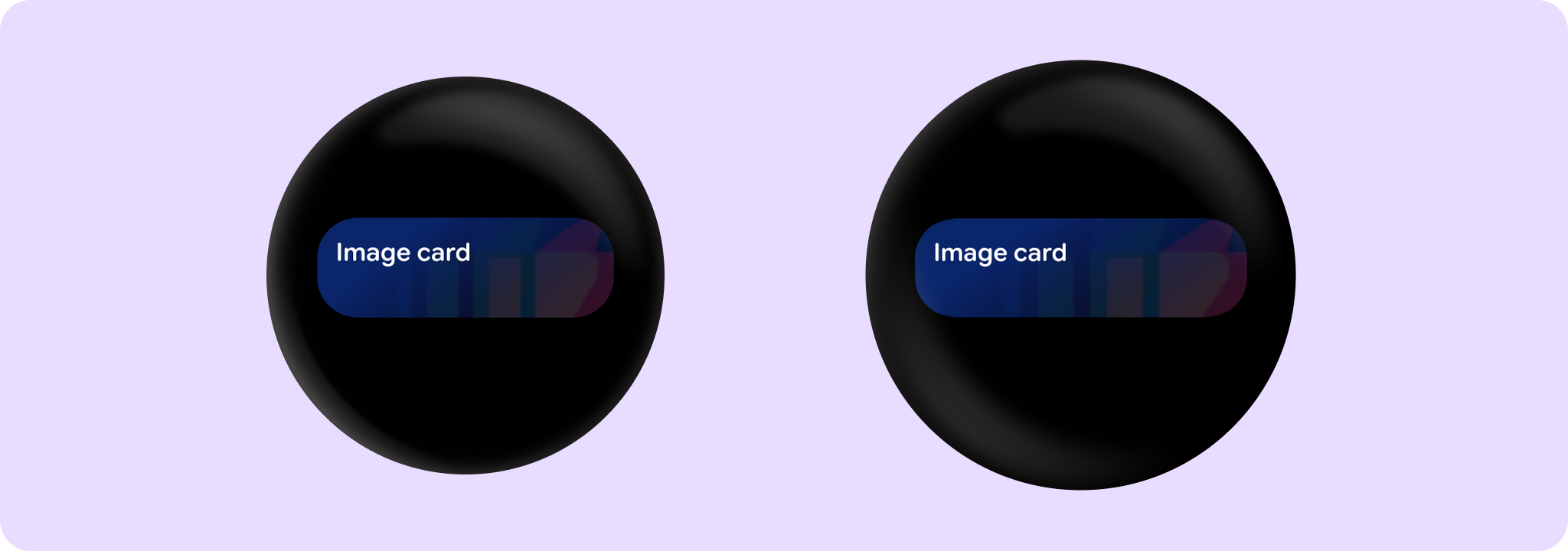
Wear Material 3 Card that takes a container painter for drawing a background image, and offers a single slot to take any content.
An image background is a means to reinforce the meaning of information in a Card. Cards should have a content color that contrasts with the background image and scrim. This Card takes containerPainter for the container image background to be drawn (the CardColors containerColor property is ignored). It is recommended to use CardDefaults.containerPainter to create the painter so that a scrim is drawn on top of the container image, ensuring that any content above the background is legible.
The Card is Rectangle-shaped with rounded corners by default.
Cards can be enabled or disabled. A disabled card will not respond to click events.
Example of a Card with an image background:
import androidx.compose.foundation.Image
import androidx.compose.foundation.background
import androidx.compose.ui.res.painterResource
import androidx.wear.compose.material3.Card
import androidx.wear.compose.material3.CardDefaults
import androidx.wear.compose.material3.Text

Card(
    onClick = { /* Do something */ },
    containerPainter =
        CardDefaults.containerPainter(image = painterResource(id = R.drawable.backgroundimage)),
) {
    Text("Image card")
}
| Parameters | |
|---|---|
onClick: () -> Unit |
Will be called when the user clicks the card |
containerPainter: Painter |
The |
modifier: Modifier = Modifier |
Modifier to be applied to the card |
onLongClick: (() -> Unit)? = null |
Called when this card is long clicked (long-pressed). When this callback is set, |
onLongClickLabel: String? = null |
Semantic / accessibility label for the |
enabled: Boolean = true |
Controls the enabled state of the card. When false, this card will not be clickable and there will be no ripple effect on click. Wear cards do not have any specific elevation or alpha differences when not enabled - they are simply not clickable. |
shape: Shape = CardDefaults.shape |
Defines the card's shape. It is strongly recommended to use the default as this shape is a key characteristic of the Wear Material Theme |
colors: CardColors = CardDefaults.cardWithContainerPainterColors() |
|
border: BorderStroke? = null |
A BorderStroke object which is used for drawing outlines. |
contentPadding: PaddingValues = CardDefaults.CardWithContainerPainterContentPadding |
The spacing values to apply internally between the container and the content |
interactionSource: MutableInteractionSource? = null |
an optional hoisted |
transformation: SurfaceTransformation? = null |
Transformation to be used when card appears inside a container that needs to dynamically change its content separately from the background. |
content: @Composable ColumnScope.() -> Unit |
The main slot for a content of this card |