
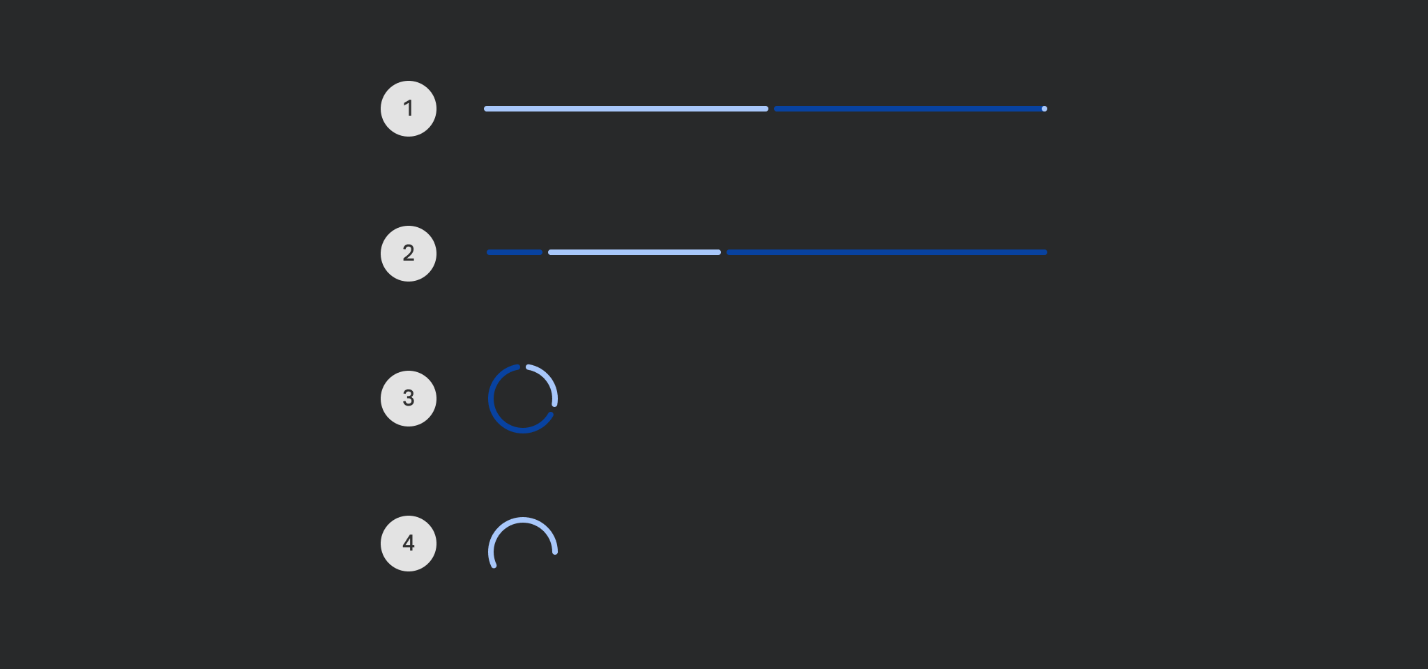
CircularProgressIndicator
Functions summary
Unit |
@Composable |
Cmn
|
Unit |
@ComposableThis function is deprecated. Use the overload that takes `progress` as a lambda |
Cmn
|
Unit |
@Composable |
Cmn
|
Functions
CircularProgressIndicator
@Composable
fun CircularProgressIndicator(
    modifier: Modifier = Modifier,
    color: Color = ProgressIndicatorDefaults.circularColor,
    strokeWidth: Dp = ProgressIndicatorDefaults.CircularStrokeWidth,
    trackColor: Color = ProgressIndicatorDefaults.circularIndeterminateTrackColor,
    strokeCap: StrokeCap = ProgressIndicatorDefaults.CircularIndeterminateStrokeCap,
    gapSize: Dp = ProgressIndicatorDefaults.CircularIndicatorTrackGapSize
): Unit
Material Design determinate circular progress indicator
Progress indicators express an unspecified wait time or display the duration of a process.
import androidx.compose.foundation.layout.Column
import androidx.compose.material3.CircularProgressIndicator
import androidx.compose.ui.Alignment

Column(horizontalAlignment = Alignment.CenterHorizontally) { CircularProgressIndicator() }
| Parameters | |
|---|---|
modifier: Modifier = Modifier |
the |
color: Color = ProgressIndicatorDefaults.circularColor |
color of this progress indicator |
strokeWidth: Dp = ProgressIndicatorDefaults.CircularStrokeWidth |
stroke width of this progress indicator |
trackColor: Color = ProgressIndicatorDefaults.circularIndeterminateTrackColor |
color of the track behind the indicator, visible when the progress has not reached the area of the overall indicator yet |
strokeCap: StrokeCap = ProgressIndicatorDefaults.CircularIndeterminateStrokeCap |
stroke cap to use for the ends of this progress indicator |
gapSize: Dp = ProgressIndicatorDefaults.CircularIndicatorTrackGapSize |
size of the gap between the progress indicator and the track |
CircularProgressIndicator
@Composable
funCircularProgressIndicator(
progress: Float,
modifier: Modifier = Modifier,
color: Color = ProgressIndicatorDefaults.circularColor,
strokeWidth: Dp = ProgressIndicatorDefaults.CircularStrokeWidth,
trackColor: Color = ProgressIndicatorDefaults.circularTrackColor,
strokeCap: StrokeCap = ProgressIndicatorDefaults.CircularDeterminateStrokeCap
): Unit
CircularProgressIndicator
@Composable
fun CircularProgressIndicator(
    progress: () -> Float,
    modifier: Modifier = Modifier,
    color: Color = ProgressIndicatorDefaults.circularColor,
    strokeWidth: Dp = ProgressIndicatorDefaults.CircularStrokeWidth,
    trackColor: Color = ProgressIndicatorDefaults.circularDeterminateTrackColor,
    strokeCap: StrokeCap = ProgressIndicatorDefaults.CircularDeterminateStrokeCap,
    gapSize: Dp = ProgressIndicatorDefaults.CircularIndicatorTrackGapSize
): Unit
Material Design determinate circular progress indicator
Progress indicators express an unspecified wait time or display the duration of a process.
By default there is no animation between progress values. You can use ProgressIndicatorDefaults.ProgressAnimationSpec as the default recommended androidx.compose.animation.core.AnimationSpec when animating progress, such as in the following example:
import androidx.compose.animation.core.animateFloatAsState
import androidx.compose.foundation.layout.Column
import androidx.compose.foundation.layout.Spacer
import androidx.compose.foundation.layout.requiredHeight
import androidx.compose.foundation.layout.width
import androidx.compose.material3.CircularProgressIndicator
import androidx.compose.material3.ProgressIndicatorDefaults
import androidx.compose.material3.Slider
import androidx.compose.material3.Text
import androidx.compose.runtime.getValue
import androidx.compose.runtime.mutableFloatStateOf
import androidx.compose.runtime.remember
import androidx.compose.ui.Alignment
import androidx.compose.ui.Modifier
import androidx.compose.ui.unit.dp

var progress by remember { mutableFloatStateOf(0.1f) }
val animatedProgress by
    animateFloatAsState(
        targetValue = progress,
        animationSpec = ProgressIndicatorDefaults.ProgressAnimationSpec,
    )

Column(horizontalAlignment = Alignment.CenterHorizontally) {
    CircularProgressIndicator(progress = { animatedProgress })
    Spacer(Modifier.requiredHeight(30.dp))
    Text("Set progress:")
    Slider(
        modifier = Modifier.width(300.dp),
        value = progress,
        valueRange = 0f..1f,
        onValueChange = { progress = it },
    )
}
| Parameters | |
|---|---|
progress: () -> Float |
the progress of this progress indicator, where 0.0 represents no progress and 1.0 represents full progress. Values outside of this range are coerced into the range. |
modifier: Modifier = Modifier |
the |
color: Color = ProgressIndicatorDefaults.circularColor |
color of this progress indicator |
strokeWidth: Dp = ProgressIndicatorDefaults.CircularStrokeWidth |
stroke width of this progress indicator |
trackColor: Color = ProgressIndicatorDefaults.circularDeterminateTrackColor |
color of the track behind the indicator, visible when the progress has not reached the area of the overall indicator yet |
strokeCap: StrokeCap = ProgressIndicatorDefaults.CircularDeterminateStrokeCap |
stroke cap to use for the ends of this progress indicator |
gapSize: Dp = ProgressIndicatorDefaults.CircularIndicatorTrackGapSize |
size of the gap between the progress indicator and the track |