
AppCard
Functions summary
Unit |
@ComposableOpinionated Wear Material 3 |
Unit |
@ComposableOpinionated Wear Material 3 |
Functions
AppCard
@Composable
fun AppCard(
    appName: @Composable RowScope.() -> Unit,
    title: @Composable RowScope.() -> Unit,
    modifier: Modifier = Modifier,
    shape: Shape = CardDefaults.shape,
    colors: CardColors = CardDefaults.cardColors(),
    border: BorderStroke? = null,
    contentPadding: PaddingValues = CardDefaults.ContentPadding,
    transformation: SurfaceTransformation? = null,
    appImage: (@Composable RowScope.() -> Unit)? = null,
    time: (@Composable RowScope.() -> Unit)? = null,
    content: @Composable ColumnScope.() -> Unit
): Unit
Opinionated Wear Material 3 Card that offers a specific 5 slot layout to show information about an application, e.g. a notification. AppCards are designed to show interactive elements from multiple applications. They will typically be used by the system UI, e.g. for showing a list of notifications from different applications. However it could also be adapted by individual application developers to show information about different parts of their application.
This AppCard does not handle input events - see the other AppCard overloads if you want a clickable AppCard.
The first row of the layout has three slots, 1) a small optional application Image or Icon of size CardDefaults.AppImageSizexCardDefaults.AppImageSize dp, 2) an application name (emphasised with the CardColors.appColor() color), it is expected to be a short start aligned Text composable, and 3) the time that the application activity has occurred which will be shown on the top row of the card, this is expected to be an end aligned Text composable showing a time relevant to the contents of the Card.
The second row shows a title, this is expected to be a single row of start aligned Text.
The rest of the Card contains the content which can be either Text or an Image. If the content is text it can be single or multiple line and is expected to be Top and Start aligned.
If more than one composable is provided in the content slot it is the responsibility of the caller to determine how to layout the contents, e.g. provide either a row or a column.
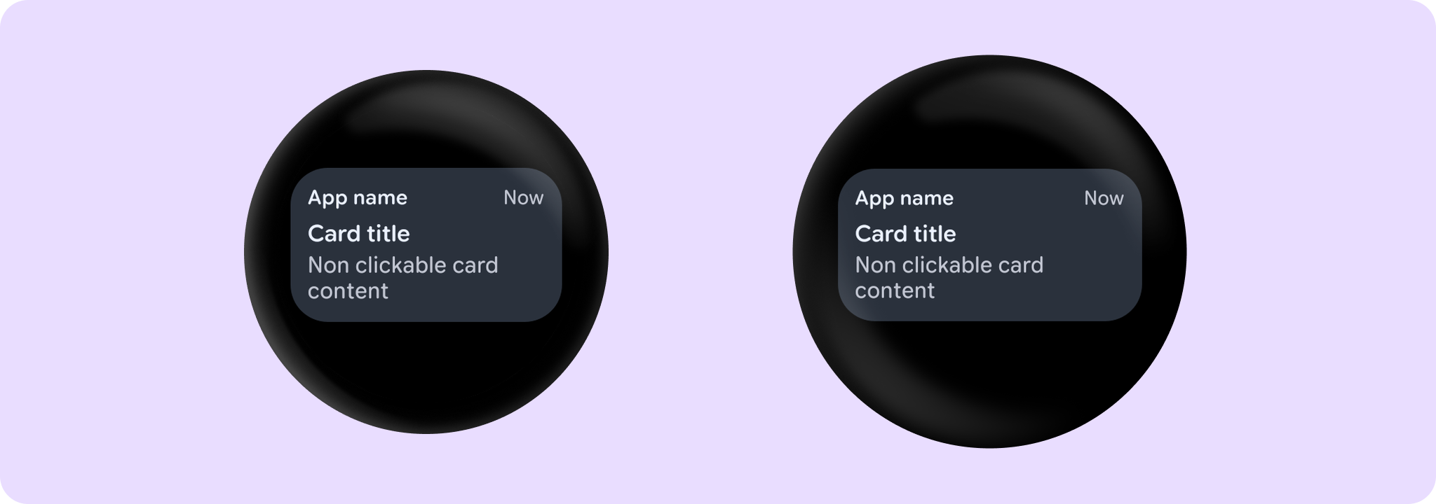
Example of a non-clickable AppCard:
import androidx.wear.compose.material3.AppCard
import androidx.wear.compose.material3.Card
import androidx.wear.compose.material3.Text

AppCard(
    appName = { Text("App name") },
    title = { Text("Card title") },
    time = { Text("Now") },
) {
    Text("Non clickable card content")
}
For more information, see the Cards guide.
| Parameters | |
|---|---|
appName: @Composable RowScope.() -> Unit |
A slot for displaying the application name, expected to be a single line of start aligned text of |
title: @Composable RowScope.() -> Unit |
A slot for displaying the title of the card, expected to be one or two lines of start aligned text of |
modifier: Modifier = Modifier |
Modifier to be applied to the card |
shape: Shape = CardDefaults.shape |
Defines the card's shape. It is strongly recommended to use the default as this shape is a key characteristic of the Wear Material Theme |
colors: CardColors = CardDefaults.cardColors() |
|
border: BorderStroke? = null |
A BorderStroke object which is used for drawing outlines. |
contentPadding: PaddingValues = CardDefaults.ContentPadding |
The spacing values to apply internally between the container and the content |
transformation: SurfaceTransformation? = null |
Transformation to be used when card appears inside a container that needs to dynamically change its content separately from the background. |
appImage: (@Composable RowScope.() -> Unit)? = null |
A slot for a small ( |
time: (@Composable RowScope.() -> Unit)? = null |
A slot for displaying the time relevant to the contents of the card, expected to be a short piece of end aligned text of |
content: @Composable ColumnScope.() -> Unit |
The main slot for a content of this card |
AppCard
@Composable
fun AppCard(
    onClick: () -> Unit,
    appName: @Composable RowScope.() -> Unit,
    title: @Composable RowScope.() -> Unit,
    modifier: Modifier = Modifier,
    onLongClick: (() -> Unit)? = null,
    onLongClickLabel: String? = null,
    enabled: Boolean = true,
    shape: Shape = CardDefaults.shape,
    colors: CardColors = CardDefaults.cardColors(),
    border: BorderStroke? = null,
    contentPadding: PaddingValues = CardDefaults.ContentPadding,
    interactionSource: MutableInteractionSource? = null,
    transformation: SurfaceTransformation? = null,
    appImage: (@Composable RowScope.() -> Unit)? = null,
    time: (@Composable RowScope.() -> Unit)? = null,
    content: @Composable ColumnScope.() -> Unit
): Unit
Opinionated Wear Material 3 Card that offers a specific 5 slot layout to show information about an application, e.g. a notification. AppCards are designed to show interactive elements from multiple applications. They will typically be used by the system UI, e.g. for showing a list of notifications from different applications. However it could also be adapted by individual application developers to show information about different parts of their application.
The first row of the layout has three slots, 1) a small optional application Image or Icon of size CardDefaults.AppImageSizexCardDefaults.AppImageSize dp, 2) an application name (emphasised with the CardColors.appColor() color), it is expected to be a short start aligned Text composable, and 3) the time that the application activity has occurred which will be shown on the top row of the card, this is expected to be an end aligned Text composable showing a time relevant to the contents of the Card.
The second row shows a title, this is expected to be a single row of start aligned Text.
The rest of the Card contains the content which can be either Text or an Image. If the content is text it can be single or multiple line and is expected to be Top and Start aligned.
If more than one composable is provided in the content slot it is the responsibility of the caller to determine how to layout the contents, e.g. provide either a row or a column.
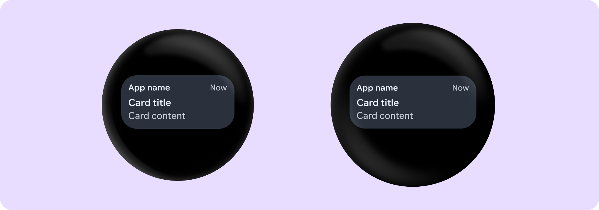
Example of an AppCard with onClick:
import androidx.wear.compose.material3.AppCard
import androidx.wear.compose.material3.Card
import androidx.wear.compose.material3.Text

AppCard(
    onClick = { /* Do something */ },
    appName = { Text("App name") },
    title = { Text("Card title") },
    time = { Text("Now") },
) {
    Text("Card content")
}
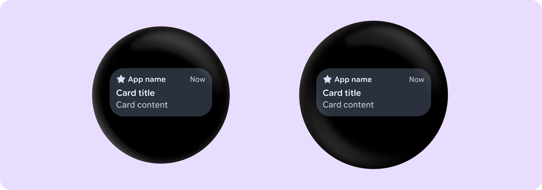
Example of an AppCard with icon:
import androidx.compose.foundation.Image
import androidx.compose.foundation.layout.size
import androidx.compose.foundation.layout.wrapContentSize
import androidx.compose.ui.Alignment
import androidx.compose.ui.Modifier
import androidx.compose.ui.res.painterResource
import androidx.compose.ui.semantics.contentDescription
import androidx.wear.compose.material3.AppCard
import androidx.wear.compose.material3.Card
import androidx.wear.compose.material3.CardDefaults
import androidx.wear.compose.material3.Icon
import androidx.wear.compose.material3.MaterialTheme
import androidx.wear.compose.material3.Text

AppCard(
    onClick = { /* Do something */ },
    appName = { Text("App name") },
    appImage = {
        Icon(
            painter = painterResource(id = android.R.drawable.star_big_off),
            contentDescription = "Star icon",
            modifier =
                Modifier.size(CardDefaults.AppImageSize)
                    .wrapContentSize(align = Alignment.Center),
            tint = MaterialTheme.colorScheme.primary,
        )
    },
    title = { Text("Card title") },
    time = { Text("Now") },
) {
    Text("Card content")
}
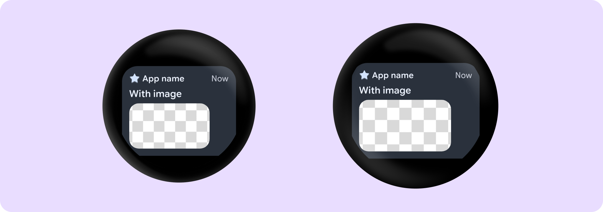
Example of an AppCard with image content:
import androidx.compose.foundation.Image
import androidx.compose.foundation.layout.Row
import androidx.compose.foundation.layout.Spacer
import androidx.compose.foundation.layout.aspectRatio
import androidx.compose.foundation.layout.fillMaxWidth
import androidx.compose.foundation.layout.height
import androidx.compose.foundation.layout.size
import androidx.compose.foundation.layout.width
import androidx.compose.foundation.layout.wrapContentSize
import androidx.compose.foundation.shape.RoundedCornerShape
import androidx.compose.ui.Alignment
import androidx.compose.ui.Modifier
import androidx.compose.ui.draw.clip
import androidx.compose.ui.layout.ContentScale
import androidx.compose.ui.platform.LocalConfiguration
import androidx.compose.ui.res.painterResource
import androidx.compose.ui.semantics.contentDescription
import androidx.compose.ui.unit.dp
import androidx.wear.compose.material3.AppCard
import androidx.wear.compose.material3.Card
import androidx.wear.compose.material3.CardDefaults
import androidx.wear.compose.material3.Icon
import androidx.wear.compose.material3.MaterialTheme
import androidx.wear.compose.material3.Text

val configuration = LocalConfiguration.current
// Add padding to the end of the image in order to maintain the correct proportions
// between the image and the card.
val imageEndPaddingDp = (0.15f * configuration.screenWidthDp).dp
AppCard(
    onClick = { /* Do something */ },
    appName = { Text("App name") },
    appImage = {
        Icon(
            painter = painterResource(id = android.R.drawable.star_big_off),
            contentDescription = "Star icon",
            modifier =
                Modifier.size(CardDefaults.AppImageSize)
                    .wrapContentSize(align = Alignment.Center),
            tint = MaterialTheme.colorScheme.primary,
        )
    },
    title = { Text("With image") },
    time = { Text("Now") },
) {
    Spacer(modifier = Modifier.height(4.dp))
    Row(modifier = Modifier.fillMaxWidth()) {
        Image(
            modifier =
                Modifier.weight(1f).aspectRatio(16f / 9f).clip(RoundedCornerShape(16.dp)),
            painter = painterResource(id = R.drawable.card_content_image),
            contentScale = ContentScale.Crop,
            contentDescription = null,
        )
        Spacer(modifier = Modifier.width(imageEndPaddingDp))
    }
}
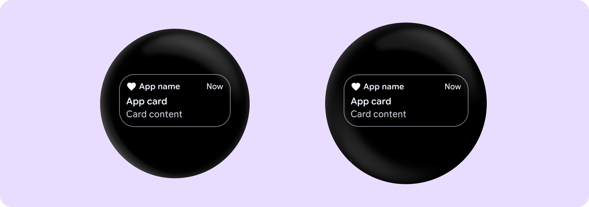
Example of an outlined AppCard:
import androidx.compose.foundation.Image
import androidx.compose.foundation.layout.size
import androidx.compose.material.icons.Icons
import androidx.compose.material.icons.filled.Favorite
import androidx.compose.ui.Modifier
import androidx.compose.ui.graphics.Color
import androidx.compose.ui.semantics.contentDescription
import androidx.wear.compose.material3.AppCard
import androidx.wear.compose.material3.Card
import androidx.wear.compose.material3.CardDefaults
import androidx.wear.compose.material3.Icon
import androidx.wear.compose.material3.Text

AppCard(
    onClick = { /* Do something */ },
    appName = { Text("App name") },
    appImage = {
        Icon(
            Icons.Filled.Favorite,
            contentDescription = "Favorite icon",
            modifier = Modifier.size(CardDefaults.AppImageSize),
        )
    },
    title = { Text("App card") },
    time = { Text("Now") },
    colors = CardDefaults.outlinedCardColors(),
    border = CardDefaults.outlinedCardBorder(),
) {
    Text("Card content")
}
For more information, see the Cards guide.
| Parameters | |
|---|---|
onClick: () -> Unit |
Will be called when the user clicks the card |
appName: @Composable RowScope.() -> Unit |
A slot for displaying the application name, expected to be a single line of start aligned text of |
title: @Composable RowScope.() -> Unit |
A slot for displaying the title of the card, expected to be one or two lines of start aligned text of |
modifier: Modifier = Modifier |
Modifier to be applied to the card |
onLongClick: (() -> Unit)? = null |
Called when this card is long clicked (long-pressed). When this callback is set, |
onLongClickLabel: String? = null |
Semantic / accessibility label for the |
enabled: Boolean = true |
Controls the enabled state of the card. When false, this card will not be clickable and there will be no ripple effect on click. Wear cards do not have any specific elevation or alpha differences when not enabled - they are simply not clickable. |
shape: Shape = CardDefaults.shape |
Defines the card's shape. It is strongly recommended to use the default as this shape is a key characteristic of the Wear Material Theme |
colors: CardColors = CardDefaults.cardColors() |
|
border: BorderStroke? = null |
A BorderStroke object which is used for drawing outlines. |
contentPadding: PaddingValues = CardDefaults.ContentPadding |
The spacing values to apply internally between the container and the content |
interactionSource: MutableInteractionSource? = null |
an optional hoisted |
transformation: SurfaceTransformation? = null |
Transformation to be used when card appears inside a container that needs to dynamically change its content separately from the background. |
appImage: (@Composable RowScope.() -> Unit)? = null |
A slot for a small ( |
time: (@Composable RowScope.() -> Unit)? = null |
A slot for displaying the time relevant to the contents of the card, expected to be a short piece of end aligned text of |
content: @Composable ColumnScope.() -> Unit |
The main slot for a content of this card |