
CircularProgressIndicator
Functions summary
Unit |
@ComposableIndeterminate Material Design circular progress indicator. |
Unit |
@ComposableMaterial Design circular progress indicator. |
Functions
CircularProgressIndicator
@Composable
fun CircularProgressIndicator(
    modifier: Modifier = Modifier,
    colors: ProgressIndicatorColors = ProgressIndicatorDefaults.colors(),
    strokeWidth: Dp = CircularProgressIndicatorDefaults.IndeterminateStrokeWidth,
    gapSize: Dp = CircularProgressIndicatorDefaults.calculateRecommendedGapSize(strokeWidth)
): Unit
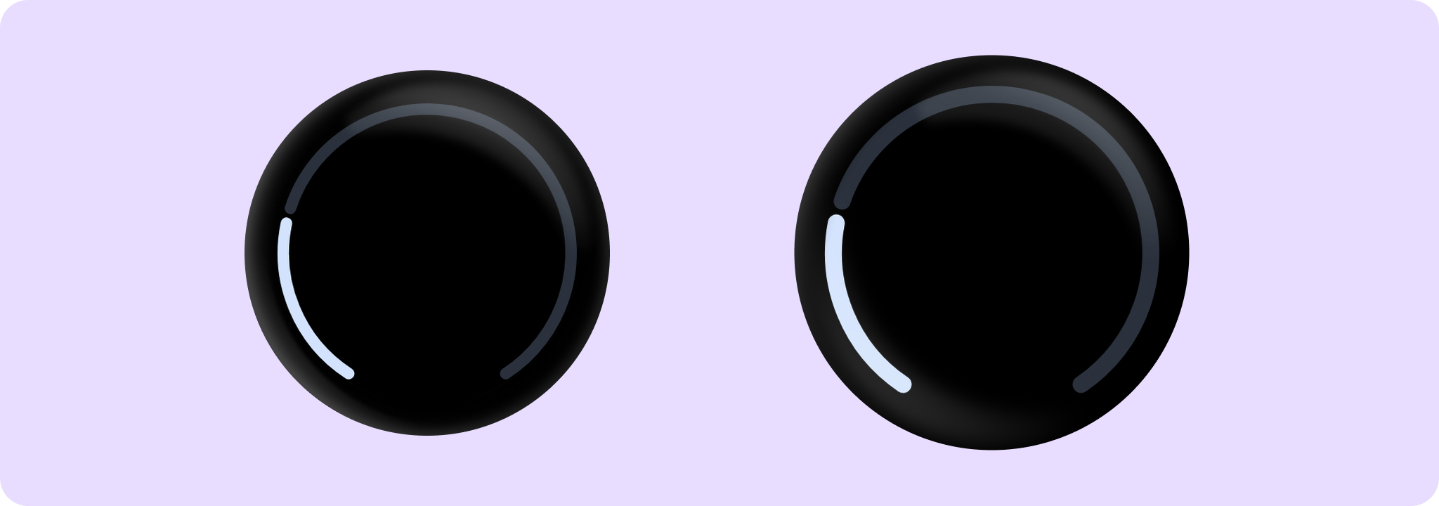
Indeterminate Material Design circular progress indicator.
Indeterminate progress indicator expresses an unspecified wait time and spins indefinitely.
Example of indeterminate circular progress indicator:
import androidx.compose.foundation.layout.Box
import androidx.compose.foundation.layout.fillMaxSize
import androidx.compose.ui.Alignment
import androidx.compose.ui.Modifier
import androidx.wear.compose.material3.CircularProgressIndicator

Box(modifier = Modifier.fillMaxSize()) {
    CircularProgressIndicator(modifier = Modifier.align(Alignment.Center))
}
| Parameters | |
|---|---|
modifier: Modifier = Modifier |
Modifier to be applied to the CircularProgressIndicator. |
colors: ProgressIndicatorColors = ProgressIndicatorDefaults.colors() |
|
strokeWidth: Dp = CircularProgressIndicatorDefaults.IndeterminateStrokeWidth |
The stroke width for the progress indicator. The recommended values is |
gapSize: Dp = CircularProgressIndicatorDefaults.calculateRecommendedGapSize(strokeWidth) |
The size (in Dp) of the gap between the ends of the progress indicator and the track. The stroke endcaps are not included in this distance. |
CircularProgressIndicator
@Composable
fun CircularProgressIndicator(
    progress: () -> Float,
    modifier: Modifier = Modifier,
    enabled: Boolean = true,
    allowProgressOverflow: Boolean = false,
    startAngle: Float = CircularProgressIndicatorDefaults.StartAngle,
    endAngle: Float = startAngle,
    colors: ProgressIndicatorColors = ProgressIndicatorDefaults.colors(),
    strokeWidth: Dp = CircularProgressIndicatorDefaults.largeStrokeWidth,
    gapSize: Dp = CircularProgressIndicatorDefaults.calculateRecommendedGapSize(strokeWidth)
): Unit
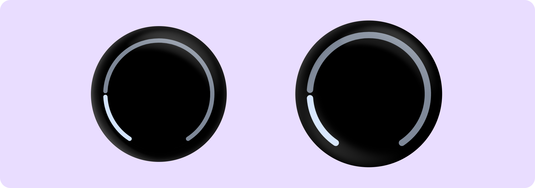
Material Design circular progress indicator. Progress changes are animated.
Example of a full screen CircularProgressIndicator. Note that the padding CircularProgressIndicatorDefaults.FullScreenPadding should be applied:
import androidx.compose.foundation.background
import androidx.compose.foundation.layout.Box
import androidx.compose.foundation.layout.fillMaxSize
import androidx.compose.foundation.layout.padding
import androidx.compose.ui.Modifier
import androidx.wear.compose.material3.CircularProgressIndicator
import androidx.wear.compose.material3.CircularProgressIndicatorDefaults
import androidx.wear.compose.material3.MaterialTheme
import androidx.wear.compose.material3.ProgressIndicatorDefaults

Box(
    modifier =
        Modifier.background(MaterialTheme.colorScheme.background)
            .padding(CircularProgressIndicatorDefaults.FullScreenPadding)
            .fillMaxSize()
) {
    CircularProgressIndicator(progress = { 0.25f }, startAngle = 120f, endAngle = 60f)
}
Example of progress showing overflow value (more than 1) by CircularProgressIndicator:
import androidx.compose.foundation.background
import androidx.compose.foundation.layout.Box
import androidx.compose.foundation.layout.fillMaxSize
import androidx.compose.foundation.layout.padding
import androidx.compose.ui.Modifier
import androidx.wear.compose.material3.CircularProgressIndicator
import androidx.wear.compose.material3.CircularProgressIndicatorDefaults
import androidx.wear.compose.material3.MaterialTheme
import androidx.wear.compose.material3.ProgressIndicatorDefaults

Box(
    modifier =
        Modifier.background(MaterialTheme.colorScheme.background)
            .padding(CircularProgressIndicatorDefaults.FullScreenPadding)
            .fillMaxSize()
) {
    CircularProgressIndicator(
        // Overflow value of 120%
        progress = { 1.2f },
        allowProgressOverflow = true,
        startAngle = 120f,
        endAngle = 60f,
    )
}
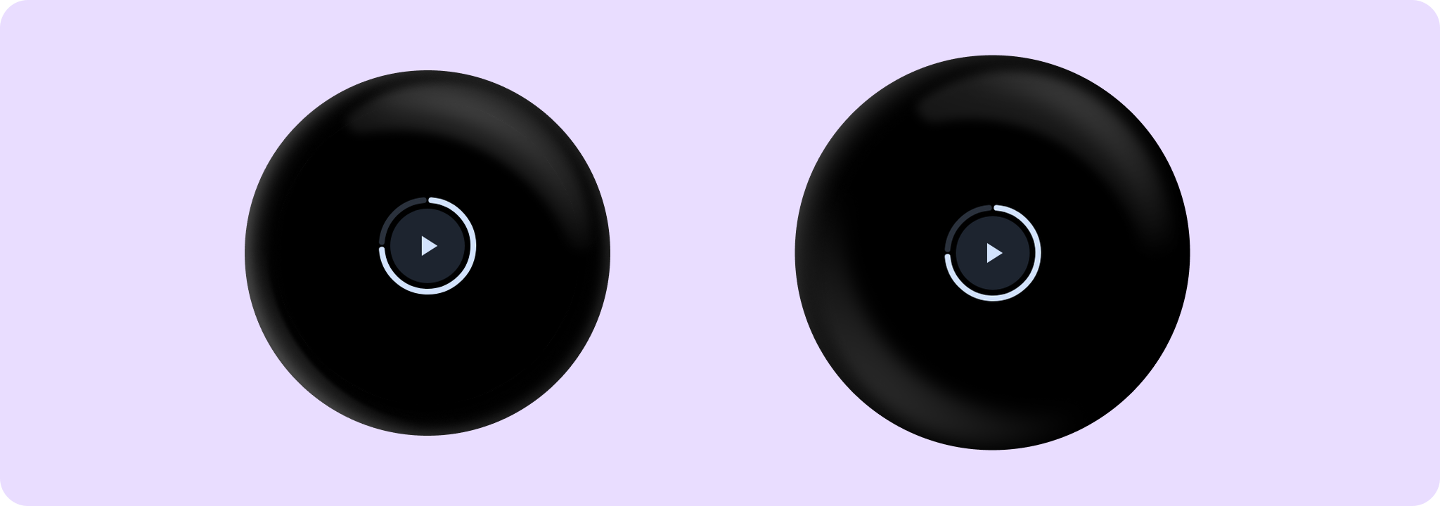
Example of progress indicator wrapping media control by CircularProgressIndicator:
import androidx.compose.animation.core.tween
import androidx.compose.foundation.background
import androidx.compose.foundation.layout.Box
import androidx.compose.foundation.layout.fillMaxSize
import androidx.compose.foundation.layout.size
import androidx.compose.foundation.shape.CircleShape
import androidx.compose.material.icons.Icons
import androidx.compose.material.icons.filled.Close
import androidx.compose.material.icons.filled.PlayArrow
import androidx.compose.runtime.mutableStateOf
import androidx.compose.runtime.remember
import androidx.compose.ui.Alignment
import androidx.compose.ui.Modifier
import androidx.compose.ui.draw.clip
import androidx.compose.ui.semantics.contentDescription
import androidx.compose.ui.semantics.semantics
import androidx.compose.ui.unit.dp
import androidx.wear.compose.material3.Button
import androidx.wear.compose.material3.CircularProgressIndicator
import androidx.wear.compose.material3.Icon
import androidx.wear.compose.material3.IconButton
import androidx.wear.compose.material3.IconButtonDefaults
import androidx.wear.compose.material3.MaterialTheme

var isPlaying by remember { mutableStateOf(false) }
val buttonPadding = 4.dp
val progressStrokeWidth = 4.dp
val progress = 0.75f

Box(modifier = Modifier.fillMaxSize().background(MaterialTheme.colorScheme.background)) {
    // The CircularProgressIndicator should be around the IconButton, with an extra gap between
    // then of 'buttonPadding'. We multiply by 2 because the size includes progressStrokeWidth
    // at top and bottom and the buttonPadding at top and bottom.
    CircularProgressIndicator(
        modifier =
            Modifier.align(Alignment.Center)
                .size(
                    IconButtonDefaults.DefaultButtonSize +
                        progressStrokeWidth * 2 +
                        buttonPadding * 2
                ),
        progress = { progress },
        strokeWidth = progressStrokeWidth,
    )

    IconButton(
        modifier =
            Modifier.align(Alignment.Center)
                .semantics {
                    // Set custom progress semantics for accessibility.
                    contentDescription =
                        String.format(
                            "Play/pause button, track progress: %.0f%%",
                            progress * 100,
                        )
                }
                .clip(CircleShape)
                .background(MaterialTheme.colorScheme.surfaceContainerLow),
        onClick = { isPlaying = !isPlaying },
    ) {
        Icon(
            imageVector = if (isPlaying) Icons.Filled.Close else Icons.Filled.PlayArrow,
            contentDescription = null,
        )
    }
}
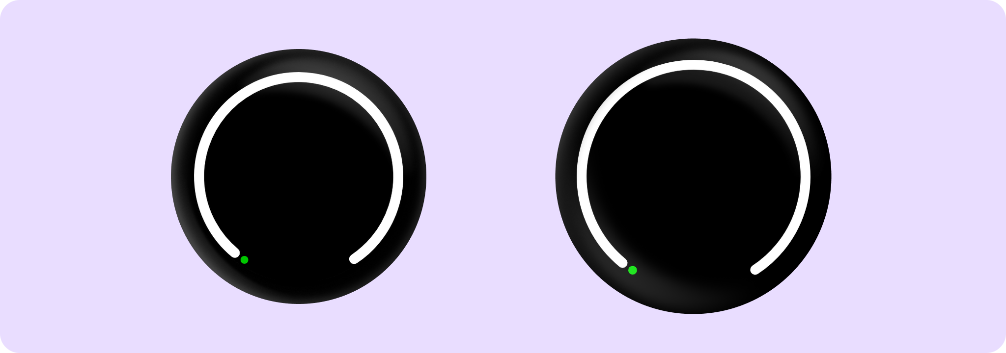
Example of a CircularProgressIndicator with small progress values:
import androidx.compose.foundation.layout.Box
import androidx.compose.foundation.layout.fillMaxSize
import androidx.compose.foundation.layout.padding
import androidx.compose.ui.Modifier
import androidx.compose.ui.graphics.Color
import androidx.compose.ui.unit.dp
import androidx.wear.compose.material3.CircularProgressIndicator
import androidx.wear.compose.material3.CircularProgressIndicatorDefaults
import androidx.wear.compose.material3.ProgressIndicatorDefaults

Box {
    CircularProgressIndicator(
        // Small progress values like 2% will be rounded up to at least the stroke width.
        progress = { 0.02f },
        modifier =
            Modifier.fillMaxSize().padding(CircularProgressIndicatorDefaults.FullScreenPadding),
        startAngle = 120f,
        endAngle = 60f,
        strokeWidth = 10.dp,
        colors =
            ProgressIndicatorDefaults.colors(
                indicatorColor = Color.Green,
                trackColor = Color.White,
            ),
    )
}
Progress indicators express the proportion of completion of an ongoing task.
| Parameters | |
|---|---|
progress: () -> Float |
The progress of this progress indicator where 0.0 represents no progress and 1.0 represents completion. Progress changes will be animated. |
modifier: Modifier = Modifier |
Modifier to be applied to the CircularProgressIndicator. |
enabled: Boolean = true |
controls the enabled state. Although this component is not clickable, it can be contained within a clickable component. When enabled is |
allowProgressOverflow: Boolean = false |
When progress overflow is allowed, values smaller than 0.0 will be coerced to 0, while values larger than 1.0 will be wrapped around and shown as overflow with a different track color |
startAngle: Float = CircularProgressIndicatorDefaults.StartAngle |
The starting position of the progress arc, measured clockwise in degrees (0 to 360) from the 3 o'clock position. For example, 0 and 360 represent 3 o'clock, 90 and 180 represent 6 o'clock and 9 o'clock respectively. Default is 270 degrees |
endAngle: Float = startAngle |
The ending position of the progress arc, measured clockwise in degrees (0 to 360) from the 3 o'clock position. For example, 0 and 360 represent 3 o'clock, 90 and 180 represent 6 o'clock and 9 o'clock respectively. By default equal to |
colors: ProgressIndicatorColors = ProgressIndicatorDefaults.colors() |
|
strokeWidth: Dp = CircularProgressIndicatorDefaults.largeStrokeWidth |
The stroke width for the progress indicator. The recommended values are |
gapSize: Dp = CircularProgressIndicatorDefaults.calculateRecommendedGapSize(strokeWidth) |
The size (in Dp) of the gap between the ends of the progress indicator and the track. The stroke endcaps are not included in this distance. |