
TextButtonDefaults
object TextButtonDefaults
Contains the default values used by TextButton.
Summary
Public functions |
|
|---|---|
TextButtonShapes |
Returns the default |
TextButtonShapes |
@ComposableReturns a |
TextButtonColors |
Returns a |
TextButtonColors |
@ComposableReturns a |
TextButtonColors |
Returns a |
TextButtonColors |
@ComposableReturns a |
TextButtonColors |
Returns a |
TextButtonColors |
@ComposableReturns a |
TextButtonColors |
Returns a |
TextButtonColors |
@ComposableReturns a |
TextButtonShapes |
Returns the default |
TextButtonShapes |
@ComposableReturns a |
TextButtonColors |
Returns a |
TextButtonColors |
@ComposableReturns a |
Public properties |
|
|---|---|
Dp |
The default size applied for buttons. |
Dp |
The recommended size for a large button. |
Dp |
The recommended size for a small button. |
TextStyle |
The default text style applied for buttons. |
TextStyle |
The recommended text style for a large button. |
Dp |
The minimum vertical content padding for the list when a |
CornerBasedShape |
Recommended pressed |
RoundedCornerShape |
Recommended |
TextStyle |
The recommended text style for a small button. |
Public functions
animatedShapes
@Composable
fun animatedShapes(): TextButtonShapes
Returns the default TextButtonShapes for a TextButton with an animation between two CornerBasedShapes when pressed.
Example of a simple text button using the default colors, animated when pressed:
import androidx.wear.compose.material3.ButtonDefaults
import androidx.wear.compose.material3.Text
import androidx.wear.compose.material3.TextButton
import androidx.wear.compose.material3.TextButtonDefaults

TextButton(
    onClick = { /* Do something */ },
    colors = TextButtonDefaults.filledTextButtonColors(),
    shapes = TextButtonDefaults.animatedShapes(),
) {
    Text(text = "ABC")
}
animatedShapes
@Composable
fun animatedShapes(
    shape: CornerBasedShape? = null,
    pressedShape: CornerBasedShape? = null
): TextButtonShapes
Returns a TextButtonShapes with an animation between two CornerBasedShapes when pressed.
Example of a simple text button using the default colors, animated when pressed:
import androidx.wear.compose.material3.ButtonDefaults
import androidx.wear.compose.material3.Text
import androidx.wear.compose.material3.TextButton
import androidx.wear.compose.material3.TextButtonDefaults

TextButton(
    onClick = { /* Do something */ },
    colors = TextButtonDefaults.filledTextButtonColors(),
    shapes = TextButtonDefaults.animatedShapes(),
) {
    Text(text = "ABC")
}
| Parameters | |
|---|---|
shape: CornerBasedShape? = null |
The normal shape of the TextButton - if null, the default |
pressedShape: CornerBasedShape? = null |
The pressed shape of the TextButton - if null, the default |
filledTextButtonColors
@Composable
fun filledTextButtonColors(): TextButtonColors
Returns a TextButtonColors with the colors for a filled TextButton- by default, a colored background with a contrasting content color. If the text button is disabled then the colors will default to ColorScheme.onSurface with suitable alpha values applied.
filledTextButtonColors
@Composable
fun filledTextButtonColors(
    containerColor: Color = Color.Unspecified,
    contentColor: Color = Color.Unspecified,
    disabledContainerColor: Color = Color.Unspecified,
    disabledContentColor: Color = Color.Unspecified
): TextButtonColors
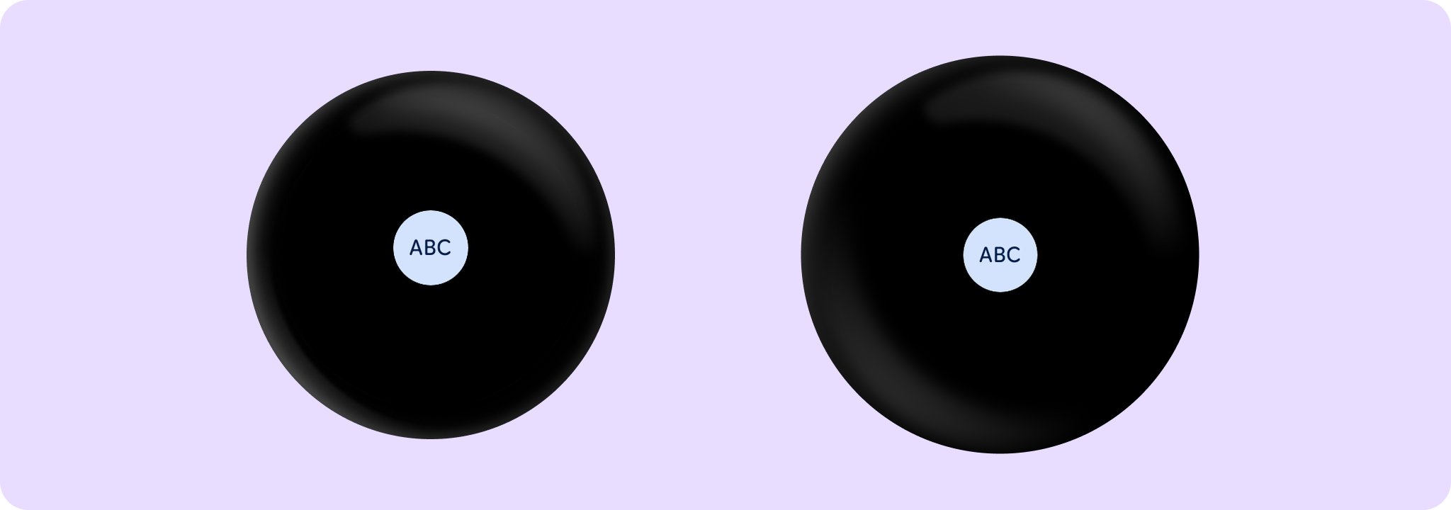
Returns a TextButtonColors with the colors for a filled TextButton- by default, a colored background with a contrasting content color. If the text button is disabled then the colors will default to ColorScheme.onSurface with suitable alpha values applied.
Example of TextButton with filledTextButtonColors:
import androidx.wear.compose.material3.ButtonDefaults
import androidx.wear.compose.material3.Text
import androidx.wear.compose.material3.TextButton
import androidx.wear.compose.material3.TextButtonDefaults

TextButton(
    onClick = { /* Do something */ },
    colors = TextButtonDefaults.filledTextButtonColors(),
) {
    Text(text = "ABC")
}
| Parameters | |
|---|---|
containerColor: Color = Color.Unspecified |
The background color of this text button when enabled |
contentColor: Color = Color.Unspecified |
The content color of this text button when enabled |
disabledContainerColor: Color = Color.Unspecified |
the background color of this text button when not enabled |
disabledContentColor: Color = Color.Unspecified |
the content color of this text button when not enabled |
filledTonalTextButtonColors
@Composable
fun filledTonalTextButtonColors(): TextButtonColors
Returns a TextButtonColors with the colors for a filled, tonal TextButton- by default, a muted colored background with a contrasting content color. If the text button is disabled then the colors will default to ColorScheme.onSurface with suitable alpha values applied.
filledTonalTextButtonColors
@Composable
fun filledTonalTextButtonColors(
    containerColor: Color = Color.Unspecified,
    contentColor: Color = Color.Unspecified,
    disabledContainerColor: Color = Color.Unspecified,
    disabledContentColor: Color = Color.Unspecified
): TextButtonColors
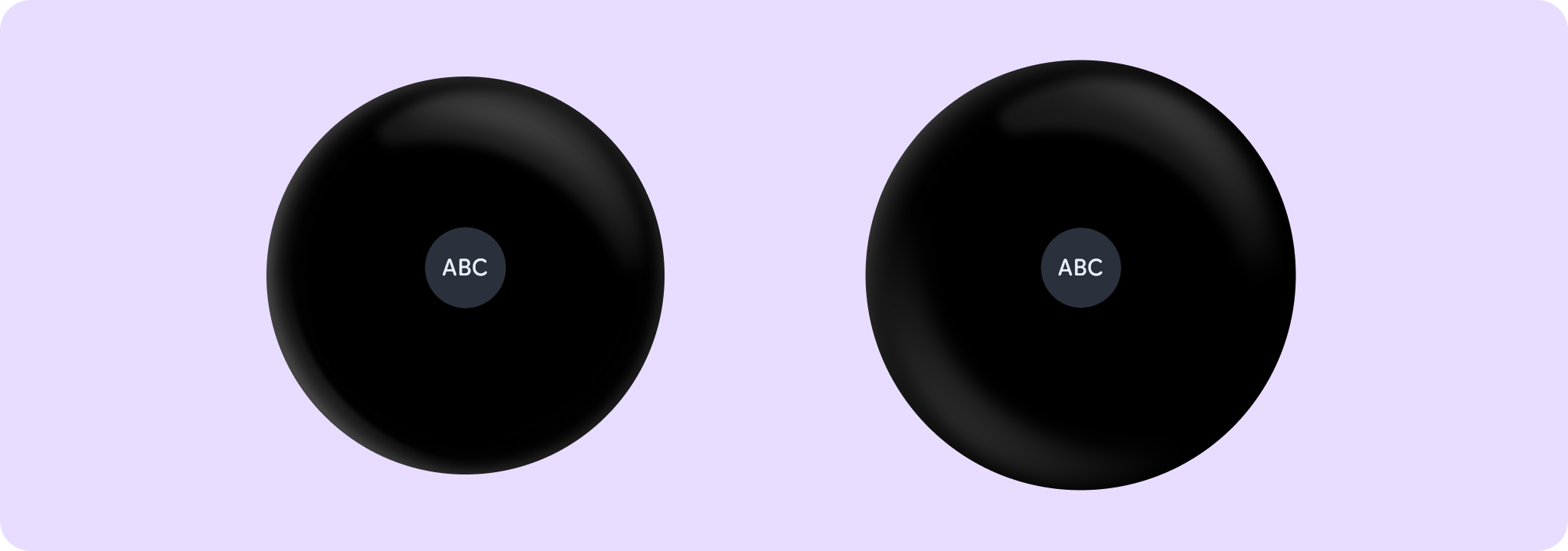
Returns a TextButtonColors with the colors for a filled, tonal TextButton- by default, a muted colored background with a contrasting content color. If the text button is disabled then the colors will default to ColorScheme.onSurface with suitable alpha values applied.
Example of TextButton with filledTonalTextButtonColors:
import androidx.wear.compose.material3.ButtonDefaults
import androidx.wear.compose.material3.Text
import androidx.wear.compose.material3.TextButton
import androidx.wear.compose.material3.TextButtonDefaults

TextButton(
    onClick = { /* Do something */ },
    colors = TextButtonDefaults.filledTonalTextButtonColors(),
) {
    Text(text = "ABC")
}
| Parameters | |
|---|---|
containerColor: Color = Color.Unspecified |
The background color of this text button when enabled |
contentColor: Color = Color.Unspecified |
The content color of this text button when enabled |
disabledContainerColor: Color = Color.Unspecified |
the background color of this text button when not enabled |
disabledContentColor: Color = Color.Unspecified |
the content color of this text button when not enabled |
filledVariantTextButtonColors
@Composable
fun filledVariantTextButtonColors(): TextButtonColors
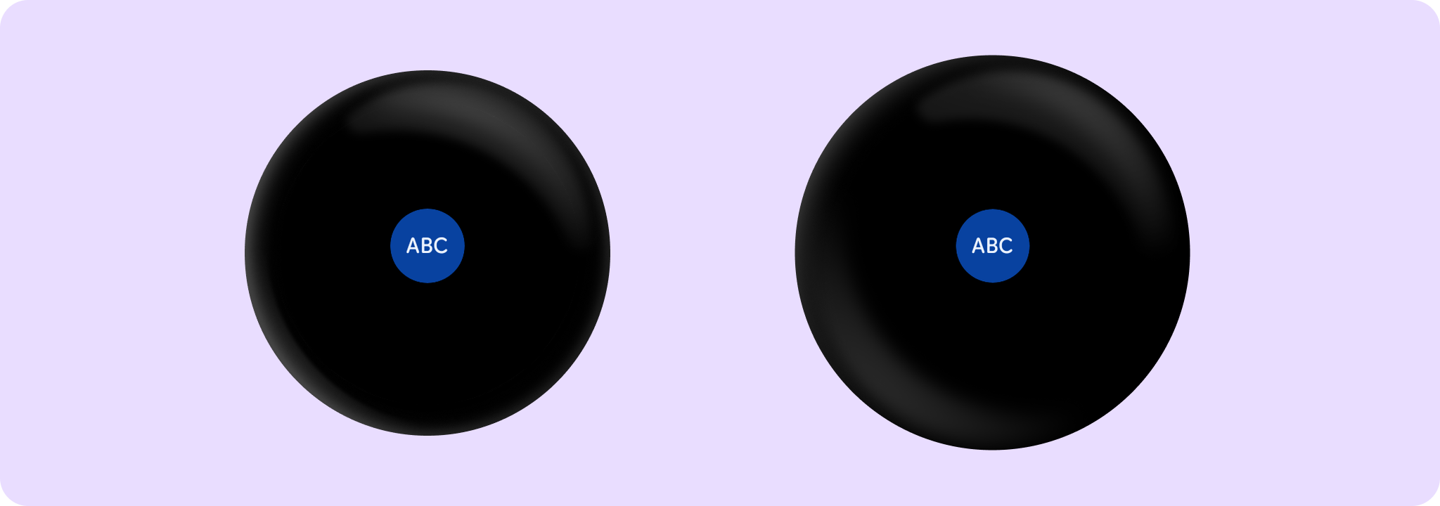
Returns a TextButtonColors as an alternative to the filledTonal TextButtonColors, giving a surface with more chroma to indicate selected or highlighted states that are not primary calls-to-action. If the text button is disabled then the colors will default to the MaterialTheme onSurface color with suitable alpha values applied.
Example of creating a TextButton with filledVariantTextButtonColors:
import androidx.wear.compose.material3.ButtonDefaults
import androidx.wear.compose.material3.Text
import androidx.wear.compose.material3.TextButton
import androidx.wear.compose.material3.TextButtonDefaults

TextButton(
    onClick = { /* Do something */ },
    colors = TextButtonDefaults.filledVariantTextButtonColors(),
) {
    Text(text = "ABC")
}
filledVariantTextButtonColors
@Composable
fun filledVariantTextButtonColors(
    containerColor: Color = Color.Unspecified,
    contentColor: Color = Color.Unspecified,
    disabledContainerColor: Color = Color.Unspecified,
    disabledContentColor: Color = Color.Unspecified
): TextButtonColors
Returns a TextButtonColors as an alternative to the filledTonal TextButtonColors, giving a surface with more chroma to indicate selected or highlighted states that are not primary calls-to-action. If the text button is disabled then the colors will default to the MaterialTheme onSurface color with suitable alpha values applied.
Example of creating a TextButton with filledVariantTextButtonColors:
import androidx.wear.compose.material3.ButtonDefaults
import androidx.wear.compose.material3.Text
import androidx.wear.compose.material3.TextButton
import androidx.wear.compose.material3.TextButtonDefaults

TextButton(
    onClick = { /* Do something */ },
    colors = TextButtonDefaults.filledVariantTextButtonColors(),
) {
    Text(text = "ABC")
}
| Parameters | |
|---|---|
containerColor: Color = Color.Unspecified |
The background color of this text button when enabled |
contentColor: Color = Color.Unspecified |
The content color of this text button when enabled |
disabledContainerColor: Color = Color.Unspecified |
the background color of this text button when not enabled |
disabledContentColor: Color = Color.Unspecified |
the content color of this text button when not enabled |
outlinedTextButtonColors
@Composable
fun outlinedTextButtonColors(): TextButtonColors
Returns a TextButtonColors with the colors for an outlined TextButton- by default, a transparent background with contrasting content color. If the button is disabled, then the colors will default to ColorScheme.onSurface with suitable alpha values applied.
outlinedTextButtonColors
@Composable
fun outlinedTextButtonColors(
    contentColor: Color = Color.Unspecified,
    disabledContentColor: Color = Color.Unspecified
): TextButtonColors
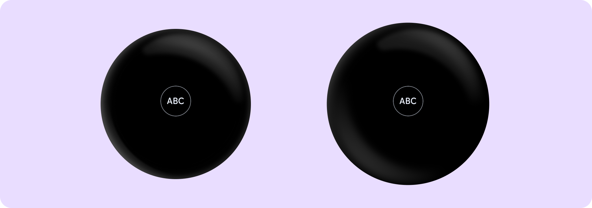
Returns a TextButtonColors with the colors for an outlined TextButton- by default, a transparent background with contrasting content color. If the button is disabled, then the colors will default to ColorScheme.onSurface with suitable alpha values applied.
Example of TextButton with outlinedTextButtonColors and ButtonDefaults.outlinedButtonBorder:
import androidx.wear.compose.material3.ButtonDefaults
import androidx.wear.compose.material3.Text
import androidx.wear.compose.material3.TextButton
import androidx.wear.compose.material3.TextButtonDefaults

TextButton(
    onClick = { /* Do something */ },
    colors = TextButtonDefaults.outlinedTextButtonColors(),
    border = ButtonDefaults.outlinedButtonBorder(enabled = true),
) {
    Text(text = "ABC")
}
shapes
@Composable
fun shapes(): TextButtonShapes
Returns the default TextButtonShapes for a static TextButton.
shapes
@Composable
fun shapes(shape: Shape): TextButtonShapes
Returns a TextButtonShapes for a static TextButton.
| Parameters | |
|---|---|
shape: Shape |
The normal shape of the TextButton. |
textButtonColors
@Composable
fun textButtonColors(): TextButtonColors
Returns a TextButtonColors for a text button - by default, a transparent background with contrasting content color. If the button is disabled then the colors default to ColorScheme.onSurface with suitable alpha values applied.
textButtonColors
@Composable
fun textButtonColors(
    containerColor: Color = Color.Transparent,
    contentColor: Color = Color.Unspecified,
    disabledContainerColor: Color = Color.Transparent,
    disabledContentColor: Color = Color.Unspecified
): TextButtonColors
Returns a TextButtonColors for a text button - by default, a transparent background with contrasting content color. If the button is disabled then the colors default to ColorScheme.onSurface with suitable alpha values applied.
| Parameters | |
|---|---|
containerColor: Color = Color.Transparent |
the background color of this text button when enabled |
contentColor: Color = Color.Unspecified |
the content color of this text button when enabled |
disabledContainerColor: Color = Color.Transparent |
the background color of this text button when not enabled |
disabledContentColor: Color = Color.Unspecified |
the content color of this text button when not enabled |
Public properties
DefaultButtonSize
val DefaultButtonSize: Dp
The default size applied for buttons. It is recommended to apply this size using Modifier.touchTargetAwareSize.
LargeButtonSize
val LargeButtonSize: Dp
The recommended size for a large button. It is recommended to apply this size using Modifier.touchTargetAwareSize.
SmallButtonSize
val SmallButtonSize: Dp
The recommended size for a small button. It is recommended to apply this size using Modifier.touchTargetAwareSize.
defaultButtonTextStyle
val defaultButtonTextStyle: TextStyle
The default text style applied for buttons.
largeButtonTextStyle
val largeButtonTextStyle: TextStyle
The recommended text style for a large button.
minimumVerticalListContentPadding
val minimumVerticalListContentPadding: Dp
The minimum vertical content padding for the list when a TextButton is placed at the top or bottom edge. Recommended for use with androidx.wear.compose.foundation.lazy.TransformingLazyColumnItemScope's androidx.wear.compose.foundation.lazy.TransformingLazyColumnItemScope.minimumVerticalContentPadding, which allows items to choose a preferred content padding for the list. TransformingLazyColumn takes its contentPadding as the maximum of the preferred content padding values and its own contentPadding parameter.
pressedShape
val pressedShape: CornerBasedShape
Recommended pressed Shape for TextButton.
smallButtonTextStyle
val smallButtonTextStyle: TextStyle
The recommended text style for a small button.